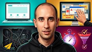
A designer removed social media buttons, sidebars, and top navigation from his website to cut clutter and force focus on content. An author initially questioned the move but later praised it, saying the clean design made her a loyal follower.
Chapters
Why I simplified my website. So I got an email from an author not too long ago on my website. We've got about 8,000 people who contribute to my website, and he wrote in to say, "Why is it that you don't have social media sharing links on your website?" So somebody goes to his article, you can't click on the simple tweet button, Facebook like button, any of that stuff. He said, "Why do you do that? Like, people should want to share this stuff." And I got into this whole thing on email with him and he came out loving it, but here's the reason why, okay? If you look at my website, it's changed a lot over the past couple of years. The philosophy here is we want to minimize the amount of work and the amount of options that we give people, because when you minimize the options and you make it powerful, you're more likely to get somebody to follow through. If you have somebody come to your website and it's full of stuff, so many options, What are they going to do? They're going to be confused, they won't know what to do, and then they'll bounce. Ideally, what I want to do is for people who are writing content for my website, I want to have it so that the article is so good that people will go to Twitter on their own and share it, right? That's the test. I'm sure you've been on some websites where you love the content so much that you went and shared it even though there was not a little button on there. So we're trying to minimize distractions. Some of the other things that we did was we eliminated the sidebar. So there's no sidebar anywhere on the website. It's just a flowing down piece of content. Because again, we're distracting from the reader. If you're reading something that's great and then they have to jump to the sidebar, then you're distracting their flow and it's not a great thing for them to do. I also have a bit of a beef with top navigation. And this is maybe a personal rant of mine, and I don't know, we'll see if I stick with it, but I'm feeling like Right now, you look at my website, at the top there is no navigation. It's just a video. And my reason for doing this was that when I'm looking at my site and looking at doing a redesign, I thought, you know, everybody has a top nav, so what do I put in my top nav? And I was sitting with my designer and said, you know, I'm just going to kill the top nav. I don't want a top nav. The reason is, why do you have a top nav? Okay? If you have content and somebody is coming to your website, okay, they are reading your homepage, they start scrolling down, If they're not reading anything and they're distracted by your top nav, right? If they're clicking away before they even scroll down on your page, then the content sucks, right? The content on your homepage sucks. They're not reading it. They're bouncing right away, going to somewhere else on your site. So fix your content, make it better. The other option is if they do like the content, you know, they are scrolling down, reading whatever is on your homepage or whatever page they land on, you're then making them scroll all the way back to the top. To navigate your site. To me, that didn't make sense. It made sense that you should have great content that people should want to read and should want to scroll. You're minimizing the options for them to get distracted on. And then at the bottom, you have your bottom navigation. You have your footer navigation where they can go for next steps to learn more. To me, that just makes a lot of sense of how somebody should work through a website. Maybe I'm the— I mean, I know I'm in a huge minority. And a big problem is most websites are too cluttered, they're too full of crap, too many distractions, and the content sucks! You know, the content is bad, so I'm clicking away. Make good content, make me want to read it, make me want to get engaged with it, and then right there at the bottom— I don't want people clicking away right at the top— right there at the bottom as a next step, right? I'm reading your website, say, "That's really cool what these guys do, I want to learn more." Boom! Right here, here's my next step. Make it easy for people. Remove the distractions. So the author who wrote in, I wrote this whole long email to his really short question, and he wrote in to say— I wish I saved that tweet. I'm feeling sick if you can't tell right now, so my mind is a little— anyway, he wrote back to say, 'You know what? That was exactly the answer that I hoped you would say,' and he followed me on Twitter and he wrote, you know, Because you stand for something, you've gained a new follower. And so that's what you want to do with your business. Try it. Simplify it. Make your content more valuable. Remove distractions and watch your business grow. Believe. For those of you watching, like the video, thumbs up below. Leave a comment, ask a question, I'll make a video response. And click on my face to subscribe to the channel. Thank you so much and I'll see you soon.