How To Make Your Brand POP with Mike Smith
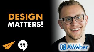
Mike Smith, a designer at AWeber, breaks down branding with the 3 Ps framework: Purpose, Position, and Personality. He walks through a bullseye model that layers logo, colors, and typography, then shows how to apply them across emails, ads, and websites. Consistency across these elements is what makes a brand stick.
Chapters
Bonus. Alright, welcome everybody, another Hangout. Super excited to have you on with me here today. I've got Mike Smith with me from AWeber. Mike, welcome aboard.
Thanks, thanks for having me.
Mike is a designer at AWeber, and for those of you who this might be your first time checking us out, we're doing a monthly series where various people from AWeber are kind of joining in to answer some entrepreneurial questions. They do email marketing software, and I've been using them for my newsletters for the past 10+ years, so I guess a lot of designs that have come from Mike I've seen as a customer. So yeah, Mike does a lot of the designs there, and he has a passion for designing and branding and kind of art direction. Mike, do you have a just quick intro beyond what I said, and then we'll get into the questions?
Yeah, like Evan said, one of the designers here at AWeber, a lot of my role is now moving the design forward. So I've been here for almost 3 years and we've grown a lot in those 3 years as far as our design language is concerned and, and trying to continue to push that forward. So, um, yeah, it's a lot of fun.
I love it. So the way that, uh, Blab works here is if you guys have a question, you can type in /q space and then type your question in and it'll show up on the side. And as we get to them, uh, we'll try to answer them and get through as many as we can because, uh, that's what we're here to do today is help help you guys with branding and building your business. So let's pop in on the first one. Now, J-Rise, I'm popping the question up on the screen here. I know he knows, I know he loves a lot about design and branding, and if you saw the pre-chat, he's been dishing a lot of wisdom and knowledge about branding. So what he's asking here, does making a brand pop really matter? You know, I think that's more for entrepreneurs. How do you tell an entrepreneur that, who's just trying to get sales and trying to get something coming in the door and they're struggling to pay the bills, that they need to focus on design instead of, you know, picking up the phone and trying to make a sales call? Sure.
Yeah, I mean, both are incredibly important. You can't obviously run a business without any sales. However, I really do think that if you don't stand out in the market in some way, you're just going to blend in like every other company. So those are the— that's kind of the area where popping is important, you know. I like to think of branding and the visual aspects and company objectives as working together, not against each other. So if you think of like a double helix, like a DNA strand, one strand is your, is your company objectives, your goals and things like that. The other strand is your brand. So they kind of work hand in hand. And I don't, I don't, and this may just be me, you know, touting this, but I don't think you can really do one without the other. Both are integral to the success of a business.
So what in your mind, how do you make a brand pop? How do you, you know, what are the elements for people who may not be as versed in design? You know, they don't have a Mike Smith on board on their team kind of helping guide their direction. What are the things that they need to worry about or focus on to make their brand stand out?
Yeah, consistency is, is key. If you're constantly putting out pieces that look completely different than each other, you're not going to build a brand identity, a brand vision. So consistency is huge. You know, you making it pop, stand out, you know, you could say bright colors, you could say really bold graphics, but if that's not who you are as a company, then that's not going to speak to you. So making it pop is like staying true to who you are. Figure out who that is and then look for inspiration that speaks to that and just consistently put that out over and over again in unique ways, in traditional ways, you know, whatever that is. Yeah, you can really get yourself out there. Popping is like a relative term, you know, if I'm not interested in your business, your information may never pop to me.
Right. So is there a— so for an entrepreneur who, you know, is really good at what they do but may not have a sense of design or branding, how do they, how do they get started on that process? You know, so as an example, I own one of my businesses, a dance studio. So I have the— I own the largest dance studio in probably North America. So say I'm just really good at dance and I just want to teach people how to dance. How do I turn that into a brand that will pop and attract attention?
Yeah, and I think every business should go through an exercise of figuring out what I call the 3 Ps, and that's your purpose, your position, and your personality. You know, purpose being high level, like why are we here, what are we doing this business for? So for your dance studio, you know, figuring out what you want your dance studio to stand for. So that's your purpose. Your position then is what is unique to your dance studio that would make you stand out from all the other dance studios in North America. And then what are those personality traits that then give you that feel of and vibe of your particular dance studio? So when you build those three things together and pull everything back to those three, it becomes easier to be consistent time and time again.
Interesting. Okay, so, so just kind of walking down that path, I like those three steps of purpose, position, and personality. For, for this school, just as an example, the purpose is to give people a sense of community and to have fun. So most people don't come to the dance studio to learn how to dance. They're coming because they're, you know, they hate their jobs and this might be like the best part of their week is coming to learn how to dance and release some stress and make some friends and community. So if that's kind of why people are coming, then how do I figure out the next steps in terms of branding? I think it could be helpful just for people watching to go through a real life scenario.
Yeah. I mean, knowing that that's why people are coming is not just to learn dance, but to take a break. You can really play up that in all of the materials that you put out. So you wouldn't want to have your traditional, you know, little girls in tutus lined up against a balance beam kind of ballet studio type thing. You could go a completely other end of the spectrum where it's like, you know, much more adults, people having a lot of fun, you wanna emphasize a lot of smiling faces and all that kind of stuff because that is core to why people are coming to your particular dance studio and what they're getting from it. So to share that sense of feeling in a visual way is really what you're trying to convey. Whether that's done through photographs or iconography or color or even the creative headlines that you use, that's what's important to convey and communicate.
Are there— so I love your 3 Ps there. Are there— you talked about icons a little bit and logos and fonts and colors. Is there another list of like, here are the 10 things or 5 things that you got to focus on as you're building your brand, kind of general buckets for people to pay attention to?
Yes and no. Yes, in the sense that there are generally the same things for every company to be aware of. But since each company is unique, those things can be tweaked and altered just a little bit. So to build off of my 3 Ps, I have this great thing that I developed, and I think it helps a lot of people understand how to take those 3 Ps and then apply them to their brand. So if you think of those 3 Ps as like the center of a target, so the bullseye, those are your, your core identity, who you are. You always come back to those things as this is our, you know, once again, our position, our personality, and our purpose. Then just outside of that, the next ring of this target is your brand elements. So that would be things like your logo, your colors, your photography style, your illustration style, all of that kind of stuff. And then the ring outside of that is the application of those things. So How does your logo get applied to all of the elements that you put out? How are the colors applied? And that those become things like your mailers or your Facebook ads or your website and all of that kind of stuff. So that's kind of the framework and structure that I like to think of when thinking of brand and application.
I love it. Have you guys turned that into like an infographic?
Internally?
Internally?
Yeah. And we're actually working with each team to develop what does that team— so our mobile team, I just did an exercise with them and determining what are the mobile team elements and application for their particular thing. And that bullseye, once again, stays consistent across every team. So for a larger team, that's applicable. For a small team, you know, you may only end up with one bullseye target.
Right, that's pretty cool, man. You know, I don't know if you're open to it, but I'd love to be able to share some version of that with people watching as like a takeaway.
Yeah, yeah, definitely. I can send you over something. Recently I just saw Ryan asked, does AWARE actually use those? It's something that we're starting to use more recently. So we haven't fully fleshed all of them out, but there are a few that have been floating around and we're letting those influence our decisions moving forward. Cool.
Okay. And so, you know, if Mike sends me something over, I'll add it to the description of the video that we put on YouTube for you guys to kind of check out and download. I think that doesn't— that'd be a super practical, helpful piece.
Yeah.
Awesome. Great. So let's move on to Rishi. Rishi Cup TV. My brand is both silly and serious. I'm not sure how to capture both through design. Any ideas?
Yeah. So going back to— and I'm probably going to reference this a lot— going back to the target, you know, your personality traits can be both silly and serious, or maybe you're selling a serious thing, but you want your approach to be a bit silly, you can accomplish that. And I was looking through the pre-chat, someone said Pixar is a good example of that. It's kind of a serious-ish company, but their applications are very silly. You know, their movies are silly, their characters are silly, but you wouldn't say that overall Pixar is a silly company because they're very successful. So there's got to be some realm of business seriousness to that.
Cool. You think of— so Rishi Cupp is a longtime kind of viewer-subscriber. I think she's been on all the AWeber chats that we've done. She has a YouTube channel, and she has a combination of her sharing what she's doing with her friends. It's kind of a vlog, but there's also her singing and her unique— she's a songwriter, and she has days where she sings her songs. She uses the cup as part of her branding. So you can see in her picture, she's got the cup. And sometimes, you know, we'll ask her what's in the cup today. So whatever she's feeling. So is there advice for her? So if her focus is kind of focused on YouTube, there is her advice for her on how she can. So if you even look at her, you look at her name, you look at her picture, you look at her colors. Is there advice you could give her on what she's doing now without— I mean, you haven't seen her videos and gone through all her materials, but even as she's branding herself now, that first impression, what comes across.
Yeah, that concept of a cup. Oh man, you could take that so many cool ways. And whether that cup is consistent and you overlay things on top of it, or each day, each mood, each thing gets another different cup. Thrift store is a great resource for that. So if you're doing YouTube videos, you go to the thrift store, buy a whole bunch of 25-cent mugs or, you know, teacups or whatever. And each day within your YouTube thing, have a cup that relates to, you know, what the topic is. So like if it's serious, maybe you have like a very floral and like serious toile kind of mug, or if it's like a lot of fun, you get like a quirky mug. That's one approach to take. I think it could be a lot of fun. If you want to have a consistent cup though, that doesn't necessarily apply. If it's that white mug I see that you have in your photo, maybe that's not the direction to go. But that's a way to keep seriousness, fun, silly, you know, all of that.
Yeah, and so it's interesting because we were having a conversation a couple months ago, I think, about her branding and she almost dropped the cup. She's like, "I don't know if I should keep the cup or not, or should it just be my name?" Everyone's kind of encouraging to keep the cup and she really likes it. I like it.
Yeah.
I mean, I think it could also be, uh, even if you're keeping the same cup in every episode, could be what you put in, either what you actually put in, like if you're drinking coffee or if you're drinking beer, if you're drinking water based on your mood, or even just as a metaphor, like, hey, my cup was filled with love today, or my cup is filled with anger today, or my cup is filled with whatever, right? Like you can choose. I love the idea of having different cups, but if the white cup is always your thing, then you can either with actual liquid inside or with, you know, in theory, you know, your emotions inside. I think that could be a cool way to express it.
Yeah. And it would be a fun element of surprise because it's like you don't know what's going to be in there. And then as you pan up, you find out, you know, oh, it's filled with glitter today. You throw the glitter.
I want to know, Rishi, what's in your cup today, right? It's like we're looking forward to it every day.
I would watch just to find out what's in the cup. There you go.
There's some branding in action. So it's good. And so she's got in her name, Rishi Cup TV, and she's got it in her picture as well. Yeah. Cool. Cool. Okay, let's go to the next one. Jennifer Price, another longtime loyal viewer. What do you think is the one thing to start with to help create a signature look/design for your brand? The best represent your values and biz.
Yeah. And going back to the 3 Ps again, you start with that bullseye and let that inform what you, how you apply it. So I would say, you know, in branding a lot, things are getting more and more similar. So find other things out there that you, that inspire you, that speak to you and speak to what your bullseye is. And then take those and put your own unique twist on it. So don't just steal it straight up, but take ideas and thoughts and images you've seen that you like, bring them in, see if they align to your personality traits, then take those personality traits and tweak the images and stuff that you found to make it you. That's the best place I could suggest to start, and then just be consistent after that.
Cool. The metric that I use, or the methodology I use, is more through, uh, finding your one word. And this relates to purpose, I guess, for me. So mine is believe. I'm Christian, go find the one word that they kind of resonate best with. And then, then in terms of creating design and elements, you look at a logo, right? My logo is here. It's a paper airplane, uh, because I believe in entrepreneurs. And when you're starting off as an entrepreneur, you want to fly, but you're also super frail and weak, and like you can get blown around and you don't have the tons of money from venture capitalists, and, uh, but you're still gonna go off and chase your dream. And so starting with your one word, or starting with your purpose, and then saying, okay, well, how do I create a logo around that? And how do I then create— you know, the font has meaning. This font is here for a specific purpose. It could be a lot more fun, or it could be a lot more serious. You know, if you see the Walt Disney font, that means something. Or if you have the Army font, that means something. And so starting with the purpose or in my case, the one word can help integrate into every design aspect of your brand.
Yeah, it goes back to the rationale. So you can have, you know, any, any element, but if you don't have a reason as to why you chose your one word or the reason why you chose the paper airplane for your logo, you know, that's really what's, what's core to that idea is having that rationale behind things.
Cool. Now I'm curious to find your first impressions because, because Jennifer has been on before and I know her. Jennifer is a copywriter. Okay. And so you see her face there, you see her icon and you see her name is This Is Much. What, what do you get? What are your first impressions from a branding point of view from what she's done with her, her naming and her picture?
Right. This is Much probably means a lot more if I were to visit her site. So right now I don't, I don't know a whole lot about This is Much, but it is unique. So that's good. You know, that, that would cause me to stop and be like, what is This is Much? Like, why is she calling herself This is Much? And then I would want to find out more. So that is awesome. Being a copywriter, I think her using her own face, if, So there are a lot of solopreneurs or small businesses where you're a service-oriented company and your face or your image becomes your brand image as well. So it becomes hard to separate yourself from it. I think Evan, you've done a great job in creating this believe and this is paper airplane. But just as much Jennifer could use, you know, her avatar, as long as it's consistent across a lot of things, as her brand image and people get familiar with her face. Then they become familiar with her. So it is an approach to take, and I think it's a very valid and good approach to take a lot of times because it humanizes the brand as well. It's not like, oh, someone's writing your copy for me, for you. It's no, Jennifer, this face in my avatar is writing the copy for you, right?
Yeah, I think it's one of the biggest advantages that you have as an entrepreneur is your story and the human element. Because if I could hire a big company versus hiring a small company, the The big company has all the respect and a name that I know and a lot of tradition. So why would I go with a startup unless they were cheaper? You know, you're going to go with somebody who's smaller because you like their story and your passion. And so many entrepreneurs, if you look at their website, they're trying to emulate the big guys. It's just like this boring corporate website. You go to the about page, there's no pictures, there's no story with the founder. It's super boring. Like, you know, even point form, 'cause that's what you think you need to be professional. But you can't compete with those big guys playing their game. Your way in is to tell the heart, like to show your passion for what you do. And that's how you start winning and being able to charge more because you feel like this person really understands it. This person really is excited and not just hiding behind a corporate story.
Yeah.
Do you touch on that? I know, like, do you consider that part of design, like the storytelling component to it? I know you tell stories through design, but how do you guys deal with that at AWeber?
I do. I think that really awesome designers are trying to communicate something, and so they need to use whatever means possible to communicate that story. And so sometimes it's stripping away all of the design elements and letting the words speak for themselves. Stripping away all of the frills and nonsense from time to time and letting the image speak for itself. So, you know, I see myself as a storyteller, and that applies in a multitude of ways whether I'm working on a marketing project or, you know, AWeber being a technology company working on our service itself, you know, the dashboards and the interactive elements and things things like that. But even then you're telling a story. So yeah, I see it as incredibly important. And I spend a lot of time in my current role, I spend a lot of time thinking more than I do actually designing. How is this going to apply? How are people going to respond to this? And we're telling the right story, we're putting forward the right face and all that kind of stuff.
So when, just out of curiosity, when you guys are planning a campaign, if you're working on say you're working on a YouTube video or you're working on a newsletter, you know, you're gonna send your— AWeber's sending their own newsletter out to their clients.
Yeah.
Obviously you're a part of that because they need you to design something amazing. Yeah, who else is involved and what are the roles and how do you talk about what's the thought process before you actually get to actually creating the content and the design for the newsletter?
Yeah. That's a really good question. We have, we have a, a really solid team. Uh, our team consists of, uh, content writers, um, traditional marketers, web designers, um, visual designers, all of that. So, uh, generally our process goes, we figure out what we need to communicate and who we need to communicate to as like a, an overarching idea. and then we'll take the time and the content writer will come up with the copy. And so here are the words that we're trying to communicate, and then the design team will take that and go and run with, you know, so how can we take these words and make it most compelling, most interesting, and the most useful to however the person is receiving it. And there's a lot of collaboration within that. I made that seem like a, I hand it off to you, you hand it off to me, you know, it's, We're all working together along the way to figure out what is the best way to communicate to the audience we're trying to.
I love it. And then, I mean, since we're talking about newsletters and AWeber, for clients who are then planning their own email campaigns, is something I do. I send 2 emails a week to my newsletter list. You know, as a solo entrepreneur, for most entrepreneurs, or they may have, you know, some part-time staff, but assuming it's just them, they may not have like 5 people to collaborate and connect with and figure out what their email is going to look like. So what, what process would you go through to say, okay, I want to send an email out, I'm planning my autoresponder sequence, this is what I'm, you know, setting up my account, I'm going to plan my autoresponder sequence for the next 10 weeks that goes out. What should my thought process be in terms of figuring out what stories I want to tell? And then bringing that down to the tactical of, okay, headlines, colors, logos, pictures.
Yeah. Hopefully a lot of that. So if you're new starting out, first time doing your newsletter, all of that is a, a task that you have to accomplish. It's, it's a challenge and you have to figure out, all right, how am I gonna communicate within the inbox visually to my readers? So ideally you're only focusing on that maybe the first few times, and then after that it's just consistent and you, you can focus on the writing and, and all of that stuff. But, you know, asking questions all along the way, how is this gonna look on a desktop device? How is this gonna look at on someone's phone? You know, am I, am I needing to convey this with imagery? So what images do I need to add and at what point throughout my newsletter should I add them? Or is it simply words and the images are just going to distract entirely from my message? You know, I, I personally follow a very simple structure when it comes to sending out emails. And that's if it's for a business, logo at the top. And then if there's imagery that's going to support what I'm going to talk about or catch someone's attention, image. And then text, occasionally images throughout. But, you know, all of those elements within the body of the email could go in or out depending on, you know, how personal do you want this to look? Do you want it to look like a letter? Do you want this massive email sending to thousands of people look like it was a personal email that I sent you? Well, then you should probably steer clear of imagery altogether to have that more like personal email touch. If you're selling something, you should probably show what you're selling within the email. So it's very case-by-case basis, but asking all of those questions as you go through on who am I sending this to and what do I want them to do with what I've sent.
Cool. I think too, it's never been easier to not be a designer and still get great designs. Yeah. If you use, so if you use like an AWeber for your newsletter, they have templates. That maybe Mike had a role in designing and planning that has the colors and pictures and all of that that you can easily put in. Or if you're starting a website, you can use WordPress and there's lots of themes for you to do that. And you don't have to create everything yourself or spend tons of money necessarily hiring somebody, which you may not have when you're starting up. So you can also leverage the tools that are out there. Yeah. Um, to help you get great designs without you having to spend time to learn it and be a designer yourself.
And there are a lot of like low-cost ways to do that as well. So the Envato Marketplace is a place where you can buy email templates and then kind of customize them. And you need a little bit of HTML knowledge to be able to do that. But I know AWeber does this, offers template customization for, you know, like $29 or something. So you could be like, hey, I love this template. I'm not sure how to fix it. Hey, could you guys help me out? And we could, you know, our customer support team is awesome and they would be able to easily help you guys out. So yeah, Ryan, thanks for that.
I did not know this. I'm writing it down. Template customization. Yes. All right. Very cool. And what was the other one you said at the end? What was the marketplace?
Envato. Ryan actually posted it in the chat there on the side, envato.com.
They have— Ah, there you go, perfect.
Yeah.
Envato. And that integrates with AWeber?
No, that would just be a place to go find custom templates. You would need HTML knowledge then to be able to edit it yourself. But you could paste that into AWeber once you're done with it.
Okay, cool. That's cool, I'm gonna check that one out too. I mean, being able to update HTML files compared to just design it from scratch— Yeah. Way easier.
Yeah, and a lot of times they include like PSD files in there, um, so if you wanted to just mess around, if you had Photoshop and you wanted to mess around before getting into the code, you could do it that way as well.
I'm learning something new, I love it. Okay, let's keep moving. We got Nathan. Nathan, fellow Toronto entrepreneur. My brand is serious clean tech company that innovates. I'm I'm not sure how to capture through design that could make it easy to understand our company to customers from a website. Any ideas? Thanks. Telling the story of our company. I don't know Nathan, but in the previous, just before we started, we were chatting and he has a, he wants to do green technology for cell phones so you can charge your cell phones with green power. So how to make that easy to understand and tell the story through design.
Yeah, um, I wouldn't necessarily even consider that too serious, or it doesn't have to be serious, um, but because there's that innovative element to it. So there's, there's so much imagery, whether it be through, um, you know, showing the green side of things or showing the technology side of things and charging and phones and different things like that. Um, Yeah, I mean, there are so many ways to go with this. You know, if you want to stand out from the crowd, I would encourage you to not just put a bunch of trees on your website because that could be any company. So, you know, figure out what your unique selling proposition is and then what personality you want your company to have and then build off of that, you know, allow, allow that to dictate how your website ends up looking. I think you could go a lot of different directions. There's just idea after idea spinning in my head.
Well, for the— I mean, I'm thinking through the story of the company that was kind of in the last part of the question. Like, why is this so important to you, Nathan? Yeah, right. Why does this matter so much? Uh, why do you care about green technology and cell phones so much? Like, if you told me a personal story that I can say, man, that, that guy really cares, cuz there's so many companies are gonna be pitching similar things. But then if I feel like you have the heart and you're not just some scam artist trying to capitalize on an opportunity.
Yeah.
Uh, but you, that you actually care trying to build something important that would resonate with me. And I, I, I'd be kind of drawn into your story a lot more. And, and I think for a lot of people who are trying to, this might be more in the, like the wording part, but a lot of people worry about getting the exact words. Like, I'm not a copywriter, I can't write. And so they end up not doing it. The intention is, in my view, way more important than the actual words. Like, if people can feel your passion, then if you say the wrong thing, like you don't use the exact right word, it doesn't matter as much because the intention, the passion's coming through. That's much more what you want. And so I wouldn't let the fear of not knowing the exact words to say hold you back from writing a passionate story to put on your website.
Yeah, and I think your story would separate you from maybe others within your, you know, space because it is so personal to you.
Cool. John, what are some ways a brand can differentiate from looking too much like Instagram even though the content is displayed rather similar?
That's an interesting question. I don't know if John is still here, if he can clarify any of this, but are you a mobile app company? Or I guess, you know, there's a desktop view too.
Native app. Yeah, John is still here. John, if you want to— so he's writing native app.
Yeah. That's a really tough question because the web and apps are starting to look more and more and more alike. And so you go and you look at something and the most popular one becomes the one that everyone's like, oh, you're just copying X or you're just copying Y. Um, I would say don't worry about it. Um, if that is the best way to present the information or the imagery or whatever you're trying to convey, then, uh, find ways to differentiate yourself from them, but, uh, use the best, best method possible to still communicate that. So even if you're going to be similar, it may not be the end of the world because, you know, that may just be the best way to present that kind of information or those kind of pictures.
Yeah, I look at this question and I think— so he's asking what are some ways a brand can differentiate from looking too much like Instagram? I'd be— I'm more concerned with how are you, how are you actually different than Instagram? Not just like, not just looking different, but how is your company different than Instagram? And understanding that first, right? Going back to the purpose or going back to your one word, uh, how is your business different than everything else? Not just Instagram, just everything else out there. How are you different? And then you can worry about what the visual ends up looking like. And so I think we're struggling on the question because we don't know much about your business. So your native app that looks like Instagram, you haven't told us about your purpose, your position, your personality. Your one word, you know, why you're doing this. And so it's kind of hard to answer. And I think just as a general rule, as you're communicating and telling people about what you're doing, leading with that instead then generates interest and excitement and the ability to kind of dive deeper and help. So I would echo Mike's point to say that I don't know that that matters that much about how you look different than an Instagram. Because there's a lot of websites that might look like other websites, and there's a lot of people who will copy things that I'm doing on my YouTube channel. I don't, I don't care about them. Like, you can't, you know, for people who are copying, you're never the original, right? The original, in my view at least, is always going to be better because I'm always innovating. I'm always doing something new. There's the heart and soul and intention behind it. And the people copying, it's all I'm going to do that, and then they can't innovate and they can't keep up and they don't have the, the innovative capacity to keep going. Um, and so in a roundabout way, and coming back to how is your business actually different, what do you stand for, John, your business, right? Because then we could have maybe tied it into a little bit more of a helpful conversation. He says a follow-up there, what about the color being used? Uh, we want to use blue to establish trust, but I don't want it to look too much like IG.
Instagram, yeah. I mean, blue is not the only trustworthy color. You know, there is psychology to colors and their value and things like that. If it's a concern that you're going to look too much like them and your app is too similar to them and then you're going to use a color that's just like them, I would say consider like what about your app is different. And play that up and make sure that it becomes, you know, different enough from Instagram as a whole to differentiate yourself. I wouldn't stay away from blue because Instagram uses blue. I wouldn't stay away from Instagram's layout because Instagram uses Instagram's layout. I would say what makes you different at your core and then allow that to dictate everything else about, you know, your colors, your look, your logo, all of that. It's gotta— Go ahead.
The color question was also asked a little bit before. Deborah wrote in asking about colors. So can you just touch on that? Colors, what they mean, picking a color, you know, why AWeber has its colors, or what entrepreneurs should think about when picking a color as opposed to just, "Oh, I like pink, so I'm gonna go pink." Like, there's meaning and significance, and the color is itself a language.
Yeah, each color, and you can Google this, like, what do colors mean? Each color has a psychological effect on humans as well as, you know, subconscious effects on humans. So they begin to stand for different things. They begin to communicate different things. Some companies have gone so far as to patent certain colors, like T-Mobile has patented their pink color for, but they can only patent their pink color within the mobile phone space of, you know, of businesses. So, you know, as you do think through it, think through who else is in my space. So if Instagram is in your space, like John's question, and your app is very similar to them, well, if you use a blue color just like they're using a blue color, you may not differentiate yourself enough from them So blue might not be the best choice, even though it may be your favorite color or it may engender trust. You have to consider all of the different aspects when going to choose a color. So am I going to be different enough? Are there other people in my space that are using this color, and will I be able to differentiate myself? So beyond just the psychology of color, you have to consider all of those things as well.
Cool. Peter, what are your thoughts on using terms like biz and for you?
If it's your personality, do it. You know, it might be a little past its prime. I probably would not do it, but if it fits your personality and you can own it, then own it and do it.
Yeah, I think, I think there's a certain stigma, especially against the For You. I, I, when I think of For You, I feel like I'm being scammed. I feel like there's just so many people who, the people who have used it, there's no like big brand that really dominated and added class to For You. And you could be the For You that adds the class. Um, anyway, I don't know. I feel like I'm being scammed. It was happening, but Even biz, like I haven't really used biz much unless I'm trying to shorten something down in Twitter as an example. So I think it just depends on, as Mike said, your personality and also your audience. So Rise Online is posting that rappers use for you all the time in their songs and it's part of the culture. Awesome. I'm obviously not ingrained in rap culture enough to comment on that. But if that's the culture, right? If that's who you're selling to and they get it and they feel like you understand them too and you're part of the same family, then it works. If it's not, so if you're gonna go all in on rap culture and your marketing and your branding and your logos and your font all kind of represents rap culture, then great, it could work. If you're trying to be, if you're trying to do like, be a, I don't know, be, you're trying to sell newsletter software and you're calling yourself Newsletters 4 U to a business market that might seem a little scammy. At least that's my initial thoughts. So that's it, Peter. I wanna know what you're selling, Peter. Give us some context. What's he, he wrote on the side, a colleague is trying to drive the business in that direction and I'm trying to resist. That's exactly how I feel.
Yeah, I think I may have met Peter before. Peter, are you, are you in the Philly area? I don't know if that's a question you want to answer, but I feel like we met at a meetup one time.
Could be. Cool. Okay, Tom. Tom, do I build a new website or do I put up a website that I had a developer create that in my opinion looks like crap?
Awesome. Um, if you don't believe in it and you can't get behind it, I would say don't put it live. There's a rough balance. I tend to want to put things out that I'm incredibly proud of, that I can get entirely behind, but if that prevents you from just doing something, then that's when it's going to hinder you. So if the website doesn't poorly represent you and you just personally hate it and it's preventing you from starting your business, then I say just do it. Just put it out there. If it's going to be a poor representation of who you are, your personality, going back to that bullseye, in that case I would say hold off, revise it to where you're happy enough with it, and then put it out.
Soulsum UK is saying that that's like using another person's dating profile. Um, you know, I'm a big believer in that you have to be proud of what you're creating. You know, you, you need to— I want to create something. This is the mindset I take to when I'm making my YouTube videos. Yesterday was filming day, and, you know, I want my videos to be something that I can hang my hat on, say I made this, and I could show my grandkids and say This is what Grandpa Evan made, you know, when I was in my prime. This is what I put out, right? And so I think a lot of people just mail it in, like, ah, it's okay, you know, put it up. And I get it, 'cause you've got a million things to do. This is one of them. But I feel like you should release something that you're proud of. And especially for something like a website, that's the visual representation of your brand. You have to look at that every day. And every day that you look at that, you're gonna get upset and more and more angry that that is there and the one that you wanted isn't. And I think sometimes it can be hard because you may have invested a lot of resources and time and energy and you hired this developer and maybe that was all the budget you had for your business and you poured it into this guy and he didn't deliver a great product. And so you feel like, I gotta put this up now 'cause of all this money, but it's really a sunk cost. And, you know, on my team we throw away more stuff than most people even create. Uh, it's just insane the amount of awesome stuff that we create that we never use, or we put up and do once and just will throw it away to go after something even better. Uh, and so don't let that like sunk cost hold you back from creating something that you can be proud of and can be the visual, visual representation of your brand.
Yeah, he did say it's a current business, so I would say You know, hold off, put something you're proud about. So put something out that you're proud about.
Cool. Yeah, and again, there's some questions I see. I see J-Rise is doing an awesome job of posting for people. If you have a question, you could do /q space and then type the question and it'll pop up on the side for us. But thank you, J-Rise, for posting some for us. So this one came from Katra I have my own clothing label where I designed and handcraft each piece. My background and story is very unique and my designs reflect that. How do you embrace that without confusing my audience? Asked by Katra.
Yeah, tell that story end to end. And then once your story is written and a piece, each unique piece fits into the story, let people know where that fits in and what the influence is through your, you know, your timeline were. So, you know, if something happened in your life here and this piece is inspired by that thing, well, make mention back to where that was and what the inspirations were. So I don't think that— I don't think it will be confusing at all if you tell a cohesive story about who you are and then how those pieces fit back into who— into that story. I think it will be very cohesive and a very compelling story.
Yeah, for anybody who's creating art, You know, I see clothing as art.
Yeah.
There's a lot of love that goes into that. I would, I would have two stories. I would have one for the company like you, Matthew. Why did you start this business? I know Matthew because he's a commenter on my YouTube channel. Why? Why was this important? Why did you get started? What's the positive change? You know, what's your purpose? What's your one word? What are you saying for all the stuff we've been talking about? And then for each piece, because he doesn't have a million different pieces, right? This is like some high-end stuff, a lot of love and effort went into creating each design. Uh, tell me the story of that design, right? Tell me why you created this piece, or which artist you work with on this piece, and why it's important. Even if there's like behind-the-scenes pictures of you were making it, or like a time-lapse video, or, um, even a YouTube video of you just sharing your thoughts. I think, I think that'll work to really draw me in. I think artists as a general rule don't do a good enough job of explaining what their art means to them and the process that went into it. It might be easy to digest like a pop song. It's meant to be popular. It's meant to be easily digested. But there's a lot of great art that passes over a lot of people's heads and artists will say, "Oh, those guys don't get it." Well, no, like you maybe didn't do a good job of explaining to people what it means. And it doesn't mean you have to be a great salesperson or a great marketer just telling your genuine authentic story. Because as an artist, you understand how much love has to go into creating this piece of work that's coming out, right? That's insane love. And so if you don't explain that story and where it comes from, people will miss it. And so just tell the story. So, so for Catra, that's what I would do. I have one story that kind of talks about the company and why you started this, and then individual stories for each piece that you're you've created.
Yeah, you can even name them, you know, thinking back to art, a lot of art pieces are named, you know, name your, name your pieces that you design, your clothing that you design. And then I'm envisioning like on your website, you have this gallery of designs that you've made. And then, you know, each one is named, and then you can click on it. And maybe each one has a blog post that design that describes the process of why you did what you did. And, um, yeah, and then do everything that Evan just said.
So there was— you used the word gallery, which I really loved there, and I think it depicts what he's doing really well. And I'm— and, you know, when you say the word gallery, I think of art gallery, and it kind of immediately makes me think of this is high class stuff that is worth being shown off. And I'm wondering, for entrepreneurs who are just getting started, who may not have the branding that people can recognize yet, uh, how can they leverage words or themes that people already know to apply meaning to their brand? So like, if they're— if they want their thing to show off and they create it in an art gallery kind of style, immediately if I hit that I'm thinking that it's higher end and classy and it's art because he intentionally gave me that message through his design. And so I'm wondering, for entrepreneurs who are trying to build up their brand, how can they model others or leverage existing trends or words or names or styles that can apply meaning to what they're doing in their business?
Yeah, if, if I understand, you know, what you're asking, if if there's a specific idea or thought that you need to get across, maybe the photos alone are not going to communicate that. So, you know, in an art gallery, you could walk in and you have the painting and you have the name and you have the medium, and that's about all the context you have. Now, if you understand the artist's story and you understand what he was going through at the time that he created the painting, you have a little bit more insight into why he did what he did. So similarly for entrepreneurs or small businesses, a photo alone of like, "Hey, I did this thing," may not be enough to tell someone why that's important or how that speaks to who you are as a company. So going beyond that and just, you know, telling the raw details, telling the process details, because the case study of how you came to the end result may speak more to another business if you're a business-to-business, to another business owner than the piece itself, because that piece may not fit into who they are, but the process could speak to, you know, something that they can see themselves in.
Right. Yeah. I'm also thinking in terms of the imagery that you use, like I picked the paper airplane for a reason because the paper airplane is flimsy and can get blown around and that talked about the store earlier on in the session, uh, and people can associate with the paper airplane. You know, you guys, I have— I got it here. You know, you got AJ here, right?
We got him here too. He's a little stuff guy.
Oh nice, I gotta get one of those for my son. He'll love that.
Limited edition.
Um, uh, like you picked an astronaut for a reason, right? Like it's not, hey, we're gonna do a donkey, or we're gonna do a tree, or we're gonna bring like Yeah. So, but by picking these things you have, you know, if you picked a tree, then maybe that in the other example was that's a symbol of green, green technology, right? Or maybe it's a symbol of strength and trust. So like by picking these symbols that already have meaning, it attaches meaning to your brand.
Yep.
Right. And so is there a process that you can recommend for entrepreneurs and they're picking symbols for their company that already have meaning, uh, that then they can figure out, okay, here's what I'm going to put in my logo, or here's where I'm leading my newsletter off talking about trust, and so I'm going to lead with a picture of a lock or a bank or a safe, or, you know, just that importance, as opposed to I'm going to put that picture because it looks pretty, right? Like there's meaning behind the pictures just like there is behind the colors.
Yeah, and, and, uh, we went through that process as we were developing AJ the astronaut that we were just talking about, you know, what does a certain character or what does a certain image— yeah, there he is— what does that convey about who we are? So there was another idea that was floated out, um, that kind of spoke to a dehumanizing element of A. Weber. So it was like, you know, there's this, this idea, and I don't want to share it, but there was this idea and it came out and it was like, well, that kind of says that you know, there's not real people behind this brand. So what is something that can more align to what we're trying to communicate, that there are real people here that are working hard to help you achieve your goals. So I think the same is true when, when you're going for any, any association with imagery, and even in your email newsletters, like you were saying, if there's a, your email newsletter is about trust, if someone hits your, opens your email newsletter and at the top there's a very, an image that conveys that feeling, well then before that person even begins reading, they're understanding that, oh, this person is trying to convey this idea to me. So if you can bring those associations in that people have from all over the internet, from culture, from, you know, whatever their life experience is, and you can like bring those associations together closer, then you're going to already achieve a better relationship with that person, a better connection with that person. So yeah, be very thoughtful when choosing images, icons, mascots, logo, all of that.
Can you talk a little bit more about the selection of AJ and why the astronaut and maybe anything else about the design? Because I think like the example, the case study helps.
Sure.
—bring it home for people to do it themselves.
Yeah, so AJ is an astronaut, and his idea is that he is enabling and helping you through the journey of email marketing. So we wanted to have a very technological idea so that the astronaut in space speaks to that. We wanted to have a very fun idea as well. And then, you know, going into the specifics of his name, AJ, We didn't want to pigeonhole him into either male or female or into a specific name or anything like that. So we went very generic, AJ. You may never see him take off his helmet because the mystery and intrigue that's there, like, who's underneath the helmet? That adds another element of the choice that went into it. I will say the one idea that we did have was a robot and— robot was way too, uh, Jetsons-esque. You know, you think about, um, I can't remember the robot's name, but she was the maid that ran around the house. And it kind of took on this element of, um, you know, there's not real people here. But AJ has this friendliness that pulls that human element back into it, that there is someone underneath that helmet, you just don't know who it is.
Rosie, your, your colleague Tom, uh, wrote in the side, I'm the only one who knows what AJ stands for.
He doesn't, and it doesn't have periods, Tom.
That's what I was gonna say, Tom. It doesn't have the periods. How can you know what it stands for without putting the periods in, man? Anyway, cool.
You didn't name him.
Little ripping, little ripping. For those of you remember Tom, we did a session a while back on time management that still gets a lot of comments. So yes, he added some good value. Cool. Valerie is writing in, she needs help designing for WordPress. Do you Do you have any ideas on design ideas for WordPress?
Yes, envato.com again. They have amazing WordPress themes that you can buy for around, you know, $40 to $50 and then apply them much more custom. They have everything from very blog-esque themes to full-on website themes. So I would say start there. I've used a number of them. I'm not great at developing WordPress sites or designing WordPress sites. But I have used the templates and was able to customize them from there too for, for the different projects I've been working on.
I love WordPress. If I was starting my website from scratch, I would use WordPress. I think it's just so much easier and you don't have to be a designer to know like how to make everything fit together, or programmer especially. And there's so many great designs that you can pull from, then put in your own pictures. Yeah. I've got to look up envato.com. Rise Online is pitching Divi. He loves Divi. Divi, Divi, Divi. Please use Divi.
I have not heard of Divi, but I've heard of a number of things that plug in or sit on top of WordPress that are very helpful.
Yeah, I think Divi is a— so we use Divi on some of it. It's a framework that sits on top. It allows you to easily design landing pages, custom pages. Awesome. Again, if you're not a designer, say, I want it to look like that, and you just Drag it in and it looks like that. Yeah, it's never been easier. And I think it's, you know, with WordPress, if so, if you're using Envato.com or some of the other sites, there's a lot of free templates and there's a lot of amazing templates for $50. Yeah, that just spend the $50 and get an amazing looking website because it's going to generate business for you. A lot of people cheapen out on that and just go for the free one. It doesn't quite look what what they want. Just, it'll do a world of— it makes a world of difference to have a good design.
And I will say, if you are shopping on Envato, look at the reviews. I've bought some with low reviews and there's a good reason that they had low reviews. So go towards the one with higher reviews. Like there's a star rating, go towards the 5 stars because it'll make a big difference.
And the reviews are about what, how easy it was to integrate or the support with the founder or what?
How easy it is to customize, how well it works, and what the customer support's like. Yeah. Got it. Because each developer within Envato is responsible for their own customer support.
Got it. Since we're talking about newsletters and getting people onto our newsletter list, are there best practices with design in terms of, you know, if I want to give away a free ebook or some product and, you know, I want people to sign up for my newsletter list if they're coming from a YouTube video or tweet a Twitter post I'm putting up or, you know, landing page on my website and I want to, I want to get people to sign up for my newsletter list. What are some design best practices or guidance that you give people? I know there's a lot of templates on AWeber that you can test different lightboxes and popups and free guides and stuff, but what would you say to somebody who wants to build their newsletter list from various sources from a design point of view?
Be abundantly clear and as simple as possible. So if it's difficult for me to sign up for your list, or there's, you know, 12 fields that I have to fill out just to download this ebook, that's a poor experience. And, and it goes beyond just how it looks. That's a poor design decision, is having someone having to fill out 12 fields. So keep it as simple as possible. Let's just take the example of an ebook. If you're going to drive traffic from YouTube or Twitter, set up a dedicated landing page just for that ebook that clearly has the ebook, clearly states what's in the ebook, and then has as few fields as possible so they can quickly sign up and get that delivered to them. Yeah, there's some great tools and plugins that integrate with AWeber as well that make that really easy. Ooh, like what? I'm curious.
Well— For my own use.
Yeah, LeadPages is one of them. Great landing, landing page software. And they also just came out with some really cool, a plugin for WordPress for web forms that slide down the page with you, slide in the page, and are really sleek and easy to use. So that's called Rapidology. That's the plugin for WordPress for like a web form. But all of that integrates with AWeber and, and may maybe easy to align to your brand a little bit more.
Cool. I'll check it out. The other thing that I really love about online businesses, you can test all this stuff, right? Like if you're— if you have a lightbox that pops up on your site that is going to then promote your ebook to then sign up for your newsletter page, you can, you can test 3 different versions of that through AWeber and then see which one wins and then always try to beat, you know, beat the best, right? If you have like 80% going to the best and then that 20%, you're always trying to beat the best. It's never been easier to run those kinds of tests as opposed to the old school way of taking out a newspaper ad or direct mail campaigns. Um, do you guys have best practices for that? Like how many you should test against each other if I'm doing a new lightbox to promote my newsletter?
Um, it depends on what you're trying to test. If you're testing, you know, you could test design, you could test number of fields, you could test the actual words that you use. You could test same words, different incentive. So it really depends on what you're trying to accomplish. But I, I would do A/B test. If you're really curious, A/B/C would be the most I would do. But yeah, and there's a lot online about best practices for landing pages, for input fields, for button color, all that kind of stuff. We've tested a lot of that here and found that it really depends on your audience. So the audience on the case studies online, uh, we didn't find that to be identical for our results. So you really have to test for yourself and don't just take someone else's word for it, right?
And the last session was on conversion, so we talked a lot about that. But, but I agree, like, you want to I found for my audience that it's totally different than what the reports come out and say. Yeah. When's the best time to send out a newsletter? Well, for me it's Wednesday at 5 in the morning. You know, it's different for others that say it's Sunday evening or whatever it says. So I, but it's easy to test, right? To, to, to your point, just A/B test it and see which one does better and then always try to beat the best. But there's a lot of design elements, like if you're testing the, you know, even just if you put them on ebook, the COVID of the ebook can make a big difference to how many people sign up.
Yeah. And even, uh, we tested, um, showing a mockup of the ebook. So like a fake mockup of the COVID on a book that you could get online or, uh, taking a photograph of someone holding that and then putting the COVID on the book. And, um, the human element of someone holding it tend to, to respond a little bit better than just the mockup itself.
Very interesting. That worked for us.
I like it. I don't know if it will work for you. Test. But it's a test.
You got to test. I like it. That's interesting because at the end of my YouTube videos, I have— I promote an e-guide that you can download to sign up for a newsletter. But maybe if I'm now— I should add a new picture of me holding it.
See how it does. There you go.
I'm writing that down. I'm getting lots of ideas from Mike today. Okay, maybe last question here. Let me pull it up on the screen here. Another one that Jay Rice posted on behalf of Lauman Photo. I've been doing photography 16 years and have a logo and name for myself. How do I take what I have and make it pop? I wish we could, and let me see on the side, 'cause I kind of want to see what the, what. Yeah. Jay Rice just kind of posted this on behalf. So it is up there, Lauman Photo. If you scroll up, you can kind of see it. It's a black logo and it says Lynn on the top. Lynn Lauman, I guess that's her name. Well, it kind of— advice for a photographer who wants to take their name and logo and make it pop. Yeah.
If, if your logo was made 16 years ago, there's a chance that it may not pop as much as it is today without starting over. Got it. Okay. Okay. There it is.
I'll bring it up so now we can see the logo.
Yeah. How do you make it pop? In my experience in working with photographers, and I know many and was one for a brief period of time, uh, your images are going to speak louder than your logo itself. So if I were you, I would say take your logo, make sure it's on all of the images, you know, all of the watermarks, all that kind of stuff. That photographers tend to do, but it's strong enough to stand and be unique. Just make sure that the images that you put it with are the type and style that you want to continue to do and are your best images. Those images will pop. Then someone's like, "Oh, who took this?" "Oh, Lynn did." "Very cool." And so your logo is just going to reinforce the element, and I don't think your logo is the piece that actually needs to pop. It's the photography, because that's what someone's hiring you to do. So your logo is very important to you. It may not be important to your clients or future clients. So let your photography pop and then just make sure that your logo is there for the association so that when someone does come to your site, they're like, oh yeah, this is this person.
Yeah, I have a couple of quick thoughts. One, I love logos that look good when they're small too. You know, I can't read this. I barely see Lynn and I can't see the bottom part. So this logo only works when it's a lot bigger. Where if you look at iconic, like if I saw McDonald's or Nike or Apple that size, I would instantly know what it is. If you saw the airplane that size, you'd be able to see it. So I'd love to see something where it looks good on a small scale too. For a personal brand, I think you'll get much higher leverage out of your face than out of an icon. but if you are gonna do an icon, then make it something that represents back to our kind of initial, how we started this whole thing was what's your purpose, right? Yeah. What, why are you doing this? You know, you want, so the name itself doesn't mean as much as if you had, you know, an airplane or a tree or a car or whatever, something that relates to what you stand for as a human being and what you're trying to drive into your business, much more than just saying your name. Those options. I would still probably lean towards having your face though. I think it would— I think it makes it more personal because the business is named after you. But, um, if you're not going to do that, then pick an icon that relates to the mission that you stand for, not just your name.
Yeah, and there are some small tweaks you could make to this to, to bump it up without having to start completely over.
Well, quickly, such as what would you—
such as adding an icon. So, you know, You leave the wordmark. So there's two types of logos. There's wordmark logos where your word is the logo. J.Crew, you know, Lynn, your, your logo. And then there is more of an icon mark. So, or there's a combination of the two like AWeber. Right. So you could combine your current wordmark with some sort of icon mark and to beef that up, to make it pop a little bit more. You know, you could also leave the Lin the way it is and then beef up— I can't read the word that's at the bottom, but beef up the— Lao Men. Lao Men, yeah. Or, you know, I see an outline of a square. Maybe that outline of a square becomes a bold square instead of just the outline. So little tweaks like that could take your existing logo and make it more impactful pop.
Yeah, especially since the name of your business is Lauman Photography and then all I see is Lynn in the logo when it's small. It's a little incongruent. So just beefing that up might help too. Cool. Well, we're a little bit over. Mike, thank you for the time. Just before we sign off, uh, I want to do a quick giveaway. This is for the YouTube channel. AWeber sent me some stuff, including this shirt. They sent me 2 shirts of medium that are my size and 2 shirts that are large that are too big for me. So I'm gonna give away the two large ones. The first one is— was AJ that we talked a lot about, and the second one is their logo here with some funky design. Uh, they're American Apparel. Feel beautiful, way to class up on the shirts there. And so for the YouTube channel people watching, whoever leaves the two comments that get the most thumbs ups, I'm gonna mail you this shirt. We'll connect afterwards. I'll send you a direct message and I'll send it off to you. So they can be a kind of, wow, a fun, I said a kind and fool instead of fun and cool kind of way to spread some love. Mike, thank you for the time. For people who wanna find out more about you and ask you maybe questions afterwards, where's the best way to be able to reach you?
Yeah, connect with me on Twitter @mesmithdesign. Yes, my name is Michael Smith. It's the most generic name ever. So M-E Smith Design. Is my online persona. You can find me at that pretty much any— on any social network, but Twitter is probably the best for here.
Awesome. Mike, thank you so much. Thank you guys for joining, and we'll see you soon.
Thanks, Evan.
More from Evan

How the Biggest Mistake in History Created A Trillion-Dollar Empire | Sergey Brin


9 Machiavelli Principles That Force People To Respect You | Machiavellian Philosophy


The First 10 Words That Instantly Ruin A Sales Conversation | Vanessa Van Edwards

The Top 1% Mindset Behind The First $5 Trillion Company | Jensen Huang (Nvidia)

