eConnect Dashboard
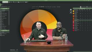
Robert Conde and Marcus Kelly walk through EC7's dashboard tools: creating custom dashboards, adding widgets like graphs and event history, and using a new aggregation workflow to group data by revenue center or employee. You can pin widgets, hide pending events, and set a favorite dashboard to load on login.
Chapters
I'd like to welcome everybody to today's webinar. My name is Robert Conde. I'm director of Investigations at E Connect. I'm joined by Marcus Kelly, the Investigations Manager at EConnect.
Good morning, everybody. How are you guys doing today?
And in the back running all this is going to be Dave McCormick. He will be fielding any questions you have. So please feel free to type in your questions and he will get them over to us. We'll try to answer them during this webinar. Today, we're going to be covering EC7, our latest release of E Connect.
A few new changes have been made that we feel you guys need to be trained on. A lot of you are already using eConnect7 and might be confused with the new dashboard. And so most of today's webinar is going to be covering that dashboard, how to set up your custom dashboard, how to subscribe to dashboards, and how to create favorites. We'll also talk about our new aggregation tool. So to get started, if you need to get an upgrade done, please contact your econnect account replacement and they will get you on the list for the updates. Please bear with us. We have a lot of customers that want to get this update, so it may take some time, but we will get to you as quickly as we can. And so, to start with today, we're going to show you one of my dashboards that I've created. And on this dashboard, you'll see there's a bunch of different graphs, pie charts. You see your pending events are still down here. This is all customizable, so you'll be able to move your graphs to whatever works best for you. So if you want stuff, set up a certain way. If you want to hide certain things, whatever you like to do, you can do that. With this new dashboard, you're also able to create as many different dashboards as you'd like. So if you want to set up one dashboard that's just for a certain revenue center or just for bars, you can create that. And that way when you come in, you can just access the ones you want to access any given point in time.
So to better understand this, I can talk about it all day, or we can build a new dashboard from scratch, which I feel is going to be the best way for you to understand. If you're at your computer, go ahead and follow along. You can create your dashboard as we go and hopefully it'll prompt some questions. So when you log into econnect, when you come to the Insights page, which is up in the upper right hand corner you have the ability to create a new dashboard or look at subscriptions. So if you click on New Dashboard, it's going to come up with a blank screen that asks you to name your dashboard. So I'm going to call this test.
Dashboard. You can put a description here if you'd like, and underneath that you'll have the option to select if it's private or not private and if others can edit. If you leave this private box checked, other users won't be able to access or see this dashboard unless they have admin privileges. If you select Others Can Edit, that means that other users can actually go in and take your dashboard and edit it however they want to, which will affect how you view it on your screen.
The other thing to keep in mind with this, if you only have the permission set of a viewer, you won't see these boxes, so don't be paranoid and it will be kept private. It's just a default setting. It's because Robert's an admin that these boxes are showing.
Alright, so I click on save and it's going to come up and you'll see our new dashboard is.
Right here. So we'll select this dashboard and it's going to come up and you're going to see.
Can we go back to that real quick? Because one of the other things we forgot to mention, if we go back to the dashboard, when setting it up and typing in a description right below the name of the dashboard, you can type in exactly what you're getting ready to input into that dashboard. So at a quick glance you know what's there, you just don't have to go through open it up to see it. And if you're going to let other people subscribe to your dashboard, it's a great way to let them know, hey, this is let's say merch locations only, or this is all my coffee shops, or this is all my bars. It's just a easy way, easy reminder and let you know what's going on with that dashboard.
So as you see, he's going to update the name real quick and then he's going to give a description of what this actual what this dashboard is actually going to show you. So when you log in and you can see it, it'll make make your life a little bit easier and not going to have to guess what's on that dashboard.
So here we can see, I named it Webinar Dashboard and then webinar Test Dashboard. And to edit this you can come down here and hit edit. If you want to delete your dashboards, you can come over and delete them. One thing I forgot to mention before you do see that we are using a dark theme here. We've added this feature in. There's some of us that like to use it in a dark theme. There's others that prefer a light theme. So if you click on this palette up in the upper right hand corner, you get the option to select if you like the light theme or the dark theme. And then you can also select your accent colors.
So you can set it up however you'd like. So let's go ahead and start on this dashboard. When you click on it, it's going to come up with nothing on it. And this is probably the most confusing part for most of you. So the first thing you want to do is up in the upper right hand corner you see this button that says add widget. So we'll add a widget and you have the option of a graph, a web browser, or event history.
Now, if you're at a casino on a closed network, the web browser, you're not going to be able to actually get anything to show up in that web browser. So you won't want to add one if you're at another location that has Internet access to your E Connect computer. If you add a web browser because you want to see the number of people that are coming into your location, or you have those stats readily available online, you can select web browser and you can put in the URL that will show whatever it is that you want to see. The event history are those pending review. The pending review tile that was on the old dashboard, that's what that's for. So mainly you'll be working with graph. So once we select graph, we can click on add widget. It'll come up and we can see it says new graph up here. And nothing shows up because we haven't selected our criteria for this graph.
And it's one of those, remember setting up the dashboards, it's going to be some legwork at the beginning, but once you have it set, it makes your life a lot easier because you don't have to reset them. Kind of like the query builder in a summary view. Once you set it, you're done and you just pull it up every time when you're ready to log in.
So up here beside the word new graph, you'll see three lines. Investigations. We always called these the pancakes.
Developers call them hamburgers.
So whatever you want to call them, hamburgers or pancakes. Because breakfast, breakfast or lunch for you, we'll select that and you'll see it says settings and remove. So if you want to delete this later, you can delete it by hitting this remove. We're going to go into settings. It's going to open up a window on our right hand side at the top. It's going to allow us to name it. So I'm going to do one for no sales. So this is going to be, this is going to be running a query for no sales, the same as going to your summary view, going to no sales, graphing it out for the past seven days. This is going to be the exact same as that. I can select if I want a bar graph, a line graph or an area graph. I'm going to select bar graph and then you're going to want to scroll down until you see the query that you're looking for.
So one thing to keep in mind as you notice when Robert's scrolling down, is if you have multiple plugins when you log in across the top for your pos, those are the same areas you're going to be selecting from here. So just keep that in mind. When you're building these queries that you can call it no cells from your micros or if you have micros and infog at some of the properties you're going to have, you'll be able to select either one.
So you can select one or multiple queries if you'd like in here to run at the same time down below you'll see it says use dashboard range last 7 days or last 14 days. If you have a query where you want it to be static and only show you the last seven days, select that. Using the Dashboard range will set it up so that when you change the date and time range at the top here, it will adjust these queries to match that date and time range that you have selected. So once you select Save, you'll see a graph out the results for the past seven days.
And one thing to keep in mind, once you do hit save, you have to click away from the graph on an open spot to get that window to shut.
Now, the one thing our customers have told us that they don't have a lot of time to run queries and aggregate the results and drill down on the data. They just want to know who are their employees they should be focusing on or who should they be looking at. So that's what we're going to do now. We're going to select one of these Points of data and it's going to take us into this new area. Well, this area is going to do the same thing that the aggregation tool will do to a new level. And so for when I run my investigations, if I'm looking at no sales, I want to first look at which revenue centers have the most no sales. So I would first go to aggregate. Once I've run the query, then select revenue center, then go to aggregate again, then select employees and then select the top employee. And then after I've looked at them, go back and select the next employee. And it's a bit.
Time consuming.
Yes.
So we're going to start by selecting Revenue center and then down below we're going to select count. Now, depending on the query you're running, if you're running a query where you want to see total dues over 100, you can select dollar amount and it will aggregate it by dollar amount. So we're going to do count and we can see here's our count of the no sales at the revenue centers. And over here is a list of our revenue centers. So if we click on count here, it's going to sort by ascending. Now clicked again, it sorts by descending. So now I can see all my revenue centers in descending order.
And you also have the option, if you prefer, you can either do the bar graph or you can leave it in the pie format. It's all about personal preference.
Alright, so I only want to see my top five revenue centers. Let's see top 10 revenue centers with no sales. So now have my top 10. Well from here if all I'm interested in are my revenue centers, I can pin this to my dashboard.
But I want to take this a step further. So if you right mouse click on any of the names over here, you get a list of filters you can add or take away. And this is going to be your drill down feature. So I want to add top 10 descending. If I come back over here and say show me the top 1013 and I right mouse click, it's now going to say show me the top 13 descending. So whatever this is set to will determine what type of filter you're adding.
So I'll go back to top 10.
And I'm going to add this filter. So now I can see the top 10 revenue centers and they had the most no sales. And if I change.
Okay, one of the things you notice once you do set that filter, you're going to have to resort the information again because it's going to go back to the default and that's usually by name versus count.
And if I come up here and I change my date range and apply this, you should see my data set. Change my graph change.
So now if you want to look at this information, you can hit show data set and it will take you to the results of this. But I want to take this a step further. So now I'm looking at the top 10 revenue centers with the most no sales. Next, I want to take a look at which employees within those 10 revenue centers have the most no sales. So once again, I select employee and count. And now I have all of my employees that have worked at those 10 revenue centers that have the most no sales. And since I've selected top 10, I am now showing the top 10 in my graph once again, I'm going to come over here, add a filter, looking at the top 10 employees descending. So now those results are set. Now if you are doing this and you accidentally add a filter, you want to change it. You come down here and go to remove filters, and you can see all the filters that you've added while building this. Once you've come up with something that you like that's useful to you. For instance, we have top 10 revenue centers. Top 10 employees at those revenue centers.
We want to sort before we pin.
Oh, yep, sorry. Always remember to sort. If you don't sort, it will show up in the order that it was when you pinned it. So if you pinned it in alphabetical, it's going to come up alphabetical. So we have it set. So we're going to pin this to the dashboard.
And now you see we have a second graph. It's got my employees with the number of no sales they've had. And because I built this knowing these are my top 10 employees in the top 10 revenue centers for no sales.
To view any of these. If I want to look at this employee here who had 125, I can click on that 125. And it's only going to take me to that employee's results on our data grid, which is what you guys are used to seeing. If I go back to my insights page, I can see all of the data set. So this is all top 10 employees. By clicking on this is going to take me to all their results.
And this is what everybody's been asking for. Who doesn't have the time to spend 8, 10 hours a day doing data mining? This is at a quick glance. Hey, here are your top 10 employees or top 5 employees, however you set it up. Let me go Talk to them, let them know that I'm watching. And as we know, the more employees that you actually touch and get to talk to every day, the word's going to spread throughout your property and they're going to pay a little more attention.
So we'll go back over to our Insights page. So now we've added a regular query graph. We've added a drill down. Well, let's say, are you going to name this? Always remember to name these. Once you add them, it's going to come up and say breakdown for. And then whatever your plugin is set up as, it'll say pos count. If you don't rename this the next time you log in, you'll forget what it is or as you add more, you'll forget what query it was that you ran. So click on Settings, it's going to come up and we're going to Change this to top 10.
Revenue center employee.
Yes.
Down below that you have an option for. If you want it to be vertical or horizontal, that's going to be where the data sits in relation to the graph itself. Once you're rearranging everything, you may want to change it from a pie chart to a bar chart and you may want to adjust the number of results you have. So once you've finished all that, we click on Save. And we can see that now the names are below the graphs above. If it doesn't work for me, I come back to horizontal, click on Save. And now it moves all the names off to the side and the graph to the left.
And as you notice, you click off to the side to get that window to close.
So does anybody have any questions? If so, please type it into your GoToWebinar box. Dave will be back there and he will send over any questions you have to us.
So let's go ahead and add a few more to give you guys a good breakdown of what's going on. So once again, to add another widget, click on Add Widget. We're going to select Graph Add Widget in the bottom left corner.
And as you see as you're adding more graphs and to your dashboard, it's going to auto fit. But here shortly we're going to show you how you can adjust them and make them the size that you want to for your viewing preference.
So we're going to go to Settings. Any queries you want to pull up.
I like Transaction Council.
And it's one of those. This is where when we come out and do trainings on site, we tell everybody to build your toolbox. And if you have five known events, KPIs key performance indicators that you want to keep an eye on. This is where you rebuild them. So every day when you log in and once you load your dashboard, you can take a quick look at them to see what's going on.
So I've added two in there. I put Transaction cancel, and I put Transaction Cancel without pickup check. That way we can have them both graphed out at the same time. So I clicked on Save. It should pop these up for me. I'm going to name it up here, tc.
TC without pickup check. And I'll hit save one more time. You'll see that name apply and our results are going to populate. So you can add as many different queries into one as you'd like. In this case, we've done two. So let's take a look at Transaction cancel without pickup check.
And this is where you're going to be able to drill down. And if you wanted to build individual graphs for each of the event types based off the one main graph, we can. I believe we're getting ready to show you how to do that.
Okay, so let's say I want to select Revenue center, but I also want to see. I really do want to see the top employees, but I also want to see which revenue center they're working in, so I can determine if I want to look at them right now. One of the new features this year with E Connect is the ability to select multiple fields to group by. So so far I've selected Revenue center, but I'm going to hold down my control key and I'm also going to select employees. Then I'm going to count and you'll see that I have a Revenue center and employee name and the number of times that they've done this type of transaction.
And remember, whichever one you click first is going to be the first sort followed by the employee. Because we selected that second is going to be the second sort.
Okay, so now I'm looking at my top five employees.
By employee and Revenue Center. So I can see that I've got Panda, Papa Loca, cs, Fruit Panda, and I can determine quickly who I want to focus on. So once again, I can now pin this to oop. I got to add the filter. If you don't add the filter, you'll have the ability to see all of them. So we want to add that filter for the top five, make sure we're sorted properly. Pin that to my dashboard.
And now I have where it says Breakdown. I've got to change my name of this. This is going to be.
TC.
Revenuecenter.
Employee. Top five is what we did.
Okay. And we'll click on save. So as you're building this, you may start to notice you're going to get a lot of things going sideways.
One of the things I prefer to do is to actually put my results right above the query box itself. And you see to do that. And I'll reset this back to where it was.
A little too far over.
As you move a box around, if you don't move it away from the current box, you'll get little boxes at the top, the bottom left, right. And you can see as I go over another window, I get more options within that window where I want to add it.
So it really is going to allow you to move stuff around so that it's best viewed by you in the way you want to see the information. So in this case, we'll have our queries down below, our results up above. Now, if you get to a large number of these and you're not as worried about this stuff, you're more focused on who the employees are. So you can come in quickly and click on a few employees and look into them. If you were to take this query for instance, and set it right on top of this set of queries, you'll now see that they've been joined together. And down at the bottom you have tabs. So this is our no sale query. This is our transaction cancel query. And now I can just click on these tabs out at the bottom to be able to show the different queries.
If we want to, we can still add our pending reviews tile by clicking on the event history.
Adding that.
And from here you can actually move that one to set up top, or you can make that a smaller box. It's all about personal preference from this point.
So in this case, what I prefer to do is I like to pin this out of the way. And so right here there's a pin and it says auto hide. If you click on that, it'll disappear. So right now it's over here to the left. When I mouse over it, it's going to pop up and say 71 pending events. So I can click on the 71. It'll take me to all of my pending events that are in my system.
I can go back and just by clicking away, it disappears. And most all of your things can be hidden. So if you do have stuff that you want to hide, just click on the window you want to look at, click on the pin. It will pin it off to the side just like the other things. You can move this around. If we want it to be on the right hand side or the top, we can come and select. Put it on the top. Now it's back out.
Dave, have you received any questions from anybody that's watching the webinar right now? Nope. But do mention that I'm going to throw the new manual in the handout section. Okay, so Dave is going to be doing a handout for you. You guys will have the option to Download the new EC7 manual that was recently completed. It does break down a lot of this information, but we wanted to do a video to show you guys how to create this dashboard. So that's the basics on building your dashboard, on how to run your queries, how to aggregate the results, and how to pin the results to the dashboard that best suit your needs. Now, before we started, we talked about subscribing to webinars. Sorry, not webinars, subscribing to dashboards. And you can see that whenever I go to my dashboard of this site, I have lots of different dashboards created here. And if you see that someone else you work with has a really good dashboard and you want to be able to see that same information, you can go to subscriptions. And by clicking on Subscriptions, you'll then see any dashboards that are available for you to subscribe to. You simply select it, hit save, and then on your main dashboard page, you will see that graph. So I can select the graph that I've now subscribed to and all the information is going to show up for me now, because I didn't create this dashboard, I'm not allowed to edit this dashboard because that box wasn't checked. Therefore, all I can do is view and look at the results. So by coming in here, I can see that they've created a bunch of queries. Discounts, negative transactions, no sales total due, less than negative. 15 transaction cancels, unassigned drawer and void without refill. And so these are all my queries. And then directly above it, it's showing me my top five employees for each one of these. So if I only have a few minutes a day to log into econnect, I don't have to go run five different queries, aggregate the results by employees and look at the top five employees. I can now just set this up. And once it's set up, I can log in every day and look at the top couple employees, add me one of these events quickly and then get on with the other things I have to do during my day.
Now, the other thing we want to make sure we cover is at the top of the page, you see where it says favorite. This is a feature that's going to allow you to select which one of your dashboards that you want to show up whenever you log into econnect. So when you first log in, if you select this one, for instance, every time you log in, this is what will pop up on your screen the second you log in. So you want to click anywhere, nothing has to be done. You just click on it or log in and you're there.
All right, so we're going to move away from dashboards. If anybody has questions, please feel free to ask Dave. For the most part, everything you're going to see within Econnect has stayed pretty, pretty much the same. You will notice that we've now added another row in where the query sit. We're layering how stuff is presented with AnyConnect. So now before you might go to POS and then summary view. Summary View is essentially the queries, so it falls under the Queries tab along with the query builder and then all the queries that you're running. So the one thing we want to make sure we go over is we showed you the new aggregation feature on the Dashboard page, and we've also incorporated that into our regular system. So if you run a query for no sales.
And look at the results, if we click on Aggregate, which everybody should be pretty familiar with, it comes up. And you now see up at the top here we have Aggregate grouping and Aggregate this. Aggregate is the one that if you, if you've had E Connect for a while and you've had EConnect6 or MBR5, this is the agri tool you've grown used to using. Agri Grouping is kind of what we did on the Dashboard page, where you can select multiple events just by clicking on them and group by that. So if I say I want to see. I don't know if this will work. We'll try it. Employee and authorized Employee. So it's going to show me first the employees and then the authorized employees that authorized those. No sales. I click on count and it's going to give me the breakdown of who the employee is and who the authorized employee is. In this case, it looks like the authorized employee is Employee zero. So they don't have a number associated to them. Consequently, if I want to come back and change this up, I'm going to Say show me the revenue center and employee.
It will now break it down by the revenue center and the employee and how many they had.
One thing to keep in mind with EC7, when you use the aggregate grouping, you will notice off to the right hand side data and how it's going to be displayed. And for the first time logging in, it's going to be set to default. And again, that's more of alphabetical. It puts dates and orders and everything like that. But to use it probably the way you're accustomed to, you probably want to select highest.
And that's very, very important because if you look at the default right now, it appears you've got one employee that's just way out of control at Amber Waves. And so that's something you would want to look at. But when you select highest now, all of a sudden that big employee at Amber Waves is gone because now it's not alphabetical. Now it's actually based on the top results.
We can also select bar graph like before and from here we can click on this and it's going to take you right back into the data set you're used to seeing, right to the data grid where you can take a look at the check or see what's happened in that location.
And the other thing to remember with aggregate grouping, if you don't want to put it in groups, you can still use it like you're used to using just by selecting one and then just to count. And it's going to do the same information for you. And as you become more proficient and more familiar with it, that's when you can start adding different layers or different groups to aggregate out by.
So if anybody has any questions on this, like I said, Dave has sent over the training manual. If you haven't got access to that, please contact us. We will get you the new EConnect7 training manual. We will be doing more webinars and if you have questions, please feel free to ask or you can contact us at investigationsconnect tv. Yes, we will help you build your dashboards, set them up, help people, subscribe to them, whatever is going to make your job easier.
So thanks for attending today's webinar and we'll see you next month.
Everybody be safe. Have a good one. It.
More from Henry

Skip the line, not the security: Facial Recognition for Guest Experience & Safety






eConnect’s Red Light Green Light – The Most Advanced Facial Recognition Tool for Casino Entry



Skip the line, not the security: Facial Recognition for Guest Experience & Safety