2025-03-15 RPS Let's Edit Photos #15 - Water - Joe Houghton
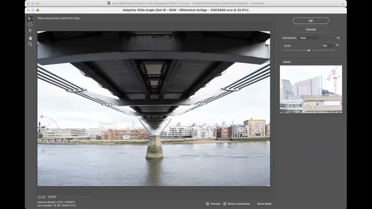
In this live editing session, Joe Houghton walks participants through a comprehensive workflow for processing water photographs using Lightroom and Photoshop. He begins by explaining how contributors upload raw files to a shared Google Drive and how the session’s handout outlines equipment, shooting tips, and resources. Joe demonstrates the initial setup in Lightroom, including grid navigation, panel toggling, and separating raw and edited files. He then tackles perspective correction, using Lightroom’s Transform tool and Photoshop’s Adaptive Wide‑Angle filter to straighten horizontals and verticals. The bulk of the session focuses on selective editing via masks—linear, radial, object, color‑range, and luminance masks—to isolate sky, bridge, water, buildings, and other elements. He showcases the impact of Clarity, Dehaze, Texture, and the Black‑White conversion, discussing when to apply each for water detail, contrast, and mood. Throughout, Joe debates color versus black‑white, adjusts white balance using temperature sliders and the eyedropper, and demonstrates cropping strategies (aspect ratios, rule of thirds, removing distractions). He introduces AI‑enhanced features such as Adaptive Color profiles, Generative Remove, and Lens Blur with custom bokeh shapes, explaining their practical limits. The session also covers Lightroom history management, snapshots, and the inability to delete individual history steps. Community members submit images, receive live critique, and discuss technical choices, fostering an interactive learning environment. The video concludes with plans for future sessions, encouragement to submit more images, and a preview of upcoming guests.
Chapters
There we go. Godfrey saves the day. Right, that's 2 gold stars I've got to give out this morning now. Oh dear. Oh, you've all disappeared on me. Right. Oh no, that's it. My second screen just died and came back. Right. Okay, so we're going to look at that next time. But today is water. And thank you, everybody who sent in images. For those of you that are new, We send a link out to a Google Drive. So in this case, it was, it was this link here, and you can upload images for me to play with during these sessions into here. And then when I've pulled them down onto my computer, I drop them into, into this folder here. So you can see all the ones that have already been downloaded. It's easy to download, to upload into Google Drive once you're in here. You can either just drag and drop from Windows Explorer or from Finder, or you can just go to New and then File Upload and then navigate to the file or files that you want to bring up and just— and then they will upload into here. Okay, so that's just so that those of you that are new, if you haven't done that before, that's how to do it. Okay, each session I also put together a little A little handout. So you've got a good one this time. So there's 30 pages in the handout today. So you can see, if we just look at the table of contents there, so, you know, equipment settings, setting up the shoot, and then a bit about different types of water photography, some recommended books and online articles and stuff like that, and a load of links at the very bottom. to other stuff. Okay, so there's lots there for you to go off and explore and play with. And when we finish the session, what I do is I copy in the Zoom AI summary. And so you've got a kind of like an abridged transcript, if you like, of the session as well at the bottom. So that'll be up. you know, within an hour or so of us finishing normally. So if you come back into the Google Drive, that little PDF, you could just download it and kind of keep it for future reference and stuff. Okay, so I don't know whether anybody ever does, but— I do, I do. Oh, right, okay, so it is worth me doing them every week. Absolutely. Fantastic. Lovely. Okay, All right, so let's minimize that. So we've got a superset sent in. Let me just run through them all. So what I just did, so to shut down the left-hand panel, Shift and Tab closes the left and right-hand panels. I turns off that information in the top left-hand corner, and then LL just turns the lights out, just kind of just gives us the picture and not all the other stuff in Lightroom. So we can just flick through. These are the raw files. I've separated the raw files and the the edited files out. And I haven't looked at these. I never look at these before we have a session so that it's just as if, you know, they've just come off my camera and I'm editing them. So there's some super shots to play with today. From all different places as well, by the look of it. There we go. So G for grid, L turns the lights back on, and then what's the shortcut key to bring in the left-hand panel? F7. Oh, Stephen's on the ball today. Yeah, cooking on gas today. Indeed, F7 brings in that Okay, well, let's start with one of Dot's. We haven't done one of Dot's for a while. Is Dot with us? I am. Oh, hello, Dot. Yeah, there you are. See you. Yeah, so, um, I think this is Millennium— is this the Millennium Bridge? It is. This is— Yeah, yeah, looking down towards St. Paul's that we probably can't see because it's in, it's in the way there, isn't it? So, okay, D for develop. Now I think Dot had been out for a night on the town before she took this shot. Handheld wobble. Indeed, indeed, yeah. So let's sort the horizontals out first then. So we come into Transform, and I've moved Transform up from where it normally sits to the top of my workflow because I normally will transform and crop before I do anything else. Okay, so wherever you have Transform, come into it, and I always use the Guided, or this and the Guided are the same thing. Okay, so I just click on there. Our main concern in this case is the horizontals. So one of the horizontals would be, and I mean, it doesn't have to be perfect, but I'm just going to take a line along here and kind of try and figure out where that horizontal should be. It's a bit difficult, isn't it? Because we've got— I think it's a wide-angle lens, so I'm just going to say that should be one horizontal line, and then I'm going to pull another horizontal line, and I'm going to take this top horizontal of the bridge. Okay, now you see the loop view, the little square in the middle? That's on because I've got the Show Loop checked. If you don't have Show Loop checked, you don't get that tiny little view. So that gives you pixel-perfect placement. So we'll find the edge there, and then we'll move across, and we'll find the edge there. And that— so this is the second horizontal line, and when I release now, it makes both those lines horizontal. Okay, so that's kind of how you play with those horizontal lines. And I think our verticals are looking pretty good, but again, we've got a bit of distortion because you can see now we've got keystoning coming in from the right and the left a little bit. So I'm going to take a horizontal and run it down there and try and just match it to the vertical of that building. Yeah, and on the other side, I'm going to do the same thing and try and get that vertical. I reckon it's about there. Right, so now we've got our buildings vertical. It's still not perfect. I mean, I'm pretty sure that building hasn't got a higher right edge than, than the left edge, but with Lightroom, that's all you can do. Okay, now if, if we wanted to go further with this and get this absolutely kind of perfect, we'd have to drop out into Photoshop. And use the adaptive wide-angle filter. Does everybody know about the adaptive wide-angle filter? Well, let's let's show you that then. So so so let me do that. Let me let me do this transform then, and just say okay. But let's now let's now go and edit this in in Photoshop. Bum bum bum. And it's Photoshop. Yeah, Photoshop is. Gonna, gonna come up. Come along, Photoshop. Right, okay, and I don't need the Nik stuff. Okay, so what we've got now is, is the photo that we edited in Lightroom with the, with the Lightroom edits. Yeah. But I really want that to be horizontal as well. Okay, so let's just see whether we can make everything work exactly as we want it. So if we go up to the top to the filters, there is this option for Adaptive Wide Angle. Okay, and this is like Transform on steroids. You can put as many lines as you like into an image. with the Adaptive Wide Angle. Okay, so what we've got now is the image showing up, and if I draw a line, say, along the top of this building— and again, you see the right, this here is like the loop view— so I can put the cursor exactly on the top of that building, the little crosshairs there, and I can draw a line along the top of the building to there. Okay, now you get a circle, and then within the circle you get 2 handles, and between those handles you can't actually see it because of the color of the sky, but there's a, there's a white line. Okay, now if you right— you've got to put your very point of your mouse on that white line between the 2 handles and right-click. So at the moment we're saying between that point there and that point there, between these 2 points on the circle. Yeah, I want you to make that straight because it might just be slightly bowed or whatever and it'll make it straight. But I also want you to make that horizontal. So you choose horizontal. Okay, so it's going to make that horizontal. Now it's basically made that horizontal and it skewed the rest of the image now, hasn't it? So now what we've got to do is we've got to say, okay, well, that's not quite right. So let's do another line then. So let's do a line along, say that. And can you see that line is kind of slightly bowed? If you follow it around, it's slightly kind of arched. So let's say that, you know, we think that that line there, say, should be horizontal. Well, I reckon that's about right. Yeah. So that will make that Absolutely horizontal. Is that right? Don't like it. I'm going to delete it. Let's let's do it. Let's do some smaller increments. So let's make this horizontal. Right click. Okay, so you see now that's made that bit horizontal and this bit's horizontal. But I also want this to be properly vertical as well because it's not. So I'm going to take the the side of this building here. I'm going to come down here to there, and just the same way, right? So that's making it straight, but then put my cursor between the 2 handles and say make this one vertical. Okay, so that's now the top of that's horizontal and the top of the side of that is vertical. And then we can, we can come over, say, to this side and do the same for this building. Yeah. But we're not just limited to just these, you know, 2 lines. So there's, there's my line again. Right-click, vertical. Okay, and then let's say that I want to make sure that the center of the bridge is vertical. So I'm going to draw a line down here, yeah, and I'm going to say, okay, right-click, make that vertical. So that's kept vertical. that's kept vertical, and now this is kept vertical. So it's kind of doing all these multiple transforms and trying to kind of then keep everything straight. Yeah. And now I'm looking in the middle here and I'm thinking, well, that building's still a little bit distorted, isn't it? So let's take a line here. Yeah. And just come up. And I'm looking over in the right-hand loop view here to get this right because it's so small on the main thing. Right-click. Vertical. Yeah, so that is now vertical. So pretty much I think we've set up our image perfectly aligned now. Yeah, so now— Trevor seems to think the nearer horizontal girder is still bowed. The nearer— this, it is, well spotted. Right, so look, watch what happens. Look at this. You're going to bend metal. So from that point over to this point, I want that to be straight. Ooh. Yeah, yeah, and horizontal. So it's kind of tried to do it, but it's not quite, you know, achieving what we want, is it? Because it's gone the other way. So we can try just tweaking it and see whether we can get kind of it to do what we want. I don't know whether we're going to be able to. You know, sometimes there's a limit to what it will do, but yeah, so that's not letting us go horizontal. Let's see whether we can just take a smaller piece here. Can we make that fully horizontal? Yeah, no. So the, you know, to some extent the barreling of the lens is— we can only do so much. Yeah. You could go into the the perspective and put a mesh on this, and actually you've got even more control. But the adaptive wide angle has kind of set us up for pretty much a reasonable image. So I'm just going to say okay, and it now applies all those changes. Okay, and then I'm going to save that image. File, Save. And by saving the image, That's going to save that image back into Lightroom. Okay, so you can see it's saving down in the bottom left-hand corner there. Okay, so if I now— I can, I can shut Photoshop down actually now, and I generally do that when I'm not going to be kind of using Photoshop again because it'll save me memory. So now if I come in, I've got the original file. Yeah, the ARW file that That's the one that Dot sent. And then we've also got the raw file, the PSD file. So I mean, it's kind of like, which one do you prefer? That's the one with the Lightroom adjustments. And we've still got a straight here. And we've got a pretty straight here. But the building is definitely bowed. Or we've got perfect buildings now. But we've got a twisty top. So I mean, you've got to choose which one you prefer. Yeah, you know, I'm going to go with dots. Yeah, I'm going to go with dots because I think that's a bigger element of the scene and it's in the foreground. And to me, the fact that that's bowed here looks wrong, whereas this one looks righter. So can I say that? Righter? Yeah, probably not. Not today. Okay, so that's the one that I would propose to edit. Sky's a bit bright. So, but if you look at the histogram, it looks like we've got just a little bit of falloff before it gets to the edge. So I reckon that if we come out of Transform and go into Basic, that we'll actually be able to rescue our highlights. So let's just see. Yeah. So all those details, all that detail is there. Now, because we're under the bridge, I'm just going to start with Dehaze and just see whether Dehaze will give us a start on that, because Dehaze is also going to affect the water. Yeah. And you see what Dehaze is doing? It's kind of— it's darkening the underside of the bridge a bit. That's all right. We can fix that later on. But it's giving us detail in the cloud, but it's also giving us a bit more kind of clarity around the water. which, which is, you know, good. And then I can pull back the highlights and get, get my sky back and stuff. And this is before we've even started to select sky or, or do anything fancy there. Um, so now we've got a nice kind of, you know, more detail in the sky going on. I think, I, I think this should be black and white. I haven't— I don't know what you did to this yet, Dot, so don't tell me. But, uh, but I think this is a form shot, so I'm going to see whether we can turn this into black and white like that. So I press the V key V to turn that into black and white. Okay, so V just swaps you between black and white and colour. And now we've gone into black and white, I think let's just drop down into the B&W tab here. And let's see if we darken off the blues a bit. Yeah, so now we can get a bit more contrast going on. from the sky. And notice what's happening in the water as well. As we darken the sky, the blues in the sky, because they're all reflected into the water, the water is also getting a bit more detail going on. And it's also accentuating the reflections, which is quite nice. So blue, and there's not— there's a little bit there, a little bit of action in the aqua, just in those highlight areas there. So you can play, you can play with that as well. Okay, so we're just starting to get a bit more drama going on in the sky. You don't— I don't want to make the blues completely black because I want to keep a bit of tonal separation between the sky and the bridge. So just pull the blues back there so we've got the detail and the darker kind of clouds, but the bridge is still the key thing to play with here. Right. So I think the underside of the bridge wants to be one element that we play with. I think that the buildings would be another element to play with. And then I think the water would be, you know, a third. And then we've got the sky as kind of the fourth element. So let's say we've done the sky. So let's choose the bridge. I don't know whether Select Subject will do that for us. Let's play. Oh, well, it made a pretty good job of it, but it's not by any means perfect. We could start with that and kind of add to it, maybe. So let's have a look. If we do a bit of adding to that, then if I just do a big brush on the front there and just, just, just running all this. Yeah, that's fine. Yeah, and you see, you see, when I was doing that, it wasn't kind of bleeding into the sky, and that's because I've got the Auto Mask on. Yeah, so if I come down here and make the brush a bit smaller Yeah, the, the Auto Mask option, if you run along something, whatever the color underneath the center of the cursor, when I press my mouse and I'm brushing, yeah, it will match the color under the center of the cursor and not go over a line with Auto Mask on. Whereas if I turn Auto Mask off and try the same thing on this side, Yeah, you'll see it'll bleed over into the, into the sky. Mm-hmm. So that's what Auto Mask does. So if I Command+Z or Control+Z, that undoes that. So turn Auto Mask back on, and then, and then it'll just let me run up that bit there and, and not kind of fall into the sky. Yeah, which is, which can be quite useful if you're trying to do those little, little kind of nudgy bits like that. So there we go. Bump, bump, bump. Now, another little trick is kind of— so if we're trying to select all the bridge bits, yeah, but you do kind of bleed off into the sky too much or whatever. Okay, so we'd also want this, wouldn't we, as the bridge and stuff. So let's say we— because certainly that bit of sky there, whatever, we didn't want. Okay, and maybe the bits through the grating there. So now what I might do is just try subtracting the sky. So choose the mask, subtract sky. Let's see. Right, so you see it gave us that one back. Yeah, and it's pulled out these bits here and stuff like that. So we've got a starting— what looks like a better kind of mask. It would need a bit more work. the mask, but it'll do for what I want to do now. So there's, there's my mask. Let me just move it over here. So now what I'm going to do, first thing I want to try under the bridge, I want to, I want to bring the shadows up so that we can see a bit more under the bridge, and then I want to apply clarity. Okay, so clarity is going to darken darks and brighten brights. So I'm going to go a little bit too far with the shadows, but because the clarity is going to darken the darks back down again. Okay. Now look what clarity does. It kind of gives you a much more kind of punchy effect under the bridge. So, but you see it's dark, it's blackening the blacks even more. So we've got a much more, you know, punchy bridge than we had before now. Yeah. Now, you might be kind of, you know, thinking, what is he doing? He's ruining Dot's lovely image here, you know. And again, this is always subjective, you know, you might like this, you might hate it, but I'm just showing you kind of possibilities here. So let's say, and maybe a bit of texture, particularly this grilling under here. The texture is just going to give you a little bit more detail on that texture. So that might be nice. Right. So then the buildings. Could we, can we do anything with the buildings? Well, let's try masking the buildings. So let's just call that Mask Bridge. So that we know what we're talking about. We'll create a new mask. I'm gonna do a linear gradient up from— um, no, I didn't want a linear gradient, I wanted, um, a radial gradient. And I'm just going to do a radial gradient across the whole of the image like that. Yeah, now we've got too much of a feather. On that. Okay, see, so I'll take the feather back. H shows me the, the lines for the, for the gradient as well. So there we are. I just, I just want to really choose the, the buildings. So there's the buildings. Now if I subtract sky, that'll give it— get rid of the top, um, for me. And then The bridge, I can't kind of subtract that, but maybe I could subtract it as an object. So now if I draw around the bridge bit as an object and say, can you take that away? Boom. Yeah. So that's nice, isn't it? Now you'll see that there's a little bit here. So then let's just clean that out with a brush. Okay, so we don't want those bits there, but we've now got everything but the river now removed, and I think I'd have to remove the river with another brush, so I'll stick with this brush, yeah, and I'll just use the brush to run along the front of the buildings with a brush, yeah, and again, if I Auto Mask is on, so it's not going into the bridge there. That's fine. So there we are. You don't have to be perfectly exact here because really I just want to kind of like be able to separate the processing of the water from the processing of the, of the buildings. So now we've got the buildings. So we'll just call that buildings. And we can now play with the building. So do we, do we want to darken the buildings off a bit against the sky? Yeah. Do we want to— again, I mean, clarity is going to bring out the buildings, you know, and give them a bit more contrast, which in a black and white might be nice. Mm-hmm. Dehaze will darken the darks. So again, it just, it just gives it a bit— gives them a bit more weight, doesn't it? And stuff like that. So that's, that's maybe what we want to— or you may want to go the other way and you might want to say, well, actually, we don't really want to make the buildings you know, that darker, heavier bit, let's just kind of just make the buildings kind of almost recede a little bit, because the key thing here, the story that we want, is the bridge and then maybe the water. Yeah, so if we don't— if we de— kind of clarify the buildings, then they go back in the image and they don't become as main a part of the image. So you don't always have to kind of amp everything up. Yeah, okay, so that's the buildings. So now the, the last thing is, is the water. Um, I think probably the easiest way to select the water is a linear gradient and then just remove the middle. So create a, create a mask with a linear gradient, come up to about here and hold the Shift key down. And now as I click and drag upwards That linear gradient has a kind of reasonably soft edge there, but it's kept fully horizontal. Yeah. Whereas if I don't hold the Shift key down, you get that kind of thing. And I always find drawing a linear gradient really difficult because, because my finger wobbles. Yeah. So hold the Shift key down as you're moving and it just keeps it horizontal. And once you've got it, you can just now drag it up and down. to, to kind of where you want. So there's our gradient mask, and now I just want to remove that little bit of, bit of bridge. Okay, so I will come to the mask, subtract using an object, and then just run around the, the bridge there. Yeah, it's magic, isn't it? Subtract, when you use subtract with another mask, it's always a bit like magic. So now this is our water, this is our river. Okay, so what do we want to do with the river? O turns the overlay off, or just click on that little button there. Okay, but we're still working in the river area. And to get the most out of the water, clarity. Clarity is your friend here. Okay, so Clarity is really going to bring that water up beautifully. Yeah, it's, it's just an amazing tool for, for water. And, and Dehaze, you know, let's darken that water off. So now what we've got is a darker water kind of reflecting the dark triangle coming in. Yeah, reminds me of the Star Wars destroyer, you know, in that first guy. But we've got much more detail in that water than we had before. Yeah. So if we, if we go from kind of where we started to where we've ended up. Yeah. That's brilliant. You've really brought a bit more out, haven't you? Are you still talking to me, Dot? Oh yes, absolutely. That's wonderful. Did you send a before and after in? I did, but I don't want to show it now. Come on, let's see. Let's see what you did. Where's where's yours? Dot da da da da da. Dot raw dot edited. Right. So you stayed in color. I did. I had a bit of a problem with the buildings at the back trying to select them with a brush. Yeah. Because there was the building and then there was a bit of a well there was quite a a space between the rest of the building if that makes sense. Yes. Two levels and I couldn't quite select them properly. And I was also trying to blur the water. Yeah, okay, so you wanted the kind of long exposure effect on the water? Yes. So how did you try to do that? I did that with the dehaze or the anti-texture, yeah, one of those 3 anyway, to do it the other way instead. Yeah, so I mean for those of you that haven't kind of been on one of these sessions before, if we wanted rather than the water to be highly clarified like this, yeah, if we wanted— so I'll go back into Dehancer Develop and come into the Basic tab again. So let's go back to our masks and select the river again. Okay, so we've got our river mask selected. So rather than have it pin sharp like this, if we want it to just be kind of soft as if it was a long exposure, Then if we come down to the clarity and texture and dehaze, rather than coming to the right, if we go to the left, yeah, we can get a totally different effect on the water. Yeah. So now you've got that kind of almost fine art, you know, silky, silky look. And you can play with, you know, each of these to get, you know, more or less of that effect. But you've got a huge— these sliders give you a tremendous amount of creative control over the look of the image. And one isn't right and the other wrong, they're just different ways of going to an image. So, a couple of questions, Joe. The wall on the far side now looks as though it's on a roller coaster. The wall on the far side. It may well do, Gordon. I mean, this was a difficult one from a perspective kind of control. Sorry, Joe, it was on the image within Photoshop. Yeah, if you look at the Photoshop one, you'll see it. Once you've sorted the buildings out and the rest, you get this sort of effect. Yeah, wiggly effect. And that can be a problem when you're just adjusting verticals and horizontals in specific areas of the image. you know, if you can make those lines as long as you can within the image, and then that tends to kind of make the whole image morph. So yeah, yeah, that was— that's a good point there. How much of your editing of Dot's photo could you do in color? Let me put that back to where I kind of had it before, which would have been what, a bit more dehaze there. It was probably something like that, wasn't it? Fine. If we press V again, yeah, we're back into color. Okay, so there's the color version of that. Trevor, what's— expand on the point, Trevor. What do you— is it just kind of to see what the difference would look like? Have we got Trevor? Yeah, you're muted, Trevor. There we are. Yeah, I actually prefer it in color. Right. I, I think an awful lot is lost in black and white. It certainly is the buildings and so on. I think it loses a lot of the impact of the, the scene itself, and I just wondered how much of that, um, adjusting you could do in color. And clearly you can do it all in color. Oh yeah, absolutely. Yeah, you have done. So that answers the question. Thank you, Joe. And I mean, now, you know, now we're in color. If we were staying in color and we were going to kind of try and amplify this up a bit more, okay, so what we could do now is we could do a new mask and say, and just choose a color range. So let's say you wanted to pick up those colors, you know, of the wall. Mm-hmm. So we could just draw a little box here, and that gives us that range of color. And now we can make it less or more. So let's say, look, there we are. So that's picking up now just those— what are they— algae kind of greens, probably, isn't it? Yeah. And it's picking them all up on the wall, and it's picking them up on the bridge as well. So maybe, you know, I don't want the bridge affecting on this one, so I'm just going to rub out— I'm just going to subtract that stuff from the mask. Okay, so good. So now I've just got the wall green, and now we can— oh, just turn the overlay off. We can saturate that, or we can change the color of it, or whatever. So if we go down to the saturation of that green and we wanted to make that a bit more saturated, say, we could bring that green up, or we could desaturate it. Yeah. So that the wall just becomes gray. Yeah, and we're now just left, if you like, with the blues in the image. So, you know, then going and playing with the color like this, and then again, so that would, that be our green mask? I presume that would, they were greens. I'm colorblind, that's why I'm presuming. So now we do another color range, and we maybe choose the blues. Yeah. And, you know, the blues of the, of the river. Okay. And obviously there's a huge amount of blue in the whole image because we're getting blue reflected from the sky and reflected back up under the bridge. So again, reduce that range. Yeah. To just the blues that are in the image. And then maybe we just want to work the river in this case. So let's take the mask and subtract the sky. OK. And then we could also subtract, say, with a linear gradient, and just pull a linear gradient down from the top, and just remove everything above the center line of the linear gradient. OK. So now we've isolated the river based on color rather than on anything else. And now we can play with the, you know, the colour in the river. And again, we can either saturate it a bit more or we can pull it back or whatever. So, you know, if you want to make more of this image with the colours, then you've got those additional options, I suppose, that you wouldn't have had with black and white. Does that make any sense, Trevor? It makes so much sense. I've never seen Lightroom demonstrated before, and I'm almost tempted to go out and buy it now just based on what you can do with it and the ease with which you do it. Yeah, it's a very powerful tool. It is, it is, clearly. Yeah, I mean, you know, you, you talk to a lot of people in clubs and things, and they, they go on about Photoshop all the time, and Photoshop is an incredibly powerful tool, and it will do more than Lightroom. But if you're not one of the photographers who wants to get into layers and, you know, putting objects on backgrounds and stuff like that, Lightroom will pretty much do everything that you need to do if you're just wanting to adjust the photo as taken, if you like. You don't need to necessarily go through the, I think, much steeper learning curve of learning Photoshop. So So that's why I tend to think in Lightroom, because I'm simple and Photoshop's too complicated for me. Yeah. Ian asks, could you use the Color Mixer tab for this, what you've just done? You could definitely go into Color Mixer, but the Color Mixer tab doesn't work, I don't think, on a mask, does it? Let's have a look. I don't think the Color Mixer tab is just working on the mask. Let's see if we choose all the colors and go back to blues. I think it'll work on all the blues. Yeah, you see the sky is being affected as well when I'm changing those blues. So the Color Mixer tab will affect the color in the image, but it's a global effect rather than a localized effect in the mask. Yeah, by choosing just the river, then you're limited to the stuff in this lighter gray box. So you could play with colors in the tone curve. So if we just chose the blue, yeah, now we're just on the mask at the moment. We're just working in this area, and the tone curve is part of our, of our mask tools. So if we wanted to, say, darken the blues, we could just pull the mask down Yeah, and we're just affecting the colours there, but it's going to affect all the other colours as well. So, you know, we can— but you can start just playing with the river colours using a tone curve mask if you want. You've got lots of options there. Okay, but you can't use the Colour Mixer tab on a mask. Okay. Bon, bon, bon. Thank you, Mel. Kept me honest on that one. Lovely. All right, well, I think we've probably spent enough time on Dot. I hope that was okay, Dot. That was brilliant. Thank you very much. Super duper. I went, oh, I love this shot when I saw it. So I don't know whose this one is. Peter's. Yeah. Where's this, Peter? In Porto. Lovely. So we've got a long exposure image, 30 seconds at f/11, okay, giving us a beautiful image. But with all, you know, as with all shots that are shot in RAW, there's maybe a little flatness to the RAW file. Okay, now let's just go into the Basic tab and let's just have a look at the profiles. Okay, now, you know, remember we've got these 2 new profiles that have just come in with 14.2, uh, Lightroom, the, the Adaptive Color profile. So if you, if you hover over Adaptive Color, you can see that what that's kind of doing— this is the kind of AI profile— is it's bringing up the darkness in the rocks and giving you much more detail in the rocks, as well as kind of brightening the sky generally, getting rid of the slight vignetting effect that we've got on your wide-angle lens as well, Peter, there. Yeah. So if we chose that, yeah, look what happens when we choose that to the histogram. So if I go to before, look at the histogram, it's kind of pushed to the left because we've got these darker tones. And if we choose that, the histogram kind of moves into the middle. So now we've got much more kind of, you know, centered tones, if you like. So this would be a starting point, and it doesn't change any of the sliders. Okay. So, you know, it maybe gets you part of the way there without you having to mess with any of the sliders. And now you can come in and make your own changes. So now what I'm looking at and I'm thinking, well, maybe the, the sea, the white here is a little bit too bright. Yeah. So I'm thinking I might just take a radial gradient, a very soft radial gradient. Okay, so that's not a soft radial gradient, that's a hard-edged radial gradient. Yeah, we turn the lines on and off and you can see. Yeah, but let's feather it the other way and just make it really soft. So now the effect of this radial gradient is going to be more in the middle there. Yeah, and if I turn H, just turns the lines on so that we can see where we're playing. So I just really want that radial gradient to be affecting this central area, not really the sky. Yeah. So let's just bring it out a little bit more now. And whatever I do in that area now is just restricted to the radial gradient. Now, you see, it is still— it is bleeding out into the sky when I do some stuff. So before I do whatever I want to do, what I might also do to that mask— O shows the mask— is just remove the sky from it. So just do a Subtract Sky. Yeah. And that's just removed the sky from it. So now it's that radial gradient, but cut off at the horizon line, which is nice. So now what I can do is maybe just pull the highlights, perhaps. And it just starts to give us a little bit more detail in the water. Now, you might not like that because it's kind of bringing that water down a bit gray, isn't it? So if you pull the highlights down, but then push the whites a little bit, you've now got the detail back, but you can reconstitute the whites. Yeah. And another thing, again, to play with water so often, clarity and dehaze. Okay. So if we dehaze, we're going to get more of the darker water stuff. We're still getting movement, we're still getting the softness, if you like, but we're actually getting a little bit more clarity into the darker areas of the water. Clarity might be too much, but it depends what you're looking for. And then texture, you probably don't want texture, but what texture will do is it will find the rocks. Hmm. Yeah, and it'll just give them that little extra sharpness. So now I actually prefer it the way it was, the starting point. I think that radial gradient is actually not doing us any favors, you see, because I'm showing you the before and the after. You might like that one. I actually quite like it as it was before we started. So sometimes you try this and then you say, nah, don't like that. Yeah. then maybe you take the radial gradient and you just delete it. Just hit delete. Yeah, and it puts it back to where it was. So you can try things and then, you know, say, nope, I didn't like that. And the history panel has got all your changes. So there's the delete of the radial gradient. If I— oh, I didn't want to delete it. Well, then come back a step. Okay. Yeah. There's the step before. And come back a few more steps and we can see what we did in that radial gradient. And you see them being reflected in the image. Now, this change, this ability to look at the image by going down the history and it being reflected straight across there, that's a setting. Okay, so if yours doesn't do that, there is one of these options. Blah, blah, blah, blah, blah. Where is it? Where is it? There's an option in here somewhere. I think it might be under Performance. Yeah, Enable Hover Preview of History in Loop View. Okay, so it's this little tick box here under Preferences, Performance, and then the Develop tab. Yeah, so if that's checked— so let me uncheck it now. So you see now, as I hover over those different history steps, nothing's happening in the middle. You're not seeing the differences. Whereas if I go back to Lightroom Classic and Preferences and turn that back on, now you're seeing the differences on hover. Yeah. You need a reasonably fast machine To do that, otherwise there's a bit of a lag. But if you've got a reasonably fast and powerful machine, then that's one to turn on. It's quite a useful one. Okay, so that's that. Always check, and it looks to me like it's okay, but always check your horizon line. Yeah, so coming to Arthur Crop, yeah, and then the angle tool. So you put one end on there and then go to the other end there. I reckon that's off by about a couple of degrees. Yeah, and an experienced judge will catch that. Yeah. So, you know, whenever you do a horizon, you know, even if you were on a tripod and you had a leveling line or whatever it was, sometimes, you know, just Just always check that your horizon is actually working. And then— Remembering all the rocks, not always, you know, those are things you're going to change in post. Yeah, absolutely. But we have the tools in post. Yeah, if you know that you've got that tool in post, you don't actually have to get yourself a self-leveling head and spend all that extra money. You can just say, ah sure, I'll fix it in Lightroom, and it takes you a couple of seconds to do. I like this type of an image. I like a kind of more panoramic view. Mm-hmm. The sky up at the top here is a little bit blown out in the highlights. So I might try a sky selection. So just create a sky mask. And I might just see whether we'd pull the highlights down a little bit. Yeah, so we can get a little bit. But you see that bright there? You're not going to get that back. That's gone. So in that case, I'm thinking maybe let's crop just below that and go for a 16 by 9 crop. So if we do a crop, half a crop, and we go 16 by 9, yeah, we can still have our rocks at the bottom. Yeah. But we lose that, that bright there. This one's fine. So we've still got a little bit of the cloud movement. Yeah, but that actually now also brings us pretty much up to the rule of thirds. Look at that. Now our horizon line is pretty much dead on the rule of thirds. We've got leading lines, this nice kind of triangle effect of the leading lines going on here. We've still got sky and we've still got color and all the rest of it. So that's, that's just something to think about. Yeah. And then if you wanted to pick up the, the rocks as opposed to the sea, I would try to create an intersect mask. So I'd do a linear gradient up from here, just, just to make sure we've got everything apart from the sky. Okay, and now I'm going to intersect that mask, so 3 dots and intersect. Yeah, or hold the Option or the Alt key down and there's the intersect button. Right, and I want— I'm going to intersect that with the luminance range. Okay. And now put that, put that over here. Here's my luminance range. Now if I exclude all the brightest tones, we'll just be left with the rocks. So you just pull back from the right. This is the bright tones. This is the— these are the dark tones. I just want to leave— I just want this luminance range to include the dark tones. And watch what happens as I pull back from the right. The sky is disappearing. The white of the sea is disappearing. Yeah. And as I keep coming back, yeah, all I'm— all I'm left with are the darker tones. Right, so there we are. Come back to— come back, give me the rest of the rocks, and then separate that little house icon from the vertical one. Yeah, because this is the main tones and this is the feather. So let's just feather it out so that we've got no, no sky. Yeah, I still need to subtract sky. Right, there we are. So, so, but that's really now just giving us, you know, pretty much the rocks. Yeah, if I want to paint in these rocks here, then I could do that with a brush. I could just add a brush, make sure the Auto Mask is on, and I can just paint in. And you see it's not going over the edges because the edges are high contrast. Okay, so I can, I can get the rest of those rocks in. Now you see there, it bled into the white. That's because there was a little bit of white on the rock and the center of my cross went into the white. Yeah, you see there's some white there. If I go over there, you see it immediately bleeds into the white. Hmm. Yeah, so now what I want to do is I want to come over here, hold the Option or the Alt key down, turn my brush into a minus, and I can just brush those back away. Okay, so there we are. So now I've got the rocks nicely selected and the darks nicely selected. And now whatever I do with, say, texture— yeah, yeah, gives me— look at the detail that we're getting out of those rocks with texture. Okay, so look, no texture, texture. Really? And if that texture detail accentuates the softness— Yeah. In water, so, you know, you, you bring the rocks forward and the water recedes and kind of is, is, is, looks even softer. Um, so, uh, so that's, that's what we would do with that. Um, and then, and then I might, I might put that vignette back In this case, you know, it's a very central image, this. So, so we could just go down to, um, we could just go down to Effects and just pop up just a, just a 10 vignette, something like that. Just a little one there, just to bring the eye in a little bit. That vignette's still a little heavy in the corners, isn't it? Yeah, if we, if we do that. So I'm not actually liking that vignette. So maybe I'd do it with a radial filter, another radial filter. So then pop a radial gradient over this area here. Yeah. Yeah. And now you're not limited to it being circular. And if you wanted, let's say we just wanted to vignette the sky and we didn't actually want to vignette the rocks at the bottom. Okay. Well, the way of doing that, let me delete first, is you'd come in and you'd make your, your You'd make your image a bit smaller to start with. So let's— it's at 30, so let's go down to say 12%. Okay, now come into the masks again, create a new mask with a radial gradient, but do the radial gradient kind of so that it's just, you know, kind of off the image like this. Yeah, yeah. And now when I invert this, so I'm going to invert the gradient so it now only affects those other bits. Yeah, and you can now make this as big or as little as you like. So there we are, we're getting there. Basically, we're just going to get an arch of slight darkening. Yeah, and then come into exposure and just, just darken it down on the top just a little bit. Yeah, and again, if that's too— if the arch is wrong, yeah, I mean, we want a bit more, then you can change the radial filter. You can bring, you know, you can change the, you know, the width of it and the kind of the circularity of it to suit what you actually want. Yeah, so you've got a huge amount of control there over the possibilities. of doing that. And if you want a complete circle, hold the Shift key down as you open up your Radial Filter, and it'll keep it at exactly the ratio that it's at now and just grow it. Yeah, so that's quite nice. So there we are. So now we can just— we've got the control that we want. So Z brings us back to full screen. Great. Joe, we have a dreaded word about AI. Does the Adaptive Adjective in Lightroom and Photoshop mean that it's using AI? It is, it's an AI filter. Yeah, so just be aware of that, Gordon, for a kind of club or whatever. If they say no AI, then don't— LRPS. Yeah, don't use the Adaptive Filter. Yeah, yeah, good to know. Thank you. No problem at all. You know what time it is now? Go time. Right, we will pause the recording, stop the share. Okay, so back for round 2. I was looking— I'll share my screen again. I was looking at the grid of pictures. If I go back to G for grid. And I mean, there's lots of lovely pictures in here, but one that kind of jumped out at me was Lymington Harbour. And the reason that this jumped out at me is that the colour balance is wrong on it. To me anyway, it looks very blue. Yeah? Yeah. Okay, so why is that the case? Because when you When you took the picture, you had your, probably you had your white balance set to something like flash or fluorescent, because I don't think that the scene as it's presented would probably have done that with auto. Auto would have got it closer to the kind of correct colour balance, but if you'd actually got your camera set on one of the colour balances that tends to move towards the bluer end of the spectrum, Then this is, this is what you would get. So, I mean, the color balance thing is an interesting one. I mean, I always, I always set a color balance when I'm going out. So, you know, you just, you just look around you. If you, if you, if it's a cloudy day, which it very often is, then if you just move to the little cloudy icon or whatever. What I never do is leave the camera on auto white balance. Interesting. And the reason that I don't do that is that if I do that, the camera is deciding what the color kind of temperature should be for each image separately. So they're all over the place over the shoot as a whole. Yeah, in most of the— most shoots, the light isn't going to change radically during a shoot. So if that's the case, then set the white balance and then the color temperature is the same for, you know, all the shots that you take over a period of an hour or half an hour or whatever. And as long as the light hasn't changed significantly in that time, then you know that you can make a change to one of your images and, you know, it'll be the same change that you can apply to all of the images. Otherwise, you've got to go into every image and kind of tweak it tweak it differently. So very easy to do though, so I mean this isn't a problem. The temperature slider at the top of the Basic tab is the one that adjusts the temperature, so you see as I move this from the right-hand side, which is where it starts, and we move it to the right, we warm up the colours. And we're starting to get something that looks a little bit like, more like normal. Now, you know, we go further and we're now into the too warm. Yeah, so it's somewhere between there and there is kind of where we should be. So a quick way of kind of getting to that is use the dropper. Use the dropper and find something that should be white or mid-gray. Okay, so let's say that the, you know, that wheelhouse there should be white. Yeah, so you put the end of the dropper on that, and if it's saying, well, that's about right for the color balance now, you know, maybe let's try this. See, yeah, it's not moving it much more. So you can, you can kind of move around a bit. So we're all, you know, the color temperature is now at about 6900, and you can— and I mean, obviously then you can come and tweak it, you know, to, to get it to just, just what it is that you want. 5200, I think, is normally kind of daylight. That's, that's— 5200 is recognized as normal daylight temperature. So It's quite possible that, you know, the conditions were such that today the light coming through the clouds or coming out of the sky was a slightly different color. So we actually need to warm it up a little bit more than 5,200 because, I mean, we're, you know, what, 1,300 Kelvin warmer in this case to get it looking something like correct. You were frowning there, Gordon. So do you think this is still too warm or too bright? It's difficult to know, isn't it? It's— yeah, I know, I thought it was right. I think I was looking at which whites you should pick up, and I always find it difficult to try and find a white that's right. That's right, yes. I try and look at the RGB percentages, um, and try and get them around the sort of, uh, 80 to 90, uh, position, and you've got that bang on 90 there, which is pretty good. So that's Yeah, and for those people that are wondering what Gordon's talking about, the RGB, if you look in the top right-hand corner of the screen under the histogram, and you've got the R, G, and B, the red, green, and blue values there. And you see, so I'm in a white area there, so that's quite bright. So we're up in the 90s. If I move down into the netting, you see the RGB colors are much lower now because I'm into shadow. I'm into darks. And then if I go over to the water, we're into the kind of, you know, the midtones, 60s, that kind of stuff. So that gives you an idea of the brightness of the color, the 3 colors under the dropper. So, okay. So what do we do with this image now? Again, my OCD is kicking in, so the first thing I'm going to do is I'm going to do a transform. So because the— if you just look at the verticals here and the verticals here, it's keystoned out that way. So how would you avoid that keystoning? It's difficult when you're using a wide-angle lens. So Let's have a look and see whether we've got any lens information on this. So it's the 24-105 out at kind of 39mm. Okay, so it's not that wide angle a lens then, but we definitely are getting a bit of keystoning. So let's just go into the transform and let's run a vertical down that pole there, and then I'm going to run a vertical down You know, the side of that drain pipe there. So that would be correct on verticals. I don't know whether this should be horizontal or not, but let's say that should be horizontal. Well, that would make that horizontal, and we don't have to do a second horizontal line, but if that's the case, then that's what we'd end up with. Now, Does that mean that we lose— because we're now losing the tops of those buildings because we've done that transform. Is that an important part of the story? I kind of don't think it is. To me, the part of the story here is the nets and the detail and the color and stuff here. So then I'm thinking, okay, well, now if we crop, what can we eliminate? What can we get rid of? Okay. And, you know, for me, the story mostly here is the nets and the reflection in the puddle. And stuff, but I do quite like that jetty line taking us into it. So I mean, I was thinking maybe do an X and make this an 8 by 10 and just focus in on these details here, you see, and that would eliminate most of the other extraneous stuff and now we've just got a focus on that, but I do rather like— so if I go X again— oh no, I don't want to go rejected. So let me come back out to full crop again, so R for crop. Let me now press X. I do like that jetty, so could we get the jetty in if we stayed at 8 by 10? Well, yeah, so something like that, and that just gets rid of a little bit more of the extraneous. And then I might not even stay at 8 by 10. I might say, well, I just need a little bit of the sky, and then we'll just go down to just below here and kind of, you know, maybe sit at something like this. Yeah, that's too tight on the right now, isn't it? So we'll just pull out a little bit there. So we've got that line coming in, but this is, this is the kind of key, key area. Do we want everything? I'm just playing here, yeah, but I mean, it's fun to play, isn't it? Now, let's say we didn't like this, yeah, we just really wanted the nets and the boy or whatever it is. Well, we could go and we could use kind of some of the clever stuff now, the GenAI remove. So let's say, okay, I want you to remove This. Let's see how good a job it will do at removing, removing that for us. Yeah. So we've got 3 options now. So that's the first one, that's the second one, and that's the third one. One, two, three. Hmm. Interesting, aren't they? I reckon I reckon that one's probably probably the most realistic, isn't it? Something like that. So I'd probably go with that one. And now I'm looking around and I'm saying, okay, so now what do I want to do? Yeah. This is my key bit. So maybe I want to get a bit more now out of the nets and stuff. So what would Select Subject give me? Not very good. Okay, so let's undo that. Command+Z on a Mac, Control+Z on Windows. Okay, well then I'm going to use the Object Mask. Okay, and I'm going to draw around this net and the thing. So you just draw around the edges and include the— include that. So let's see whether it'll select all that. So it selected most of it, it just didn't give us the buoy. That, that's all right. I don't, I don't mind it not having the buoys because I really just want to get more out of the netting. Okay, so now we've got that mask and you see it's sitting in the main tab area at the moment. We can just pull the masks out to there. Now we can play. So O turns the mask on and off. Yeah, so what do we want to do? Well, again, I'm thinking texture because there's lots of lovely texture to be had from that netting. Look at the difference. that we're getting out there. Yeah, Dehaze will give us a little bit more punch, particularly in the reflected nets. Look at the difference in the reflection the Dehaze makes. Yeah, and that's— that works for any reflection in water or where you've got water and then maybe a stream bed. Yeah, Clarity and Dehaze will very often get rid of a lot of the reflection and let you look down through the water and really bring up the detail there. Okay, so that's rather lovely. Clarity is going to kind of accentuate the midtone contrast. I don't think we need clarity in this case, but I do like the way that Dehaze has given us more punch in the reflection. It makes this cohere much better, doesn't it? So that's working. Now, so let's call that nets. And then I want to play with the ball and maybe saturate it up a bit more. So let's create a new mask with an object mask. So let's see whether we can choose the— That's not a very good— mask. So let me undo that and let me try it again. And we'll just make our brush a bit smaller. There's April's friend arriving. Okay, so that's better. There's a little bit that I'm going to have to take away there. And then that mask, ideally, I also want to put down here, but I'm just probably going to have to do these as 2 separate masks. Okay, so there's one. But I can add another object to that. Okay, so let's add a second object and come down here and say add that. Yeah, and then from the first object, I'm just going to subtract with a brush and just get rid of that little bit on the edge there that wasn't— I didn't want to be masked. All right. So now, oh, turn the mask off so that we can see what's going on. Yeah, and let's see what we can do to those 2. So if we play with clarity, oh, what that does. Okay, so that's giving us quite a bit more detail. Dehaze will darken. Now it's interesting that the darkening underneath on the reflected one is much more than the darkening on the top one. So what I might do here is actually separate these 2 masks out. Yeah. So I might kind of actually get rid of that second object mask and just treat that as a separate one. So I'm just going to delete object 2. So now my mask is just the top mask. I've deleted that one. So we're just working on this for now. So we'll just, we'll just play with— so texture, look, all that detail is sitting in there in the raw file, but we're just not getting it. Zoom in, hold your Shift key down, and you can move the, the, the photo around. Okay, there we are. That, that subtract wasn't very good with the brush, was it? I've still got more stuff in there. Just get rid of that. Okay, right, so, oh, but look at the detail that Texture gave us. Yeah, really, really brings things out beautifully, uh, and, and the clarity as well. And then maybe, maybe just a bit of saturation or whatever, just to give that a bit more color, just punch it up. And you could do— you could even change the color if you wanted, you know. I mean, you you could kind of, you know, you can go crazy with it. But let's leave it at the color that it was. Okay, so there's— so that gives us a bit more on that. And I might just darken it a little as well, just to pull it off. And then I'm going to go down underneath, and I'm going to do a new mask on this one and see what we can get out. So that will call that top. Boy. And then we'll create a new mask with an object, and we'll see what we can get out of the bottom boy. And again, just, just run the same kind of things down. We, we maybe just need a little bit of exposure But then let's see whether we can get clarity, texture. You know, it's really— it brings the boy out a bit more, and we probably don't need the exposure now. So let's just bring that back up a little bit more, something like that. So that's— And Z brings us back out. What else might I like to get a bit more out of? The paving stones. Let's see whether we can get a bit more out of the paving stones. I'm going to do a brush to start with, and I'm going to brush around. Make that a bit bigger. Square brackets keys makes your brush bigger. Square brackets keys bigger and smaller, or just use your trackpad or whatever. Okay, so if I keep Auto Mask on, I should be able to brush along the edge and it not fall into the water. Yep. Okay, now I don't have to be too careful here because really I'm just trying to get it to play in the area of the the paving stones, you see. And it's, it's doing a pretty good job of not falling out of the, the edging too badly, and it's not critical anyway. Okay, but there we are. Let's just draw that mask in and fill all those gaps in. Okay, something like that. That'll do. Now Let's see what we can get out of the paving stones. Yeah, clarity again. Stonework. Yeah, just really brings the detail out. Yeah, dehaze will darken everything down, you know, darken the blacks, brighten the whites. But look, look what we're seeing through the water now. Yeah. That we weren't seeing before. You know, there it's kind of just, just, just kind of reflected out. Put a bit of dehaze on that and a bit more texture on it, and you've just brought out all that beautiful detail in the foreground, which is, which is rather lovely. Yeah. And then the back, you know, to, to now separate the, the, this foreground out of the background, let's try, let's try something different. Let's try going down to Lens Blur. Right. And what I want to do here is, is, is just kind of knock the background out of focus slightly. Yeah, because at the moment everything's in focus pretty much all the way through. There's a little bit of depth of field, but not a lot. So this gives us a depth map. Okay. So if we now restrict what's in focus to the front, so let's just pull it right to the front. Okay, so now can you see, look at what's happened to the back of the image? Yeah. And if I change that the other way and I say, right, well, let's blur all the front and just make the background in focus, I could just move this to the back. Yeah. And it's like, you know, having an f/1.2 or something lens and changing where the focus is, but after the fact. Yeah. And if you want to not have the focus right to the front, well then pull from the front here. Okay. And let's just exclude that very front element. And now we just move it around until the netting is nice and sharp. So let's have a look. Where are the nets? Yeah. So we can move forward to the nets. There we go. Now, this is very computationally intensive. This is one of the AI masking tools or AI tools. And my MacBook Pro M4, the fans have just kicked in. And they never kick in. Okay. So, you know, what I was doing there on a lot of computers would take quite a long time to happen. This is quite a— this is one of the kind of currently fastest computers that's out there. So I can show you it like that. But it may take a little bit longer on your computer. computer. The blur amount you can also accentuate. So look, we can get more blur or less blur. Okay. So once you've actually chosen the area that you want in focus, then you can make the out-of-focus areas kind of more blurred. It's pretty clever, isn't it? Yeah. Has anybody played with this blur tool yet? Because it is very powerful for this kind of thing. Yeah. So, okay, right. So, so that's, that's maybe what I would do. We, we haven't really, I don't think, got a whole lot of bokeh going on, have we? We could try changing those, um, those bokeh balls, but I don't think they're— yeah, they are. There we are. So you see, watch that little ball there. Let's zoom into the, the top. Those, those, that bokeh ball there. Okay, so you see that's the default bokeh ball, and just give it a second because it takes a second to process all the bokeh in the picture. Right, so that's your normal bokeh, that the blurry circles of light. But if you, if you wanted to kind of simulate a different type of lens, maybe a 5-bladed lens, then if you click on that, you'll see that the ball changes to a— was it pentagon, isn't it? Yeah, or you were shooting through one of those mirror lenses, those short mirror lenses. Now you've got the donut type bokeh. Yeah. You've got an option to change the look of the bokeh, and even then the shape of the bokeh. So, you know, put it back to the circles, but you can kind of make it slightly you know, cat's eye shape if you want as well. So you've got a lot of control these days over the shape of the bokeh in your shots as well using this Lens Blur tool. So just showing you what can be done there. And I think once we've done that, I might just throw a Radial Filter and just vignette very slightly. So radial filter over this area here, the masks, H, give me the lines, sorry, OH, and then just bring the feather in So that's my area that I'm going to invert. Shortcut key to invert a mask? I? No. Apostrophe? The apostrophe. Yeah, absolutely. That's it. It's the apostrophe key. So that inverts the mask. Okay, so that's now going to— whatever I do now is going to be everything but this area here. So now if I do an exposure adjustment, yeah, you see it's just going to work on the outside. So we can just bring that down a little bit, and that nice soft feather is gonna, you know, not be too easy to see. But there we go. So we've gone from that at the start to that at the end. I don't know whether you like that or not. Fantastic. Whose was this one? I can't remember who was the author of this one, Lymington Harbour. Anyway. It was me. Chris was, yeah, Chris, yeah. Thoughts, Chris? Are you still talking to me? I like aspects of it, but I don't like it as a complete picture. Yeah, so what, what, what, what would you not have gone with? I wouldn't have gone with so much blur in the background, right? Um, I certainly like the way you brought the paving slabs out. Yeah, it's a neat trick. Um, working on the buoys and that Obviously, I never thought of doing it, but I could have easily done it on the original. Yeah. So, um, yeah, but, but as, as a final picture, I— You like the background as well? Yeah. I, I wouldn't— I think the blur is just a bit too much for me. Yeah, yeah. And I mean, really, I'm just showing the tool, you know. So, yeah, no question about that at all as far as it's concerned. I've never come away from one of your things without learning a load of bits. Biggest problem is memorizing them all. Super. Okay, wonderful. All right, super. Okay, well, G for Grid. Let's see whether we can find something different then. This is a different one, isn't it? We haven't processed one like that yet tonight. We're not duplicating anybody's. Oh, who's Gigi? Me. That's, uh, Godfrey. Godfrey, one of yours, right? Okay, where's this, Godfrey? Uh, it's just the harbour in town, right? We have quite high tides. This was a, um, September tide, 10.2 meters, I think. Whoa, 10.2 meters higher than normal? Yeah, yeah. Wow, tides we get. Uh, wow, Jersey get 12-meter tides. Wow. So that all the hotels were worried that another few inches and they were— Shops. It's all shops along there. Yeah. Jeez. Wow. I was wading around in Wellington boots on one of the piers when I took that. Yes. Right. Okay. All right. Well, let's go straight into, I think, transform actually rather than crop. So let me— Joe, can I just ask this Trebus question? Just before we go on, can you remove a single stage from the history? No, I don't think you can. I think you can do everything above, can't you? But you can't just take one stage out of a history. We'll try that in a minute, but I don't think you can. No. So let's just fix the uprights, just run along. there, run a line down the end of that building there. Should be about right, shouldn't it? Right, so there we are, we're vertical. The horizontals look all right, don't they? That's fine. So we'll just say okay from that perspective. The highlights are a little bit bright, so I think we'll just maybe just try pulling the highlights down initially. Just a little bit, not too much, because we don't want to lose the nice kind of contrasts going on. I don't know, I always like to try black and white with kind of high contrast scenes and things like that. So again, we could go either way with this. The colours are rather beautiful. But I don't know. And then, I mean, I don't know whether the colors are too bright or not. So again, we could pick a mid-gray. The front of this building probably looks like it should be mid-gray. And yeah, it's just adjusted the temperature a little bit. So that would probably be something like— but I mean, temperature is very much something that's quite personal as well, isn't it? I'm always looking for kind of crops, and this big pole here is not particularly attractive. So I wonder whether if we cropped in and put the line of lights as a leading line in from the top, would that maybe work? In which case, I'm probably going to lift this up a little bit. Yeah. Something like that, maybe. So we're keeping the reflections, but I think maybe that's a stronger— Yeah. And we've eliminated something that didn't really add a lot of, you know— now, Godfrey will tell me that that is a critically important piece of history that I've just deleted or something. Good, good. Now, how can we get— have you got— is this on the water or is this on your lens? That's all on the water. It is all on the water. It's not, it's not splattered water on your lens, right? No, no, that's fine. Okay, so I mean, let's, let's see whether— what we can do with this water, given that we are supposed to be playing in water. I'm just going to do a big brush and just see— oh, Turn off Auto Mask. You see there, you see what happened? You can see that the, the— it kind of found the lines of the reflections. That's because Auto Mask was on. If I turn Auto Mask off and I brush across again, you see it just brushes as if it was a spray paint. It's looking for contrast, presumably. Looking for contrast edges, yeah. So I, I'm just generally brushing the water here. I just, just want to get that general area of the water And let's just see what we can do with it. Okay, so, and if you're not quite sure whether you've got it all, just flick down into— so the 3 dots there, just go into white on black, and it'll just show, and you see, look, I've missed a bit. Wow. So it just shows you, you know, that you've actually filled in that whole area, and then come back to color overlay, and Turned off. Okay, so now we're in that— that's what we're playing in now. So now, now we can go play. So do we want to just bring the highlights down on the water just a little bit and get, get a little bit more detail going on? Yeah. If we take the blacks down or bring them up, we're going to get, you know, a slightly different other look. The whites, we can, we can just punch the reflectance of the water up with the whites. Yeah, but again, I'm going to come down to my favorite 3 sliders here. Yeah, and look what clarity does to the water. Yeah, it kind of likes it, makes it metal, doesn't it? It's just lovely. Yeah, yeah. Dehaze again is just going to give you that difference in the darkness and the brightness. Bring it out a bit more. And, and the water texture, you're going to get every tiny little undulation of the water if you go that way. And if you want the— if you want to soften the water, go the other way. Yeah, with, with, with texture and clarity, you can kind of just de-clarify it a bit as well. Um, but, but in this case, I think, I think it's just wonderful, isn't it, the detail? Now, sometimes in these night scenes, the saturation is almost too much, so you might just want to back it off just a little bit, yeah, or you can, you know, amplify it as well. So that's another thing to do. What was in your head with this one, Godfrey? Am I making complete haymes of this? I've forgotten. I've sent you my All right, so we'll have a look at yours at the end then. Yeah, yeah. I think I intensified it, I think. Have we got a— have we got a man there? We got somebody, um— Yes, it is. Yeah, yeah, yeah. He looks like he's buying a parking ticket. Yeah, I think he's taking a picture. Yeah, maybe he is holding up a phone or something. That's right, yeah. He's kind of— he caught my eye a little bit. I'm gonna nuke him. Yeah, definitely. Yeah, but you're gonna bring out the best in him. No, he's gone. There we are. There we are. He's gone. He was never there. Yeah. Yeah, I think that's probably what I would do with this one. And now I'm looking at it again, I want to play with the cropping, just see. So that's definitely the line in, but then if that was the line in, is that a stronger No, no, no. No, it's not. But no harm in playing, no harm in trying the different crops and seeing, you know, what might work and what might not work. And sometimes just trying different crops as well. Okay, so I mean, I like my 16 by 9, but what would a square crop give us? You know, so again, if we ran the line in and just did a square crop out, To stay there. Yeah, yeah, that's quite good. A different one, isn't it? Yeah. And we've got the kind of line of the water coming in there, I've got the line of the lights coming in there leading us down to here. And if that was our crop, then might— what I might do is just run a quick radial filter, um, create a new mask, radial gradient, and just brighten that that area there, just brighten it up a little bit. Yeah, just to— so if I H— I know, so you see, so the lines are taking us here. So now with that radial filter, yeah, if we just raise the highlights over there Just a little bit. You kind of don't know it's been done, but that little light pool now is taking the eye to that place. Yes. Yeah, a little bit. So, you know, it's thinking about what's my story here. I'm using the elements of the frame, the elements that are in the frame, you know, the lights and the reflection of the lights and the street here. They're all taking us to that back corner. And that's nicely now, you know, in that roughly in that thirds intersection kind of point in that corner, stuff like that. So, so I think that would be my take on that. Let's see what Godfrey did with it. So that one's mine. This is yours, isn't it? Yeah, G. So then— Right. Okay. So talk us through yours then, Godfrey. I, I just wanted to accentuate the, the color, um, and I thought more towards the warm end was really what I wanted to do. I should have adjusted the lights like you did. Um, I think that's a much better one with the string of lights coming out of the top corner. I don't know why I didn't do that. I clearly wasn't thinking properly at the time. Oh dear. Well, it's all— it's just fun to play, isn't it, with these different compositions and things like that. So yeah, yeah, okay, all right, lovely. Trying to keep my eyes away from all the processed shots and see what else we've got. What about a waterfall? Yes, we'll do a waterfall then. Let's have a look, which one will we do? Let's do this one then. Whose is this one? It's mine. Oh, Steve's. Okay, right, okay. We can always get a little bit more out of a waterfall like this, so if we D for develop, Now, if we, if we want to choose the waterfall, the kind of whites of the waterfall, the easiest way of doing that is with a luminance range mask. Okay, so luminance range mask, and then get rid of everything. So you start with everything selected. Okay, and then if you pull from the left, you're going to exclude all the darks. How do you bring them up? and just leave the brights. So now we've got the bright leaves, and then, so something like that. Yeah, yeah. So if we, if we turn the overlay on and off now, we've just got the brightest areas showing. Yeah. Yeah. And if we go back a bit further, let's just turn it on again, and then feather. And just pull the feather off. Now you've got pretty much all the whites of the water with just a little bit of the leaves. And if you really want to clean that up now, just subtract with a brush and just run the brush, the Subtract brush, you know, over this bit and say, well, I, you know, I'm not bothered about the foliage really. My key thing here— oh, I went too far there, didn't I? So this is water. So then let's just subtract with a brush. Actually, you know what we could do is subtract based on color range. That would be a fun one, wouldn't it? Yeah, so if we subtract based on color range and choose some of the greens right now, that's getting rid of most of the— and, and if I hold the Shift key down Yeah, then I can click up to 5 places with colours. So these are these greens that are showing up in the mask. If I click on them, you see it's getting rid of all the green bits. And now really my mask is mostly just the waterfall. That's it. Okay, so I've done that. So now when I'm making my changes and I'm going back down again, yeah, to Dehaze, look what Dehaze does. Yeah, so it's separating the, the dark water from the white water a little bit, and Clarity will do the same. Okay. So if you want more softness, go the other way. But if you want to just show a little bit of the kind of detail of the different waterfalls, then you can use Dehaze to do that. Yeah, and if you Detexturize at the same time, it keeps a kind of soft look. Come up to the blacks, pull the blacks, change the blacks, and you again, you're going to get similar, similar thing. Okay, so You can, you can play with the waterfall and just get a, get a, you know, a slightly different look to it. What you never do is pull the whites to the left, because if you pull the whites to the left, look what's happened to the whites— they've gone gray, and that's miserable. Yeah, so you want your whites to still be white. Yeah, and if, if the waterfall is too bright, then you use your highlights. that brings the brights down. Okay, but this waterfall, you know, you've not blown— it's very easy to blow the highlights on a waterfall because the light's falling on the water and reflecting straight off it. So use your highlight slider just to control how much these are. And if you want a visual, a kind of numeric representation, if you put your pointer, your cursor over the waterfall, you see the RGB B values are 82, 83, 85. You want them below 95. Okay, anything above 95 and it's going to look like a blown highlight. All right, but roughly 95, below 95, you're good. So you see there, you see the pool, 95, 97. So you might, you might now just take a little radial filter onto the pool. I know you're going to find Okay, we've got somebody in the background who's— is it Angela? Oh, you'll have to mute, Melanie. Yeah, that's fine. So throw a radial filter just on the little pool there, yeah, and just now just pull those highlights on the pool down just a tad. Yeah, and now that pesky judge isn't going to do you for blown highlights on the bottom. You might get away with it. All right, so then what else would we do? We might want a bit more detail in the shadows down here. Yeah, so again, we could do a— let's do a linear gradient from the bottom and say, okay, there's my shadow area. Now remove. Yeah, so what I'm going to do now is you could subtract based on luminance. Okay, and let's choose a luminance range. So subtract. So what have we got in our mask if we, if we show them, if we take our brights out? Can we do it that way? No, that's not working. Nope. Delete that. Okay, show me my mask. Okay, let me intersect that then. So hold the Option key down, intersect with luminance range. Now I want to keep the, the, the darks and get rid of the whites. So if I pull the whites away That's getting rid of the waterfall, and then feather it out a bit. Okay, so there's my feather. So now the mask is just the dark areas. Yeah, so what I can do now is I'm just going to raise the shadows perhaps in those darker areas, and it's just affecting those dark areas, it's not affecting the water, yeah, which I've masked out. So that gives me a little bit more detail. And then give myself some, some texture in that detail just to bring out that— you see, the more, the more texture and detail you've got, then the water looks even softer and even more different. Okay. So, so that gives you that little contrast going on again. And then it's kind of just, you know, maybe thinking about composition. I mean, it's very central at the moment and I'm not sure that there's a lot of benefit up here. I think I'd probably go 10 by 8 on this, leave the bottom but then maybe come in from the— maybe put the waterfall on the left. Yeah. Something like that. and just have it more like, say, that. Yeah, might be just a bit stronger as a composition. Now, if you do that, do we leave this rock in, or do we try taking it out? Nuke it, as you say. Let's do a generative remove and see if it'll just fill it in with a pool, with the rest of the pool. Boom! Wow, fantastic! Nice! It's as if the rock were never there. Joe, going back to the RGB, Dot says, do you lose detail after 95? No, you lose detail at 100. I mean, well, you're starting to get very close to kind of losing the— 100 is full white, so 95, you're almost there, Dot. Okay, thanks. You're losing visual detail above 95, but, you know, just having judged for a long time and been kind of subject to pesky judges myself, Yeah, you know, and then gone back to images that they've pulled me up on for being overblown and stuff. It's around about 95 normally that I find causes— To be safe. Yeah. Okay. But at the end of the day, you know, to some extent it's like, how bright is your screen set? I tend to have my screen set quite bright because my eyes are getting old. Or how bright is the projector in the hall? You know, that can also affect. So when in doubt, dial it down a bit further. Because if you've got a really bright projector or they're viewing it on a really bright screen, it might still be at 95, you know, and it might be well within the bounds, but they might say, oh, those highlights are blown. Yeah, so you've got to— it's a difficult one. It's a difficult one. Did that give you some ideas, Steve? Oh, that was great. Thank you. Very good. And I haven't actually processed that one. I've taken a lot of pictures of waterfalls, and, but I like what you've done there. It's very good. Joe, can you try the removal of a line in the history and just see if that works? Of course, yeah. Let's see. So D for develop, go to the history. Let's have a look. Now we can copy the history settings to before. We can clear the history above this step. And we can create a snapshot at this point, but we can't just take a line out. No, it's like a Jenga box, like a Jenga block, isn't it? I just want to slide that one out. Yeah, no, no. Like your own Jenga. And as soon as you go back to one and then start doing something, it wipes out all the ones before. Everything goes. Yeah, yeah, yeah, yeah. That's why the snapshot is quite handy. That's what, yeah, snapshot or, you know, or make a virtual copy at that point, and then you've got kind of 2 branches. Yeah, so that's it, that's it. Now, Janet, what are you hoping for here, Janet? Well, I haven't edited it. It was taken on a boat, so it's not exactly ideal. But it kind of all blends in, unfortunately. Yeah, yeah, it's again, it's a little flat, isn't it? It is. What could we do with it? Could we make it into a kind of fine arty piece? Let's see, let me have a little play here. So if we— let's do a Select Subject and see what we get. Right, so that's all right, but we want the boat, but we also want the reflections, don't we, of the boat? So we'd have to add with maybe an Object Mask now and just come in and say, well, give me all this as well. Yeah. Right, and we might even just— yeah, let's see whether we can do that again then. Objects, give me this. Yeah, and give me that. Yeah, it's going to be a bit manky, isn't it? Right, and we'll subtract. Right, so we'll take that away. We don't want those. And subtract sky. Yeah, that sorts that bit out there. Okay, so that— so we've started to get that. So if that— let's just call that boat. Yeah. Okay, and then I do 3 dots, duplicate and invert, and that just gives me everything else. All right, yeah. Yeah. Now it's not going to be perfect here because these are too sharp. Yeah. Okay, I think I'd probably have to go and mask these using a luminance mask. Right. To get the dark bit or whatever. But, you know, what I'm thinking is that we just take the rest of it. Oh, look at that, the difference. You know, yeah. Now, I mean, you see, this isn't right. No, no, but hey, yeah. But I mean, even if we just wanted to play with that, Fun. So let's have a look. Let's— let me— I've never used the luminance mask, actually. Yeah, let's just get rid of the reflection completely. Okay, so let's just say, okay, we're just going to have the boat and the man. Okay, and all the rest we just want to include in our background mask. That's fine. Good enough. So now we could start playing with the mask behind, you know, the stuff that isn't the boat. Yeah, yeah. And we could, you know, play with that contrast and soften it off or whatever, and come down to our clarity and our texture. Yeah. And now we've got that lovely kind of Oh, goodness. Pop it into, you know, something like a 16 by 9 or even a, you know, tighter, something like that. And we've got a kind of very different look to the image. Oh, goodness. Yeah. It's amazing. I didn't know Joe did fine art. Does now. Yeah. Well, you know, it's fun to play. Yeah, it is. Isn't it? It is. I'd never thought of doing all that, but thank you. And to take things in that slightly different direction and stuff like that might be an interesting way of going. You know, you could even desaturate everything bar the yellow. Oh yeah. Something like that, couldn't you? So if we, yeah, I mean, you can, yeah, yeah, that would be, that might be an interesting way of doing it. And then— Shame to lose the water though. Sorry? It's a shame to lose the water. A shame to lose the water. Yeah, yeah, yeah. I mean, it's not, it's one way of going on this, isn't it? Just to kind of like, I was just playing with that finer Yeah, interesting. I'd lose— I think I'd lose the boat behind. Yeah, yeah, yeah. Before I did anything, I would have just, um, nuked it as well, um, just to, just to get rid. Um, but, uh, but yeah, well, that was a fun one to finish on. Yeah. Right, well, everybody seems— still seems to be awake, so I'm gonna— Well done. Thank you. Thank you everybody for coming again. So, um, Send in an image to be judged in a fun way next time. Okay. So these are your best images. Joe's not going to improve them, he's just going to talk about them. Yeah, we'll see. And we're allowing AI, aren't we, Joe? That's right. You can do— you can send in whatever next time. Yeah, yeah, yes, we won't judge harshly. And I shall be joined by a special guest as well next time. Oh, wow. So we shall have fun. Okay. All right. Well, we'll see you all on the whatever it was, the 12th of April. Yeah. Yeah. Okay. All right. Thank you very much. Steve, you're going to stay on. Oh, yeah. Yeah. Thank you. Brilliant. Okay. I'll stop the share. I'll stop the recording.
More from Joe



2026-01-31 RPS Under the bonnet 5 - Masking in Lightroom Classic with Joe Houghton

Joe Houghton on creating a Google GEM based on a NotebookLM notebook optimised

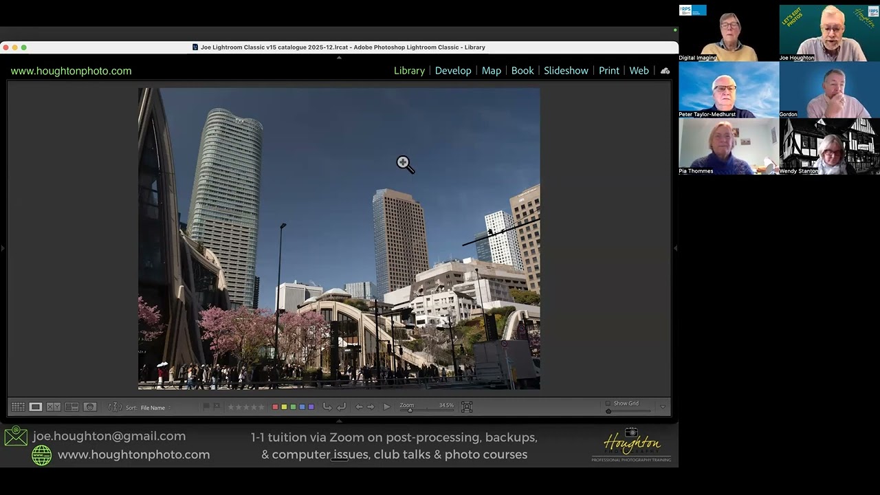
RPS Let's Edit - Composition - Depth & perspective - Joe Houghton 2025-12-06