ADVANCED Interactive Components in Figma
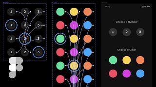
A tutorial on building complex interactive form components in Figma using interactive components and variants. Learn how to create multi-selector radio buttons and color selectors that respond to user input within your design prototypes.
Recording. All right, shut the store. Can never tell if I have my autofocus set right or not. In a recent video, we looked at interactive components using a single screen selector and then another slightly more advanced example where we're linking a component to multiple screens. Then when I posted this video in my Shift nudge Sly community, Rebecca, one of the members says, okay, but I'm curious. This is slick for one component. But what if you're trying to design something like a form which with multiple radio button questions not being one, to back down from a design tool challenge, I started hacking away at a multi selector type screen and I ended up with something like this. One, two, three, and then any combination. You can start choosing this now. If you were gonna create this with a standard way of prototyping screen to screen interactions, you would have so many rows, you would have a color for every single row of numbers. Your numbers would all be. It would just be a lot, a lot of screens because every time A1 would be selected, you'd have to have green and then if you click the 2, the orange would not necessarily be selected. It's just too much logic to try to bake into one screen prototype. It's not really what this type of prototyping system is for. However. However, there is a way with interactive components and it is a little bit cumbersome to create, but it's not that hard. And I actually didn't have to draw every single one of these lines. It's quite simple when you know how to kind of hack the system. So that's what we're going to do. So I'm going to do a quick little walkthrough to show you how you can make some interactive form components on your prototypes if your project calls for it. But before we do that, I'm kind of feeling a rant coming on. So if you want to skip straight to the tutorial, go to this timestamp here. I know you might be thinking, wouldn't this be easier with framer? Is this really necessary? Why go through all this trouble to create something with a design tool and that would be 10 times faster to create with code. Should you just focus on the design and not worry about all these bells and whistles? The answer is framer could make this easier as long as you're quicker and more efficient inside of that than you are figma. And also as long as you know how to make custom interactive radio buttons. And I've personally designed huge projects inside a framer with extensive interactions, components, etc. And even though I'm quite experienced with it, I. I still prefer Figma over Framer. And I'd rather figure out a way to do this with a clever solution and keep everything inside of the tool that I really enjoy using. Now, this is also just a very personal choice. I'm not saying that you need to make the choice and I'm not requiring you to come to the same exact conclusion that I have for how to create this by any means. You make your own decision. You're the designer, you should definitely do what you want and you should have fun doing it. Use a tool that you enjoy. But we're here right now because you were curious about how to create this and inside of Figma. So we're going to dig in right now. All right, so here's our prototype. We've got everything clicking around, so this is what we're going to be creating. So I'm going to go ahead and show my layers, I'm going to add a new one and we're going to call this color YouTube. All right, so I'm going to copy this frame and I'm going to paste it in here and we're going to get rid of all of that stuff. So the first thing that we're going to do, we're going to draw a little circle. We're going to make it 60 by 60 and we are going to make this 2, 2, 2 because our background is one and we're going to have this be a number. And actually let me go ahead and change the background here so we can actually see what we're doing. All right, now I'm going to make a Type tool of 1. I'm going to use this font ttfers and we're going to bump this up to like 18 pixels. We're going to center align it and I'm also going to use monospace lining so that that guarantees all of our numbers are going to be the same exact width. Now, I am going to duplicate this ellipse and the background. I'm going to bring it out to 80, the bottom layer, remove the fill and I'm going to add a stroke of this blue. These are just some pre selected colors that I've got here. We'll use a four pixel stroke. We can do the center, the inside or the outside. It's not really that big of a deal. It's going to be my stroke, this will be my background, this will be my number. I'm going to select all this and hit command opt k to turn it into A component and I'm going to call this number, then I'm going to create a variant of that component and I'm going to hide the layer here, I'm going to leave the layer there. This would be an on off toggle. We'll call this selected. We'll call the default. This one is the default. And we will call it off and we'll select this one and we'll call it on. This would be my first instinct for how to create a radio button that's either on or or off, right? Simple, easy. If you click one of these instances and you option drag out here, you get a simple on off toggle because we've named it on and off. So if the thought would be, okay, let me just put these on here and then I'll have a bunch of on off toggles and I can override the text. Let's go to here prototype mode. This one links here. Let's just put it on dissolve so it has a nice little fade. And that one will be on dissolve as well. So now these should all work. Let's go back to our prototype. Boom. On off. On off works great, right? Well, not if you want all of these, only select one at a time because we have multiple toggles. So we kind of have to group all of these selections into one component here. So although this is a great way to create a simple single toggle, it's not a very great way to create something that has one or two or three. It's only good for just a single instance. So we're going to have to go ahead and delete what we just did here, go back into design mode. We're going to take this out and give it the number name again. Another thing I like to do is kind of abstract my component. So instead of being the number one, now it's just the number component. So now I'm going to take an instance of that and I am going to duplicate it twice. Let's give ourselves about 20 pixels of margin in there. And now we're going to create a component out of that command option K. And this will be our number group variants to this. So there we go. This one's going to be default, this one's going to be number one, and I'm going to hit Command D twice more. And we're going to do a number two and we're going to do a number three. So now I'm going to go 1, 2, 3. Remember, this is going to be our default and this is going to be Just, just for clarity sake, let's copy and paste this number and we'll use these as kind of like faux rows, just so it's like, this is group one, this is group two, this is group three. Just so we all kind of understand we don't lose our place. All right, so now that this is my default set, what I want to do is hit return and have all these selected so I can go to this one here. Number one is going to link to the first variant set, Number two is going to link to the second variant set, and number three is going to link to the third variant set. And that's all we have to do to set up this component for the initial prototyping settings. Now, this is the. This is where we get into the slight hacky part. So when we create these variants, it gives us all of these frames, so we could actually delete everything out of here. But we still have the variant frame and we still have this link going to that variant frame. It doesn't matter what's inside of that frame, it will still link to that frame. So because all of our default numbers inside of the default frame are linking to all these variants, we're going to go ahead and delete all of these out and then we're going to copy these. Just hit return on the parent frame, press Command C. Then I'm going to select number one and I'm going to Command V, select on two. Command V, select on three. Command V. And you can see that all of these prototype connectors are updating automatically. So now if I go to the prototype tab, you can see that every One of these 1, 2, and 3, they all rotated around properly. All of the links are in place. All we had to do was set up that initial 1, 2, 3, and then we just pasted them all in and it all works nicely. Now we just need a little bit of visual differences to go along with this. I'm going to Command click on the background here, show the stroke. Same thing there, Command click, show the stroke. That way there is a noticeable visible difference between those three and they're all working. So now, instead of this group of numbers in the simple toggles, now I can pull this toggle option, drag the toggle over there, and we are going to play this. And you can see it's going to go between each one of them. You cannot select 1 and then 2 and then 3 and have them all show up because it's going back and forth between all these toggles. So this is exactly the exact same process that we're going to use for all the colors. So just to make this a little quicker, I'm going to option drag the number component, command option B to break it apart, rename it color, get rid of the number, and I'm going to make this one teal. And I'm just going to go ahead and command opt k to turn that back into a component. And now I'm going to do the same thing about 20 pixels apart. And let's go ahead and give ourselves three more colors and I'm going to command option K all of these. So now this is our color group. And what's great about this, like you don't have to nest the components, but if I ever wanted to go in here and change the size of my main color shape, it's just a good practice to go ahead and get in. And if you know something's going to be repeated over and over and over, it'll just save you time in the long run. Sometimes it can be hard to design this way, but the more you do it, the better you will get at it. So now I'm going to override these colors with some pre selected colors I have made. And one more blue. There we go. So now if we look inside of our color group, you can see that all these colors are here. I'm actually going to go ahead and name these just for organization sake, because we're going to have a lot of these colors, a lot of prototype connectors. It'll just kind of make our head hurt less once we get into all of this. We're going to create our first variant with the color group here. Clicking on variant, you can see now we have variant 2 and default. We'll click variant 2 and we'll hit Command D. That's going to be. This will be default. This will be Teal Yellow. Now we're going to do orange, red, pink and blue. All right, so this, this, I will admit this is a little confusing. These are a lot of colors. You know, this is where people might start getting opinionated about whether or not we should actually be doing this or not. But just bear with me, there's not a lot we have to do here. All right, so we can go ahead and bump up the space between all of these because that can help keep that a little more organized. We're going to name the property. So we're going to name this Teal. We're going to name this one Yellow. We're going to name this one Orange, Red, Pink and Blue. Now with Our default selected. We are going to go to prototype just like before. We're going to choose Teal, we're going to link it to our Teal. We can see what's happening over here when we link it to the group that we just named, just to kind of double check ourselves. So yellow, you can see. I don't want to link it to Teal, I want to link it to the yellow variant. And then for the orange, I'm going to link it down here to the orange. For the red, we'll go to the red. And then the last two, we got pink and we have blue. Now, this is all really quickly. I'm linking these in a matter of seconds. It's taken me a little bit longer because I'm trying to also explain it in a video while I'm doing it, but it's not that time consuming. In fact, it is very fast. All right, so now let's go back and do our little trick. This is the one hack. People might get upset about it, but I'm telling you, this is fast. This is a fast way to do it. We're going to go back in here, we're going to select every one of these variants. We're going to hit return once. Boom. That selects everything inside of all those parent containers and we're going to hit delete. We did not delete the parent containers, we only deleted the contents inside of those containers. So now we're going to select this one. Remember, all of these still link to these empty containers. We're going to hit return now. We've automatically selected all of these, including all the prototype interactions. We're going to hit Command C and we're going to select every single one of these variant names here one by one. Hit Command V, select Command V, select Command V, Select Command V. Very, very fast. And now look at this magic prototype. Boom. Look at all these lines that are automatically added. We have 1, 2, 3, 4, 5, 6 variants. 3, 4, 5, 6. Six times what each one would have. Six. So we've saved ourselves 36 custom interactions that we did not have to do because we're copying and pasting those from the default color. So now go back to design. Now we do want to go in and activate the proper color just so it's showing that it is active. We're going to go to stroke on that one. Make sure we are on. We're on red. So we'll dig into the red, activate the stroke, we'll go into this one, we'll activate the pink stroke. And then we'll go to here to activate the blue stroke. Now we can grab these, pop them over here, line all this up and go to our prototype. One, two, three. Color, color, color. Look at there. That's a pretty robust little multi radio button color selector thing. Just for good measure, we're going to go ahead and add in a little bit of text. We're going to say choose a number and I don't want this title to be such a contrast that it's going to compete with our call to action. So I am going to knock this down to our medium gray double a large. I'll put this at like 24. I'll put this one at 24 as well. And we'll do choose a color and now let me group that and group this. And then we'll do like let's say 48 in between those two. And then just for fun, let's go ahead and create a 60 by 60 pixel button, or 60 height, rather not 60 width. And then we'll do 48 pixels on each side and let's go ahead and round these corners so it matches nicely. And we're going to add a light color. We'll grab the same exact size font. There's really no need to change the size here. We'll say next and we'll make it the same color as our background, group it, call it cta. If you really, really wanted to, we could turn that into a component and then drag the instance over here. For this particular demo, it's not really that important, but you can always make this stuff a little bit more organized. So there we go, let's go back to this. So that's a pretty nice looking little like multi selector component thing. I do want to iterate again. I'm not saying that this is the only or even the right way to prototype this type of thing. It's only one way for you to build this type of prototype inside of figma using interactive components. If you're already a Figma user, or if you just perhaps find this way to be easier to use over other methods, then this is a way you can do it, no problem. But if you don't like it, no problem. I have no issue with that whatsoever. But if you did find this interesting, be sure to like and subscribe and all that jazz. Should I have said smash, smash the like button. Smash, smash, subscribe. If you want more content like this, smash it, like it, pound it, use it, break it up, rewrite it. I don't know if you want to like it and subscribe it. You can do it. That's all I'm saying. And if you're super interested in learning all the ins and outs of designing beautiful UI, definitely check out Shiftnudge.com that's it for this video until the next one. Peace. Oh, my gosh, it's so hot in here. And I'm also getting ready to break all of this down because we're getting some work done. This is my home studio, and we're converting this studio into my oldest child's bedroom. And we're gonna build a new studio in the backyard. And I have to temporarily relocate to my bedroom, which is not going to be ideal, but it is happening. So this might be the last video that I make with this setup. We'll see. We'll see how it goes. Should I make a video about the office renovation and things like that? Should I post stuff like that on this channel? Let me know in the comments. Or if I should just keep it design focused, that's fine too. But I don't want. I don't really want to do a bunch of. A bunch of channels for a bunch of different things. Just one channel. Would you be okay with seeing home studio stuff alongside design tutorials? Because I've got a bunch of random vlogs on this channel also. But these are the things that. These are the things that you will drive yourself crazy thinking about by yourself in a room talking to a video camera. Lens of my camera. And that's just weird. It's weird to do that. And you don't have any feedback. You have no feedback as to whether or not it would be weird to post a home studio video, your design channel, or if they're vlogs. I don't think it matters. I think we overthink it. I'm gonna stop talking to the camera now. You have a wonderful day, and I'll see you. I'll see you next time.