Matt walks through a UX design course covering Illustrator, responsive web design, wireframing, navigation, and mobile-specific design. The course breaks down project strategy, responsive screens, and how to build for different devices systematically.
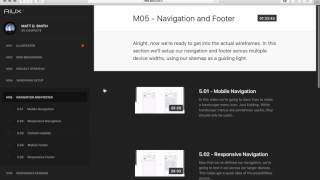
Hey, it's Matt here and I'm going to give you a quick look inside of the AI UX system. So first of all, you've got all of your modules and lessons over here in your left navigation. So in this first module we've got eight different lessons in here. And this is going to get anyone who's not familiar with Illustrator ramped up really quickly about how to set everything up, which tools to use, and some different tricks that work really well for wireframing and UX design. And even if you've used Illustrator in the past, there's lots of specific things that I cover that works really well with UX design in general. For the next section, Responsive Web Design Breakdown, we examine some sites that are done really well and look at some of the techniques that are used in each of those. For the people who are not quite as code savvy, I give a crash course on how the flow of HTML works and some constraints to respect when we're designing for the responsive web. And beyond that, I have a few videos based on prioritizing content and why we would design mobile first in the first place. And in the next module, Project Strategy Module three, we introduce our fictitious clients and we go through a project kickoff. We evaluate their website, audit all of the content on the website, and then design a really robust site map for the entire project. And then we optimize the structure based on a few different techniques and recategorizing some things to make things cleaner. And then we develop a user flow for someone buying products on the site and kind of using this site map as a kind of a guiding light. Once we've done that, we get into the module 4, which is the wireframe setup, and we'll just go ahead and get our devices and our documents kind of all in place, kind of prepping the stage to begin the wireframing. We'll set up some components that will help us go a little bit faster. In the fifth module, we'll cover navigation and footer design. We'll be looking at designing a mobile navigation and some techniques behind that and some of the thinking behind that and then how to expand that into a responsive and just ways to look at it from a strategic level. Instead of tucking everything into a hamburger menu, we'll look at some different concepts with that, update some of the content that we created in earlier videos based on our navigation discoveries. We'll also create a mobile footer and responsive footer and using the same techniques for the navigation on down into module six. We will look at designing these responsive screens. So once we have the navigation in place, we will look at designing a responsive homepage. What goes into that update our documents again, get into some category screens and responsive product pages based on some of the things that are in the existing site and some new things that we've put together in our site map and our user flow and we'll just continue kind of progressing through this project. There's 12 videos in that module and once we've gotten past the key responsive screens, we're going to dig into the mobile only screen. So all the remaining screens for the site, we're just going to kind of cruise through these as fast as we can just to make the most of the time for our project. And there's no real need to design every single screen in a responsive format. So we'll do the crucial ones up front and then we'll move into mobile only in the remaining modules. And then one of these lesson pages you can see is kind of has the video here and you can download files for each lesson and some of the, some of the lessons have additional resources or refer back to other lessons. In this last module, these are the last mobile screens and this kind of covers an in depth look at a user account that's creating a login and sign up and all the things that go into that with verification, success messages, we'll dig into order infos and returns and exchanges. Some of the complex kind of more app side of things that would go into a larger project as opposed to just a marketing site. And then once we're done we will have a file, so we'll have our big site map, user flow, the navigation and footer and so on and so forth. And so these are all of the screens that you will create in this lesson and we'll walk through step by step, each one. The UX strategy behind all of this, in addition to ways to do this really fast with Adobe Illustrator. So that's a little look inside the course. I hope to see you inside.