AIUX - High Level Wireframe Design Intro with Illustrator
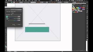
This is a YouTube video titled "AIUX - High Level Wireframe Design Intro with Illustrator" created on December 11, 2014. It features Matt D. Smith presenting a detailed tutorial on rapid UX wireframe design using Adobe Illustrator, explaining step-by-step how to create mobile-first wireframes with various design elements and tools.
Hey everybody. Welcome to AI ux, a series about rapid UX design with Adobe Illustrator. I'm Matt D. Smith and I'm going to show you how to create these high level wireframes when you don't have much content but you still want to get started on a project. Alright, so we've got our phone and our Safari title bar for our mobile first design. So I'm just going to break down a few of these elements. So first I've got this background picture going to hit M key to just draw a rectangle that's 320 by 600. See where that goes? Alright. It's a little big. So we'll scale it. The V key and I'm going to make the fill gray and then the stroke going to make it a little bit like a dark gray. And again let's go and make sure we're aligning to pixel grid so everything's nice and crisp. Let me just move this stuff off of here. So I've got my phone and my background drawn and I've got it locked in place. And for the, for the title bar we can just go. Or for the navigation bar I'm going to do 320 by 44. It's usually a good 44 is the standard iOS title bar. Looks like I got 50. So we'll do 50 line the Pixel grid and just to give this a little bit of separation from the content, we'll make this fill white. So I just double click on the swatch and then keyed in the hex code for white. Now for these little boxes they would represent the navigation. I've drawn them as squares here. So actually first before we do that, let me make sure this is lined up. That looks good. Alright, so you can do these as squares or lines. I kind of go back and forth. Not sure why I do that. But you can draw these squares with the M key. That's like 39 by 7, 40 by 6. I don't know why I like to do even numbers on my components. So we just have this over here and then we just option drag it and then hit command D a few times. To get our navigation. You can also hit the backslash key and you can draw a line. This is probably more versatile because you could change the width of the stroke. You could change the width of the line faster by just grabbing one point and sizing it as opposed to an actual shape. You'd have to grab go in trying to double click to isolate it. You'd have to go in and select both sides. So I'm going to make it again with a line here and I'm going to option drag that over command D a few times. Now I can select all of these and go to the stroke panel and increase the stroke to be four points. I can get rid of these. I'm going to command G to group those, get them in place, you know, get your logo of choice, your own or your clients, whatever, stick that in there. And whenever I'm laying these out, I really like to have even spacing around just to make everything nice and cohesive. So for example, if I've got these little navigation things, I like to line it up what's nudging it over so it makes sure it's on a pixel grid. But so I line it up and then you can kind of pick your margin, but I like to hold shift and then nudge it over once or twice depending on the element that you're, you know, trying to lay out. That makes a shift. Arrow key will do 10 pixels, whereas just the arrow key will do 1 pixel. Alright, so moving on now this is going to be an image, so it's good to display an image with an X as a placeholder. So I'm just going to use the line tool and draw from corner to corner and get my crosshairs right in the kind of lined up right there. If you draw the point all the way to the corner, sometimes you can have your. Your like if you wanted to do a bigger stroke, it might end up going out of the bounds a little bit. So I like to keep it short. And since this is going to be kind of in the background, I'm going to do a lighter color. I can keep this dark gray and I can just change that to like 20% opacity and then select all of this and hit command G. Now if I want to pull it or duplicate it and size it down for another picture somewhere else, it's still in a group. Alright, so now we're going to do these two headlines, going to grab the line tool again and just going to give it a bigger stroke, like 10 pixels. And then I'm going to option shift nudge and then shift nudge again to get the sub headline since that's more of a sub headline. I'll do like 5 pixels instead. Alright, then we'll bring another one down here. Hold option to scale it evenly across both sides. And then for our call to action, we'll just make a little rectangle that's still left over. That size is Left over from earlier. So we'll just drag it out a bit. Zoom in here, right in there, make it a fill only make sure it's aligned to pixel grid. And whenever I'm working on wireframes I like to let me turn that to a fill instead of a stroke. I like to create a global color here and you can do that, but you can turn any of these into a global color by double clicking and then just selecting global right there. Or you can hit new color and then you kind of set it up. But when you hit global color that means that if you have multiple instances and then you decide you want to change that color and it changes everywhere within the document. So I like to create my kind of call to actions with a global color. That way if I want to update it for a different client or I want to change the color, I can do it once and it would update it all around. I'm just gonna give this a little corner radius and for that video in the middle we'll do see 160 by 90 to do kind of like a 16 by 9 ratio. I'll make it that dark color. So I'm using the eyedropper tool to get that gray color. And I'm going to switch from the stroke to the fill and round those corners a bit. I'm going to do the ellipse tool to draw a little circle here. We'll do like 50 by 50 and hit the default stroke. And then I'm going to switch it with the arrow. Knock out that black, put that right in the middle. And now for a quick little triangle, just draw a rectangle tool and then switch to the pen tool and remove one of the anchor points and then rotate it 45 degrees and you can drag out that point a little bit and then kind of line it up in there. If you wanted to add some radius to it, you could. So I'm going to select. Alright, I've got my navigation, I'm going to group my navigation. So this is grouped and this is grouped. I'm going to select all of this and align it to the center horizontal align. That way everything's nice and lined up. But I need this to be over a little bit because it that's kind of a visually aligned thing as opposed to mathematically. So now you can see that I've got pretty much the same thing that I designed over here. If I were to move this, I could just set it in place and there you've got your initial wireframe. This looks a little thin. So I'm just going to add a little bit of a weight to that, made it four pixels instead of, instead of one. Alright. And another thing is annotating these little icons, or not icons, but annotating these elements. So a quick way to do that is to use your rectangle tool and draw a little shape right here and with the pen tool add a point and then delete it. Now you've got a. Now you've got a little kind of left bracket here. We'll change that stroke color to our main color and make that one point. Now we take the line tool, get right in the middle here and just draw a little extension of that and then type in like my intro plus my call to action. So what you want to do is draw a little ellipse tool action right here, a little circle, reduce the opacity and then I'm going to use the line tool from there. Since I've used red, the little swatch is right here. So I'm going to choose that and then make it the stroke. And then I can just add a. In the stroke panel I can add a little arrow to one side and a dot to the other. And then if I want to change that, I can hit this arrow here. And now I can drag this text over here and say this will be my call to action and then change that to red as well. And it's picking up the opacity difference. So I'm going to pull that back up and I might want to line that up a little bit better right in there. Alright, that's it. That's how you create high level wireframes in Adobe Illustrator. If you have any questions or comments, let me know or hit me up on Twitter. I'm MDs and I'll see you next time.










