AIUX - How to Create a Mobile Safari Title Bar Wirefame
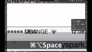
Matt D. Smith walks through designing an iOS Safari title bar in Adobe Illustrator. He covers the specific tools and step-by-step techniques for building mobile UI elements that work in real apps.
Hello and welcome to the second AI UX video. My name is Matt D. Smith and I'm going to show you how to create an iOS Safari title bar like this. In the last video I showed you how to make a iPhone wireframe. And in this video I'm going to show you how to make this little guy right here. I've grabbed an image. I don't know what Yspark RU is, but they apparently sell hair brushes. It has what we need on the top here to get started. So, as you can see, I'm going to drag this over here and then I'm going to recreate this for you. Alright, so the first thing we're going to do is draw this background. Alright, I'm going to hit the M key for the Rectangle tool. And also while you're, when you're designing this, make sure that you have your smart guides showing. That's Command U. That'll help you get aligned here. So I can just align right there and I can click and hit 320 by 64 since I already know the background size there. And if you don't know the background size, you can click and drag and you know, see where that lines up. So you can see that 64 right there. And then you can change it in your Transform palette or panel, whichever you prefer. And now I'm going to. I'm going to hit the Eyedropper tool and just select what I've already drawn here with my iframe or not Iframe iPhone. That way I can keep a consistent style, my stroke and color. So now that I have that and it's lined up, I'm going to select this image and I'm going to knock back the opacity to like 20%. And then I'm going to hit command two to lock it in place so I don't mess with it. And you'll notice that when I'm working in Illustrator, I don't pay any attention to the layers. I just manipulate everything on the stage as it is. And I don't really do any layer addition or subtraction. You know, the layers are in there, but I don't mess with them at all. So you can see the one that I locked and then if I hit command option two, it unlocks them. Any lock, any locked layers. And that's one of the reasons why it makes Illustrator super fast, because you can just ignore the layers anyway. All right, we're going to draw these dots. The L key for the Ellipse tool. These are 6 by 6 ish. I guess they're probably closer to 5 by 5. 5 by 5? Well, maybe they're 6 by 6. Anyway, let's do 6 by 6 and call it a day. Alright, so I'm going to line that up and I'm going to go over here to my transform tool. Make sure that align to pixel grid is selected. You can get off of that somehow. Sometimes this will get unselected and cause issues. So make sure you just kind of keep an eye on that sometimes. All right, so I'm going to hold option and shift and drag this over to about here. Now I'm going to hit command D. Duplicate that a few more times. All right, so we got that. Now I'm going to hit T for the type tool. Throw up some MDs as the carrier. Feel free to use your own fun acronym. Go with 12 point Helvetica. Helvetica New, as I like to say. But as I'm told, it's officially Helvetica Neue. That's for another time to discuss. Okay, now we have that in place, I'm gonna zoom in to this guy and I might need to unlock this, bring it back to 100% opacity so I can see what we're working with. And then I'm going to re lock it. So now create this little icon. So we're going to just use some circles here and change the stroke. I'm going to hold option and shift and just nudge up and then nudge back down. Whoops. Nudge up and then let go of option nudge back down. So now I've got a copy in place of that existing object. Just a quick nudge up to copy and then nudge back down. Now I can hold option and shift to scale from the center as opposed to only shift which scales from like a corner. So option and shift to scale to right in there. I'm going to do the same little nudge copy trick for this last one. This one's more of a fill instead of a stroke. So I'm going to make that a fill. Alright, so now I'm going to cut these temporarily. So you can see there's pretty much just like a wedge shape. So I'm going to take the rectangle tool, make a rectangle, turn it 45 degrees, hold shift to maintain the rotation increments. And if you don't know how to rotate, you can just hover right beside the corner of that box and you'll see it. Alright, so now I'm going to select all of this and align them. Whoops. Align to selection instead of artboard. Let's do that again. There we go. And sometimes if you are using align to pixel grid, if you're not on a, on a good, like if you're, if you're not mindful of what your measurements are, your align tool will be off a little bit. And that's what just happened to mine. But now if I do command Y to see my centers, you can see that they're all lined up. Alright, so let's turn this, push this down a little bit about the center. Alright, so now I've got the center of this rotated square diamond in the center of that circle. Now. Now I'm going to select all of these and go to my Pathfinder tool and hit divide right here. That's going to make everything turn into its own individual shape. So now I'm going to take the direct select tool and just remove what. I don't, don't need this, don't need that. So some of these. So you have, you have everything you need right here. But you, you don't need to delete this whole shape. You just need to delete these points. So I'm gonna select the shape and then I'm gonna select that point, this point and this point. Now I've set a, I've set a command to remove. You can go to object path, remove anchor points. And I've set a shortcut at AS command E. And you can do that under keyboard shortcuts right here and just look for the one you want. I'll cover that later. But for now I'm going to do command E and you can see. Okay, I actually needed to delete those. So if you get stuck with a shape like this and you want a stroke, you can just hit P to add a point and then delete it and then you'll have a single stroke. So I'm going to just change that. All right, now do the same thing for this shape. I'm going to delete those stroke, delete all that. So now we've got our little WI FI signal. I'm gonna thicken these up a tiny bit. Let's go to 1.25 stroke. Whoops. Okay, so this is once you hit divide, it's treating. It didn't work because it's treating this entire object as a thing. So if I use the select tool and I pull it, you can see that it, I haven't grouped it or anything, but it's treating it as a combined group so one quick way to do that is just double click into it, select all the pieces, command X and then Command shift V to paste it in place. And now that should let me change the stroke. Yeah, so that now it's thinking of it as a grouped object group grouped objects instead of like a combined shape. And I'm just going to move this over and select that color just to kind of give it a true representation. All right, move that back. So now I'm going to unlock my layer again, the background image, change the opacity back to 20 command 2 again. Bring this right in there. Alright. And so you can see right here, this text is center aligned. Technically it should be left align if you wanted to be super technical about it. Because if you typed in orange you would want it to go from this point, likewise with at and T or whatever, Verizon. That way if you were going to use this in other files it would be kind of already set up. Whereas if you left it at center aligned, started trying to type in something, it would mess you up. I'm gonna go left align Command shift L with the text selected. Command shift L for left Command shift C Command shift R. Get the idea? All right, so I'm gonna option drag this over here. Center align for the time. Go with good old 420 for that. Alright, we've gotten a little out of sync here. Somehow I moved my background shape so I'm just going to slide it back into place. I'm going to command shift R for the percentage. All right, so now we're going to draw this little battery M for the rectangle tool. Let's double check. This is on a pixel grid. Okay, 22 by 10. Alright, so I'm going to make this a stroke and that will kind of change the size that I need. There we go. You can change the corners, the corner radius or radii inside of this transform box, or you can use the Direct select tool and do it up here. Either way works. Let's see. That's one pixel. It looks pretty good. For now do another square inside of here. Nobody likes a dead battery, so let's go ahead and make it full. Full of life. That's a good thing. Align the pixel grid. So now we should have. There we go. So that's all good. Now we'll make the little positive battery nub. Line that to pixel grid. Make sure that's nice and good. I'm going to use the Direct select tool to just select these two points and then I can change only those two radii. So that looks good. I'm going to select all hit command G to group it. That way I can kind of sling it around whenever I want to. All right, unlock this background layer again. Go to 100 opacity. Command 2 to lock it. Now I just unlocked it so I could change the opacity so I could see the dimension for this input field. So that's about 28, 29, something like that. When you hit align a pixel grid, it will change. See how this is 19.8692, 8.854. Hit align to pixel grid. It changes to a whole pixel. So that's, that's what you want. I don't know the width of this. I'm just going to click and drag all the way over here and that put that at 300. So I'm going to nudge it down and hit my eyedropper tool to get that color and then do the corners again. 5, 5 points, 5 pixels. That looks good. Alright, now I'm going to hit Command shift left bracket to send that to the background. While I work on adding the URL, I'm just going to option drag this text down. Go ahead and type in this URL. Hopefully this is not some inappropriate site that I'm using as a reference here. 16 points. That looks decent. And I'll leave that there for now. And now, last thing I'm going to make is this little icon here. So a little ellipse with the L key, put it on the stroke and then I'm going to leave that there. There's different ways you could do these icons. Like you could get the pen tool and draw all of this as one shape. But I think it's always best to use these like just circles and squares whenever you can. It makes it easier and a little more uniform. So you can see. Got us. We pretty much we just analyze the icon. Even the same thing with the battery, it's pretty much a circle and a square or a circle and a triangle rather. So I've got my circle and then I can, with the smart guides, draw a square right here and you can hit that point on the circle there. Select both of them, go to the Pathfinder tool and remove that wedge. Then I can select this point and delete it. Now I've got the little circle that I need. I'm gonna draw a little square here and align the pixel grid. Adjust it a little bit. And now I'm just gonna add a point there, the pen tool and I'm gonna remove these. If you deleted this, you would end up with two shapes with one, this one with two points and this one with one. So you want to make sure that you don't delete these points because you want to keep that shape intact. So you can go to object remove anchor points to do that. But we don't want a stroke on that. We want to fill. So let's see how that looks. I'm going to group that and bring it over here just to check it out. Just a little off. I'm going to nudge that back. One might need to kind of want this center point to line up with that. So I need to go. Might need to adjust this to not be on a pixel grid. Actually, since we got most of this in place, I'm going to go ahead and unlock this background image. Move it over here. Slide this over. So I'm going to take. I'm going to turn off align to pixel grid. Kind of slide it up to there. Group this. Oh, it's already grouped. So that. That's pretty good. And just like those other. Just like these WI FI bars over here, I'm going to make that. This 1.25 because I think it's. If you look at both of these side by side, you can tell that's a little thicker. So let's do 1.2. All right. All right. So now you can tell. I've got my input, got my address. Let's go ahead and change that. Something more relevant. And so I've got these gray circles with my black text because the black is the default color. So just to make this more consistent to pay attention to the details, I'm going to make all of this that same gray color. Now I can't select these stroke pieces and the fill piece and use the eyedropper or it will do this because it's trying to fill the shape. So there's two options here. We can either select these stroke things individually and then select an object with a stroke that's gray and then do it that way. But that's a little time consuming and we're all about speed here. So we're not going to change this anymore. We know this is pretty locked in, so I'm going to go ahead and go to object path outline stroke. So now that changes the stroke into a fill and I can make it gray. And then we could always reduce the opacity of that one to give it that effect. Same. Same with this battery. I'm going to go ahead and should probably should set a shortcut for that. Let's go ahead and do that since we. This is something that I use often and I haven't set a shortcut for that. I'm gonna go keyboard shortcut. And this would be. Oh, we need to go to object here. Path outline, stroke. Let's do. Let's see. Command, shift, O O Crea outlines. Okay. So it'll tell you if there's a conflict. And I use that one also. So I'll do command option O browse and bridge command. I will never ever use that in my entire life. So I'm gonna go with it. Wait a second. Are you sure you want to overwrite the set? Remove anchor point? No. Command option O. Okay, don't think that I'm overriding that. But anyway, let's see if it works. Command option O. There we go. So now we're even faster. And same with this one. Command option O. So now I can select all of this, deselect these two pieces, and I can do the eyedropper on this gray. And for good measure, we can do the input field, same as the rest. And there you have it, your very own iOS8 Safari navigation bar. Now this works good for mobile. First design for websites and any other things you might want to use for this. And that concludes second video in the AI UX series. I'm going to delete this and I just put together a gumroad, a free gumroad product package with this cover image. And now it's going to have this navigation bar and this iPhone wireframe. You can download that for free in the link below in the blog post. All right, thanks for watching and I will chat with you later.










