avoid THIS MISTAKE in Figma when linking components
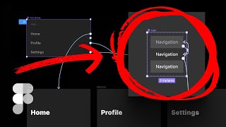
Matt D. Smith shows how to link buttons inside interactive components to different screens in Figma. The video covers step-by-step prototyping, hover effects, and managing component states for better UX design.
What's going on? Welcome to another video. In this one, I don't know how to start. It's been so long since I made a video. So long. In fact, I don't even know how to apparently set my autofocus or my exposure correctly. But whatever. You know what? Let's just skip the intro. Let's just get right into it. I got a comment on one of my other videos. Christina. Gg she says, awesome video. Thank you so much. I have a question. Is there a way that I could click on a button? It's inside of a box of interactive components, and. And when I click on it, navigate to another screen. For example, I'm on the web on the home screen, but I want to go to the profile screen. So I pass the mouse over the button. All stuff I established on the interactive component. But I want to add the property that when I click navigate to the profile screen. I don't know if I'm making myself clear. I mean, I think you are, but let's give it a shot. All right, so to make this simple, I'm going to go to my iPhone 13 Pro frame. We'll call this one home. And let's call this one profile. There we go. Home and profile. And let's give this a background color. And let's type home right here. I'm just going to use good old enter. I'm going to go black with that typeface. I'm going to go 120 from the top, 40 from the side. I would never design a screen that says home this big unless there was a really good reason. So just need to throw that out there. All right, this is profile. This is profile. So these are our two screens. So Christina wants to have a button inside of a box with interactive components, and when she clicks on it. So she's on the web on home screen. Want to go to the profile screen. So I pass mouse over. So I pass the mouse over the button and happen. All the stuff I establish. I'm assuming she has, like, some rollover components and things like that. And I think I know where this might be going. And then she wants to navigate over here. All right, So I think I got this. Okay. So let's just say, all right, we're going to create a little bit of a menu here. I would also probably never say menu just big on the screen. But this is just for an example here. I'm going to go medium. Let's go like 11. I'm going to pull up this little contrast plugin, and I'M going to go all the way down to where this is like double A, like 4.5. That's going to be 8, 98989. We'll just make it 999, just for goodness measure. Okay, this is going to be like our little tiny sub menu. And I'm going to make these. That's 40. I'll make these 20 just for now. And let's just. Oh, should we leave these gray? Let's say we've got a profile, let's say we've got settings, and then let's also say we have navigation. All right, so I'm going to. We don't really need this, but I'm just going to leave it there for now. It's kind of decorative, so I'm not actually going to worry about the contrast. This is the menu. These are the menu items that are here. This is a decorative title. Decorative titles don't have a contrast requirement. You could argue that this isn't decorative, but for this purpose we're going to call it decorative. And so we got profile, settings, navigation. All right, so what we need to do is create a component out of this. So let's just call this like navigation and we're going to bring it over here and we're going to create a component command option K. We're going to create a variant and all I'm going to do is a simple hover effect. So I am going to try to decide what I want to name these variants. Right now it's property one, default. I know this is going to be a hover on or off. That's as simple as we're going to do. Whenever I can do a simple variant, I like to keep it simple with a true fault statement or an on off statement or a yes no statement. Let's call this one yes and no. So this is going to be. The default is going to be no, and the other one is going to be yes. And we have to have some kind of change. So I'm going to make this one white. All right, so that. Let's also add some auto layout to these because it just helps if we ever wanted to change the background color or something. Like, if we wanted to give it a fill. Like, let's just say we did that. It looks horrible, but at least if we started typing, the red background would be there. So we can always remove it if we don't. If we don't want it. All right, so we've got our. Our white text. Let's remove that fill because that's not really what I want it. So we've got our navigation and we want all of our navigation items to turn white when we mouse over them. So if I go to home and I hit play building the prototype. Alright, look, nothing's happening. Profile settings, navigation, no clicks, no hovers, nothing. All right, that's okay. We're getting there. So I'm going to go over here to prototype mode and I am going to link this to here. That is going to be on hover while hovering. Go to there to the hover version. Instead of instant, I'm going to go to smart animate. 300 milliseconds. Ease out. That's fine. And we're going to bring this one here. Boom. That is going to go to the other one. Mouse leave. When I leave my mouse, when my mouse leaves this object, I want to go here. Smart animate, Boom. Done. All of these are just text layers, so let's grab. Oh, wait, is this, Is this navigation? Is that a text layer? Okay, it's a text layer. So let's bring this actual instance over here. Okay, we're just gonna throw that one in there. This one can be what? Oh, notifications. I think that's what we said. Notifications. So now let's test this again. We can just go back here. Okay, that's not working and I don't know why. All right, let's rebuild the prototype. I bet, I bet that was it. It's because I didn't rebuild it. All right, now you can see we're getting the faintest bright white rollover. So we could do something a little bit different if we wanted to. Even give this like a. Let's make it a little bit more visually dramatic just for the purpose of this video so we can actually see a little bit more. So I am going to add 16 pixels. Auto layout goodness all the way around. I'm also going to add auto layout to the frame itself that's holding everything so it stays. It stays in the right spot. Okay, so let's make this one the background color of this and then let's go like black for that one. Okay, so now this is going to be bigger. And also if we, if we stretch this out to the entire thing, this entire background should also change as well. All right, so let's close this out in case that is what messed us up last time. We're going to hit play again to rebuild this. And there you go. You can see a much more dramatic thing happening here. Just so it's absolutely clear. That that's what we did. I don't actually love this hover effect, but I'm just going to go with it because this is not about creating cool hover effects. It's about creating a link to a profile page. So we could, theoretically, we could put one of these. We could put another click. We could put a prototype click on these items and try to link it to a screen. But I don't think you want to do that necessarily and get your components and your interactive components all in different. You kind of want to keep the separation of concerns. So in this one, we're going to call this like navigation hover. I mean, let's just call it. We'll keep it navigation and then let's make these three a component and we'll call this Nav group. Nav group. And just for consistency, we'll just call this Nav. Okay, now we're going to go profile. Actually, let's do home profile and settings. You might already know where I'm going to go with this, but we're still going to go for it. All right, so I'm going to. Let's actually put this all. Let's put this all the way against here and then let's stretch out this entire container and all those should have stretched with it. All right, so now just for fun, we're going to go back to our design and we're going to add 24 to each side. And then we'll put our menu and our home at 24 as well. So we have this, like, nice sharp left alignment layout, connected typography on point connection here. And we'll put our menu icon right there. That's not an icon, that's text. Menu text. Still don't know how I feel about that yet. Okay, so before we go any further, let's test out to see if all of these are working. Home profile settings. Boom, boom, boom. There we go. All right, so that's working. Now we're going to take inside of this. We could link these, but what we really want to do is link this group. So I'm going to go profile. Okay, so we're going to. You can see it's got these, like, mouse enter, change to. It's already got like the hover effect, like in there. So we're going to add this linking to here and let's actually bring this to the top just so it, like, makes a little more sense. Okay, so we're just going to go straight up, no action. We're not going to do any fancy Thing, it's just going to go there. Okay. And this one, when you tap, is going to go home. And just for good measure, let's go ahead and call this one Settings and let's go ahead and link settings to that page. Really? Anytime you have a, you know, you want to go somewhere, you got to have a frame for it that you're going to link to. All right, so we've linked all of these. So now all of our component instances are pulling from that particular component. So now I can copy and paste these and they should all be the same. Let's make our settings and stuff line up. Okay. Why don't we also. Okay, so let me think here. Let's. All right, so I'm going to add auto layout to this. Okay. And then I want to put this little menu thing inside of there. I still don't know if I like it, but I'm going to throw it at the very top and. And I'm going to throw some shift A action on there so it adds an auto layout. And then I'm going to add 24 to that. And then I'm going to do fill con. Fill container. Okay. And then I'll go ahead and just make the background of this the same color just so it's easier to see. Okay, so now all of these menu little things popped in. Okay, so now I'm just going to restretch these to make them fit. And it looks like they. These right here need to be set to fill container in order for these to go all the way across. Because when I added auto layout, it shifted these from to be like naturally stretchy to now they're fixed width. But if I change this to fill container, you can see that it updated all the others. So. And I just hit command Y to be able to see the bounding box. That's going to be like view show outlines though. You can toggle command Y to see that. Okay, so now all of these in prototype mode. See, these are linked. Then these are now linked. These are now linked. And these are now linked. So now theoretically, moment we've all been waiting for, is this going to work When I rebuild this, all of the hover effects work. All right, here we're going to click profile settings. Boom. All right, so what if we wanted to show settings and profile and home maybe like as a little icon on there or something. So we, we could go and we could make another interactive like variant. Actually, why don't we do that? Let's go, let's go. Here, take that off because we just duplicated it. All right, so this one's going to be. Let's go in and we're going to change this from like hover. Yes, no. And we'll just do, we'll do style and a drop down. So this one's going to be default, this one's going to be hover, and this one is going to be active. Okay, so our active is going to be white without that background. And then on each one of these we can go in here. All right, the home. We're going to change it to Active profile. We're going to change it to Active settings. We're to going, going to change it to Active. That way, you know, we're not done with this. We're not done with this design by any means, but at least we're getting our point across. So home, it's showing up. And you can't actually even hover over that because there's no hover effect on Home Boom Profile. So that is how you would create your rollovers and your links. Because I think what Christine must have been doing is trying to link this interactive component to one of the screens. If you were to put the click effect on the default navigation and then you hovered, that wouldn't register a click anymore because you would be on this one. And then when you rolled off, there can just be a little bit of confusion when you're trying to add click effects onto the prototyping, like interactive stuff. So whenever you create something like this, I would always recommend creating a secondary version of that. That, that one that handles all of the rollovers and then another one that handles all of the clicks. That way you can keep these things separate and when you have this going, you can just build it out. Okay, I hit the wrong, hit the wrong thing here. Let's go to that one and hit play. Then you can go boom profile. Boom settings. You have your hover effects and all of your clicks working great and it's all controlled from those couple of components. Whenever I get a fun little like interesting challenge like this in the comments, it's kind of nice to be able to have something like this where it's like, I can make a video about that because I will end up trying to make this huge blown up video that takes me like two weeks to think about. And so anyway, if you have other video questions, drop me a comment. It can be with interface design, product design, UX design, or even FIGMA problems that you're running into. And I will pick the very best ones and I will make a video about it. So thank you Christine for the comment and I'll see you in the next video. Hey, what's going on MDs here. Now, if you're new here, Shift Nudge is the best way to learn how to design visually beautiful interfaces from typography, layout, color, and more. I've got you covered with 85 meticulously crafted lessons, over 30 hours of video content, and over a thousand homework critique videos from student work. On top of that, there's a vibrant Slack community with past and current students posting their work, critiquing each other's designs, and sharing lots of job opportunities on a daily basis. If you haven't already, jump on the email list@shiftnudge.com to make sure you don't miss the launch. Thanks for watching and happy designing.