BOOST Your Design Game: 5 Color Contrast Scores You CAN'T Ignore
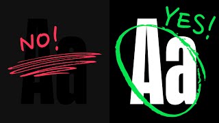
A designer walks through five color contrast scores that matter for accessible UI design. Learn what contrast levels work for text, icons, and buttons in light and dark modes, and how to check your work with the Use Contrast Figma plugin.
Have you ever measured the contrast of the colors that you're using in your designs? Did you know that in addition to passing or failing, there are five score ranges that you can use as a guide in every single one of your projects? 21 at the highest, all the way down to 11 is black on black or white on white or any color with any color. It's no contrast, but the highest is is a 21. Now, a 21 is perfectly fine for most light mode designs and even a dark mode design that has a bright, punchy headline. Totally fine to use a strong contrast for main headlines, headings, and those types of things that demand a lot of attention. And that actually looks pretty decent on a white background. Fully black text on white background. It looks good, the contrast is good. And I would recommend not going much below 12 on the contrast scale for dark body text on a light background. Now, anything above 7.0 is going to be a triple A contrast. That's the highest ranking score. But then you got seven all the way up to 21 in that range. I personally don't think you should go much lower than 12 because if you do, it starts to get washed out. You can see like as I go lower and lower and lower, it's just going to get more and more and more washed out. So 12 to 21 is a pretty good range for dark text on a light background. However, the same text on a black background, I would recommend not going above 12 because if you go all the way up to pure white now, it looks okay with these two paragraphs, but if you have an entire website that's nothing but bright white text on a black background, especially if you're in a dark environment, it's just going to vibrate in your eyeballs whenever you're using dark mode. And when you're. Whenever you're in a dark room, your pupils are going to dilate, they're going to get big, and that lets more light in. If you've ever had someone shine a flashlight in your eyeballs in the dark, you can know that it's pretty blinding. The same thing happens when you have dark mode and you're using white text or any bright elements. You have to be very careful when you're designing in dark mode with the contrast much more careful than you do designing the exact same thing in light mode. That's why you'll probably see a lot of dark mode designs that just aren't that great compared to their light mode counterparts. So because of that, we want to stick right in the 7 to 12 range for a lot of body copy on a black background. These are suggestions. It's not a law, it's not rigid. You can adjust this depending on your design. But these are great starting points. So let's move on down to 4.5, which is going to be your double A score. You can see that right here I've got my 21 full contrast black on white. And then right here I've got my 4.5 somewhere in that range. Anywhere from 4.5 up up to 7. Even if I highlight this, and I went up to seven, I mean, that still works. But you can see as this gets darker and darker, those two items are going to start to compete with each other. Now, that actually looks pretty good. Both of these black. But it is a title and an author. So you have to just make your own judgments when you're designing your own thing based on whatever it is that you're designing. So 4.5 is a nice compliment to the darker titles. Same with dark mode. The 4.5 is a great score to hit when you're designing these bright white things, and you want a little bit of like a supporting element. So like this author's name here. You do want to be careful with 4.5. Even though it is double A, it's passing accessibility contrast scores. If you were to use double A only for your body copy and your headlines, it looks a little more contrasty on dark mode because of the light sensitivity. But if you use the same contrast over here, it has a tendency to just kind of feel washed out. So all of all of the same contrast, 4.5, especially the lighter you get, it's going to just feel washed out and flat. Now, sometimes that might be a design style, and there are ways that you can kind of play with that if you're going for a very specific aesthetic. But if you're not specifically trying to do that and you just don't know what you're doing when you're choosing colors, then you should probably avoid a very low contrast like this. A few other just smaller examples here. Let's say we have like a little line item in an app. This works great for WI fi connection. And this was like some kind of like helper text, not connected. This is like a great example of when a 4.5 gray would really be a nice supporting text up against that title. Sometimes if you have a list of items, Maybe we go 4.5 on the title because the sections title is not quite as important as these individual line items. These are our interactive tappable items. And this is just kind of like playing a supporting role. It's important, but it's not as important as all these other things. So there's nothing saying that we couldn't make that title black, but you can see that if we did that, it just. It calls a lot more attention than it would normally need. So if I put that back at 4.5, see that it just kind of fades into the background kind of nicely, and it lets these other main items come to the foreground a little bit better. Every time you use a contrast color, you're playing with depth and you are trying to elevate the importance of certain elements while de emphasizing some of the others. Another example of some 4.5. If you have a lot of copy over and over and over, like In a table, 4.5 contrast score can be really nice. There's nothing to say that you couldn't use a 7 right here. That would still look really good. But if you have a lot of information, it could possibly become a little bit overwhelming. And. But somewhere in that 4.5 to 7 range is pretty good. It just depends on what you're designing for and how you want your things to look. All right, so let's move on to 3.0. This is going to be our double A large score. None of the scores have a size requirement except for the a large, the 3.0. Now, in order for this to be a passing score, it has to be at least 18 pixels bold, roughly, or 21 pixels regular font size. This particular score does have that requirement, so let's look at some examples of when this might work out nicely. This would be great for placeholder copy, especially if you don't have an actual label above your input field. 3.0 is a really nice score because it brings the contrast down just enough to where you can still read it. But it doesn't look like someone has already typed into the field. If you have all the way black, it's going to look like someone has already typed search into that input field. And we just don't want that. We want it to look like a label. We want to bring it down to like 3.0. Same thing with, like, primary action colors. 3.0, 3.1. That's a great kind of target to hit with your button colors for your primary action. Now, it's kind of interesting here. This white text on this orange background is reading as 3.5. However, this black text is reading as 5.9. So the contrast according to this calculation is much higher for this black versus this white. But if you ask almost anyone, they're going to tell you that this primary with the white jumps out a little bit more, especially as a clickable call to action. Well, that's because this web content and accessibility guidelines formula doesn't really account for all of the luminance of all of the colors. So there's a new experimental formula called the apca. I'm not going to get too nerdy about it, but it's a different formula that takes that into consideration. And so you can see it's scoring as a 66.7 versus 42.8. So there are some areas where this 1 to 21 system will start to break down a little bit, but in general, these are great guidelines for you to follow. 3.0 also works really, really well for interface icon colors. 3.0. You don't want to go lower than that with your icons. This works for dark mode and for light mode. 3.0 is going to be a great score for all of your icons. 3.0 is also a great score for button borders. If you, if you wanted that to be a little bit more prominent, that would still be a passing score. There's not necessarily any specific rule around button borders. You could go a lot lighter, but you can see like, the lighter you go, the harder it is to kind of see that out. And you would definitely want your text to pass 3.0, at least if it's 18 pixels bold or 21 pixels regular. But you would also want this text to be more than likely 4.5 or higher. Whereas your border, it kind of comes in nicely as a 3.0 border. Same thing for this icon right here. This is a 3.0 color contrast there, and it's just a nice target to hit for your icons. All right, so next up, we have a failing score. So anything lower than a 3.0 is failing. 2.9 is failing. 2.8 on down all the way to 1. 1 is black on black. You can't see it. This is a 1.5 score. Now, you might have trouble reading this, and that is why that it's a failing score, because your critical text on your interface should not be a failing score. None of your important text inside of your apps should have a failing score of 2.9. Shouldn't even have 3.0 if it's not those size requirements of 18 pixels bold and 21 pixels regular. However, failing scores are not all bad. So let me just show you a few examples of when you Might want to actually use a failing score. Failing scores are great for borders. See these borders right here. Now, especially on dark mode, if you were to go with bright white borders, all of a sudden your designs are not going to look very good, because now my border is commanding more attention than the information inside of my table. So it's always a good idea to go with a lower contrast border. And if you use as a number 1.2, 1.5, those are good ranges for these borders. And then also if you're going for a secondary call to action here. So just like on this border example, we went with a 3.0 because we want to kind of define that, that button edge a little bit more. But there's not a requirement on a background of a button. So if we took that background off and we just had learn more, that would still be a perfectly acceptable way to have a primary call to action and a secondary call to action. So there's not any requirement on a button background. It's more of the requirement of the text contrast on the button background. So because of that, if your interface could live without the background color, that means that it is somewhat decorative and there's not a strong contrast requirement for that piece of interface. So we can actually use the failing scores to our advantage. And you can see this, this is measuring the background color against the white. And it's a 1.2, 1.1. Especially for me, I've got pretty good vision, but it's harder to see. You see 1, 1.0 is white on white. You're not going to see that. 1.2 is a pretty good range there. So you can see if I went with 1.5, that would almost start to compete a little bit more with this primary call to action. So that's really what we're doing with our contrast is we're trying to set the stage for our more important information to come forward and our lesser important information to kind of sit back in the background. Now, there are requirements for placeholder text in the web content and accessibility guidelines. There is requirements for placeholder text to be 3.0, however, and this is a little bit of a gray area, so just bear with me. We could theoretically have a form here that said Twitter username and that was the input field. So we, we have a blank input field, nothing in the box. So because we could go with or without this placeholder text, I like to use a 1.5 in situations like this when it's, when it's purely supplemental. You know, if, if we were Doing something like this with no label outside, like that's just, that's not going to work. 1.5. This has to be 3.0 if you're going to do something like that. So you're going to want that to be right in there. You can definitely use 3.0 in this situation. But if it's, if it's this weird area where it's supplemental and you could use it or not, sometimes I will just consider this decorative text and make it 1.5. Sometimes I feel like it's, it's a little too crowded with the placeholders to be a really high contrast. Now I know some people are going to disagree with me and say that this should always be 3.0 because the guidelines say it should be. I mean, I could go with 3.0 here, but I personally think this is a little more decorative. I'm sure. I know someone is already gearing up to leave me a comment about this, but anyway, I'm just going to leave it here now. 1.5 is also great for disabled button states. Disabled buttons have no contrast requirements. There are some people that are going to disagree with this as well. That's fine. Disabled buttons on their own are kind of an entirely different can of worms as to whether they're helpful or not. I personally will use a disabled button of 1.5 and that way when you start typing then you can bring that up to like a nice full on contrast. This is a 3.8. Again, the primary CTA having that 3.0 score. We could definitely do without either one of these and we would have a perfectly usable input field in this particular case. These could theoretically be described as decorative interface elements. And I know I'm treading the water here, but just this is my thoughts on the matter. That's it. That's all of the contrast scores. We've got 12 to 21 for light mode text. We've got 7 to 12 for dark mode text. 4.5 for these helper pieces of information, secondary supporting text for these main line items. And then we've got 3.0 for standalone placeholder text. Primary calls to action. We've also got icons and button borders inside of our interfaces with the 3.0 contrast. Finally, 1.5 for our borders, 1.2, 1.5 even for our backgrounds on our secondary calls to action, our disabled buttons, and our potentially decorative placeholder and disabled buttons. So that's it. Those are the contrast scores. I hope you found this valuable. And if you want to get access to the contrast plugin that I was using inside of Figma. You can go to use contrast.com and you can get the free, yes, free Use Contrast plugin that I myself designed to solve this exact problem. So just go to use contrast.com click on install. That's going to take you right to the Figma page. You can see my my pal Guso there. He's the developer extraordinaire behind everything. And just click Try it out. That's going to put it right inside of your Figma file and and then you can hit Command backslash to pull up your quick menu, type in Use Contrast and then start selecting things and you have access to all these scores. You can change stuff around. It's a very handy tool. So if you found this information valuable and you find the plugin valuable, I would love to hear from you in the comments about your favorite part. If you're new around here, make sure you subscribe if you want to see more content like this. Thank you so much for watching. I'll see you in the next one.










