Boring UI process (DO NOT WATCH) unless you want to learn
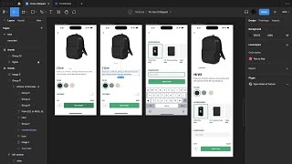
Matt D. Smith walks through a complete UI redesign in Figma, showing how he handles layout, alignment, color choices, and usability for a mobile app. Watch if you want to see the actual decisions behind the design, not just the finished product.
Hey, what's up, MDs? Here I'm trying a new video format where I set a one hour timer inside of Figma and see how much of an existing design I can improve. The only cuts from the video are the awkward long periods of silence where I'm blankly staring into the screen and moving things around. Stick around to the end and let me know what you think of this format. What is going on? And welcome to a super boring redesign. I'm going to put an hour on the clock. There we go. Okay. All right, we're going to move that out of the way now. This is a design from one of my Chef Nudge students in. I believe it's one of the layout lessons. I'm going to give it a quick redesign and see what we can do. First thing I'm going to do, let's go with phone. I go with 14 Pro Max because that is what I am currently using. I just pulled this off of our Slack channel, so I'm going to resize this to kind of match the this one up here. So like, that one's 430. I want to make sure that one is like right at 430 as well. Just so we have like a side by side comparison. Still look pretty good. Yeah, it's fine. Okay. Now, whenever I'm designing an iPhone app, I will typically always go grab Joey Bank's iOS 14 file. And it looks like. Is that this? I can't remember if this is it or not. No, I don't actually don't think this is his. This is a different one. But I'm gonna. Where is this? I should really just make my own library. Okay, let's see. I wonder if I could search for iOS. Joey, is that gonna work? IOS 15. Oh, is that a new one? Edited one year ago? Oh, no. IOS 16. I'm way off. Okay. I'm way off. This looks like it might be it. Yes, Joey, this is it. Okay, so we're gonna go over here and really all I'm going to do is grab one of these title bars. I think that's going to be right. These are all pretty well organized, so you can really grab any one and you can change it if you want. So I'm going to put this one here and this one I'm going to. I'm going to just. Actually, let's just make it grow a little. Like right there. And I'm not 100% certain if that's exactly what the Pro Max. Actually, I don't even need all this. Actually. I Only need a part of it. I was actually only trying to get this. Okay, so, okay, we got our top nav. This is actually all I wanted. I don't know why I went through all of that. Okay, so that's. I mean, honestly, that is the first thing that I always do when I'm designing an iOS app, because I want to have context for the exact thing that I'm designing for. I'm going to go and grab this home indicator as well. We might not actually need this because we're going to make maybe a little bit longer of a screen, But I like to just get everything set up and do it like that. So I'm going to get. You can. I don't know if you know this. This is just an image, but you can hold command, then pull from the sides here if you want to, like, crop in on an image. So I'm gonna do that. I'm just gonna kind of splatter in all of the elements. Hive from 229. A lot of times the students will provide a figma link, but I did not see a FIGMA link for this one, so I'm just gonna retype it really quickly. Activity with the Ultimate Travel Lifestyle Backpack. I actually do like that, like, with the backpack. All right, so I'm gonna try to keep this under an hour. So we got our timer going. Command option L to left. Align that. Let's see what else. All right, we got color, and we've got some accessories. We've got name embroidery. Okay, interesting. We've got quantity, which is important, and we've got the price, which is important. Okay, so that's pretty much all of the things. We've also got an arrow. Another thing that's really good to do. You don't have to use. You don't have to use this arrow, this exact arrow in iOS, but it is really good to just paste in the arrow and just see how big it is. The reason I'm doing this is because I could tell this one is incredibly tiny. And this one. This one's not huge, but it's. I mean, this one is, like, tiny compared to that one. I will always typically create, like, a 24 by 24 pixel frame to keep all of my icons in. 24 is just a pretty standard. Nice. Nice and standard size. Now, when I'm doing these little redesigns, I'm not too worried about creating this big reusable component system and creating an icon and doing all that. I would typically do this if I was doing a big project, but I'm not going to worry about all of that right now. I'm just mostly focused on the design. So we're just going to stick that in there. All right, so let's just. Let's look at this. The first thing that I notice, it's a good design. I think this looks nice. It's got nice alignment. This particular assignment is all about alignment. And the alignment is looking pretty good. The color to me feels a little bit weak, and a lot of these text pieces start to compete with each other and it feels a little bit. It just doesn't feel clean and crisp. This little checkbox feels a little bit out of place. And a lot of times when you're designing, you also have to ask yourself, does it make sense to put the accessories right here on the screen? It's almost, you know, you're thinking about content design as well, in addition to UI design, in addition to copywriting and placement. So I'm just thinking that a lot of this feels maybe too much. Maybe name embroidery is an option on the next step. I'm not sure. We'll. We'll maybe dive into that more later. But let's just start here. Let's say that this is the hive backpack. I'm not sure if that's what it is, but I think I would like to see that right underneath. Instead of putting giant hive letters, let's. If, if the pack is 322, then I'm just gonna go ahead and put this all in one line. I'll do like 24 from the edge here for all this stuff. Okay. Actually, I'm gonna. Why is that looking so weird? Let's zoom in on this one a little bit over here. All right. Okay. So I don't think we need from 229. I feel like maybe that works better on another page. This is kind of cool. Let's. Let's bring that in. Little square or like a little track for the photos. Let's do like 320. And then I'm gonna do 320 divided by four. Let's just assume it has four pictures and then we'll bring in that color. Alright, so I'm gonna change all of this to medium, and then I'm gonna change these to bold. And I'm gonna come back and tweak this stuff as I get more into the design. How much time do I have left? Let's actually bring this a little closer. Oh, I should have done that before. Okay. See if I can get my cursor out of the way. All right. Okay. Got this color, we got this color and we got this color. I'm going to make these 48 just to kind of see. Normally I would always mirror this to my phone to kind of get a good feel. I'm not going to worry about that right now because of the time. I. I'm not happy with the. I'm not happy with the way this text looks just yet. So I'm just temporarily gonna make some of these titles bold. I'm trying to get everything kind of in place and then I'm gonna start tweaking it because it's hard to make. It's hard to make design decisions like one by one. You kind of need to see everything all in place. I kind of like the green border he's got there, but I'm not sure about that green color necessarily. It looks a little bit. Unless this was a, like a strong brand color. I'm gonna go and just kind of see what we can do with this color. So let's go to hsb, see if I can. I want to try to keep it in the 3.0 range, but maybe bump up the brightness and the saturation. It might be kind of hard to do. Let's bump up the saturation to about right there and then let's go a little darker. I'm just kind of playing around with these numbers, the saturation, the brightness, and I'm trying to see what looks good and also what will hit in the 3.0 range. Alright, so something right in there is looking pretty Good. This is 3.0, 3.1. I don't love the 67 on the HSB right there, but we're just gonna have to deal with it. Alright, so let's use that as our green color just for now, but then we also. I'm gonna test a black, like a darker color on that green. That's 4.5. What is white? White is 3.0. I mean, that's not bad for a call to action. You technically need that to be 18 pixels bold to pass accessibility, but on a CTA, sometimes I'm good with 3.0, but I am just going to look to see like what the difference is. This is one of those weird colors where this white is going to read lower contrast, but the black is actually, you know, much stronger of a contrast. For the WCAG 2.0 system, there's a new APCA algorithm and a lot of times it tends to favor the wipe because it, it. There's some kind of perceived value in the calculation that the WCAG doesn't have. So anyway, I'm going to keep that there. I'm going to go. I'm going to round all of these corners to be. Let's do like six. And we're going to turn on some iOS smoothing there. We're going to. I'm actually going to convert this into a stroke instead of a fill. And I might. Sometimes I put it like a white fill, whatever the background color is, just so I can click it and grab it and move it around. Otherwise, if you don't have that stroke, you can't actually click in the middle because there's nothing there to click. But if you add that fill, then you can get it. So you can put it behind stuff. So let's put our selection 24 pixels from the edge and then let's move all of these over. Actually, I might see what these look like as a color, I mean, as a circle, just because I don't want to deal with the whole rounded edge thing. Also, it's worth pointing out that the square objects everywhere. Rectangle, rectangle, rectangle, rectangle, rectangle, rectangle, rectangle, rectangle. That does very slightly take away the impact that the add to cart button has because it's like, okay, the only thing that's a rectangle on this screen is the add to cart button. And it just. The shapes allow us to kind of subconsciously know what to choose or what different things mean. Different things, if that makes sense. So I'm going to go color. And again, I'm not really happy with this exact type setup just yet. I'm just kind of getting things in place. I really like to use one font size starting out and then I will adjust later. You know, we could. What do we have this at 17? We could go ahead and bump these up to 34, see what that looks like. I actually am going to mirror this on my phone because it is really, really difficult. Actually, no, I'm not because I'm not signed in and I got to do two factor authentication and I'm running out of time. It's. It's actually really tricky to, to know how big that is unless you're mirror mirroring it to a phone. It looks huge right here, especially like, compared to even like color color. And I kind of like, I do like the way that he has these, these all caps, name, embroidery. I guess I could have just change the little setting, but anyway. All right, so I'm going to get rid of this after all. So I can pull this down. Pull that down to there and let's go ahead. And I think I'm going to do maybe something like that where I have three different, three different little buttons there and then just quickly do this. Probably need, like to draw some icons for that because it's not going to work well. But select those, change them to the background color. All right, so those, those. We don't, we definitely don't need to be 66. I think 66 is just like an arbitrary number that happened when I drew my button. I'm gonna go with like 54. You could do 48. A lot of times if you're not sure about like a button size, it can be helpful to even go back into something like this and look for a button and be like, okay, here's some like labels that they're using. What is that? You can see this is like 114 by 50. So if you brought that label in or even looking at these, you can tell these are 31 tall. And that's, that's squeezing in between like a 44 pixel line item. Sometimes that can be pretty small. Okay, so here's a good example. This is 50 pixels tall. So like 48, 50, that's like a pretty standard size. On like a 1x app, you could totally go in. You could take screenshots of any other app that you like and find out how tall something is. I'm constantly doing that. I mean, I know roughly what some of the measurements are just because I've done it for such a long time, but it never hurts to go check. So we'll just do 50 just because we just saw that. And so I'll make this 50 by 50. I really want to do 48 by 48 just because I like Divisible by 4. But I'm gonna just fight my OCD here. Alright. I'm gonna end up. I'm actually gonna draw a little icon because I'm gonna go command Y. So I can see the outline here. And we're just gonna do like 20 by 2 and see how that looks. Might be a little bit big. Let's try again. There's tons of icons. There's feather icons, streamline icons, iconic app that you can use. So you can see they're doing like 14. So I'm good with my 16 here, but I probably will give it a little rounded corner there and center it. And then let's put it over here. Actually let's copy this whole thing. Remove that and then we'll put that 24 and then we're Going to grab this, and we're going to turn that into a one. And the reason. The reason I like a stepper here is because as soon as I tap this, my keyboard is going to cover it. Where's my keyboard? Where is our keyboard? All right, here we go. So let's just bring this over here and we'll just widen that a bit. So, like, that's definitely going to happen. I mean, sometimes the design will slide up, but if we can avoid that keyboard coming up, that might be better. I know we're not gonna really avoid it with that name, but sometimes, I mean, it's just quicker to change a number by tapping versus. Versus putting in the input. And we're definitely going to need to, like, figure out a better color for that. I typed in the wrong hex. Code name Embroidery. So we also. We've got two different input field styles here. This one would have, like, border bottom or a box shadow on just the bottom, whereas this one would have, like, full stroke or a full box shadow in code. So I would. If there's the opportunity to make things similar and there's not a huge reason to make them different, I would definitely go for consistency. I don't know if. I don't know how I feel about doubling up the price down here at the bottom and the top I know that he had from 229. And then we've got. We are going to very quickly look at Amazon. We're gonna look at backpacks, and we're just gonna quickly glance at their layout. So typically, you want, you know, your price near your button, you got quantity when the delivery and all that is. So there's a lot of stuff going on here. But you also want to know, like, if there's price differences between the colors. And on mobile. I'm not sure if this is not really gonna work work. I guess I could maybe if I go to this and we reload the page, maybe that would change. There we go. So you can see we got our image. There's no price up here. Unless. Is that an. I don't know if that's an ad or if that's. Yeah. Okay. So, see, we can't see the price up front. We see the reviews, the description, we get some images, we got the colors, we got the size. Then the price is down here with the cart. And more than likely, you know, we see it on. When we're browsing a page like that. We're gonna see if we search backpack. Typically, we're not gonna just randomly land on A product detail page. We're gonna see it like this. And we're gonna see. Okay, $31. Let me check that out. So as soon as I go here, I'm just checking this out. I already know that this is $31. So it's anyway just worth thinking about, you know, that we don't necessarily have to put this up here, so maybe that's a case for us to go smaller with the stuff here. And then. Anyway. Okay, so now we're gonna. We're gonna knock out these accessories, and then we're gonna start tweaking stuff. Okay, so I'm going to use the same little block here. Just going to make a little grid. Let's see. These are 172. So I'm going to make these like 120. No, let's go. Let's go. Like 160. So I'm looking at how much, actually. All right. I'm gonna put some auto layout on these real quick. That way when I scale them, they will just automatically shift for me. I think roughly, like, right in there would work. You kind of want a little bit more than that cutoff. Like 150 might actually. Because, like, if we did a hundred, that might not work. Let's do 150 and then I'll take that out and delete these so we have more to work with. Okay. We got our wardrobe, and I'm. I'm always a big fan of lining the text up when we can. Something like that. Instead of separating the price from the description or price from the title. 32, we've got a 12 liter packing and we could do like an ellipsis. And then we got what. Whatever that. Whatever that is. Toilet. See this. This just may. It kind of calls into question, like, what are these? I guess these are add ons. I guess these are add ons. So you would also want to, like. We may need a little bit of description in the accessories to include, because if we add the accessories, it creates a little bit more of a. Of a design challenge. Because now we almost need to summarize, like, what's in our. What we're about to add to the cart anyways. I don't want to get too bogged down in the specifics, so let's just keep. Let's just keep going. Okay. I'm going to start moving stuff around and just see what we can come up with here. I'm actually not loving all of this right here. Like, I wonder on Amazon, are you even choosing a quantity for backpacks? When you're on the detail screen, I guess you could be. Yeah, see, but you're not. So you're not actually changing it right here though. It's just saying like, hey, this is one thing. Whereas if I'm buying like a cleaner or something, maybe it's a little bit more likely to give me that drop down ability to change it out quantity. Drop down, it's another option. I mean, I guess technically, technically that could be a drop down. So I'm yeah, definitely changing my mind on whether or not that should be those like plus buttons or not. Because it just, it felt, that felt weird to me whenever I've got a label and then I've got some placeholder text. So according to accessibility guidelines, I'm only. I'm kind of running out of time here. But this is perfectly fine. It's a name and an input field. Okay. We can start typing text in here. And it's perfectly fine. Because of that like placeholder is not really required now. If we did not have a label, this should absolutely be at least 3.0 or 4.5 is kind of pushing it because then it looks almost like it's been typed into 3.0. I feel is a good contrast for labels that don't have, that are, you know, like the float label pattern versus the outer label. But if it's got an outer label medium. Actually let's just do your name and actually that actually feels a little. I might go 3.0 right there. Let's do embroidery instead of name embroidery because we're saying your name here. I also like the idea that we're going one label, one word label, one word label, one word label, one word label instead of a two word label. Good. Look at this one more time. Okay. All right, so now maybe let's start tweaking some stuff in here a little bit. Maybe this is a little more branded or something. I don't know. It's. It's kind of hard to save just because since this is like a, like a little one off, I'm. I'm kind of just doing whatever I'm gonna play around with maybe some darker stuff a little bit smaller. Notice that I'm not really using. I don't, I don't love using components or worrying about too much while I'm just kind of exploring and playing around. We can always kind of systematize things later. It's so much easier to just grab individual little pieces and kind of go with it. And actually this, this kind of like charcoal Y gray is Kind of nice. So I'm actually going to select this frame, and I'm going to change all of these blacks to that color. There we go. And then I can go back to just this status bar, and I can change that back to black, because that one's not really going to be that different. All right, let's see here. I'm going to grab this little image, and then I'm going to grab this one as well. Throw these bad boys right in here. And I would never really use this type of imagery in an actual product design, but one little fun trick here is we can increase the. The brightness, and then we can set the blend mode to multiply, and that'll get rid of that white band. So I'm going to increase the highlights. That way we get that really nice and white, and when we do that, we can get rid of that. Also going to size this down just to be a little bit more relational to just kind of looking at these lines across here. I want each of these images to be a little bit more sized, like, for that square. Okay, let's see here. We do need a way to add. And I don't love the checkbox, but maybe we need it. We could also consider, like, a stroke as a selection. Like, stroke shows up if you have it selected. The only. The only downside. Excuse me. The only downside to doing that. I guess we would just need a little confirmation that we're adding that thing. But usually the accessories are on the like, cart page or, like, because. So I'm wondering if it even makes sense to put these in here. I kind of want to, just because it's on there. So I'm like, how are we gonna do this? We could try something like. I don't. That greens only. See, I wouldn't. We don't want to use this green on this white background. When it's standalone text, we would need to bump. Bump that up to 4.5, but I don't love that. Maybe we'll just stack these. That way it'll be a little bit cleaner and maybe. Maybe we'll. We'll bold these as well. That feels pretty good to me. And then we have more room for our text like that. The only thing I think we might need to do is put some, like, a summary of the items you're about to add. I don't know if we need to do that or not, but. And it also feels like embroidery might be us. I don't know. Is that a little more important than, like, I wonder if this should come later. It's really tough to design the single screen because I'm thinking about the entire flow. And when you're designing a product, you can decide, does it make sense to add these accessories? Like, is this totally custom? Or does this need to support, like, a hundred different products? And they all need to have accessories? So there's a lot of questions that remain unanswered in this particular exercise, because if we had, like, if we were working and we're building something from scratch completely, we might. I would probably put embroidery and accessories on a completely different step, because it's already hard enough to decide whether or not I want the this color, this color, or this color. But now I've got all these other choices. To me, it makes more sense to add the book bag to the cart and then be like, oh, you've made that decision now. That is a decision that has been made. I'm getting the book bag. Okay. Add accessories. Okay, cool. Which accessories do I want? It's almost like it's implied that I've already bought the book bag, and now my mindset is, which accessories am I gonna put in the book bag? Kind of like when you're buying a Mac computer, you choose which computer you want, then you go and you fiddle with all the RAM and everything. Just from a business perspective, too, it's. It's nice to be able to think, okay, they've made the decision to buy the book bag, and now we have them on the accessories page. And it's already assumed that they're gonna buy the book bag, so now we can serve them, hey, do you want accessories or not? Because if we put it on this page, this is saying, do I want the book bag? What color do I want? And do I want accessories? And do I want this embroidered? So I'm. I mean, as I'm talking this all out, I'm thinking that it might actually make more sense to bring this page over here. And, you know, what if it was, you know, a second page to add this stuff, continue to check out or something like that? Again, we're not doing that big of a deep dive on this whole thing. So it's. You know, we would need something up here and. But I just feel like this might make a little bit more sense, something like that. So here's what we're gonna do. We're gonna put that over there. We're also gonna save this one over there just because I don't want to mess all this up, but let's take that off. And, like, would that be. Would that be, like, much more clear? Or another option would be, like, configure or customize and customize could be a link that opens that up that's like, yes, customize it, or no, don't customize it. We could even theoretically come steal one of these little switches. Where are these little guys? So, I don't know. This is maybe not. This might not be the. The most ideal design here in terms of, you know, experience, and I'm not sure I have enough time to go into the full intricacies of if this makes sense or not. But one thing to point out here is if. If I did have something like this, where I needed to put a background behind this text, I would. I really would want my text to line up, if possible. So I'd be tempted to either pull this out to, like, 12 like that, or grab this stuff and, like, push it in a bit. Now, you don't always have to do that, and it's not completely out of the question to indent this piece of text here. However, it does create, like, a little line that kind of like your. Your eyeball is kind of like, instead of, like, the straight down. And that's kind of what this lesson is about, is, like, kind of how you would line stuff up. So it's worth considering. And of course, if you were gonna customize it, this would probably pop open. You would get this. This guy would spread out, and you would add accessories and stuff in there. It's just an idea. It's something worth considering. I don't necessarily think this is the best design in the world. I'm actually, for whatever reason, the 50 is bothering me. I'm gonna go up to Flex 50. It just feels too small for this. I don't know why, because we got that at 48. And I'm gonna move this over here just for a second. I wonder if. Would this feel any better as, like, dots? I don't know. I mean, you kind of got this whole line motif going. I'm not saying that lines are better than circles or whatnot. I'm just messing around here. Little auto layout. So this is where I would start to. All right, we got that 40 from the dots. Let's put this, like. Let's try, like, a 32 pixel spacing between these elements. And then we could also just kind of bring this back to see, like, where. Where that is. So, I mean, we could, theoretically, we could go a little smaller and we can bump all this stuff up so it fits a little bit better on The. And actually, I mean, depends on, like. Depends on a lot of things. But why does that SF Pro display. I don't know if that makes sense to put those there. Usually underneath the thing is better. All right, so let's go. Let's go like 24 right there. Maybe we'll tighten that up to 12, and we'll put this at 32. Maybe this could go a little tighter. Right now it's at 12. Maybe we put it at 8, and then maybe these turn into 16. Now we can do 32 and 32. So I'm kind of trying to get my spacing down. I got this. This title above this text is 12. So that means I'm gonna want this title above this selected thing at 12 as well. So I've got 12 here. We've got 12 here, and now I need 12 here. So title to object is gonna be 12 for now. We can always change this. I got five minutes, and now we're gonna go back and make sure that this is 32. This is 32, and that's 32. See if we can bring this back. I mean, I do. I do like that line. I mean, it's not. It's not bad. Maybe it's a little smaller. It's. It's tricky because the way that. The way that it is here, it lines up nicely with that text. But the way I have it here, it's kind of conflicting with this. It's kind of conflicting with that. This, like, all of this negative space, like, right in here, this chunk is conflicting. Whereas over here, it's, like, straight and straight. So you have to watch out for stuff like that. Just messing around. And if we wanted to bring in, like, some slab. I don't even. I never use slab serifs, so I'm not even sure what a good one is. I'm running out of time here. Got two minutes. Sentinel. What's a. Let's do a Google font just so I know I'll have it real quick. We got Merryweather. Looks like a kind of a slab serif. We'll give that a shot. I def. I actually like this slab serif a lot better. I like the geometric nature of it. Whereas, like that. The V on this one is a little bit odd. Play fair, Laura. Laura is kind of cool. PT Serif Noto. Serif noto. That's not what I'm looking for. That one's kind of cool, bitter. I'm just. I'm actually just trying to find one that looks a little more similar. Oh, is that. Did I actually find it? That might actually be it. I think I found it. Yep, I found it. Alright, let's. Let's actually try bidder for these and see what that does. Let's go all caps. And I typically wouldn't. Anytime I'm gonna make a big change like that, I'm gonna always consider it with the, like the overall brand. And then also just does it actually feel like it works? I mean this one looks kind of cool. I wonder what would happen if we. Is that noticeable enough? Or maybe we do we bring in like a line element to separate those things. That's a good cf. Cf. Sometimes a good failing color is. A good failing color is. I mean a failing color is a good border. You definitely don't want those to be too much. Actually gonna go a little bit lighter sometimes. Like even 1.3, 1.2. Try ed on this guy here. We just, we really don't want attention, a lot of attention on that border. And because we have these at 8 and then also 16 between these colors, I'm also kind of wondering, okay, should we do 16 pixels here and in here to match that or does it match a little bit better to have eight? So I'm gonna also play with that. Eight doesn't look bad. Straighten that up a bit. You know what we could do if we did a line like that? We could like, we could integrate the stepper as the border and then we would have a little bit more of a. Like if there was multiple images that might be a little too fancy because it's like kind of an interactive element, but also not. So I'm not sure if that would actually work well or not. But I do maybe I do like that one. Let's try 32. 32. Let's. Let's try this one without a background. And I just ran out of time. I'm gonna go a little tiny bit longer. Let's go 32 on the bottom and we'll call that a day. So we actually have a little bit more room. So if we wanted to go. If we wanted to group some of this stuff and slap some auto layout on it, align it to the left and then go 32. Strain it to the bottom. Then we could start playing around with just like a quicker little number there. 32, 36. This is when I might start integrating some auto layout here and there. 40 doesn't even look bad, you know. But then I might take it off and then I might grab this and move this back down to like, okay, that's 24. And maybe this gets moved up. I still don't. Something like about all of this right in here, I'm not loving. What if we did like the hive pack or something? I don't know. I can't really assume that we could change their products name or not, but maybe we just go back to like a smaller little thing, keep it nice and airy and maybe we bump that guy up around these corners here. I didn't actually realize that had all of these condensed. These are actually pretty nice compressed. Oh, this is for the. That's kind of cool. 17 looks A. It looks pretty small, though. Expanded. Interesting. I mean, the expanded is kind of cool. I mean, I haven't really played around with that a lot, but so maybe we'll keep that one. So regardless, I'm still going to. I'm going to keep all of these at $17. So I still want to keep these at the same size. So we're going to keep all these sizes the same as opposed to like changing it to go tiny, tiny, tiny. So I've got. I only have two sizes. This one and the others. I mean, if you really also wanted to change this a little bit, you could go to like 7.0, maybe lighten that up a little. So something like that. I'm gonna stop there. I'm definitely not fully satisfied with the way this one fully looks, but those are some of the just things that I would think about when it comes to color. I feel like this is. This is probably. It might be double a large. It could be. It could be 4.5. Yeah. So that is. That is passing, but for the tech, like white text on a. On a darker. Darker background. I mean, dark text on a light background. I would kind of want that in the. Probably in the, you know, 12 to 21 range or 7 to 12 range, rather. I'm not. I'm not sure. I'd have to kind of play around with this more. But this being at 7.0 feels about as light as I would want to go on that. Just because I feel like it's a pretty important. It's a pretty important section of text. So anyway, we are going to stop it there. We've, you know, kind of drastically reduce the amount of cognitive load. We are. We're just looking at this. We're swiping through pictures, we're choosing a color and we're adding it to cart. Maybe we customize it, maybe we don't. We could definitely spend more time digging into the way all of this would work, but for now for this hour, we're gonna call that one done. If you want to see more videos like this, make sure you subscribe. And lastly, if you want to see bits and pieces of these designs behind the scene day by day, I'm posting daily design content on my Twitter. You can follow me there. I'm ds thank you so much for watching, and I'll see you in the next one.