COVID-19 Self-isolation UI Design
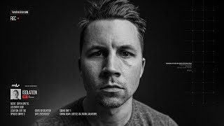
This is a YouTube video titled "COVID-19 Self-isolation UI Design" created on April 1, 2020. It features a single speaker, Dan Petty, who walks through his process of designing a sci-fi inspired overlay interface for video logs, demonstrating design techniques and tools like Figma and Lightroom. The content is a detailed tutorial and design walkthrough rather than a conversation.
I designed this overlay interface for a video log of sorts, inspired by the kind you see in sci fi movies like the Martian, Oblivion, Avatar, things like that. I posted it on Twitter and people seem to get a kick out of it, so I thought I'd redesign it in Figma and talk through my process. I originally designed it in XD because their animation between artboards tends to be the smoothest in terms of rendering. But I mostly use Figma for my interface design work. So that's what I'm designing in now, so I can make it into components and allow others to kind of use it on their own. So this is a shot of me in my home studio with a black backdrop with my Aputure 120D2 light. So if we desaturate the photo and pump up the clarity and grain a little in Lightroom, it makes for a cool cinematic look, a bit more drama. So the first thing I'm going to recreate is the mobile interface as if it were an Instagram story overlay. I've airdropped myself some Instagram story screenshots to get a frame of reference for sizing and positioning. Hey Jeremiah, Instagram story interface is pretty simple, so it won't take us long to recreate this from scratch. Just going to pick a spot and get started. First I'm drawing these story indicators at the top, which are just white rectangles with rounded corners. Then I'm holding option and dragging them to the right to make a quick duplicate and hitting Command D will repeat that duplication. Now we'll make half of them transparent so it looks more realistic. Now onto the text. Most iOS apps are set in San Francisco Pro, so this part is fairly simple. And now that I see the size of this text, I realize I forgot to scale down my screenshot by 3X, which will produce a design at 1X. Now we'll go ahead and redo that last bit. Now let's make a rounded rectangle to use as the image mask and also draw this bottom stuff real quick. Most icons can be made combining simple shapes like rectangles and circles. Some can be a little trickier, but with practice you'll be able to get it. Alright, now that we've got our Instagram story interface, let's start designing our custom overlay. First we're going to draw this top part, a rectangle and some text fields. The orig example I made had lines, but I'm curious how a solid background will look with a little background blur effect. I'm going to Try the same approach for the avatar and the name tag component. Usually, rounded corners are more friendly overall, which isn't really the style we're going for here, but I'm still curious if it could work. Now I'll put this type into place. Draw some more horizontal scan lines on top of the image to give it that kind of faulty transmission. Look again with the option drag and Command D for duplicating. I'm going to add a radial gradient that has zero opacity in the center and about 80 to 100% opacity black on the edges to give the interface bits some more contrast against the image. This is a pretty common trick to use in UI design when you need readable text and elements on top of an image or a video. Now to type out some more of the information. I'm playing around with the layout of these elements because I'm not 100% happy with it yet. I really like the negative space and the feel of the larger example, but I haven't landed on something I really like for the mobile version yet. It feels a little crowded right now. Now I'm thinking the rounded cor aren't really working that well, so I'm going to try hard edges again and maybe take a notch out of the bottom right corner. I'm going to bring in my logo for a little more visual interest here. Realized I left it out of my original mobile version. Still going to play around with this bottom layout. I'm not quite happy with it yet, so don't be afraid to move stuff around over and over and over to test things out. Most of the time you won't know that it works until you see it. Now we're going to bring in this tiny eight pixel text with a bunch of random numbers and letters. This just adds that sci Fi kind bunch of letters and numbers. Animating for no good reason seems to be appropriate. Okay, I'm starting to like the four text pieces here stacked on top of each other and aligning the others to the bottom edge. This gives it some nice negative space and balance. Now I'm looking at modifying this tag a little bit more in terms of size and style. Again, we're going to keep tweaking it until we're happy with it. Thinner strokes, smaller text. There's a number of things you can do to try to make good progress on your designs. Now we're going to add a little more of this tiny text over the right to balance out all of the heav on the left. And we're also Going to add a little more Sci Fi flair with a bit of a grid. Again, make a drawing option, drag it to make a copy, and hit command D to duplicate. This works with individual objects and with selected groups. Fine lines can be tricky to pixel snap. And to get super crisp, I actually started with half pixel lines with a 0.5 stroke to have a smaller precision feel. But they ended up causing alignment issues that I didn't really feel like finessing. So I switched them to one pixel lines, a grid piece component, and duplicated a bunch of instances so that I could just update the master component and have all the quadrants update automatically. With Figma component instances, you can select a child inside of that instance and hit the delete key to hide that piece. It's a great way to modify your component instance without having to get too wild with multiple versions of the same component too soon. Trying to keep it as simple as possible. For now, I'm still trying to make decisions about what this bottom area will say and if I have room for a third block of text. We also need to fig figure out where this grid thing will align. Right now, it's just kind of there for no rhyme or reason. Whenever you can line things up, you need to line things up. As humans, we crave structure, and this is something that can very easily break a design. So when you can line things up, definitely do it. I'm thinking maybe green is a better color for isolation level one. That way we can save red for level five or something else maybe. Perhaps. Still playing around with it. Not sure yet. Okay, after seeing these notches, they're starting to feel a little amateurish, so I'm going to remove them. Still looking for places to align things. This is really going to help the overall balance and structure of the design. I'm thinking I don't need a bunch of padding around the image now, so I'm going to continue to modify this tag area until it feels really solid. Command Y will toggle the outline preview mode if you need to see a simpler version for measuring margins and whatnot. Trying to decide where these little numbers and letters look best. Now I'm going to clean up the grid master component a little so I can experiment with little corner lines instead of those three pixel blocks. This feeling a little too heavy and undone. A lot of times when a certain piece of your interface doesn't feel like it's working, it can really help to isolate it from everything else so that you can work on it and mold it as a nice little design on Its own. Then go plug it back into the rest of the design and figure out where it should go. Okay, now that things are getting tightened up, I'm going to start abstracting these images out so that it can easily be updated and work for a wider variety of people. Instead of just me with my mean mugshot in there, I'm creating a component out of the smaller avatar and the big image so that others can just drop their image right on here and have the designs update. Now I'm tidying up the components off to the side so the document makes a little more sense. I'm also curious if I can create a big component out of the main overlay and then have it appear as a standalone app, but then use that same component scaled down vertically to fit within the Instagram story. It's worth a shot. All we need to do is smartly group some of the elements and set some of the resizing constraints in the design panel. Alright, now let's try it out with an image of my buddy Dan Petty to see if this layout still works. Definitely a different feel with a big colorful image in there, but it's still looking pretty nice. Let's try one more and maybe adjust that gradient overlay we put in place earlier. It's always best to test multiple image types like this to see if your interface breaks or not. I can tell here that I'm going to need a much darker gradient for it to work with an image like that, but for now, I'm going to keep it more simple and use my image. Now we're going to add some instructions on how to update this for someone's own Instagram Instagram story. All right, that'll do, but now we need a nice dribble shot. I'm going to see if 800 by 600 dribble shot ratio works with my existing component group. It's close, but not quite so. I'm going to detach a lot of these components so I can move things around more freely on the larger version. We've got a little more room now, so let's see if we can use it, but still keep some really nice negative space in place. All right, that looks good. Let's post it. To dribble big shout out to Richard Ekwanye, who made the fun little experimental web app that I'm using with this animated face detection built in. You can visit the URL down below to see it for yourself. If you'd like to drop your own image into this design, go check out my original figma file, you'll just need to duplicate it and follow the instructions inside. Link to that also down below. Last but not least, I've been a professional interface designer for the last 15 years, and if you're interested in pursuing a similar career path, I've created an interface design course called Shift Nudge that teaches just about everything I know on the subject. So links to all this stuff down below. Pretty sure I'm supposed to say like and subscribe, so if that's your thing, go ahead and do it. This is MDS over and out. It.










