Creating and Using VARIANTS in Figma
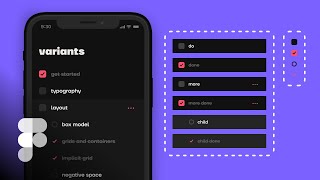
Matt D. Smith walks through creating and organizing component variants in Figma. He uses practical examples like to-do list items and toggle switches to show how variants let you manage different states and styles of the same component in one place.
Foreign. Hey, what's going on? MDs here? And in this video we're going to take a look at figma component variants, variants, how to create them, how to use them, and how to make it more approachable because it can be a little bit confusing at first. So let's just dive straight in. So we're looking at a simple to do list screen that I've designed with a collapsed view and and an expanded view based on different versions of these components. And it's all created with this one to do component here with all of these different variants. Now, a couple of features of this particular component. We have a type for default and child, and then we have two switches, one done and one for more. So if we open up our panels and we select this actual component, you can see our more toggle is going between this one and this one. And our done toggle is going between here and here and here and here and here and here, depending on which one is selected. So we can change it to child and do lots of quick little fun stuff to change all of these variants. But this can be a little bit difficult to understand when I'm. Okay, apparently my autofocus wasn't working there. I was just saying that it can be difficult to understand going through someone else's example. So we're going to take a look at another screen and just put it all together. So I'm going to click on building blocks here and we have our same screen just without all of the component stuff going on. So you can see I've got a simple frame here. It's got a background shape, a label, and a little rectangle for a checkbox. All right, so the first thing I'm going to do is grab this checkbox and you can see that variant is not an option here because it's not a component. So I'm going to hit command option K to turn that into a component. All of a sudden I have variants as a possibility. So. So I'm going to go ahead and just hit the plus button there to kick off our variant endeavor. So now that I've got this created as a variant, you can see it's named default and variant two. I'm just going to ignore what's happened so far and I'm going to work on the visual differences between these two. So let's go ahead and sample our color for the selected state and pop in the check mark as well. So now I have the actual visual differences that I'm after with this checkbox. The first thing we're going to look at is how to create a little toggle switch. When I pull this over, this is a variant and I can currently choose between default and variant 2. This is the perfect example for when to create a little switch. So what I'm going to do is go over here and I'm going to call this done. And then I'm going to call this one no, just by clicking on this input field over here, I'm gonna call this one yes. So now this instance of the component variant turns into a magical little done toggle switch. Now, there's two different types of variants. There's just one with a drop down and you have multiple selections. Or there can be a toggle switch which is a boolean binary on off state. You can name the states on off. You can name them true, false, you can name them yes and no. Any three of those will work to create a switch like this. You can see that if I went back and I changed this to nah and yes, left that. So now, now all of a sudden it's back into a drop down, which is useful, but in this particular context it's much more useful to have no and yes as a toggle switch. It's just very nice and easy. And again, we can call this right here whatever we want to by going back to the frame here and then double clicking right there. And we could say selected, selected on off. But since we're using a to do list, we'll call this done and leave it at that. And this is one thing that I like to do. I like to have an instance of the variant outside of the variant control panel, just so I can click it and kind of test it as I'm building it. So now we're going to add two more of these. I'm just going to click this one here and hit Command D twice to create two more variants. I want this little circle inside of this area. Get that in place, delete. And I want this checkbox inside of this one. Now let me just delete that background. All right, so there we go. But you can see that this has created some odd naming over here. Again, I'm just going to ignore all of this. What I really want to do is click the variant component name up here. That way it gives me access to all these variants. So I don't want anything to mess with my on off state. I don't want additional names in my on off state. So this one is going to be off and this one is going to be on. Now I can go Back to my variant to test this. You can see that I have the little thing that's telling me there's something wrong. This is still going to work to some degree, but you can see that now it's not going to the correct one. So this is where we're going to introduce a new property to our variants because we're going to have. This is going to be our regular checkbox stuff here and this is going to be our kind of child checkbox stuff down here. And this is going to be our dropdown. So what I'm going to do is go back here, I'm going to add a new property and I'm going to call this type. And now the fact that I've added this as a type, I can click on individual children of this variant group and you can see that type is just set to default. That's going to be the first name. So I want this to be rectangle. This one is also going to be rectangle. And you can also choose two of these at the same time and name it Circle. But maybe this is weird, maybe because there's not a circle here, maybe that doesn't make sense. And maybe because we have this kind of parent child relationship, maybe it makes sense to call this parent and child checkboxes instead of rectangle and circle. Maybe that makes a little more sense. So now that I've changed the type, that's going to create a drop down child and parent. So you can see now if I toggle between child and parent and the done toggle is on, it's basically going back and forth between these two because those properties line up. I think that type should be above done in the panel here. This feels a little bit odd having this attribute above the actual category. I feel like this is more important. So what I'm going to do is go back to this and just hover and grab these tiny little handlebars and I can rearrange the order of this content. So now the category is on top and the toggle switch is down below. So child and parent. But what if I wanted parent to come first instead of child? I can just go in here and rearrange these. That way parent comes first and then child. So, so that's just like an easy way to kind of set up this panel. So everything that you set up in this area, everything inside of the variant list is going to be controlled by clicking on the name and fiddling with all this stuff. Adding new properties. If you add a new variant, it's going to Change things up. So this is kind of a simple example of both a dropdown and a toggle. Let's delete this stuff because we don't need it anymore and let's move on to our bigger to DOS right here. So inside of this frame we're basically going to do the exact same thing. Alright, so if we look in our layers panel, you can see I've got this background shape, this label here, and this kind of placeholder rectangle which I'm now going to replace with this one. So I'll just delete that out and I'm going to click and drag while holding option to place an instance of this component inside of this frame. So now I have access to change this however I want to. And remember, when it's not a component you cannot create variants. So the first thing we're going to do is hit command option K to turn this into an actual component. Second thing we're going to do is add a variant. So now we have our todo component with variants. Now again, like I like to pull this out so I can have one to test. This is an instance instead of the main component. And you can see now same thing happened. I've got a drop down with default and variant 2. So now let's get in here and do the same thing we did to this. Only now instead of actually needing to go in here and redesign it, I can select this nested component and I'm just going to call this done. And so now that that's changed, I just need to update the variance and how everything is working. So I'm going to call this the same thing I did the checkbox and this is going to be done no and done yes. And again we've created a simple little toggle switch which is great, but we also need a more category. So if we have more to do's associated with this main to do we want the kind of child option with this different checkbox style that's slightly indented to show ownership. So what I'm going to do is grab this command D and I'm going to option drag this over here just to create a little dot dot dot by hitting option eight three times. And I'm going to change the color of this kind of put it over here on the right a little. There we go. So this is going to indicate that more are available and I'm not going to worry yet about fixing the variant names I did want to show. Yes and no, it's still there, it just is not a toggle switch anymore because now this has turned into done three which is not ideal, but it has to turn into some kind of name. We'll go back after the fact and fix this. So this one's going to be more. And now you'll see I need to create the two child versions of this as well as well as more. Done. Let's go back over to building blocks. Hit command D on that again. Make that checkbox done. Another thing I'm going to do for both of these is just add a little bit of a gray color and I'm going to change the style, the decoration to a strikethrough just for a little bit more clarification. So now we've got done and then more. And now I'll create the children here. So I'm going to select this one here, Command D and we're going to indent these. I want this to be kind of like right in line with the left edge of this text. So I'm going to do 64. I'm just holding option to pull up the measurements there and I'll put that 64 from the edge. And now we've already created these, which is very handy. So now I can go in and just change this component to a child. I'm going to remove this more thing and so now we have our child instance right here and I'm going to CMD D again and change this one to done. And then I'm going to copy the same style right here by hitting command option C. Click this command option V. And so that's basically everything we need. So again you'll see that we have all these different variants, all these different property names of the variants and we need to clean this up a bit because it's not really going to be that usable like this. So I'm going to introduce a new category, a new property. I'm going to go to the to do name right here and I'm going to create a new property and I'm going to call it type. Now that we've done that, when we click on an individual instance, you can see now the type is available and we can start editing the value of each one of these types. I'm going to select these two and I'm going to go done is off. And then these two done is on. So now that's going to turn this back into oh, I did yes and no. So you have to actually be consistent with with your labels or it will turn into a drop down. So let's go back and Say yes and no or true or false or off and on. These are all going to be no, they're not done. And these are all going to be yes, they are done. Now our toggle is back, but you can see it's going back and forth between this one and this one because it still doesn't know what to do because we haven't added that type yet. So this type of is going to be default. This type we're going to do more, and this type we're going to do child. Now we have the done for default. We go to child and the done is working properly. And we go to more and the done is working properly. I still don't like the organization of this just yet. I also don't like that child is before default. I can. I kind of want to change that up. So I'm going to go back to this name and I want type to be on top and I want default to be first and I want more to be second. So I'm just going to rearrange that and now I'll just test it here. Default. Done, not done. More child. And that's working now. Now, another thing that we can do here. More is technically not another type. It's really a default style with just. It has more. It is definitely a Boolean statement. So this is where variants can be tricky. It's not that they're confusing on their own, but they expose the complexities of naming things early on and it might be difficult, but this is probably a good thing. So if you're working with a development team on this, this would be a great time to pause what you're doing. DM someone get a conversation going about how this stuff should be named. Do we want this to be a type? Do we want it to be a Boolean value? What makes the most sense here? Because we could very easily call this default and then we could create a new property that says more. And this one is let's actually all of these. Let's turn more as no, and then these two are more. Yes. So now instead of more being a type, we just have default and child and more is a switch. You turn it on and off. Now, it doesn't really change how you design these variants, but it does change how you use the variants later on, how you want to use it. It's really up to you. Do you want it to be a boolean value or do you want it to be more of a category type? This can have drawbacks because if you have. If you have the Child selected. There's not a more version of the child, so that can be a little bit confusing. So maybe category types. If I go back and undo everything that I just did, maybe having more as its own category type makes sense. For this particular example, I'm just going to copy these screens into my building block screen for reference for how many I need to put in. Now I'm going to just copy by option dragging over into here. We've got 1, 2, 3, 4, 5. So I'm going to grab this option drag and then hit command D. And now, oops, these got a little bit misaligned, so let's put them back in place. This one is going to be done and this one is going to be more. And now I can go ahead, change the names of each one of these for a little bit more actual content context. All right, so let's copy these over here and let's move color and style down and we'll do 1, 2, 3, 4, 5 more. 1, 2, 3, 4,. Just tidy this up. All of these right in here are going to be child and just to show the differences, we're going to click on three of these to do. Done. And quickly rename this stuff just so it has a better feel. Delete these and there you go. We've done it. We've got all of this created with just this single component made with a bunch of different variants. Alright, that's it for Figma variants. I hope you found this helpful and if you have any questions, please let me know in the comments below. If you want to see more content like this, feel free to subscribe or head over to Shift Nudge on Twitter, where I'm posting just about every other day. Some kind of interface design tips and tricks and critiques from the Shift Nudge interface design course. Thanks so much for watching and I'll see you in the next video. SA.