Design with me (Polishing a mobile ecom page)
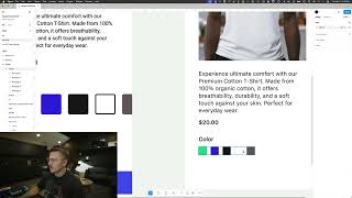
A designer walks through refining a mobile ecommerce page, adjusting buttons, color swatches, typography, and spacing to improve how it looks and works. Watch the specific choices that make a product page feel polished.
Okay, we're looking at some alignment homework from the layout module in the shift nudge course. And what I want to do is I want to recreate this over here on the right simply because I think there's, this is a great start but there's just a few little tweaks that we can make to, to make this a little better. So I like to start off by designing for the phone in my pocket because it's easiest to actually see and to layout. I've got the iPhone 16 Pro, so that's what I'm gonna, that's what I'm going to use here. And one of the first things that I always like to do is grab. One of the first things that I always like to do is especially when I'm designing for mobile, I like to go ahead and put in this status bar just to make sure that. Let me get it in the frame just to make sure that this actually, you know, it starts to feel a little bit like an actual device. Notice how on this one the status bar doesn't exist and it's kind of throwing things off a little bit like you got this arrow. It's probably a mobile site like you kind of infer that that's what it's gonna be. Alright, so we're gonna say premium cotton T shirt and I'm just going to, I'm going to hold command to just kind of steal the, this photo out of, out of here. And it's always a good idea to use square images in your e commerce photos. It's not that you couldn't use something else but square is going to be the most versatile product image. Alright so I want this to be 40 pixels from the edge. So we're going to go. I'm just, I'm starting off with 40 because that's what it looks like they have here. And then to make my life easier, I'm going to use this SF symbols app and I'm going to type in arrow, arrow left. So I'm going to hit command C and I'm going to paste that arrow there. There's a number of ways you can snag this text and I'm going to use ChatGPT. Give me this text. That way I can just copy and paste it. And if you want to get fancy you can say in a markdown block and that will give you the same thing. But with this little copy pieces in place and because I'm running out of space a little, I'm going to move that off for now. These feel like they're maybe a little large. I think 20, 24 is a decent starting point. I mean, you could definitely go 32. Really. I mean, you can do any size you want, but there's not necessarily anything that says we can't do. Alright. And here's something interesting to think about. When you have this white selection and let's just say it's not selected, you know, like you cannot see it. So one thing you can do is add a stroke, add like a 10% stroke on the inside of these colors. And that way it gives you just that little border that can kind of separate all of these. We can put these in an auto layout to kind of give us a little more control over the spacing. We can play around with that and then we can come back in. Maybe, you know, the active one has. But you know, based on this color over here, you're also gonna. If that is the selected state, that's actually not gonna work for the black color here. You know, if we put that at 100 and we put this one back at 10%, you can tell, you can't tell which one's selected. So this is, this is a good time to use a component. I'm always for not using components until it makes sense for your project. Because if you use too many components too much auto layout too early, it can constrain your creativity. But in this case it's going to enhance my creativity and it's going to be. Make me more efficient. So I am going to, I'm gonna make this little color swatch into a component. But before I do that, I want to duplicate this a little bit. And because of what I want is an, I want an external selection and I'm gonna put that on the center here. So they've got a little bit of a rounded rectangle on theirs. So let's say if we do eight here and we do four here, that looks like a pretty good target. So that could be a hundred, maybe less. Maybe we do six and two. I don't know. For some reason that's. Or, you know, the other option is to go with the rounded circle. I actually kind of like that, especially because it contrasts the shape of the button. I'm always trying to be very conscientious of. Does the color conflict with the button? Does the shape conflict with the primary. Not the button, but the primary call to action. We want the primary call to action. We want it to have a unique color, we want it to have a unique shape. We want it to have, you know, an Unmistakable. Undeniable clickability. And even, even though this might be a shirt color, you know, let's just say that it's a slightly different shirt color just simply because if that's gonna be the color of the button and also it might be worth looking at, maybe the gray scales are first and then you get into the colors and maybe we actually use the white as the first one. Thinking I can go a little bit larger with this selection and possibly a little bit thicker with the selected. Okay, so now that I've got this, this is going to be my color, this is going to be my. We'll just call it selected and I'm going to select both of these and hit command option K and I'm going to name this color swatch. We can always rename these later. I like to drag my main components off the canvas so we have them on their own. And I don't really want this stroke to go outside of the bounds, but because this is set to center, it's going to do that. So I'm just going to hold option and CMD and shift and I'm going to just stretch it out. The other option instead of doing that is to put this back on the inside and that's, that's perfectly fine as well. It just depends on how this is implemented. It's not. It truly doesn't matter that much at this point. I mean it will matter eventually if you want to get really, really particular. Alright, so now what we're going to do is add a variant. Actually we don't even need a variant. We're going to add a boolean. And we're going to say selected. There's a two step process when you add these, you need to create it and then you see how it says not used within the component. We now have to assign it. So we've created it, now we need to assign it and we're gonna. I'm gonna choose this selected background piece that I've already got here. I'm gonna hit this little icon Apply variable or property and I need to choose which one. I'm gonna choose that one. So now if I grab this entire swatch by option, dragging it over. Now when I toggle this on or off, the boolean property is simply true or false and it really refers to the visibility of the layer. So I can turn that off. And now I can option drag. Command D Command D Command D. And now I can just grab these colors and update them. And now with a simple click, I can toggle any of these to be selected or not. And it's also really helpful because you can see, you know, does it make sense for the individual colors? I can tell, you know, like I said earlier, this selected mechanism is not going to work for the color, for the darker color. So it's good to go ahead and think about that selected state before you start laying it out too much because you want to leave room for the selected options. So I'm going to put all of these in a auto layout frame and call it selection. Or I could just call it color, doesn't really matter. And I'm going to move these and I'm going to put these right here. And what's cool about this too is now, I mean we could theoretically, you know, we can still play around with spacing these out. We can also play around with what if we made this 20 pixels instead of 20? And sometimes the, the sizing is gonna be really hard to figure out unless you're mirror mirroring it to your phone. I do think 24 is a pretty good size and maybe, maybe we need to go ever so slightly larger with the color swatch container. And this is something you really could just continue tweaking and tweaking. 48 might even be a good size. It's never going to hurt to do multiple options of something. And especially if we end up using 48 pixels for the height of the add to cart button. 48 would be also just a really good consistent touch target size. So 48 for each of these colors. 48 for the add to cart button. That's also something to consider while we are, you know, playing around with this. So actually temporarily, let's just move that over there. Let's move this up and let's work on this add to cart button. I am going to very consciously line up the left edge of all of these and make sure this goes to 40 all the way there. And you can see our Height is currently 42. But if we add a little bit more padding here, then we can get it up to 48. And I don't love putting 13 pixels of top and bottom spacing there. So what you can also do instead of changing that right out of the gate is we can go to the text and we can set that to 100%. And you can see that as, let me just add a background color here. So as I change the line height here, you can see that this is going to also increase the size of the button. So I like to, I like to start off at 100% line height. Especially for UI pieces, because that gives you the most minimum amount of spacing and that way you can control everything more kind of, kind of at the component level. And you can see I can't quite get it to 48 by using this even 16. So you could, you can try to get in here maybe if we Change that to 97. Changing this to 97 does give us an even 48 right here. And it may seem like this is getting way too deep into the weeds, but really, I mean, all we're after is this consistent touch target. This is just good interaction design where you've got 48 pixels of touch target interaction there. We've got 48 pixels of touch target interaction there. So we're giving our fingers ample amount of space to tap each one of these items. Even these right here are actually 48 pixels tall and 48 pixels wide. So each one has like a really nice touch target that matches up with all of this. And so if we are obsessive about these increments at this fundamental level, it's going to make everything work out much better as we continue to build on top of it and build on top of it over and over. Alright, so I've got those in place and these still feel ever so slightly small, but I'm not going to change it just yet because I don't want to make any big decisions before looking at it on my phone. And also I'm not a huge fan of going full left to right bleed with the call to action button. Sometimes it can make it feel like a design element and not having the space around sort of takes away from the button quality. Not always there is, there is time where you could use a big button and maybe it's, it's a specific kind of style and everything's flat and connected. And in those cases it might make sense, but in this case I'm not so sure that it adds anything to the overall. It doesn't look like there's such a strong theme and a strong style to where it makes sense to use this. So I am going to just leave it with the padding all around. All right, so let's get, let's get this a little tighter right there. We could even add another color if we wanted to, just for the heck of it. All right, so now we're going to add quantity. Now if we use a drop down, that's going to activate a little popover, which is not necessarily a bad thing. But if we're just going like 1, 2, 3, 4, 5 or 1 3, 2, 1. We could use a little stepper as well. So I'm actually going to just steal my add to cart button here and I'm going to do one and I'm going to. I'm going to go back to actually, let's do. Let's do this. The reason I'm grabbing these, it's just quicker. They're already sized and I want to make sure that I keep that 48 pixels of height of interactivity. So I'm going to quickly open this up. We're going to grab a plus sign. Actually, I should put it on the right and then we'll grab the minus. I'm all for using custom icons, but in the interest of time for this video, and these are already, like, perfectly designed, there's really no benefit in going with some ultra custom plus and minus icon. So I'm going to go in here and change the corner radius on the top left and the bottom left. And then also here on the top right and bottom right. And now I'm going to make the color change, make this white. And then we'll do a stroke on the. We're going to do. If I do center, is that going to work for me? If you. If you did it on the inside, you'd have to adjust. Center is going to. Center is going to give you the easiest kind of way to kind of make it just align a little bit more easily. And we could add a little bit of background on these buttons if we wanted to. I'm not. I'm not in love with the way this is looking just yet. I think these could actually be. These could actually sand to be 48 as well and make sure, like, double digits work. I think it's probably unlikely that people are going to buy 10 of the same T shirt, but you never know. You want to account for these. What if they bought 100? And this also kind of taps into. Do you allow someone to buy 150? Is there a stock? Is there a certain number in stock? So if that. If they're going to do 100, we might want to go slightly larger. And we could do 48 times two. That feels maybe a little bit excessive. 48 times 1.5, that feels pretty good. And now that I'm putting all of these pieces together, these swatches feel a little small. But what's cool is I can get in here and I can just. I can make these a little bit larger, maybe even add a. Now I also want to make sure that I use the same exact stroke for the stroke width for a lot of these unless it's very consciously different. So like one could be more of a border, this one maybe could be even a little bit more present. And if we really wanted to, we could use the same selection color. I'm kind of like torn as to how big to make these. I'm just going to go ahead and put this in a frame quantity. Alright. So I've tried to like fine tune this stuff down here. Now another thing that I like to do to grab out of an iOS kit is going to be the home indicator. A lot of people overlook this and don't put it in their files and it's pretty important that you have it. All I need to do is just find a screen that actually has it. Come on, where are you? There we go. This little guy home indicator. I'm going to add this to my little component section. There's just a few that I like to use. So let's go ahead and add this to the bottom just so we know. You know, that looks like they are leaving enough room for that. But you can tell that it might end up looking a little bit strange if it's not quite in the right place. Now one thing we could do is put all these into an auto layout so we could play around with. We could also do it from the bottom so they go add the constraints to the bottom so that when we adjust this they go up potentially. The, the quantity section here still feels maybe a little too large compared to the, to the button. I do like the way that they have this button larger and right now these feel somewhat unbalanced. But I'm not gonna, I'm not gonna worry about that too much. And the other thing we could do is potentially just swipe. Not swipe, but change the position of these. Whoops. Not mean to do that. Let me turn this little app off. Come on. Why is it doing that? All I'm trying to do is make this right aligned and then we can stick this back in here and we, you know, if we wanted to truncate the text and we could potentially add like a little more section, etc. Alright, so I haven't really fully started fine tuning and tweaking the style and everything, but you can kind of tell like right out of the gate. I have just tried to intentionally add some sizing for all of these interactive items and I've also just started with one font size just as a base and then we can build off of that. Might even bring, bring that in there. Now if we Wanted to. We could also put. We could start putting all of this stuff into an auto layout container so that we could also play around with that. But again, sometimes that can. That can be a little bit too constrictive. And so I'm not sure that I want to do that just yet. Maybe I'll put some of these individual pieces in. So now I've got my text here, I've got my. Let's just call these. They're not really components selections. And then we've got our image. Just going to tidy up these layers. Got our title here. Now what we could do is we can put 1, 2, 3, auto layout. I mean, the image isn't technically auto layout, but we can select all of this, these three pieces, put it all in auto layout and looks like we definitely going to want a little bit of extra spacing. And another thing we can do is go ahead and like stretch this fully to the edges here and then we can add in our own numerical version of like this is where we had it at 40, but now that it's like fully stretched out, we can play around with what does it look like when it's like full width versus 40? You know, we can kind of play around with that. And the reason I like to do that is because a lot of times you might just need to make several copies of this and be like, okay, this one's at 20, this one's going to be at 16. This is what it looks like when it's 24. This one is 48. Even I don't know that that actually worked out too well. The 48 one, let's put it back on 40, but it starts to give you an idea of how this stuff can all work together. You can definitely do this manually as well. But the problem with all of these auto layout, if we remove the auto layout, it makes it just a little bit easier. Like, what if we wanted to do something where this image was all the way at the top? So here's what we need. We need to change these to fill container. Actually let's make this one hug, this one fill and then just do like auto there or 12, I'm not sure. Now we could play around with potentially going larger here. Obviously we need to change the line height. This stuff's no longer in auto layout, so it's not pumping, pushing everything down. And we would want, we would. At the very least we would want this to line up with the. The baseline there. And an easy way to do that is go ahead and wrap this $20 in. And it's its own auto layout and then start adding some top padding. Or we could just simply change the line height here and we could just bump it up until it got down there. But 300% of line height just feels excessive. And you wouldn't normally code something where it had like 300% line height. It's gonna be a lot more standard to use like padding on the individual component. But also, I just remembered you can get in here and change this to align text to the baseline and that's actually gonna be the easiest way to do it. So just go ahead and open up your details here. Align text to baseline, and you can just tell how much better that looks. Instead of having this 20 up here, anytime you can align baseline, it's just going to be so much tighter and it's going to feel a lot better. Let's see if we can get this back down. So I'm actually going to go back to 17 and let's just see if we could play around with tweaking these things a little bit. Maybe we give a little more space. Give a little bit more. If we give a little more negative space on the top and bottom of this title, even though it's the same size, but it's bold, it'll stand out a little bit more. And then we can push this back up a little. We got 16 there, we got 20 there. Now what I'm doing here with this arrow on top of this photo, it's not necessarily always going to work, especially with the photo that you're using. But I just wanted to kind of do this to show you, you know, like, what is possible with when you're playing around with the margins. And it's not the end of the world. If you have so much stuff that it pushes. If it pushes down the add to cart button, that's fine. You can still scroll and get to it. But I just kind of want to show. Let's go ahead and put that in auto layout and also let's do that. So let's do 24 there, maybe even 32. And we can start slowly experimenting with what might feel a little bit better. We could go regular semi bold. I'm just messing around here. So anyway, I think that is possibly like a great place to start when you're unsure of your layout is. The main thing that I did on this particular layout here was just tried to make the button and the quantity and the color have like an equal touch target. I still think that there's possibly room to there's definitely room to make this more styled. I just kind of did a standard default look for the purposes of this video. But this will give you like a great starting point. So if we want to start playing around, these are fixed and then we can grab this thing. We could make it fully wide here. That does not feel right, but at least we have the options to kind of start to messing around with that. We could even remove the gray. Maybe that makes it feel better. We could remove the stroke off the middle. Those could be buttons on each side there. And this might actually even need to be somewhat disabled because you can't really. You can't really have less than 1. So the minus button doesn't necessarily make as much sense there. So anyway, I think there are other things we could also do. Like we could go to 15 here and go like all caps. These could even potentially drop down to like 13 or so. So there's some things we can do. So just simply changing the style of these headers for the components, you can tell just looking between these two, you know, 1, 2, 3, 4, they're all the same, which is a great starting point. But this can. Changing the lower important items just naturally elevates the hierarchy of these two things. Possibly even tie the $20 to the color of the cart as one potential option. I. There's probably, you know, there's something to be said for a title above the image and you can definitely do that. I just chose to put it below. But there's a lot of things you could do with this. You could start playing around with extra, extra typography, different styles. But I just wanted to show how a couple of like very intentional decisions about the spacing and the sizing of all of the elements can help with the overall layout in general. Because right now it doesn't feel like there's as much consideration for the size of these compared to the size of that compared to the size of the add to cart button. Not that it. It doesn't have to be equal. That's definitely not what I'm saying. But if it's not equal, I want you to make sure that you've made a very strategic and intentional decision about the size. And there's a lot that I like about this. I like how big this button is, I like how big these swatches are. This could be a very cool layout compared to the one I made. And maybe the buttons do get larger, but sometimes that points to the overall direction of the brand and how you're trying to make everything feel versus what needs to happen. These are kind of just the bare bones things to consider when you're aligning things and you're working on layout within some sort of like, integration of typography and interactive components add to cart buttons. So hopefully you found this helpful. And thank you so much for watching this very long video.