Designing a New OS for a Minimalist Phone – Siempo
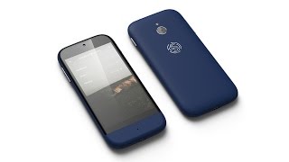
Matt D. Smith designed the OS and interface for Siempo, a phone built to reduce distractions. The system prioritizes intentional use over constant engagement, with custom interactions and animations that discourage mindless scrolling.
All right. I've been excited to make this video and to reveal this project for the last year, and I really wanted to show what it was, but I couldn't because it was kind of under the radar. They were trying to get their material together to launch a big Kickstarter. But today is that day. The Kickstarter has launched. There's a new phone called Siempo. And if you're watching today, March 14, 2017, you have today and 34 days to go to back this phone. I just backed it this morning. You can get it for like 280 bucks if you're in the US but this phone is. It's like a new phone for distraction, free living, so to speak. You can check it out on Kickstarter. I'll put the link below. But essentially it's. It's smart technology reimagined for a less distracted life. And about a year ago, Matthew Smith, AKA Whale, from Greenville, South Carolina, reached out to me and invited me to join him in a workshop with Andreas and Jorge, the two founders of this phone. And my job after the workshop was to come up with a new concept for this operating system for. For just a very focused user interface and just try to be different than what is out there. And so I spent the next two or three weeks coming up with some information architecture, some IA design and some interaction models and some UI and some animation. So anyway, I just wanted to share some of that. Now that the cat is finally out of the bag, I want to show you what it was because I, you know, been wanting to show this thing off. So we started off with the. During the workshop, we started off with this idea of the single field input. This one input, almost like a spotlight search, where if you typed in, you know, something on your spotlight, you're getting all these automatic suggestions. You know, nothing very like new and novel with that idea, but just kind of trying to apply that to a phone and make it. It's like it's all about. Only you have to be very intentional with what you want. But we wanted it to be easy so you don't have to type every single thing. Anyway, I started off with this big content map just to try to figure out all the main features like calls, text messages, contacts, status, lock screen, just all the different pieces that would go underneath each one of those categories and try to map out. All of these things are related. And a lot of these things with the red dots were to be done from the home screen. So we wanted there to be a way where we could do all these actions from the home screen. Similar to another existing phones, but in a way that just felt like you have to be intentional with it. You weren't going to get. There was not going to be Facebook or Twitter to get lost and not even these red pulsing notifications. So one of the first things I did was design a new keyboard. So thinking through different ways to display some of that, and had this single field inputs where you could hit the AT symbol and mention someone's name. And then if you were on the home screen, you just basically had like this simple list of actions and these things that you could tap on. And then where the kind of single field input came from. I had this idea where you could, you know, there would really just be one view and the view would kind of change as you entered stuff into the input field. So similar to Pinterest, if I wanted to type in shoes and hit return, you know, there's a little pill with shoes, and now I can say I can type in Nike. And so there's two different little pills and everything below that is ideally going to be Nike shoes. So that was kind of the idea that we would turn that model into the phone interaction model. So if I typed, if I tapped the text button, I would get all these recent contacts, and if I tapped a contact's name, then I would get to. I could either choose their home number or their mobile number, depending on, you know, what I had saved. Then I could add more contacts For a group text, if you entered in a number, you could get the option to text that number, call that number, or save that number as a contact. So just thinking through all the different actions that could be associated with certain pieces of information entered into the field. Let's see, there's another one where, okay, say that I'm entering in some words. I might want to text that information, or I might want to pick someone's name, or I might want to add a note about someone. So lots of different interaction models for the action that you were, you know, trying to go for. If you were trying to write a note, send a text, make a call, enter a contact. And then from there we went into some of the UI and I did lots of exploration with black and white. We were thinking about doing E Ink displays, but that ended up being like, the refresh rate on some of those hardware devices is not very fast, so it wouldn't feel like a very fast phone. So we thought, well, maybe we could be inspired by the E Ink and use more of a muted color palette and So I brought in some old school texture, kind of like a 1%, 2% noise on some of these backgrounds and kind of designed these custom icons, came up with a light mode here where you're, you know, really, really similar to the wireframes. And then decided, you know, it might be cool to show a dark mode. Maybe there's, maybe you could change keyboards here at the bottom. Just some different concepts. So I designed these darker screens and decided to use these for the initial animations. And the idea was to show going through the interaction models and how this could work and then also showing flow mode where you could kind of essentially go into do not disturb mode and hit a button, a hard button on the side where you could activate a do not disturb for 15 minutes or 30 minutes to, depending on how many times you hit it. And so I'll show you some of those. So this is, I built these in Adobe Flash or Adobe Animate rather, and exported these as MOVs. So here we have, we're tapping the input field, typing in Jessica's name, selecting her, selecting her mobile number, deciding to text her. And now we have the message field, so we can start typing. The send button appears right away. As we start typing, they're typing back and we decide to send another message. They hit send. And then I wanted to show too, like, now that Jessica and text are activated, you can hit the X at the top, right, to make those go out and kind of go back to that kind of home view. So it's kind of like one view the entire time, but as you start typing, it changes based on those pills that are activated. The other animation was showing what the other person's phone would look like if they were going into that flow mode. So they have a text and they said, hey, I just finished my chapter. I'm going to go into flow mode. And so they're going to hit this hard button up here to activate the timer. And the concept here was that you could, you know, hit it, you know, four times for up to an hour of non, you know, kind of do not disturb mode. And it would slowly basically give you no access to the phone unless you forced it through. And it would show you the timer is going to stop at 4pm and so this is just slowly showing a progression of time. This didn't quite make it into what they're shipping now, but it was still kind of the idea that it was still all based on this input. So even the input there was actually part of the timer. And then afterwards you can see like, oh, you actually got a text. So this is a notification. You know, do you want to reply or dismiss? Anyway, some fun stuff. It was a lot of fun to work on a lot of new challenges for this phone. You know, they definitely changed it a lot since I was involved, but it was good to see a lot of these initial concepts that I came up with make it through into the product. But that's all I want to show you. You should go to Kickstarter and check it out. Cmpo, the Phone for Humans. I'll put a link to the Kickstarter in the description below. If you like this video, give it a big thumbs up for me. If you want to see more case studies stuff like this, let me know. And you know, if you haven't subscribed yet, make sure you hit that button down there. I got a new lens. It's a little bit wider of an angle, so let me know if you think this is too wide. This is 10 millimeter, this is 18 millimeter. This is closer to what I used to shoot on 18. Or do you like 10? 18 or 10? 18 feels a little bit too. I'll look at my face for the whole video. 18 or 10. Also, I've got a pretty fun video coming up that has to do with a thousand birthday cake candles. You're going to want to make sure you hit subscribe so you can see that video coming up in a few days. Until next time, peace out.










