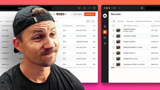
A design review on displaying massive data tables with 100+ columns, using car records as an example. The core strategy: tailor what users see based what they actually need to decide, instead of showing everything at once.
What is going on? All right, we're back with another design review. And this one I have Syed's. What is this? He says this is a. He's looking for a better way to present information that has more than 100 columns. He clipped the frame and then there was a horizontal scroll. So I'm in his FIGMA file here. And it looks like it's some sort of like car record situation. These are all like different car types. And if you go down here, we have this gigantic table of car picture, name, registration number, status, color, mileage, purchase from auction house owned by envelope all the way down, just tons of stuff. And all of it, no doubt, is important information. But he's specifically asking, is there a better way to display it? Yes, there is a better way to display this. And it ultimately comes down to knowing who is viewing your content. So this doesn't necessarily scream, I am a car buyer and I'm looking for a car type of situation. So I don't have. I don't really have any context for what this is. I'm assuming it's for like the back end dealer network, possibly. And so what I would do on something like this before I was worried about too much else. I would look at who am I designing for. Like, what person is going to be looking at this and why are they looking at it? And when they are looking at it, what information are they using to make decisions about how to proceed from where they are currently and where they want to go? So we're looking at point A and point B for that specific type of person. And we want to know that full timeline of like, okay, this is a car purchaser who's logging in and they're trying to find a car. Is it specific mileage? Is it specific price? Are there a number of things? Instead of just showing every piece of information available, which is when there's, when there's this much information, it's almost never a good idea to show every piece of information. So even clipping it here is a good idea. And then I'm assuming if you, if you click purchase receiving maintenance, you have a little typo there and maintenance cost expense. I am assuming that when you click on these, that that would show different types of information. Like if I'm purchasing, I click purchase, and then it filters all these forms. If that's what's happening, then that is a pretty solid design decision. And because overall, I mean, this layout looks pretty decent. You could, you could consider not necessarily putting every single column in this view. Maybe there, maybe that does exist in the database, but maybe there are dynamic views in that lift out only those key pieces of information. So if a person is purchasing a vehicle on the back end in the dealer network, we just need to talk to the purchaser and say like, hey, what type of information are you using when you go into this type of situation? Like what are you looking for? What are the, what are the 10 to 12 different types of information? Like what can you safely ignore and what is critical and what is like nice to have. And then it kind of gives you a priority over what information to display and what information to, to not display. So even if there is a purchaser, instead of just landing on all I would look at, okay, what are the three most important types of people viewing this content? Maybe there's some sort of pre setup where they are filtering. You know, maybe there's a questionnaire or some wizard that walks you through. You know, I'm viewing this information to do X, Y, Z and maybe there's some sort of pre screened information gathering process that we can use to, to ultimately get this information condensed into a format that a decision maker can use. Otherwise it's just going to be completely overwhelming and almost no one is going to want to view this information in this way. And then just keep scrolling and scrolling and scrolling and scrolling and scrolling. I think depending on the context, different pieces of this information would be valuable. But overall there's, there's not really a great way to condense all this information unless you have a really good idea of who is using it and why they're using it. And only then will you be able to create better views around this type of material. So kind of a quick one here. You can check out the link in the description if you want to get your own design reviewed. Let me know what you think in the comments down below. I appreciate all the feedback and I will see you in the next one.