Designing for the iPhone X – First Look
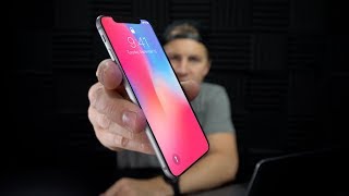
A designer walks through building apps for iPhone X, covering the notch, new screen dimensions, edge protection, and Apple's Human Interface Guidelines. Practical advice for adapting to the device's unusual shape.
Here it is, ladies and gentlemen, the iPhone x. This is iPhone x. Just kidding. This is iPhone 6. And I just made up an image. The iPhone x is here and it's got designers in a little bit of a frenzy with the notch situation up top. What are you gonna do with that notch? The more I look at it, the cooler I think the notch looks like. It just has a unique look. It's interesting. There's a lot you can do with it. And I'm going to view it as a constraint to design in and to be creative with, and I urge you to do the same instead of dismissing it and writing it off altogether. It's another variable at play. It's another constraint. Anyway, this is not a video about the notch. There's three things that I want to show you as it relates to designing for the iPhone x. I keep saying iPhone x. I hope I didn't say that earlier. Oh, my gosh. Did I say iPhone X? IPhone 10, iPhone X. There's three resources that are going to help you get started quickly. Designing iPhone x apps links to all the stuff down below. So first up, designing for the iPhone x. I'm just going to skim through some of this.
Blah, blah, blah. 812 point height is 145 points taller than a 4.7-inch display.
This is the standard that we've all been designing for for the iPhone 6 and the iPhone 7 kind of the standard sizes. That's typically like the go to 1x display size. And now if you look at the iPhone x, it's the same width, but we have 145 extra pixels to play with. The notch impedes that by a small amount. So we were gaining 145 pixels and then the notch is taking away a little bit. So for that reason alone, I'm not too worried about the notch, and I don't think that you should be either. Yet. Custom layouts. This one is going to wrinkle some designer's feathers, I can already tell.
Your app or game should always fill the display that it runs on. Placing black bars at the top or bottom of the screen makes your app feel small, cramped and inconsistent with other apps on iPhone x.
Saying that apps feel small and cramped, that's a little bit of stretch in terms of providing a standard or a reason. I mean, it's saying that it's inconsistent with a lot of the other apps. Now, that is something you can't deny. If every app on the iPhone 10 is going to have this notch and yours doesn't, it's got this little curve at the top or you've cut it with a black bar, yours is going to seem different. It might seem weird, you might think of a way that makes it better, and I'm sure that some of you are going to do that. As designers, I think we should push the boundaries and explore where can we break out of the standard, where do we need to adhere to it. The inconsistency argument is a better one because if the, if the mail app, if the home screen and all these Apple native apps are gonna have the notch and adhere to it and use it and your app doesn't, you're gonna have to do a really good job of making a compelling case, whether it's design or UX or whatever. You know, be careful when you get all gung ho about not doing it the way they're recommending it. I would recommend doing it that way first and getting a feel for it and learning it and then challenging yourself to make it even better. So in previous iPhone versions, the status bar would change height, like if you were doing navigation or if you're on a phone call and you were using another app at the same time. So now this is not changing height. You're, we're getting like a little glowing pill shape behind the time for like if you're in a call or if you're using location services. I think that looks cool and I think that's a good use of the space. It doesn't affect the content below it. It'll be interesting to see how that would work on like navigation, like Google Maps or Apple Maps, like while you're driving. But again, I can't make a harsh judgment until I see it. Okay, edge protection, here we go.
As mentioned earlier, people will access the app switcher and home screen by swiping upward from the bottom edge of the display. In most cases, swipe gestures tend to occur in the center of the display, so this interaction is unlikely to conflict with interactions in your app. However, if your app or game encourages people to swipe along the very bottom of the display, you may want to turn on edge protection for the bottom edge of the display.
Alright, edge protection. I think this is going to be pretty interesting. The whole home indicator, the little bar at the bottom that lets you know you're supposed to swipe. Well, to start off with, they're going to make it really dark, really contrasty. We're going to overlay the content because they're going to want people, they're going to want people to know that you can do that. It looks like they're giving you the ability to put edge protection as true in your coded app. And it's going to make the little bar a little bit more subtle. And it also requires two swipes instead of one to get to those controls.
This will give the indicator a more subtle appearance and change its behavior so that two swipes are required to exit your app.
I can see people abusing this. I think people are going to use this because they want to see less of the bar and it might be slightly annoying. So I would go with a standard way to do it at first and then explore other options once you've adhered to the standards. Because I guarantee you they have tested this, they've designed 20 different versions, Focus groups, user testing sessions. I can't confirm this, but they're Apple, they have tons of people, you know that they've tested this. Just piggyback on the work that they've already done and use the standards instead of creating your own. Right out of the gate, learn where you can maybe flex your creative muscles. That enhances the user experience that doesn't just take away from it.
Right out of the gate, swipe or drag lifts the indicator and enables the control while swiping a second time allows people to exit your app or game. Because edge protection leads to an inconsistent user experience, it should be used only when it's absolutely necessary.
Next up, I want to show you the resources that Apple has provided for you to download. So if you go to this link right here, Apple UI design resources, you can download the Photoshop file, the sketch file and the Adobe XD file. Notice the differences in sizes here. This is crazy. So I've downloaded the sketch in the Adobe XD file. Alright, so this is basically going to give you just a quick look at the way they've set up these components. They've used tons and tons of symbols, which is pretty nice. You can scale these and see how they're working. I think they've done a pretty awesome job in terms of creating this Design system for iOS. A lot of times we'd have to wait for somebody like Jeff Teehan or someone else to put together art and now the Facebook design design team putting out these, all these iOS kits. But now Apple straight out of the gate is doing it and providing them. That's pretty awesome. So I would definitely recommend going and downloading those again. Link in the description below. I would get in there and just start checking it out. They've got all kinds of things in here, lots and Lots of things in here. One thing that I did not like was the fact that they had the display shape here. This kind of the sensor housing and the rounded corners is just a, like a transparent ping overlaid on top of all of the elements. And if you're, if you're designing with that, even if it's in place technically you could lock that layer and you could access everything else down below and you know, that might be fine, but sometimes you might want to take it off. I think that could get kind of annoying. So I went in and drew out the shape from scratch and created a mask. Let me show you that here. I took that screenshot and I went in and I drew this kind of custom shape here. Now it's not just round the corners and that's it, you know, the, the corners round and then they kind of go in a little bit further. So I had to draw these with custom handlebars and all that good stuff. And so now if you want, you can just click on mask here and you can mask it, or you can unmask it really quickly. You can click around and move things around and design with or without it, it'll be out of the way as opposed to the ping overlay. Alright, next up, iOS Human Interface Guidelines. The iOS HIG. If you've never read them before, it's worth scrolling through and reading the design themes, the design principles. A lot of that is, it's slightly fluffy, kind of marketing fluffy, but you know, it's the principles, the themes and principles by which everything is designed. So while it can be a little bit fluffy, it is kind of the foundation for everything moving forward. So get in there and definitely read that. Go to iPhone X over here and you can see a whole bunch of different things like screen size, the pixel dimensions, layouts, how all this stuff's gonna work. And if you just keep kind of clicking through, let's see iPhone X scrolling through there. If you haven't been using any of the iOS 11 features, one of the first things you'll see is that there's a big, a big title on most of the app screens, as opposed to everything being in the top of the center of the, of the iPhone. Traditionally, everything kind of looked like this. The title was always in the top. But now with iOS 11, most of the apps have a big title on the side like that. So you can see here, browse title inside of this app. I want to just take some time and play around in iOS 11 and just find out the differences between what you used to Design and what's gonna be slightly different and look at how some of the components are packaged out of the gate versus what needs to be customized. The worst thing you can do is just start designing without having any knowledge of what are standard components and what would be created from scratch. Because if you hand a bunch of custom stuff to a developer, there's a good chance that they're gonna have some pushback on some of the components that aren't standardized. And ideally you need to be able to pitch to them. If you have a custom idea, you need to almost sell it to them before you there's a train going by. Ideally you are kind of prototyping and freaking train. Ideally you're prototyping and kind of pitching your custom solution to the developer, to the decision maker before you go full gung ho. That's exactly what we're going to do. You need to get buy in from a developer if it's going to be something custom because that takes a lot longer to design. It takes a lot longer to develop. You need to have a good reason to do that. So Familiarize yourself with iOS11 and that's going to save you a lot of time and save a lot of those like problems with handoff go through this entire document. But I'm going to skip ahead here to visual design. Definitely check out this animation section because there are some interesting things to see here. When it comes to like the way these apps are coming in and out. All of this branding stuff you should definitely read. If you haven't done much iOS design, this is definitely something you really need to go through and read. All of this stuff in here is just so good. Terminology, typography, icons, images, bars. I mean I'm not going to go through all this, but all in all the iOS human interface guidelines, I mean they've written this to help you design better apps. So if you, if you check out that video, check out all the sketch and XD resources or if you're old school, you still use Photoshop, check out that giant file. Tell me what you think in the comments below. Let me know what you like and dislike about the new phone. And if you see any like big challenges for specifically for iPhone X compared to some of the previous models. I think it will be interesting to design for the notch or around the notch. The proper term is the sensor housing, but it seems like everyone's already calling it the notch. So I think that's probably going to be the new, the new term for it. But let me know what you think about the notch. Do you like it? Do you not like it? If you found this video helpful, hit the thumbs up and hit subscribe if you want to see more helpful design videos like this. Until next time, peace out. My camera died like five times while trying to make this video. It is time to pack up and go home.