Dynamic Icons in Sketch
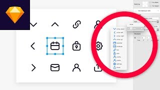
This is a YouTube video titled "Dynamic Icons in Sketch" created on September 20, 2017, featuring Matt D. Smith presenting a detailed tutorial on designing dynamic icons using Sketch software. The content is a single-speaker instructional video focused on icon sizing, naming conventions, shared styles, color swatches, symbol organization, and responsive design techniques within Sketch.
Hey, what's going on MDs here? And in this video we're going to take a look at dynamic icons inside of Sketch for super fast interface design. First of all, all icons should be the same size. It's not like they have to be exactly the same in terms of their actual shapes, but they should all fit within the same bounding box. So we have like a simple list item, kind of a simple list here. If you look at the rulers, you can see that all of these are kind of nice and square. This is just a good way to that your icons are going to line up with the rest of your interface. Now if I get in here and I change these to something like this, you can see that they're all very different sizes, but they all still are aligned. And that's because each one of these is in the same bounding box. They're all using the same artboard size. So if I look over here in my symbols, you can see all of these are lined up in 24 by 24 pixel symbols. So if I show the rulers again, you can see that even though these are slightly different proportions, they're all really nicely lined up and it's going to give you a nice even and consistent layout from the edge from other bits and pieces of the interface. So just start thinking about all these icons as squares with exact same artboard sizes. Alright, next I want to talk about the naming convention of these icons. And this doesn't only apply to icons, this applies kind of system wide. So, but for this purpose, let's check this out. You can see that I've got icon fill, icon stroke, and it's all separated with a backslash. That's just going to keep it nice and organized. When you get ready to go, put it inside of your interface. So if I look in here and I can look in my overrides panel, you can see that there's icon stroke and fill and it's just nice and categorized so I don't have to go searching all over the place. And this is all taken from those symbol artboard names. So when you're dealing with a set of icons, it's always helpful to have a shared style. That way, if I want to get in here and change the color to my default set, I can go and refresh that style and everything changes automatically. Now it's not, it's not something that you have to do. It's just a good idea and a good practice to kind of future proof your designs moving forward. All right, so what if we want to have icons with a fill instead of a stroke. Alright, so I've duplicated a couple of these icons. I'm going to convert these from strokes into fill. So first I'm just going to get in here and command select all of these pieces and then I'm going to hit Command shift O to convert them from a path into a filled object. And you can see this has broken them up into different little pieces. But now, now there are four different shapes and I want them all to be the same shape. So I want to get in here and I'm going to just start dragging these individual layers on top of each other to start to merge them. So that's going to create this top part. Now I'm going to grab. You can see that I've pulled these three shapes together and I'm going to drag this next one onto here. And occasionally you can get some weird compound path stuff going on. So what you want to do is go in and find the offending shape and click this little icon over here just to the right. And you want to make sure this is doing what you want it to. So in this case we want it to union. You can see that kind of messed up our other ones. So I'm going to just shift these around a little bit and get it to do what we want. So sometimes you have to play with the subtract and the union and you have to order them kind of in the proper stack just to get it set up. It can be tricky at first, but once you get going and you start using that tool, it's no problem. Alright, so now we've got our rectangle and it is one object. I can grab it and move it as one object. I can change the fill one time on this object and every piece is going to change same thing for the link icon. I'm going to select these shapes, hit CMD shift O and I'm going to drag these two pieces on top of one another to create this one shape. There we go. And again for the settings Command Shift O, drag that piece on there and we are all set. Now I could go ahead and select these pieces and I could create a shared style that says icon fill. And I may even want to go up here and change this instead of just icon style. Maybe this has changed and organize my shared styles here and maybe this changes to icon stroke. So now if I have a shape somewhere random, I can go in and say, oh, icon fill or stroke. There's my stroke, there's icon fill. Alright, now that we've got some filled icons. I'm going to create some color swatches so we can dynamically change the color of these. I'm going to go ahead and create like a 30 by 30 shape. And I'm going to just leave that black. I'm going to hit command K to create a symbol. That's what I've set my shortcut as. And I'm just going to call this swatch black. I'm going to double click that to edit that symbol. Grab the artboard name alt, drag, command d. And now I have three. I'm going to change this one to swatch red and change this one to swatch blue. And let's go ahead and change the colors here. So now I'm going to take this red color swatch. I'm going to place it on top of this filled icon. And while we're at it, we need to go ahead and change the name of these icons instead of stroke, they need to be fill because we don't want to get ourselves confused. And then now what I'm going to do is just kind of I'm going to change the shape of this color swatch holding command and the arrow keys. And you can see over here in the layers panel, it's not in the artboard that we want. Sometimes that's. Sometimes you just have to select that layer and then nudge it and it will go into. Now you can see that it's gone into the icon fill calendar artboard. Now that our color is there and our shape is one shape, we can hit Command Control m to create a mask from that little filled object. And it's going to mask our color swatch. So now we have this dynamic color swatch that is masked with the icon beneath it. And we can switch this color swatch out as often as we like. So now we can change it from swatch black to swatch red, swatch blue. And we can change that whenever we want. Now if I wanted to add this color swatch to these other filled icons, I'm going to use a sketch runner plugin as something that is something that saves a lot of time. And you can just hit command apostrophe, I can say swatch red and pop that in place. And I'm going to use the keyboard to kind of nudge it into place. Select that bottom shape, Command Control m. Now I'm just going to Command click and hit copy Command C. Click the artboard of the settings and hit Command V and then select that setting shape and hit Command Control M and now I can just change this one however I want. So there we go. Now we have three filled icons with dynamic background colors. And the way this is going to work inside of our actual interfaces, we're laying out something and we say, okay, I need my filled calendar icon. Just going to pop that in there. And now inside of the interface I can change the actual color to be blue or black or gray or dark, whatever color you want inside your interface. This is just a way to keep it very consistent and you can always change these after the fact and it updates everything. Alright, so now let's take a look at some parent symbols with the nested icon and the nested color shape kind of nested within that parent symbol. So if you look here, I've got line item, title icon, and if I double click into that, you can see that this is really just a background shape, a title text and the icon symbol. Over here I created a blank icon and called it icon blank just so I could see the square bounding box. And you can see that inside of here I have icon blank. In addition to fill and stroke, I put an underscore in there just so it sits at the top. You don't have to do that, but sometimes it's helpful if you want something to kind of sit as the default. So because that is nested inside of there, you can look over into the overrides panel and change that icon. If I just put it in, it's going to be blank. And now I can change it to any of these filled colors. Because these are all the same artboard size, they're all going to show up as override possibilities and you can change out different colors depending on the use case. Alright, so for a little bit of a bonus, say we had an iPad artboard and we wanted to use the same symbol. I'm just going to click the name and hit Ctrl C to give this the background color that it needs. And I'm going to option drag this one over here. Once I have this copied over here, let's say I wanted to stretch this across the entirety of the artboard and you can see that this bottom text is kind of shifting. The other icon is getting all out of whack. So there's a quick way to fix that. Double click back into the symbol. Make sure you select the title text and in the resizing panel over here, choose pin to left, choose the icon symbol and hit fixed width and pin to right. That's going to make sure that it doesn't get stretched and it's going to make sure that it stays over there on the right side. Now when we go back to it, you can see that everything's where it's supposed to be. You can select the artboard name and hit Adjust Content on resize. And then anytime you change this artboard, it's going to change the symbol as well. And this is really handy if you're trying to work on different responsive layouts or different app sizes. You name it. Alright, next up, I want to show you a little trick that I like to use for a variety of situations. And it's relatively positioning the icon based on the text width. If you look at this symbol, you can see I've got a line item, title, dynamic icon. It's basically the same symbol as before, but now I've slid the icon all the way up against the text. So I've got the text pinned to the left, I've got the icon pinned to the left as well with the fixed width. But you'll want to make sure that the text is set to auto under the alignment here and that your icon symbol is just to the right. What that's going to do because that's pinned to the left. Now that I have this, I can make a copy just so you can see the difference. And anything we type here is going to adjust the position of that icon symbol. Another great use case for this little trick is for input fields. So if you look at this symbol that I've got here, I've got a little bit of a border on the inside to show like an input field, a little bit of text. And the same thing I have a cursor instead of an icon butted right against the auto aligned text. Make sure your object is set to pin to the left and then inside of your symbol. You can use this for something like an email address or a username or whatever. And it just, it will automatically adjust as it goes. And it's just like a really neat little trick. And last but not least, when you're using lots and lots of symbols, especially when you've got a lot of icons, you can have dozens, sometimes even hundreds inside of your user interface, your symbols page can start to look a little bit messy. You just have this like never ending row of symbols. So I really like this symbol Organizer plugin. There are other ones like this, but this is one of my favorites. Hit this Run Symbol Organizer command or you can configure it, you can like kind of set how many of these per row you want in the space and the layout and all of that, and it just makes your symbols way more organized. And so that combined with Dynamic Symbols and sketchrunner, it just makes everything feel really, really fast. All right, that's going to do it for dynamic icons inside of Sketch. If you have any questions, let me know down in the comments below. If you like the video and you want to see more design tutorials like this, be sure to hit that subscribe button and I will see you in the next video. In the meantime, while I'm preparing and planning to record other videos, maybe you should check out some of these in the meantime. All right, that's enough.










