dynamic iOS nav design in Sketch
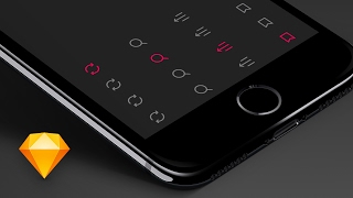
Matt D. Smith walks through building dynamic iOS navigation bars in Sketch using symbols and shared styles. He shows how to set up active and default states for navigation icons so you can manage them efficiently across your design.
So you're designing an iOS app and you have navigation at the bottom. How do you make each screen show the correct active icon without having a bunch of duplicate icons all over the place? Well, let me show you. Alright, I had some icons in Illustrator copied and pasted them into place. I'm going to group these and call these the default state and I'm going to copy them by option dragging. Call these the active state. Another thing that you typically would want to do is go ahead and create your nav icon style, which I've already done here. So I've made it gray. And so once you get the style set in place, you just want to go to create new shared style type in the name of the shared style that you want to do. That way anytime you create a new object and you might want to make that be an icon, you can just quickly change it to that preferred style. Same thing for the active states. I made it this kind of hot pink color and called it naviconactive. So now I can just change it to that. Let me just go to a new document so you can see this in action. Alright, what I like to do is do 375 divided by 4. That's going to be 93.75. So I'm going to make these 93 pixels wide by let's do 49 I believe is the shape height and we'll bump up the opacity a little bit just so we can see it. And I'm going to make a copy of these and align it and I'm going to distribute them horizontally. And now I just want to place these relative to the shape and I'm gonna align them. I'm using a plugin for the alignment called Align Layers. It's really good. I'll put the link in the description below. So get all these lined up and then I'm gonna go ahead and just copy this. Wait, these are sent to the. These are still in the front. So let me send these to the back. Now copy these. I'm going to select all of this and then deselect the background, change these to the nav icon. Oh wait, the folder selected. So I have to do. If I just select everything, it's going to select the folders you can see over here. But if I command select everything, it'll get all the little pieces in between the folders and then I'll command shift, deselect the backgrounds. And now I can change this to active. Now I can change the nav section background back to the zero Because I don't need to show that background. I really just want it for spacing purposes. And what I want to do is I want everything to change all of those. So I'm going to, as I change it, you get this refresh update. So now we're good to go. And I'll get rid of these. Alright, so now let's group all this. So here's 1, 2, 3, 4. Let's do these as well. I'm just selecting the background shape and the icon together to form a new group. Okay, so this is gonna be tab bar one. I'm gonna. I have a specific naming convention that I use because it makes it easier to kind of keep things grouped. It's not like imperative that you use this exact same naming structure, but it does make it easier in the future and I'll show you why in just a second. So I'm going to call these tab bar 1, 2, 3 and 4. And I want all of these to be kind of up there. I'm going to name these the same thing. Tab bar one active. I'm going to go ahead and copy and tab bar. So I can paste it in tab bar two active. And it's going to be tab bar three active. And this will be tab bar four active. All right, so now that they are grouped and spaced and named appropriately, I'm going to click these and I'm going to convert them to symbols by hitting command K. There is also the option to do that in the toolbar, but I don't really use the toolbars that often. I like to use shortcut keys whenever possible. So I'm going to command K all of these things. Since they're already named appropriately. I know that the name is going to same thing with all of these. Command K. Command K. Yes, yes, yes. All right, so now we're good. We have tab bar, we have all these symbols. So if I double click any of these and I go to my symbols page, I can see them, they're all there. Alright, so now what I want to do is I'm going to draw a background for my navigation bar. This is going to be 375 by 49. We'll make that, give that a hex code of 222. I can actually put this behind here just to see what it looks like. And I'll give this a shared style called nav background. Nav background there. And then I'll duplicate it and move that one down and align that with the bottom of those. So now I can Just kind of see what these tab bar icons are going to look like. And I might just go ahead and select the artboard name, hit Ctrl C to get the eyedropper and make the background that color as well. Alright, so we're almost done. Let's go ahead and just group this into nav and then let's say nav active. This is kind of like my library of UI components. Alright, so to make this tab bar dynamic, first we need the tab bar. So let's go ahead. And I like to make the tab bar have default, all default states with nothing active because it's easier to change it. So I might say this might be my tab bar. It could be nav too, but the proper term is tab bar. Call that tab bar active. But I'm only going to create a symbol out of this one shape. So this is the tab bar and I'm going to hit. Ok. And so then I might have. This is my library of components. Then I might have page one, might be my ui or it might be just screens. And this is again, this is what I'm doing now is not fully necessary, but sometimes I like to keep my library and my screens separate. So now I can get rid of this one because it's not my symbol, but this one is my symbol. And I'm going to go ahead and snag my status bar from another project, paste that in. Now that these are all symbols within symbols, it gives me the ability to do symbol overrides, which is the really powerful thing here. All right, so I'm going to duplicate this, select artboard and go 1, 2, 3 to make a total of four copies. And actually let me back up there before I change this to be the active one, I want to go ahead and duplicate that before. I want to duplicate it before I make an active one so I don't have to undo the active every time. Let's go ahead and make another copy and we'll do tab bar one active there, tab bar two active there, tab bar three active there and the last one. So now we have one symbol, four screens and different active tab bars. And what's also really cool is if I wanted to do an iPhone seven screen or seven plus and I wanted to copy and paste this thing down at the bottom right out of the gate, it's not going to work as I would want it to. It's going to stretch these things because the default setting for these symbols within symbols is stretch. But if I change it to float in place, change each one of these to float in place, that is going to make them float and not stretch. So now when I stretch this, they will float, which is great. And again, if I want to go even smaller with an iPhone SE, I can copy and paste this symbol into that screen. And now because they're all float to place, I can make this as small as I need to be. Alright, now I don't recommend getting too deep into nested symbols really quickly early on in your designs. Like definitely design some screens and design some icons and and just get a feel for it before you get too organized and production ready because otherwise it can hinder your creativity. I know for me, especially if I get too organized too fast, my creativity just kind of goes down and I feel too constrained. If you have any questions, let me know down in the comments below. Subscribe right here and check out more advanced symbol usage in sketch. Right here, right here. Here you make sure you click this, click this, then click that, then click this. There's lots of things to click here.