Interactive Components in Figma (BETA)
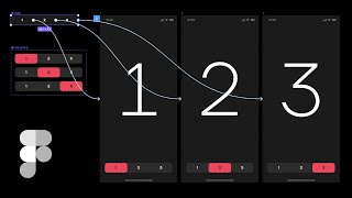
Matt D. Smith walks through Figma's new interactive components feature, showing how to set up prototypes, use smart animate, and build advanced animations within design variants.
What's going on MDs here. And in this video, we're going to take a look at interactive components inside of figma. What they are, how they work, and the different ways that we can use them in our prototypes. We'll also look at stepping up our interactive component game with some smart animate tricks. And at the time of this recording, this feature is currently in beta and not available to everyone. However, you can sign up for the Figma Interactive Component beta right here. In a previous video, we created a bunch of variants from a single component to create these screens. So definitely check that video out if you're curious how we did that. And what's nice about variants is that you can keep things nice and organized. And now with interactive components, we can add interactivity right inside those same variants to create much more robust prototypes. I've posted the design file I'm using in this video for free on FIGMA Community, and you can find the link down below if you'd like to follow along. So, without further ado, let's dig right in to create our first interactive component. Let's click the prototype tab up here on the top right. That will give us this little terminal on the right side of anything we select. Now, let's grab that plus icon and drag it down to the done variant of this component. We also want to make sure that it says Smart Animate in the animation section. Now, we'll do the same thing with all of these pairs of done and not done variants. Again, if you missed the variants video, definitely check that one out if you want to know how this was all set up in the first place. So, with our single screen that's built entirely with this one component, we've got lots of interactivity, despite the fact that we didn't link a bunch of screens together. Now, if we want to get a little fancier, we can draw a custom strikethrough rectangle instead of relying on the strikethrough text alone. So under the more icon in the text panel, we can pull up the type details and we can see the strikethrough is selected under decoration. We'll click on none to turn that off. Now, let's draw a small two by two rectangle inside of this done variant. And we're going to name the layer Strikethrough. So let's transform this object to extend the full width of the text layer. But we do want this line to always stay the same width as the text. So to make sure this happens, we're going to use auto layout first. We need to group the strikethrough layer and the text layer together by hitting Command G. And then we're going to rename that group to Label. Now, with that group selected, we'll add auto layout to the group. By default, Auto layout treats these two objects separately and hasn't quite given us what we want. You can see that if we try to move the strikethrough layer that it keeps repositioning itself around the text. It does this because both layers in the auto layout group lose their X and Y properties in favor of the built in auto layout controls. You can see that we can control the distance between the objects, but we can't add a negative margin in there in order to hack this layer. To give us what we need, we'll select the strikethrough layer and hit command option G to place that layer in a frame. Now that that layer is in a parent frame, we have access to the X and Y coordinates. The auto layout is now applied to the strikethrough frame and the text label. And now we can adjust the Y axis of the strikethrough layer independently. So now we'll bump this up negative 12 pixels here. Now we need to adjust our constraints to keep things in place if the text width changes, we'll also need to update the resizing constraints on the frame as well. In regards to how it responds to the auto layout, we want our strikethrough frame to horizontally. That way, as the text label expands, so does the strikethrough frame. We can type a new string into the text field to test our constraints. And as you can see, something is not quite right. So let's go through and double check everything. So somehow our child strikethrough layer changed from left to right to right only. So let's just put this back into position and select left and right. Now that that's fixed, we can test it again by retyping a new string. Alright, it looks like our strikethrough frame is now behaving properly, so we're good to go. Let's copy and paste our new auto layout frame that we just created into the other variant instances. Instead of recreating all of that again from scratch, we'll command click this text label to select it and delete it out. With the variant selected, we can paste in our auto layout frame. And it's important to have the same layer structure in each frame when you want to use the Smart animate feature in your prototypes. Since we're working in the default instance, we need to change the strikethrough line to be invisible, but I want to animate it from left to right. So instead of just hiding it, we're going to change the width to be 2 pixels, change the opacity to 0. We also want to change the text label to a lighter color. We'll also change the strikethrough layer to be white, even though it's invisible. That way it's the same color as the text when it begins to animate. This will serve as our starting point in this tiny animation. All right, now, we can see that it's working now, but it seems a little bit slow. So if we go back to the prototype tab, we can change the animation timing from 300 milliseconds to 200 milliseconds. To increase the speed, let's make sure to change the speed on both of the interactions. Now, we could go in and create custom animations for the check marks as well, but when you're using nested components like this, you don't have as much granular control over the animation. In order to push this further, you need each layer separated out so you can control each individual little piece. Alright, so we've used interactive components here to create little micro interactions on the same screen, just toggling from done to not done, and vice versa. Now let's dig into this example where we have multiple objects animating across the screen. That's all control with interactive components linked to different screens. Alright, first we're going to create a new page called 1, 2, 3 and reuse some of the design elements from our other screens. We'll kick things off by making a really big number one and a simple navigation at the bottom. We'll use a rectangle shape and a text layer with roughly 12 pixels of padding all around. I'm not going to worry about auto layout here based on the text size because this will be a 3 wide navigation with a fixed width control. All right, with both layers selected, we can hit command option K to turn it into a component. We can center the text and add a fixed size so that it stays in the middle when the width changes. To keep the text bounding box with our 12 pixel margin on each side, we'll need to set the constraints to left and right. Let's option drag this down to create an instance of the component, and we'll create two more instances to the right by option dragging again and hitting Command D. And we don't want all of these buttons red by default, so let's create a variant of that component let's change this text to be light and remove the background shape and use the frame fill instead to create those visual differences. Now let's add some corner radius and give this a little more style. We'll rename this component to tab and update the variant names to be yes and no, and that will correspond to the active variant property name and it'll give us a little toggle switch to use. Now we can select two of the instances in our row of three and turn the toggle off. All right, with those three instances selected, now we can hit command option F to create a new frame with all of them inside of it. Now, inside of that frame, we're going to select each instance and add the scale constraint so that if we resize the width of that navigation, they all resize appropriately. All right, now let's option drag these new tab components onto our first screen and resize the width to have about 24 pixels of margin on each side. With that in place, we can rename our labels to the appropriate 1, 2, 3 to make things a little bit more tidy. Now we can select our large frame and hit Command D twice to create two duplicates. Now we'll make a big number two and a big number three. Here's where the magic of interactive components comes in. Now, with the prototype tab selected, we can now select our individual tabs in the main component and link each one of those to the appropriate screen by dragging that little terminal and connecting it from the tab to the screen. Now we can go back to the screen based instances of the tab component and update the variants for each one by turning on the appropriate active tab. Each of the screen's tab components all work properly because our main component has the interactive connectors. Instead of controlling the connections at the screen level, previously you would have had to link every single connection individually over and over for every screen. And that can definitely be quite the cumbersome task. Interactive Components now gives us a single source of interaction truth as long as we know how to set it up properly. But remember how in our first example we didn't have the check mark animated because it was a nested component? Well, the same thing is sort of happening here. We've got some nice fading in and out of the numbers as they're selected, but it's a pretty bland interaction. So let's take a look at how we can quickly add some extra animation polish to really take things to the next level. The main problem lies within the tab component right here. It's a simple on off switch that we've created as a constraint. Now, it is nice and organized, but it's also limiting as far as animation goes. So let's rename this page 123v1 and duplicate the page to create a v2. Alright, first of all, we'll delete our on off toggle tab. And we're also going to break apart all of these component instances by hitting command option B on each of these purple component layers. Okay, now, instead of using the frame fill to create the red shape for each individual tab, we are going to create a single rectangular shape that can traverse all three of these instances. So we'll remove the red fill from the first frame and tidy up our layers so that we know what's going on here. We'll call this rectangle active and we're going to pop it back into our tab's frame. But we want to make sure that it's only in the tab group frame and not in the individual tab frame. We also want to make sure it's in the bottom layer so that it doesn't cover up the number. Now we can turn this tab's frame into a component without using the nested components like we did before. Since the active tab is now on its own layer, it can travel independently of the tabs. And before we go any further, let's relink each of these numbered frames to the appropriate screens. We can also delete these old tab instances out of the other screens, since they are from the first version that was created. And before we add this new navigation to our screens, let's think about this component structure for just a second. If we remove the active tab from the main component, then we can link the tabs and create a variant of that component instance. Now we're going to make a duplicate of the tabs component which includes all of those pre made interactions. And we're going to hit command option K to create another component with that tabs component nested as the base component. So we're doing a little bit of a component inception here. One component handles all of the interactions. The other component, which will have variants, will handle all of the animation. Let's call this one tab group and create the three variants that we need and rename everything accordingly. And remember, when we create variants like this, they all get their own little variant frame to put things in. And all of the interactions are still baked in. Because we're using the nested version of that tabs component, the tabs component is controlling the default styles and the interactions. So now we can use this new tab group component to handle the active tab animation. So we'll copy and paste this red rectangle as the bottom layer in each of these variant frames, and we'll change the text color accordingly. Now let's copy and paste this tab group instance into each of the other screens. Now we can update each variant on the proper screen so that the correct number is showing. All right, let's test our new interaction. Look at that nice animate Active tab. Nice and smooth. Got the active tab going back and forth. But look at our number here. It's just fading in and out with the default settings. We haven't really been intentional with the number part of our animation, so let's go ahead and fix that too. And before we do that, let's give these inactive tabs their own background color so that it sets it apart from the background of the screen. Okay, let's make a frame for this number that has the same 375 pixel width as the screen, so that we can control the X axis more easily. We'll do the same thing for our number two and our number three. Now we'll reduce the space between these frames to zero, select them all, hit command option F to create a parent frame for them all as well. To keep a single source of truth for all these numbers, we can turn this into a component by hitting command option K. And then we can copy this and paste the instance into each one of the frames. Because our interactive components are already linked to all of the screens already with the Smart Animate set, the numbers should animate automatically based on the X axis of that component. Let's test it out and see how it looks. There you go. An animated Active tab. Animated numbers all controlled with the single interactive component, there are a lot of ways that you can set all of this up. These are just a few examples of how you can really strict with on off toggles, or you can expand it a little bit to have some more custom animations happening. It really depends on where you're at in your project. For a lot of design systems, you might have a more strict organizational process, but if you're creating prototypes, you might have a different type of structure. It really just depends on what you're trying to accomplish. So I hope this was helpful. Interactive components inside of figma. It's a really efficient way to create these types of prototypes. If you have any questions, drop me a comment down below and I'll do my best to answer it. And if you want to learn more about UI design in general, Please check out Shiftnudge.com and other than that, thanks for watching and I'll see you in the next video. Peace.