Interface Design PRO-TIPS inside Figma
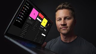
A tutorial on designing iOS app interfaces in Figma, covering icon design, typography, color accessibility, and component creation. The speaker walks through practical techniques for building a polished UI from scratch.
In this interface design tutorial, we're going to design a quick little concept of a would be iOS app inside of Figma. So first we're going to work on a simple list view navigation of sorts using the module titles from my design course. Now we'll design some icons really quickly using some geometric primitives or as laypeople might say, basic shapes. It's worth noting that I've spent a lot of time exploring different concepts and different styles around these icons before officially landing on these. And although it appears I'm designing them from scratch in a matter of minutes, which I am, I'm conveniently not showing you the hours and hours of design exploration it took me to get to this very point. Okay, so just a few more shapes and that should do it. I always design icons in their own rectangular frames because this promotes consistency of size and ease of use later on in the designs. Now we're going to color code these modules again. I've pre selected these colors through experimentation. I'm not just randomly picking all of these exact colors right now in this moment, but it is important that when you do pick your colors, you're hyper aware of how it will be used. And if you're planning on using it in combination with text or icons, you need to make sure you have a nice AA contrast score for each one. Now let's set our type for these list items. A good place to start in general is 17 to 18 pixels or so, assuming that you're designing at 1x with interface design, it's also super important that you very carefully choose these sizes and colors because as you make decisions for one screen or or one component, you're effectively creating a would be style for later screens, later components, so on and so forth. I like to start off with no more than two type sizes unless I have an extremely good reason to use more and very rarely if ever use more than four sizes in any given screen. I call this the rule of four. Okay, so let's design this one component in isolation and abstract it a little so we can be a little bit more efficient. I don't always design components first, but once I've repeated myself a few times by copying and pasting or option dragging, it's usually a good indicator that I should probably be using a component. So this will help us keep things more consistent and have one little tiny source of truth for this particular list item. I'm going for a very specific style here, so I'm going to use my brand font TT Furs Noya by the Type Type Foundry. I want this layout to be bold and exciting and kind of friendly. So I'm going to punch up the size of this line item to 24 pixels bold for the titles. There's also a bit of metadata here that I want to include with the title. That will show the amount of lessons in the module along with the total duration of all the videos combined. Now I'm also going to go into the Type Details panel here to activate the Tabular numbers open type feature. If the font was designed to include tabular numbers, which this one was activating, this will use monospace versions of each of the numbers. This. This is just a fancy way of saying that each single digit number will be the exact same width. So when you have repeating numbers in your interfaces, this will help keep them nice and aligned. Also, for this metadata text here, I want it to sit back and play a supporting role to the title. So I'm going to knock it back to a darker gray. It's also super important that we check this color for contrast accessibility. Because we're using 16 pixels here, it is critical that we hit an absolute bare minimum of 4.5 contrast, which will give us a nice clean AA score. Now I'm going to leave the main component off to the side for now and put an instance of that main component in the iOS sized frame. Now we'll duplicate this component once and then hit command D6 times to create all of the instances that we need. Now I'm going to command click the title inside of the instance so it will give us easy access to the nested icon component without having to navigate to the layers panel. If I tried to command click on the icon itself, it would probably drill down too deep into all of the pieces. So now with the title selected, I can hover that component and change the instance to that appropriate icon. The naming convention that I use for the icons allows us to make these quick component changes. Now I'm going to experiment with vertical spacing between the components, and it's kind of up to you whether you want to go fully built in with your spacing and your components or not, but that's really a conversation for you and your developer, so we'll just move on for now. It's not uncommon to find interface elements like this that are divided with a border or a card style background, because doing this will kind of activate the law of common region and it'll make it easier for users to see grouped elements more easily. But with UI design, there's always a delicate balance between Aesthetics and functionality. Using too many borders and dividers, especially in dark interfaces, can really quickly make your designs feel overly complicated and busy because there's a much lower threshold of contrast sensitivity. All right, lastly, we're going to pop in a white version of our Shift Nudge logo up here in the top, and so it doesn't compete with all the other interactive list items. Now we're ready to move on to the second screen, which is going to be the detail view of one of these modules. For whatever reason, I'm feeling the pink. So we're going to use style as our detail screen template. And just like the list component, we'll keep in mind that whatever happens on this screen is definitely going to serve as a template for all of the others. I really want to bring this color block to the forefront on the detail view, first because I think it will look really cool, and secondly, because using these colors as distinctions between the modules will also just be really helpful from a user experience point of view. It's important to know that using color alone is not always sufficient to distinguish certain items. There are an estimated 300 million people worldwide with some form of colorblindness who very likely do not see color the same way as me and you. So with this screen, we're okay to use this color because we've also got the icon shape distinction along with a big text based title that can be clearly read even if our beautiful pink is viewed as a blob of gray. Now I'm going to paste in the description of this module and set the type exactly the same as the metadata. I can do this pretty quickly by selecting the text and hitting command option C to copy the style and command option V to paste the style onto the other text. We could definitely try some different size or color options here, but for now let's leave it consistent with the other text. We can always come back and iterate through other ideas later. Now that we're in a detail view, I feel like we could go with some dark card backgrounds to mimic the big color at the top. This is another one of those things we could experiment with, but for now, let's just go for it. I'm definitely aware that this is a slightly different style than the clean list view from the previous page, but sometimes it's worth creating a slightly different environment for different sections of the app, and we'll just be highly aware of the implications and tread with caution so that we don't create a bunch of Frankenstein components with no real relational value to one another. Now let's add a list of lessons to the module, just like on the screen before. We'll create a single line item component with the lesson number, the title of the lesson and the duration of the video within that lesson. We could consider reusing the list component from the first screen for this lesson list, but that feels like it would be a little overkill for this particular view because that main list is a portal into these larger sections, whereas this list view will be for navigating to individual lessons within that large section. So we're going to make the executive decision to create a brand new type of list that is specific for the lessons. If we happen to come across another list view in the remainder of the app, we could then re evaluate whether or not we should modify the list component at a fundamental level so it could be applied more broadly. For example, we may have a list component with only a label, or a list component with a value. And what we're working on now, a numbered list component with a value. This could be looking slightly too far into the future since we're just getting started with these designs, but thinking about the scalability of your designs is never a bad thing. Your engineers will thank you. Alright, so now let's pop in some actual data from the course so that we're not looking at a bunch of incoherent placeholder text. Sometimes this can be time consuming, but it's always worth it and it will improve the quality of your designs. For example, I can see now that the lesson Depth, Lighting and Shadows is definitely the longest title, so I'm going to make a decision on how to handle this list based on now knowing that some lessons will have more characters than the space allows, and we have a few options here. We can truncate the lesson title and add an ellipsis after a certain number of characters, or we can wrap the title into two lines by defining a max width for the text field. If we do this, we'll need to make sure we have our line height really nailed down, and we'll also need to decide how we will vertically align the number and the duration with the title. In some instances, it may be fine to go with vertical alignment, but more often than not it's better to align text objects with each other according to their baseline. This allows for easier scanning and overall readability. So just because we're really digging into the details of typography and alignment here, we're also highly impacting the usability and the overall user experience. Because of these little details, I feel like we're in a good place here, but it would be nice if there was a call to action that would allow someone to quickly tap and get started with the first lesson. But for now, let's just go with a nice big play button. If you're designing a custom play button like this, it's super important to optically center the triangle inside of the circle. And if you rely on mathematical alignment alone, your play icon will appear off center to the left due to all the negative space on the right top and bottom of the triangle. Lastly, we need a way to get back to the previous screen. So let's use a 24 by 24 pixel frame for a simple little back icon. We'll cheat it over slightly to the left so it's optically centered in the frame and nudge it into position. Remember our optical alignment exercise with the play button and the circle shape? The same optical alignment issues arise anytime you have different shapes beside each other. The circle beside a square will always look smaller than the math says it is because there's less surface area. The same is true for a triangle. So in the event our circular icons are placed directly above text on possible future screens, we'll have four pixels of slight optical alignment correction already baked in. Alright, so we could go ahead and create a bunch of additional screens based off of these, but I've got a fun little idea for a transition that I want to test with a quick frame to frame animation. Whenever I create an animation prototype, I typically place those screens in a new page inside of the same document. Creating animated prototypes often requires you to break your components apart for more granular control over smoother animations, and we want to keep our original UI designs intact. As with anything here, there are some exceptions to this, but this is how I like to do it. I think it would be a cool transition to use the of the icon and transform that into the big colorful header on the detail screen. So to do that I need to make sure that I'm using the exact pieces of UI to transition seamlessly between the two. You can't really transition a circle into a rounded rectangle, but you can scale down a rounded rectangle until it looks like a circle. So let's work backwards from here to get the same pieces in place. I'm going to hit the K key to use the scale tool in Figma for resizing the icons, and let's try to use the same text fields between the screens as well. Anytime I'm creating a frame to frame animation, I like to make sure all the Elements on the final screen also exist on the starting screen, so I can have more control over the starting position and the attributes of each one. Most of the time that means copying and pasting from one screen to the other. Just make sure it's really well organized before you do that. It will make your life much easier. Alright, I'm going to copy the back arrow, the play icon, the description text, the lesson list, and the dark module backgrounds and now paste them into the list view screen. I need to put a disclaimer here because this is the part that can get complicated and your animation can get messed up. So if you try something like this and you've never done it before, start with just one object and test it and slowly add in the next, and so on and so forth. For example, here's a pink square on a black screen. Just simply animating back and forth. All right, now that we've pasted in the elements from the detail screen, we'll reposition the starting point for these elements and reduce their opacity to zero. So now let's just wire this up. I'm going to hit option 9 to toggle over to the prototype tab in the right side panel. Now we're going to make sure this little blue play icon is showing up beside our first screen. And if it's not, click it and drag it over there. Since our content is longer than the iPhone screen is tall, we want to change the overflow behavior from no scrolling to vertical scrolling. Alright, so let's select our style component in this list view and drag the little connector dot on the right side over to the detail screen. In the interaction details panel, we're going to change animation from instant to smart animate. We'll leave ease out and 300 milliseconds. For now on. We can always change those later. On the detail screen, I'm going to select the entire pink block to use as a hit state for going back. Since this is just a quick animation test, we'll just make it easier on ourselves rather than trying to click only the tiny back arrow. So with the pink header group selected, we'll grab the same small connector on the right side and drag it back over to the other frame. Figma typically remembers the previous interaction detail settings you used, but it never hurts to double check. Now let's go into presentation mode by clicking the small arrow just to the right of the blue share button. Now, this isn't going to produce a fully functioning app, and these animations will need to be recreated with code during the app development process in order to become a real thing, but this is a great way to experiment quickly with some animation concepts. Now that we've got all of this fancy design and animation under our belt, I want to let you know that every single tip and trick that you just watched is an extremely tiny slot deliver from my brand new interface design course Shift Nudge, which is basically everything I've learned about interface design running my own independent studio for the last decade. Inside Shift nudge there are eight modules and 80 something lessons and over 30 hours of content just like this that will teach you everything you need to know to start designing visually beautiful interfaces. So if you're interested I've got a link for you down below. If that's not you but you're still interested to see see videos like this, then hit that subscribe button and make sure you don't miss the next one. Thank you so much for watching. I'm MDS and I'll see you in the next one. Sam.