KILLER Auto Layout Tutorial in FIGMA
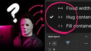
This is a YouTube video titled "KILLER Auto Layout Tutorial in FIGMA" created on November 8, 2022. The content features a detailed tutorial by Matt D. Smith explaining critical concepts and practical steps for using auto layout in Figma, including settings like hug contents, fixed width, and fill container. The video is instructional, focusing on design techniques and best practices for creating responsive layouts in Figma.
There are three critical things that you need to understand about auto layout in order to use it efficiently. Number one, you know how there's typically a bowl of leftover Halloween candy that stays around for the next few weeks? Well, that's sort of what I've got here in the form of design assets. So first off, we're going to start really slow and keep the pan to a bare minimum. To apply auto layout to any object, simply select it, press the keyboard shortcut, shift A. You need to remember this. Anything we type our background will expand the way we would expect. The first critical thing to understand about auto layout, anytime we want objects to move around on the canvas based on the content inside of a frame, we're going to have to use Hug contents. And this is great because this is the default setting for all new auto layout object. Now, let me show you one quick little pro tip about having specific elements override hug contents. So if we want to keep these little decorative textures on the left and right as a part of the button, we'll need to use absolute positioning. And we're going to do that by clicking this little icon and and then adjusting the constraints. We'll make sure this one is set to the left. We'll make sure the other one is set to the right. Now, if you run into trouble with background layers covering up your text, you'll either need to adjust the layer order manually in the layers panel, or adjust the advanced auto layout property called canvas stacking to determine if you need first on top or last on top. This doesn't really matter. It's more of a personal preference. Now that this is set up as a fully functioning auto layout button, let's pop in a few icons and see how we can expand this functionality. Once these are in place, we can adjust the space between properties to keep the distance just how we want. We can do this on the canvas by clicking with our mouse cursor and dragging, or we can click the space and manually enter a number in this little text field right here. Or, my personal favorite, we can manually enter a number in the Properties panel. The only caveat here is that if these options are not showing up for you, you do not have the parent auto layout frame selected. So that's Hug Contents. But Hug Contents alone isn't going to keep us safe from the pain of auto layout. For this next example, we're going to have to use the killer comb of fixed width and fill container, which is going to be our second and third most critical pieces. To understand, it's important to remember that these are most often used together. This is where most of the auto layout pane comes from. Fixed width for the parent and fill container for the child. You can think of this like a water bottle. The bottle size is fixed, but the contents fill the container. Right here we've got two small pieces of text that we're going to apply auto layout to. We'll select them both and hit sh. Nice and simple auto layout. Now, in order to adjust the vertical position based on the length of the text above, we're going to select this text field and this auto layout container and once again hit shift A. We're going to do that to create another auto layout frame that contains both of these objects. Remember how I said hug contents was the default? Well, that's not going to work in this case. Even though our auto layout direction is set to vertical as indicated by this little icon, and we can adjust the space between these two objects, the parent frame and the text field inside are still set to hug contents. So if this text gets changed to anything else, both the text field and the parent frame will expand to accommodate the content size. That's great for these little pieces down here, but not so much for this text up here. The first thing we're going to do is manually resize the parent container. This will automatically set the frame to fixed width. Anytime you manually resize an auto layout frame, it will change to fixed width every time. You can also manually change this in the properties panel, but most of the time you'll be resizing these frames anyways and that will automatically set it to fixed width. So now, even though our parent container is set to fixed, you can see that the text inside the parent container is still set to hug contents. So if we start typing, the text bounding box is going to continue to expand as we type beyond the fixed width parent container. And that's not what we want. To make sure this text stays right where we want it, we're going to select the text layer and set it to fill container. Now, this functions exactly as we want it to. As I type, the text field grows in height and the smaller pieces at the bottom are getting pushed down. So remember this two step process. Number one, you're going to set a fixed width on the parent frame. Number two, you're going to set fill container on the child frame. Remember the water bottle analogy? Fixed width container and fluid contents fills that container. Still with me here. Okay, good, because we're about to crank up the auto layout pane to a max before we begin I've got a really big disclaimer. If you are in the experimental phase of your design project, you do not need to use auto layout or any of the things that I'm about to show you. If you are unsure about your layout or your component design, I would highly encourage you to use as little auto layout as possible. In fact, when I was designing these original examples, I did not use auto layout. I only added it after I was happy with the final layout. If you use auto layout too soon, you may risk killing your creativity. And I'm not exaggerating when I say that. Okay, in this last example, I want this name text field here to push down all of the content below if it's longer than one full line. And I want the subtext here to do the same exact thing. I also want the body copy to do that here as well. In addition to those three things, I also want this knife and the skull count to grow horizontally to the left while also affecting the width of this subtext. Now, if this seems complicated, that's because it is. It's also why I urge you not to use auto layout until your designs are near completion and you actually need it. If you're going into production mode or going into a design system phase, or you're just trying to figure out what happens when this content gets shorter or longer, those are the scenarios in which you might need to use auto layout. So to put this all together, I've got all my little elements scattered here all over the canvas. So it's really important that we start by creating some simple auto layout frames. First, we'll start with these icons and the numbers by selecting each one and hitting Shift A. Now we've got two auto layout frames. We're going to select both of them and hit Shift A again. Now let's select the subtext and our icon group and create another auto layout frame. If we really wanted to get fancy, we could create an icon, place, order component and random text field and turn.
That into a nest component and then use instance of those components with icons and text overrides before we begin the auto layout process. But that's a whole different can of worms. Is this an auto layout video and.
Not a component creation video? Remember, everything will be set to hug contents until we change it. So that's what we're going to do now. First let's pull this parent frame out to around 390 pixels to emulate the rough width of an iPhone. This will change the horizontal resizing on the parent frame to fix and since we know we want the width of the subtext to be dynamic and fluid, it must be set to Fill container because these items are spaced pretty far apart from each other when we added auto layout to them, Figma calculated the distance and used that as our space between values. But we want this text field to take up as much room as possible without running into the icon. So let's select the parent frame and set the horizontal spacing to 16 pixels. So we can test out our handiwork by manually resizing the frame or by typing longer numbers by our icons. Or we can also type longer subtext to see how things resize when we run out of space. Sometimes it can be really helpful to put a temporary fill on the frame and so you can more easily see the boundaries of that container. Okay, now we're going to combine the name and the auto layout frame that we just created by selecting them both and hitting say it with me Shift A. So let's select the name and the nested auto layout metadata and choose Fill Container. Let's also reduce the vertical height to zero. For now, we'll add some temporary frame fills while we stress test the auto layout boundaries by manually resizing and typing randomly. Now let's select our title frame and the body text and hit Shift A. Once again, we're going to add a little fill just so we can see what's going on. Let's set up our body copy to Fill container so it goes all the way to the right. Now we're going to select our two smaller buttons down here and hit Shift A. We'll call this CTA Group. Now we're just going to drag this into the existing auto layout frame. The thick blue line right here will show us where it'll be placed. And you can always change this location by playing with your layer order. Just like all the other times. We're going to set this frame to Fill container. Notice that the buttons did not move when we did that. All we need to do is change the alignment of those buttons in the property panel. We'll just go with top center alignment. So now if we stress test our mainframe now you can see that the title is not working correctly. Well, that's because we didn't go back and choose Fill container when we added the body copy. Every now and then when you change parent containers, the children will change as well. So you'll always need to go back and check them. So to run a final test on this whole group, let's create an iPhone frame and pop the content inside of it. You can see right away that we need some padding on each side so we can select this entire auto layout frame, go over here to the Properties panel and add 24 pixels of padding to each side. Because we've got everything set up nice and fluid frame by frame, all of the content will adjust automatically. Finally, we can pin this content block to the left and the right using the constraint setting in the Properties panel. And we can see how this works by stretching out the iPhone frame. So to recap, Number one, Hub content is the default setting. Number two and number three go together. Fixed width and fill container are most often used together for fluid dynamic layouts. And if you're having trouble using auto layout, remember to focus on one small piece at a time, just like we did with our icons and our numbers when we built our bigger system. Also, make sure you stress test each time you create a new auto layout by either manually resizing or by typing lots of content. If you found this valuable, and only if you found this valuable, smash that thumbs up button for me. If you want to see how I made the music track for this video, make sure you click right here and watch this one.