This is a YouTube video titled "✅ Let’s refine some UI #design #ui #figma #ux #uxuidesign #uiuxdesigner #interface #fyp" containing a design-focused presentation or tutorial recorded in 2025. The speaker discusses UI improvements, specifically redesigning a status tag and progress bar for better readability, scalability, and visual hierarchy. The content is a single-speaker explanation without conversational elements.
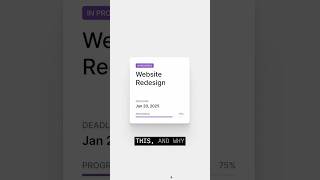
How do you go from this to this? And why does this one feel instantly easier to read? The first version isn't broken, but it's not working as well as it could be. The status tag looks a bit like a button, and the title can't scale very well. If we add in a second or third line, the layout starts to fall apart. The spacing feels a little loose, and the yellow with white text fails. Contrast accessibility. The progress bar feels stuck on. It's functional, but it adds a little bit too much friction. Now look at the redesign version. The status tag moves to the top, giving the title room to expand. The title sits on a shared baseline, whether it's one line or three. That's what makes this layout scalable. Hierarchy is tightened with font sizes, casing and weight. The negative space gives it structure and breathability. Now it has rhythm. Every element knows its place in the progress bar. It's now a clean visual anchor at the bottom, both in position and color. Save this for your next design review or share it with a friend who likes to sweat the details.