A designer walks through critiquing a modal design, pointing out problems with typography, spacing, and color contrast, then shows how the revised version fixes these issues for better readability and balance.
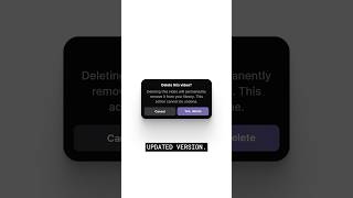
How do you go from this to this? And why does it feel instantly better? The first modal looks okay, but the details are working against it. Three font sizes and line height. That's way too tight. It makes the text hard to read. And that orphaned word at the end kills the rhythm. The spacing isn't following any clear system. The margins feel random and the visual weight is unbalanced. It just feels off. The buttons fail, contrast checks and. And those slightly different hues create a subtle vibrating effect that's hard on the eyes. Now look at the updated version. Font sizes are reduced and unified. Same size for the title and description. But weight and spacing create hierarchy. The layout feels balanced and the spacing between elements is visually Even the color palette is cohesive. Same hue, different brightness. And now every text element passes contrast standards. We can also swap the purple button for red. Not a rule, but red introduces hesitation. It tells the user this action matters. Typography, layout and color. If you get these right, everything just feels better.