LIVE Redesign – Wave Coffee Log in
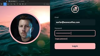
A designer live-redesigns a login screen for Wave Coffee in Figma, critiquing color contrast, logo placement, input fields, and overall layout to improve the interface.
What's going on? We are back inside of Figma with another design and this one is from the Shift Nudge curriculum, a homework assignment on density and the style module. And we're gonna see what we can do to this one. We got their logo, we got login surfer password check, submit it. It's usable, but I think there's some things that we can do to improve it. So let's go ahead and create a frame. We're going to go, oh, let's do iPhone 14 Pro, since I think that's pretty close to the same size. So the negative things about this. I don't love this white on green. I'm almost positive that fails accessibility. Let's just do a quick little check here. I'm going to create two color swatches. I'm gonna put this white one on top of this green one and we're gonna run use contrast. And yeah, it's 1.9, so that's failing. So this is technically not okay. Should have gone with a dark check, just like submit or something different altogether. So I'm just gonna pull some of these colors. All right. So I do like the idea of this wave, but see, like, this logo is not amazing. I'm not going to look at that and think, oh, that's just as good as a Nike logo or that's just as good as the Apple logo. There's a lot going on. It could be cool. These letter forms are cool. This one's okay. I don't know if this particular designer designed this logo, but it's not the greatest thing in the world to me. So I think it would be much cooler to have a nice picture of the background ocean. Let's do surfer and see what unsplash gives us. So you can tell that they picked that image. They probably did this exact same thing. And that is pretty cool. That's a pretty cool image. So let's grab that giant image and let's go ahead and grab a couple of these other ones. This one's pretty cool. Where is it? Is it going to give it to me? Okay, there it is. Just going to double check to see if there's anything else. I'm looking for some kind of like this that have more of a flat surface so I can put UI elements on top of it. A lot of these are difficult to work with if you are going to put stuff on top of them. So it can be quite a bit trickier to Whoops. I didn't mean to do that. To use imagery like this. This is A really cool picture. The silhouette's a little bit odd, but, man, look at that sunset. Or sunrise, whatever it is. Probably sunset. Let's try this surf sunset. A lot of what you're doing when you're playing with imagery again, this goes back to branding. This one's cool. Check that out. This one's. Maybe it's not showing waves, so maybe it's not as good. What about that one? That one's pretty cool, too. It's more of an implied wave anyway. So I'm just talking through some of the things that I would think about if I was going to use an image here. Maybe the brief is we really want an image on the login screen, so we could go with something like that. Oh, you know what? I also forgot to do one. We're going to go 60 seconds. I've probably been going for a little bit of time now. Let's say we cut 10 minutes off of that bad boy and we run the timer app. I can't remember how to start this thing. Some weird way. You got to start it. Start. They're gonna work. Okay. Oh, there we go. Push this way down here. And I think that'll just keep running. Yeah. Okay. All right. So the image is a little bit muddy. This button with that background, that shadow feels very muddy. Very like the shadow. The color green or teal. Oh, and this is a. I believe this is a lesson on corner radius. So they are doing the right thing here with their corner radius. And I think part of the assignment was to create, like, a nested border radius. So let's go ahead and do that as well, just because that was part of the assignment. So I'm just going to start off by creating this background shape really quickly. You'll notice that I'm going 24 all the way around even on this, just to start with. Might as well keep it simple. So there's 24 right there already. Okay. And let's go ahead and create some input fields. I'm going to go maybe like 48. Why is that not choosing color? There we go. And just to start with, I'll just go 24 with that as well. And let's take that radius off for now. So the premise here is that you're going to use, like, for example, if this was 48, and then we had 24 pixels between the two objects. So we take the radius of the outer rectangle minus the padding, and that would give us the inner radius that we would need. That way there's equal space all the way Around. So that's how you calculate the corner radius. If you have something like that. This is going to be the same thing. If we did a stroke on a shape and gave it 24 pixels of stroke, and then we rounded it 24, you can see that the inner radius is a lot tighter than the outer radius. So if we wanted to, like, really dig into this, let's just make this another color and make it transparent. You can see. Okay, that is 36. Because if you look at this in outline mode, hit command. Yeah, this path right here, this one is 24. And this one over here is 12 pixels away from it, which means we're going to be 24 plus 12 to get this 36 that we just discovered, which means 24 minus 12 is 12. So if we put this one at 12, you'll see that fits perfectly. So this one's 36. The inner stroke is 24. So it's just an easy way to figure out, like, how your strokes and radius need to be set up. All right, so I'm wasting time here trying to teach, so I'm going to try to get started and go a little bit faster. Let's go with email. To make this simple, we're just going to go with enter. Let's go a little bit bold. I'll do 16, and here's what I'm going to do. All right, before I start all that, let's. Gosh. I want to use this image just because it's so nice. Just play around with the way that could crop in. That's pretty cool. With this, like, foreground bubble effect and then this. All of these are pretty nice, but the reason I like this one is because we get a little bit of extra. It's going to be tough. It's going to be real tough to get this to work unless you did something like that. I wonder if the streamline icon set has a wave in it that I can just snag. I'm sure it does wave. Just looking for something like maybe that one. Let's see here. Plump duo. That one's kind of cool, actually. Let me use this one. See this one? That's a nice little mark. We could put a circle around that bad boy and have a new logo for this company. These are. They appear to be two pixel strokes, but they are definitely fatter than that. So there may be three. Let's try it. Just want to get that kind of lined up. Maybe 40, something like that. Looks pretty good. Send this picture to the background. Let's go ahead and holding option and command. You can stretch out the frame like this. I'm going to put that at 48, 48 by 48. And just call this logo. I don't always do this, but sometimes it can be helpful. It's just. It's got a lot of pieces around in it and sometimes it can be hard to grab if I try to grab it and I accidentally pull it out sometimes just easier to have a solid block to grab and move around. So I'm going to do that. Okay. All right, Before I start messing with that, let's go ahead and knock out these. Yeah. See, this is just not going to work very easily. Could I get this to work? You'd almost have to get rid of that guy. Or it looks like a. Looks like he's got a beard. It could be a woman. I'm not sure. You might almost have to do something like that. And then maybe. I don't know. The thing is, I don't really want to. I don't want to go a completely different direction with this. I'm burning so much time. I'm tempted to go a completely different direction just because I don't love this. And I just now realizing that there's like a coffee infused wave and that's just like way too much going on. Coffee blending with the wave. Blending with the coffee beans. Wave Coffee company, We're saying waves and coffee three different times in this one area right here. Just from a visual communication standpoint, we only need to say Wave Coffee once and it can be implied or it can be direct. But we have this. We have a logo for Wave Coffee. We have a type vase and a word mark for Wave Coffee. And on top of that, we're showing an image of Wave Coffee. So let's stick with just one of those because this is just way too much going on to describe Wave Coffee. It could be. It could be really interesting to create a little coffee cup logo. Actually, you know what, let's just do it. We'll go for it coffee and we'll use that one and then we're going to go abes again. I know we've already looked for this, but let's look for one with a sunrise or something if we can. I think, I think I saw that feel like there was one. We could always create it if we needed to. Let's just do this sun. There we go. There we go. All right, so here's what we're gonna do. We're gonna take this sun and we're take this coffee cup and we're going to take these waves. Of course, they're not able to be accessed because I set it as a component against my better judgment. All right, so let's get rid of that, this, and cut that, and paste those. I wish this were. I wish these were strokes and not. Let me do something real quick. Feather icons. I'm pretty sure these are strokes instead of let's do waves. Yeah, this one's just not as robust. Sun. Yeah. Okay, so let's create one real quick. All right, we'll do 12 by 12 to start with. And we're going to do a stroke. We're going to go two pixels. We're going to go inside, and I am going to just take our best guess at where this thing is cut off and subtract that shape. No, I'm not going to do that. I'm going to let me intersect these shapes while they're both. While they both have strokes. And that will. Gosh, it's not doing what I wanted to do. All right, here's what we're going to do. I'm going to create a point randomly right here, and then I'm going to hold shift, so I make sure I put the point in the exact same spot. Then I'm going to delete this, and I'm also going to click this path and delete it as well. And now I have what I want. I'm going to make this rounded right here so we get these little rounded things. Then we're going to just create a little line like that. And I'm going to command option V actually click this command option C. Click this command option V. That's going to give us the same path style. This is probably way too much for this interface design. But why do these have shadows? But when I'm designing, if I spot something and I feel like it needs to be reworked, I just. I rework it. And this is something that I just can't stop myself from doing. Let's bring those in a little bit. I'm really just doing this so I can have an equal amount of stroke everywhere. So we're going to create our own little wave by. We're going to put a dot here, a point there, a point there, and a point there. And so I'm going to click this point. I'm going to go 1, 2 on this one. I'm going to go 1, 2. Let's go 3, 4, and let's go 3, 4. And actually, let's take this point out. So I'm going To hit P hold option, click it. And now I'm going to round these corners. So if you go too far, it'll start cutting the ends off like that. So I'll leave it at eight, and then I might go down one there. This is. I've made a mistake. This is not working. This is way too much, and I wish I wouldn't have spent so much time on this. And our timer stopped. Because we stopped the timer. All right, this is unfortunate, but we're gonna keep going. I am going to keep going. Let's just assume. Is this gonna stop the video? I think that'll stop the video if I click it. Let's just. Let's. You know what? Let's just say we wasted the 15 minutes and we're gonna start the timer again. Okay, here we go. The reason I think I wasted my time here is because it's gonna take longer than a few minutes to design a logo. Most of the time it will take longer. But I have an idea. This kind of look like a coffee cup looking down. And if I can maybe play around with this just a little bit, maybe it looks like the sun looks like a coffee cup. I don't know. I shouldn't have spent so much time on this. But that actually, to me, I don't think this is finished by any stretch of the imagination. But I do like it better than that one. So we're just going to scale this up by 2x. I don't even know if we're end up going to use this. All right, I'm just gonna stop talking for a second if I can, and just knock these out. Also, very critical, anytime you're designing a mobile design, you really need to grab a keyboard and pop that joker in. You gotta pop that keyboard in every time. Because when someone's filling this out for the majority of their time, they are going to have that keyboard open because they got to type in their email. And in addition to that, we need this, like, suggestion thing here as well. Let's actually grab this whole keyboard, and then we're going to use that one instead. And then let's see how this is set up. We got text. Just get rid of these other ones and we'll do like an email right there. So a lot of times this pops up if you have your email, and that's going to pop up. We got login. We got. All right, so I don't often design straight out of the gate with components, but just to save myself a little bit of time, I'm just Going to create this one, and that way I can a little bit more quickly throw this in. That's a lot of times. That's why you see, like, the login button is going to be, like, up here because of this keyboard. Now, I'm not opposed to having a submit button, or it should actually be login. That should be the text, because that's what you're doing. You're not really submitting a form. You are logging in. So I would definitely recommend saying login if you're logging in. And I'm not 100% sure how I'm going to handle this input field yet. Also, let's go ahead and grab. Let's just grab this little title right there. I guess we could. Technically, we could have grabbed this whole thing. I just really. I like, really. I really like grabbing the iOS components to start with and then either modifying them or designing one beside it so that I know what the sizes are and the placement is automatically. And I don't really have to guess. Add everything. Why is that? Not centered. Don't need those. Wait. Oh, that's making my thing. All right. Messing me up. The auto layout is not my friend right now. Status bar. Where is that line coming from? Background blur. Is that what's doing it? No, Top navigation has a background blur. Let's just take this out and then delete that and then bring that back. There we go. All right. I also. Let's see if he put. See, these are 60 and that's 60. So I do like to make my buttons and input fields the same size, but I do feel like 60 is gigantic. Also, I always would recommend putting a forgot word link right beside Forgot Password, simply because that's when you realize that you forgot it. Especially if you were to think about how this screen would work. And let's just say, like, you're typing in right there and your cursor is blinking, you're not going to see the Forgot Password button. Even if this is all the way up here, you're still not going to see Forgot Password. And you're going to be pretty frustrated because you can't get to Forgot Password if you did forget. That's why it's always important to have this in place so that you can make sure you work with all of the constraints. Now, I might go a little smaller with that. You could, technically, if you wanted to see if we can stick this. I'm going to group these things and change this to, like, now. I definitely don't want. We definitely can't have Forgot password. The same exact style as password. These are inactive in their non interactive elements. This one is going to be an interactive element. So we want to make sure this one at least is either a button or it has an underline or. Or something. We could even do something like that if we wanted to. But again, I mostly just try to get things in place. I'm not making any big decisions yet. This Face ID thing, that's not really how iOS works. So I'm gonna. You could do Remember me checkbox. We'll do that instead. Just so we have an actual checkbox. So we did four there. Let's do 12. I'm gonna bump that back up for now. I like to keep things the same size for the most part until I'm ready to start tweaking everything and. And whoops. Let's go ahead. And 48 by 48 is a pretty giant checkboxes check box. Most of them would be around 24 by 24. However, you could. You can definitely make it bigger. And some people advocate for giant checkboxes. I don't. I'm not opposed to them, but they definitely shouldn't be like that big. I don't think they should be as big as inputs. But the only way you could really make this decision is if you mirrored it to your iPhone. And I'm not doing that right now. So let's. For our timer, 1927, because I'm going to open up feather icons again. I could draw a check mark, but I'm just going to grab one because it's going to be quicker. Just going to throw that right there. And then we're going to start our timer again and we'll cut some time off, put that back down out of the way. Definitely running out of time here, but. All right, what else can we do to this? See how much cleaner and crisper the solid colors bounce off of each other. Now if we were going with this color and this background color that they have, that is a bad muddy color combination. So I can understand if that's what his. If that's what his button looked like. I could understand the desire to put a drop shadow on this. But as soon as we put a drop shadow on this, it's just mud city. It. You don't really want it to look all muddy. Even if you put a strip like a black stroke on this thing. Oh, wait, did I do it on the. Why is that not working? Oh, I see. I didn't have the. I have it on the frame. All right, let's Delete the rectangle out of the background and let's just put this all on the frame, because that's the best way to do it. Fill. We're going to go that and then. I don't remember what we had that. Was it six? Yeah, it was six. See, like, you could do a stroke and that definitely shows up better. But then you're taking it in a completely different direction. You could do like a techy black outline type thing, and that could be pretty cool. For example, you could do something like that. And it could be interesting, but it starts to look a little bit more like a wireframe. So I'm going to remove that. And what we really want to do is we just want a better contrast for the background. We don't want a bad contrast on that button. Let's just see what this is. I'm going to guess that this is probably like 7.0. Yeah. So above AAA, so that's still pretty good. Let's. Against my better judgment, let's throw this in the background here and maybe we can come up with something cool. So I feel like with all this color, it's gonna be hard to find, like a good crop. That's. But like with the surfer and with everything, like, maybe we're just using this part. Maybe like a little arm or something. I don't know. Gosh, it's tough. It's tough to work with a background image like this. Another possible option. But again, this is. I just don't know if this is a great idea. Why did this stop? You could also, like, blur this background, but then you lose it. See, it's just. It's tough. This is tough. That's why I was drawn to this image here because it's a little bit more. It's just like straight up water. All right, I'm gonna do. I'm gonna do one more unsplash. So we're gonna stop our clock again. Water or actually ocean. That's not gonna. Okay, that can work. This is gonna work. Check this out. Because we almost have a header built in. It might work. Let me rephrase that. It could work. Make this a little bit smaller. I'm start tidying some of this up a little bit. In the interest of time, I'm going to temporarily remove this just so it's. I don't have to deal with it. And there's a lot of. There's a lot of apps, too, that ask for your email and then ask for your password and two separate screens. Sometimes it's easier to Check. That could be another option. I know. I don't really like to fully change the entire app. Gosh, I wish I would have just cleaned up what was already here, but I am. All right, we'll see if we can do. We'll see if we can knock out two different versions in the next 15 minutes. All right, so let me just finish this one. So this would be a good spot to put some blur on this guy. Background blur. That could be cool. And then we could even try to do background blur on this. We just need a little bit of opacity to make it work. You have to play with the opacity on the fill and then a little bit of blur on the button itself. So that's bright white 90, 80. You could also do bright white. I'll do it. I'll do it at 90, just so it's like super subtle. And then we can put that really close down here. All right, maybe we'll throw this logo back in here. And I want to make sure I save myself at least 10 minutes to redo the other one. Fun little fact here. If you've ever got a countdown timer, always go here to details and make this proportional. Actually no monospace. And so SF Pro text doesn't actually even have that. So let's just switch to SF mono. Can we do that? I'd have to stop, let me pause, change it to F mono and then you'll see the difference. Do I not have that? I thought for sure I had SF mono input. We'll just use input and then we'll continue. Now you can see these are gonna. Wait a second. Reset. I think it was storing some of the font properties. So now we've got. Let me do input. We've got an actual monoface, mono space font start and then you won't get any jittering around because every single letter form and number form is the same exact width. Okay. Alright. So I'm gonna put auto layout on this because this is not working. This is absolutely not working. Doesn't look great. And I'm not sure what to do with such little time. So what I'm going to do instead is I'm going to put a module wrapper around this. It's got auto layout. I'm going to add a fill. I'll work on these colors in a little bit and just for the heck of it, we'll use their color. 24. 24. All right, so now I need to set this frame to fill container. I need to set this to fill container as well. Because I want to give myself. Or actually instead of coming in a little bit also let me set that to. Need to put auto layout on this and then center that there. Is that gonna work? Yeah. There we go. Why is this not fill container? Oh, because this gotta be what's going on here. I don't want to deal with auto layout issues. Okay. Input needs to be set to fill container. All right. We could do something like this where there's space all the way around it, the way they have it. But now that I'm looking at this, I idea of going fully onto here and doing something more like that. Then we could even bring this into here and maybe our image. Maybe our. Maybe. Maybe it's a separate layer. Like there's an image layer and then there's like an interface layer. I don't know. This is just a super quick idea. See, I've gotten myself into this auto layout. I've painted myself into an auto layout corner because I didn't set all of this up, like really well. Now I'm having trouble navigating all the auto layout stuff because it's. I just didn't set it up well. I tried it to be fast and now I've. So a lot of times if I find myself in this position, I'll just start ungrouping stuff. But that's going to change all my colors. So I'm not going to worry about it right now. But let that be a lesson that sometimes before you have the design set up, it's not always the best idea. Actually. Let's do a group and then set the background to white on that and then ungroup it. There we go. So I'm trying. I'm just trying to get rid of these auto layout frames. Sometimes auto layout can really slow you down if you're not ready for it. It can be amazing if you are ready for it. But if you're not, it is not good. All right, so we're tending that. We have a lot of times also what you want to do. And since it can't speak a lot of times what you want to do. In situations like this, if you have two different input fields, you want to show like one of them active at the bare minimum and one of them not active. So what might that look like? I don't love this gray either. Just playing. I'm just playing around real quick. This is kind of cool, but I would almost want to see that like more saturated, like up in there. And then this is probably not going to work. But that's Cool, but it's. I don't know. That's a little bit too much. I like the way they had this closer to the wave color. And I know that I've had this here for a while, and that is not going to pass accessibility. Let's go and change that to black. All right, I need a. I need my password forgot password link back in here. I need a way they can sign up if they're not logged in. Most likely what needs to be done on this. But it's. It's turning. Slowly turning into something. This is actually. It's got a long ways to go. It's got a lot more than five minutes to go, that's for sure. So let's. Let's recreate what they've got right here. And probably should have done this to begin with. Surfer Wave Coffee. Just so we can get a little bit better of a sense for what's happening here. And if you ever like size this and you lose the original image, you can actually inspect this and click this little link here. Whoops. It didn't give me the right link. I stand corrected. Why don't we take this image back in? We'll just use this one because that's the one they used. And since we are in a pinch, we're going to add a black thing on top of that and just going to go beast mode on this thing for a second. I don't think I'm going to use this gray, though. I don't think that gray looks very good. All right, so now there's. We're working on an idea here. We're not too far off, actually. Now that I've got all of this inside of this little modal now I'm going to take this off. I'm going to add a shadow. I'm going to have to pause my timer. There's a smooth shadow plugin that I'll use a lot of times to get my initial shadows going. It kind of layers up a bunch of shadows and you can play with the layer, the offset and things like that, the blur, etc. So I don't like the way this blur is coming out of the top that much. So this actually might not work that well. We need a little bit more color, kind of like that. Just going to go ahead and get the surfer out of. I kind of want to get the surfer out of there. All right, you know what? Let's just use this picture. This one's way better. Doesn't really. It doesn't help our color Scheme. Like, we almost need to go with sunset color. And a lot of this, a lot of this is very subjective in the moment. It has a lot to do with the brand and the color scheme for the brand and all that good stuff. Let me start this timer back. All right. I'm going to give myself five more minutes, and then we'll call it timer Dart. I like to do bullets. Option eight. Option eight. That's going to be a lot more accurate than these little asterisks. Let's actually pretend that they're typing in this one and we can show that one active. We could either go inside or out. But remember, an active input field means the keyboard is showing. So do not design an active input field if you don't have that keyboard showing. You could also stick it up here possibly. Just want to make sure you get those baselines aligned. Although I do like it beneath. Let's just put it back. There was another project that I worked on, and I made a similar input field. Granted, I spent way more than one hour on it. I just want to double check to see what I did there. Yeah, so right here is sign in or sign up. And there's no keyboard showing at that point. But if you did get to the sign in, you were going to be right here. And see, it's very simple. Like, you don't need a ton of stuff. And like on this one, we just went email, password, forgot password. And if you want to go back, then you're going to be back here where you can either sign up or sign in. So anyway, it's worth pointing out that there are a lot of different ways to do this, and you definitely want to make figuring that out a large portion of what you're doing while you're trying to make something look good, you definitely don't want to just haphazardly get in here and try to move stuff around and not change anything about the experience and not have a good explanation for why something's here and all of that. All right, so I'm just. I still. I don't know what it is. I don't love the sign ins with. With these little. With these extra padding. I don't think it's that useful. I would almost rather just have more of a UI area and pull these things out. I definitely want these two to be a little closer together since they're related. This is 12. I'm going to group this as a frame. Call this password. Call this one email. So I want these two to be a little closer Together. And then I might go double, double the distance with the login button. We could even do something over here where it was like, sign up was over here. Possibly again. Who knows what this even is? Are you ordering coffee? Are you. Is it a software service? We don't really know. We're just playing around something else that I just thought of. Even though I'm done with my timer. You could put this guy, like, right there, do one of these numbers, and let's just move that for a sec. Okay. I'm way overdue. But that's starting to look cool. There's still a lot to be done here, but that is starting to look cool. You might be able to get away with. What is all that? Oh, the picture is not big enough. We could, like, fake that, put another version of that picture behind. So if you run into a situation like this, put that picture in a frame, bring the frame all the way down, temporarily hide your ui, grab this frame and choose the color that's like the darkest in that. Like something that looks pretty close. And then on top of the image, we're going to put a gradient that is the same color. So we're going to choose that and we're going to choose that. And we want this one to be. Why is that not showing? Oh, we want to make sure the gradient is 100% and we want this one to be zero. So we can just create, like, a faux fade out into that section there. So let's bring our UI back. And what I was thinking is we could potentially put a blur on this blur. Where's blur effects? Oh, we have so many shadows added. Let's go. Background blur. Crank it up. And sometimes you can play with, like, different colors with the background blur. I'm not going to do that because we're out of time. So let's just put this back at 100% opacity. And we could put our. I like the icon there. We. What happened to my checkbox? Okay, let's bring this back over here, too. A lot of things to consider. I still didn't put the checkbox back in, but you could imagine if we did the checkbox over there, I'd probably put this over here. So it wasn't competing as much. And I'd probably use the same size as that. Possibly. A lot of decisions still need to be made about this design in general, but that are. That is. That's all I'm going to do for now. Those are some thoughts. Again, I don't think this is. I don't think this. I would not put this design in my portfolio. I don't think it's ready. I would need to spend a lot more time kind of thinking through what this even is, making this look better and all of that. But you could imagine a world in which there was a screen that you were about to sign up on and it had this image. Oh, I. I was scaling the frame and maybe it had the logo and it was like, why is that not showing up? Can't forget that home indicator. I don't know why I'm still going. I should have stopped this. I guess I was trying to make a. I feel. Because this doesn't look good. I was trying to make it where we ended on something that looked a little bit better. Like I said, this is logo. I just. That's not even. That's not even that great of a logo. And so I'm going to get rid of it. And then we're going to say Wave Coffee and we're going to use this handwriting font that I've got called neo. It's called Neo Noir. I can't actually remember what it's called. I used it in my auto layout kit. It is right here. It's called NEO Nor, but it had an acronym before it. Okay, you're going to pop this on there and we're going to say Wave Coffee and we're going to scale it down. Oh, this has opacity somehow. Does that have opacity? Opacity. Oh, it's not white. At this point, I'm just randomly doing stuff. I don't love this. I don't love this either, but you could imagine a world in which this started to look. Yeah. So anyway, I don't know if this is even that valuable because I did not come up with something in the hour that I think is really that great. But hopefully there are a few little bits and pieces there. So thank you for watching. That's gonna be it. That's where we're gonna cut it section there. So let's bring our UI back.