Live UI Fix—Small Tweaks, BIG Results
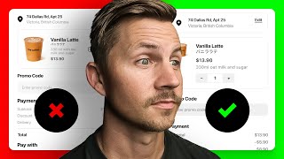
A designer walks through fixing a coffee shop app UI, tweaking typography, layout, and color. Small changes to spacing and type hierarchy make the interface clearer and more usable.
What is going on? All right, we have a form that people have filled out for a design critique, and Lucas says, please take a look at design on the app page. This is an existing coffee shop. I wanted to create an app for them. So I've opened this file. I don't know anything about this, and I am going to critique it. But before I get into that, let's take a look at this actual website just so we can get an idea of the vibe. I'm just going to copy that there. We're going to paste it into here, and we're going to check out this website, and we're going to go in English because I can't read Portuguese or speak it for that matter. Okay. I think there must be something that's not loading, but pretty cool. A little icons and minimalistic. I could imagine that this would be a good site if that image loaded in. All right, so. So here's what we're going to do. We're going to take. I don't. This is probably some exploration stuff he's done over here. That's just my guess. And then now he's got checkout, home and coffee shop. All right, so what I'm going to do is just narrow this down to make it a little bit easier to digest. We're going to pick three different designs. I'm just going to scan these. I'll not pick the old because I'm imagining that's probably maybe an older design he was working on, possibly. See, we got delivery and pickup. I do the idea that you could change between delivery and pickup. I'm torn between these two right here. I like this one because delivery is a lot more apparent, but it also competes with the pay now button. If you zoom out, you've got two black areas. One is defined as click this, I'm the action. The other one is you have already clicked this. I am selected for that reason alone. I'm going to choose this option 3. I'm just going to. Option. Can I even. Oh, this is view only. So let me just duplicate this to my drafts and then I will choose that one. All right, where are we? App. Okay, don't want those on. All right, so I'm going to bring this over here. So that's. We've chosen checkout. Now we're going to choose one of the home screens. All right, so we got option 1, 2, and 3 categories. Most popular. I kind of like the this one just because it has categories as well. Without thinking too hard about it, I'm just Going to pick that one. Put it over there. And then we have coffee shop map. I'm definitely drawn to these with the images. And I also really like this idea where you could swipe through these sideways. And I think I'm going to choose this one because the order here button is closer to the this is all hugging itself as opposed to this one. The order now button is floating out here on its own, and it feels a little bit close to this stuff. So let's grab this one. So. All right, so we've picked our favorite three out of this stuff. There could be more context that we're missing that we haven't taken into consideration. But overall, just based on pure instinct, these are the three that we're going to choose. And we're going to work on the potential of making these better. So I'm just going to tidy them up and actually what we'll do, we'll just go ahead and create another page and paste them here. And we'll also do. We'll do this. So we'll have a before and then we'll do an after column as well. Might be a little too large. And then I don't know if I'm going to do all of these, but let's just do this for now. All right, so let's just move this to be out of the way here and let's just think about this. Our. All right, so I'm just going to make some notes over here. Let's call these. But if I really wanted to get fancy, I could go to my. My shift Nudge. Lesson plan, not lesson plan. These are homework guides, and each one of them has a little sticky note inside of it. Okay, didn't mean to do all of that. Basically, I just want to steal the sticky note that I made because it's a fun little sticky note. All right, so we're going to delete all of this and we're going to say notes. By the way, if you want to know how I made the sticky note, let me know in the comments. It might not be that novel, but it's cool because this can grow and I've got some notes and you can even think you can even mess around with the logo and whatnot. Anyway, I'm getting off track here. Let's get back to it. All right, so notes. I'm going to say that I would try edit instead of an edit icon for. For the address specifically in this area. I've used this little kind of idea for editing before, but a lot of times it's just kind of floating out there, and it doesn't really have much context for someone on the go that's really wanting coffee badly. So let's hit the wrong quick key. Let's go back here, and let's. Also, we need to assess the gray color on everything, because I think these are going to be failing. All right, and then next we are going to fix the increment in decrement or decrement button. I don't really say that often, but that is possibly the word. Okay, then we're going to look at. See, look, they're doing edit right here. We should use this up there. Just let's keep it the exact same. Edit is always the same kind of deal. And then we'll look at borders, backgrounds, and dividers. And then, of course, we're going to need to look at font size. What else? Layout overall is pretty good. All right, so those are the things we're going to do. And let's go ahead and make them a list so we have some numbers to reference. All right, so number one, try an edit button instead of this icon. And then we're always going to want to align these to the baseline. We're going to want the baseline lined up. And you might be tempted to put this center aligned. And sometimes that can work. But when you're not using a border or if this was all inside of a thing, you might be able to get away with putting this in the center. And it would work because it's editing that whole chunk. But whenever you're using a UI that is not created with borders and dividers for every piece of element, and sometimes even when you are, you're still really going to benefit from having these, the edit button, like this, align to the baseline. It's just going to make this line of continuation nice and strong horizontal right there. And I'm going to go ahead and just align that to the right edge. So let's double check our sizes. We got 14 for everything that is a little bit small. If you mirror this design to your phone while you're working on it, you're going to notice that 14, while it's not unusable, 14 is quite small. So let's just look at everything we got here. All right, we got 16. While I'm on font size stuff, we got 18, we got 14, and we got 12. 12 is really tiny. I would not use 12 unless you were going with where they're using it. It's not that inappropriate. 11 sometimes is the smallest that you'll See, Apple using for legal copy. So we've got four type sizes here. That's 14, 14, which is fine. You can totally use four type sizes. But I also to try to reduce it to three if I can. If I can just get that up there instead of 12 up here. I wonder if we could make these 14. Could we do everything with 16? 16 and 14? I don't know if that's possible or not without making these a bit larger. And I don't want to spend the entire time redesigning everything, but I just want to see something. Could we do 16 for all of this? See if I can do this quite quickly. And am I going to even. Okay, that's 18. So let's knock that down to 16 and let's knock this up to 14. And you know what? IOS is really big on using 17. A lot of their stuff is 17 and 15, not necessarily 16 and 14. I'm not 100% sure why that is. Maybe because when you're designing, when this gets on a 3x screen, it's actually going to be the 45 point size and the 30 is going to be. Or the 17. What is 17 times 3? Can't do that math in my head. 51. Okay, that's definitely not going to be helpful at all, but just something to think about. All right, so if we use our contrast plugin here, you're going to see that this is failing. This has got to be this type of text that is 15 regular. Has got to be at least 4.5. Okay, so we're going to make all of this text 4.5. And that's just what we have to do. You cannot have a failing contrast because it will be more difficult for everyone to read. Okay, so that 777, let's. Okay, there we go. So that is there. All right, I'm just going to hide this guy for a second so I can move. Let's move this off as well. And actually, before. Before I started, I should have said, this is a nice design. It's clear, it's usable. You could build this and ship this, and it would work right now. So good job on your design. There's a lot of really good stuff here, and I should have started by saying that normally I like to begin the critique by giving a compliment, and I forgot to do that. So my bad. This is a nice design, and so we're just really just going to nitpick it and try to tear it apart a little bit, and that's all we're doing here. Is just messing around trying to get it looking a little better. And I'm trying not to spend way, way too much time doing all this. But I also just want to spend a little bit of time designing stuff. And is this Dallas Road? And everything is looking bigger than. Oh, I see what's going on. All right, these are bold, and then this is display and this is not display. I can't remember how big SF Pro display versus unless you're at 20 or larger. So notice how spread out those letters get. So this was maybe mistakenly set to display instead of just SF Pro. And what this stuff should probably be 15. The address specifically should probably be 15 instead of 17 because that is secondary information, not primary. Although you could make a case for that being a main section. All right, this is still all 14. I'm going to bump all this up to 15 and we may need to actually make this stuff a little bit larger. All right, so I got that there. Move this stuff down. Let's all. Let's grab the. The style from here. All right, a 777. We're going to make these 777 as well. 300. All right, so whenever I'm doing tabs, I always want to make sure that these are going to fit properly. So I know where this is going to live as well. So we, without going into too much figma component design and all that, just know that I'm considering that background for that particular section. All right, so now let's put all of that in a. What is that? What is that? What is this group? Let's get rid of that. All right, so we're going to group that and I might give this a little bit more space from the top instead of going zero right there. I'm going to try eight just to give check out a little more breathing room, maybe even four. I'm not too worried about my layer names and my styles. 30. 30 is a decent size padding, but just to satisfy my OCD, I'm going to make it 24 and just update some of this stuff. You could go 32, 28. But I like specific numbers. And why not? You can always change this later as well. All right, so that's 2433 milliliters with oat milk and sugar. Okay, maybe. Maybe we put the price. Price could be over here because we need. We do need to bring this back in on its quantity. 7 and also 17 for that is very tiny, I would imagine 24. Technically, 44 points is the recommended hit target for a lot of the stuff on iOS, so we could consider that as well. So let's just redraw this really quickly, duplicate that, and let's make the pro. Let's make the price 17, and let's make this 17. So I'm really trying to go with all 17. All these are 15. All this is seven. So 17. 17, and then 15 here. And so these are going to. I think these are too tiny. So let's get rid of that and let's give this one the background of that. So we'll just. I'm just going to group. I'm just grouping this stuff because I don't really want to do a bunch of fancy organization right now. All right, so that is our counter group. And then we're just going to disable that background just to give it equal space around everything. And I don't know if you saw, but I grabbed the same background color that I'm using for this. So let's just see what we can do by putting that directly under here. How should we set that up? We'll just keep it simple. We could even bring this. Wait, that's not the same color. Okay. Yeah, this needs to be the same color. All right. And then we could theoretically give this a slightly more space and maybe we move this down below possibly, I don't know, play around with that. Honestly, a lot of times you can even go and look. For example, let's take a Look at, like, Amazon.com and I'm just going to type in coffee cup, just so it'll be similar, whatever. All right, Coffee cup. And notice here they have title, then ratings, then price, then the description down below. Actually, this is. And so there's a lot of stuff going on here, but they've got title, then price, then description, and your quantity is a dropdown over here that you can change. So there's. It's always worth looking at other products that have already done this and they've already done research in terms of what looks the best, what works the best. So we're going to just go with that. We're going to. We'll go with title, and then we'll go price, and then we'll go description. We could potentially go bold with that, but let's just keep it as is for now. Maybe make that image a little bit larger. This feels too big to me, this icon. I'm move it down to 12. All right, we're getting there. I'm also going to do 24 from this edge, so notice how I've got 24 here, and I've also got 24 here. I'll do 20 on the top and bottom instead of 24. I like to go a little smaller on the top and bottom padding just because I feel like that. It looks better that way. All right, so let's just consider that one somewhat Done. All right, what do we have here? Semi bold. We also need to look at the font weight. So we got semi bold and medium, and then we got semi bold and regular. So let's go medium. Actually, let's go regular. The same way that we don't want too many font sizes, we don't want too many font weights. So let's pick two and see how far that takes us, and then we can decide whether or not we want to go a little bit more. We can. We can later decide if we want more weights or not. All right, so we're going to go medium and semi bold. So this is semi bold. This. We'll go ahead and do that. This should be semi bold. It is this one. Let's go and make that semi bold as well. This will be regular. This will be semi bold. This will be semi bold. And. And this needs to not be display. And we'll also do some in bold, and we'll do that as regular. Okay, we're good to go now. All right, so now let's bring back in this payment stuff. This icon looks a little funky to me. Just going to grab the feather icon and do location, and then we could redraw it, but in the interest of time, we'll just make this one work for us. Whoops. All right, see how that. See how these little. These are super pointy right here. The. The handlebars are all weird. Your handlebars shouldn't look that on your icons. They should be straight up and down. This. See how it's straight up and down and that Straight up and down. So that's what's causing these little bumps on the edge right here. It's hard to see, but once you see it, you can't unsee it. So let's get a nicer, cleaner icon in there. And maybe we will try to line this up on the center axis of that text versus centering it with the whole thing. Maybe we'll just give it a shot. We'll take a look, see if it works. If it works, great. If not, we'll put it back in the center, and it looks bad at the top. So let's put it back in the center. Let's put this back down. Probably Needs a little more breathing room as well. All right, so now let's go ahead and. So we've got this where we want it. This is. This might. This whole section right in here might be a little large. Gosh, we've got some really dirty frames up in here. But it's all right. We're not worried about that. Okay. All right, so we got promo code, and then we need to bring in the payment stuff. So let's. Let's do all of this as SF Pro Medium, and we'll make it all 15, and then we'll bump these up to 17 and semi bold. All right, so we're basically done with our notes now. We're just messing around. And see, I focused way too much on this one screen. I could have just talked about every screen. But we're going to keep rolling with it. We're already this far in, so we might as well keep going. Let's go ahead. And I'm not going to worry too much about the screen length just yet. So let's go ahead and make our screen a little bit longer just so we can fit everything in here. All right, let's. Before we do that, let's say these are 24 apart from each other as well. So 24. 24. We got 24 on the sides. We got 24 there, and we got 24 in between here. So let's make this one 24 as well. And if we need to change this later, that's totally fine. But for now, we're going to make it 24. I'm going to make this eight right in there. All right, we. Technically, we could throw in a header here if we really wanted to. I don't know that we need it, but I'm just. I'm considering the difference between this section up here and this section down here. But anyway. All right, we're going to go 12. We'll go eight on that. We're going to bring all this back in. We have a lot of interesting layer layers going on. All right. No judgment, though. I've done my fair share of layer craziness as well. I'm trying to ungroup some of this stuff while. Why is that not letting me. Okay, there we go. Just go into outline mode here so we can delete a few things. What is this little guy doing? We got a little rogue stepper right there. All right, get rid of that. All right, let's left align all of that, make sure all of this is right aligned, and then we're going to go 24 and we want to make sure this. All right, that's 24. All right, that's 24. All right, so we got our subtotal, we got our discount, which should be a subtraction. We. We have our delivery. Delivery fee. Let's just double check. 1390 minus 590 plus 890. 1609. Oh, I typed it in wrong. All right. 1690. That is correct. All right, let's just see if we can do without this line. Stick it over here. For now, let's do all caps on total. And tempted to make the total line 17 instead of 15. But I almost think for the payment we're going to need to like reuse this little modal or not modal, but like this little module thing. That way it's like this little chunk of information. So this just a quick little thing here. These look like like periods. But if Pro tip on a Mac, you can hold option 8 and get a bullet for like your masked card information. All right, so let's set these. Should we do that at 24 or 12? That looks a little bit too far away. So let's do this at. Let's try 12 and then see what that looks like. Okay. And let's make sure we're using the same border color for this as well. Again, we just. We want consistent strokes for everything. D9E6 probably we may want to go. If we go inside. Sometimes the radius can be a little bit weird, so I might try. Actually that didn't change much, but I think I might round that we could play more with a solid style versus like the white and whatnot. But not really that too worried about all those fine details. Sometimes I would go back through after the fact and do all that. We could even try to do shadow on this thing. Could be a little fun thing to do. Just using this like smooth shadow plugin might be overkill for this particular little thing. But sometimes you can do like little cool things like that where it's just this like subtle little like card and it adds a little bit to it. But I'm just going to. I'm going to take that off for now because I don't want to get into the fine details just yet. I like to get everything structurally sound, all the typography, layout and color stuff just locked in and then dive into like style and play around with all that stuff. Okay, so let's also grab this pay now button, bring it back in place. So what we want to do here, we want to make sure that our space between Our little container and our title is consistent. So we've got eight pixels here and we're going to do eight pixels here and then we'll group that and then for now we'll do 24 between these two. So this is feeling pretty good down here, this stuff. And this is good. This is good. This is good for now. Now we're going to focus back in on this. And let's see. Do we want to go semi bold with the total? I feel like that might be appropriate. What are these frames here? These are. All right, so one thing we could do right here, just to make this a little easier on ourselves, we can select these two across from each other and hit Shift A just to create a quick little auto layout frame. And we'll do the same. That'll just ensure that everything's lined up. And then we can also select this whole like all this stuff and hit Shift A as well. That way we'll just automatically get the ability to. Okay, let's actually take. All right, so this is good because we can adjust the space between everything, but we're very likely going to want a different space between like payment and subtotal. Should probably be 8, but these right here, I'm going to put them in their own frame with their. That way we could. We can change this stuff independently. So I might put that at 4 or that might actually look good at 8 and we might. What happened to us here? We might actually want to go more than. So even though we have eight right here, this is eight to very light gray background versus to the text. You can see it's almost 21 to that text. And then this is 21 as well. So we might actually need to go closer to 20, maybe not quite that much. And maybe we do need the line. I'm not sure. Let's pop the line back in there and let's actually get it inside of this frame. There we go. It's actually looking pretty good like that. So like pretty similar to how they had it. Just tightening up things here and there with the sizes and whatnot. Alright, so now let's put that at 24. Let's put that at 24. There's a part of me that wants to pull that all the way across the top. I don't necessarily think that's fully necessary. But one thing, now that we have all these together in these individual blocks, we can put all of it in an auto layout frame if we wanted to. And then we can play around with. Okay, does 24 look better? Does 28 look better. 32. Like, 32 is actually not too bad. And actually, I meant to put this in here as well, and we'll bring this back up. Can't remember exactly where we had it. So now we can play around with all of these sections a little bit more. Like I said, 28, 32. I'm like, just based off of quick gut instinct, 32 looks pretty good. Just because I want enough space between here that it's. It just feels right. The other thing that we could try, and this is where these little experiments come in handy. So if we duplicate that, what I might consider is what if we made all of these 15, but we did them uppercase instead of the way we had it, and then maybe these go down to 15. Almost wondering, should we go bold? All right, so basically we have everything semi bold and medium. Now I'm thinking, okay, what if we go and we do bold for everything? For everything that was previously semi bold. What if we go and maybe that's not bold. Maybe that goes back down to medium. I'm going to put these all on auto. Another thing that we could consider doing is going, like, even lighter with those. It doesn't really work that well. I kind of liked it better when these were bigger and not all caps. This feels like it needs a little more space. And now that I've collected everything and everything's somewhat shored up, I'm just going through and looking at everything to see what could be a little bit better. I just want a little more negative space around this title so it's a little bit easier to, like, prominently stand on its own. And honestly, that's like. That's looking pretty good like that. Let me just. I don't really need that one. Bring this one back over. And this is where. Okay, so, like, right now everything is 15 and 17. These little a minute. Like, we might be able to go like 13 with those, maybe even 11. But that does feel pretty tiny. I feel like 13 could work, though, just because it just seems right again. We'd probably have to mirror this to our device to see, like, what. What we really thought about it. I also noticed that this might need to move over, but it's. Since it's in a component, I'm not going to worry about it. All right, so now that I'm looking at all this, one thing that really bugs me is, is when I'm looking down this right side, I really want to see a lot of this stuff lined up. Now, this stuff right here is nice and lined up, but this little guy is not. And I kind of wonder if we could possibly get even this little. Even this little thing here lined up with everything. That might be asking too much of the design. But what I want to consider doing now is so we're using this, like, stroke around these different sections. So we have it around vanilla latte. We added it around payment information. You can see how just that stroke gives it a little bit more of a tappable feel. So now I'm going to go in here, and I'm going to use this for this area in here. What's happening here? This is why auto layout is sometimes the worst. What's going on? All right, let's do, like, we'll start off with 16. What do we do down here? 16. Okay, 16 on that one. 16 on that one. We're going to need to bring that over so we can give our little icon a little more space to breathe around. So we're going to go. Let's go 20 on the side and then 20 on that side. So even though it's 24 here and 20 on the side, we're just, like, constantly scanning and making sure everything's lining up. Some people like to do eight pixels, eight pixel grid. I like to do four. All right, so that's 16. And so now. Now I'm thinking, because this is how this has a border on it, border around it, we can go with a tighter margin. We could go like 16. And it's not going to be too crowded because now we have, like, very defined borders. A lot of times if you're not using a border or a background color, you need to give more negative space to give that implied separation. But when you have a distinct and, like, overt divider, you can get away with a smaller amount of space. And it's still looking okay. You can see this looks pretty good. But now, because these are. They don't have that background, they're feeling a little bit tight. So what I'm going to do is I'm going to select these three items and put them in their own auto layout frame. Let's actually that's not grouped properly, so let's do that. All right, so I've got these three. I'll put them in their own auto layout frame and leave it at 16. And then these three are going to be in their own auto layout frame. And we're going to make those 32. And then we'll go ahead and lump this in with those three. And now that I'm looking at this, these could probably be tighter. 8 feels pretty good right there. So now you can see that we are. Our edit buttons are now lined up. And if we wanted to, we could potentially bring this stuff in. We could bring that stuff in a little bit. So now we actually have this placeholder text and this text are lining up on their own. And now we have on the left. On the right side, we have the edit up there and this stuff and then the edit right here. That's 16. That's 16. Okay. What did that look off? Okay, that's good. We're really close here. The thing that's bugging me is almost want to see these lined up as well. But I'm just not sure if that's going to be worth. I don't actually know if that is best or not. We might just have to deal with those being in the other way to do it would be like manually moving these over. But I'm not sure if that works as well. I'm going to take this main section out of the auto layout because this feels a little tight right there. Let's go. Let's go bold with that. So I think we need a slightly different spacing system between the background color and the typography than we do from typography to typography. So I'm going to do 24 if we have a solid color on the typography. But then when we've got type to type, I'm going to go a little bit larger because that the text is always going to need a little bit more breathing room because you can see like the enter promo code to the payment right here. That's 37 pixels when you break it out. So it just offsets it visually. And. And I don't want this to be too close to the payment because we don't want to like someone accidentally tapping their card when they are trying to pay now. All right, I think that's feeling, like, pretty good. So if we brought this back down to here, you can see we definitely made the page a little bit longer. And your average iPhone that is 390, 390, and 844. So this would technically be like a 48, 44, which is like right in this area. So one thing we can do in this situation is put our. If this is clipped off, we could either have this floating and fixed at the bottom. We also want to be mindful of the home indicator, which he has right here. Home indicator. I think that's supposed to be a little taller than that. But not going to worry about it too much. All right, so this. All right, so that's one way we could potentially do the. The checkout stuff. So hold on. Let's get that out of there. I'm going to break that apart. Modal stack. I was going to try to simulate a scroll here, but I don't know if this is going to. All right, we could just do this. Let's put all of that into here and then we're going to go. So this stuff could. This could scroll and actually the home indicator wouldn't scroll. Check out. Trying to just simulate this here. There we go. So like, that could like, you could theoretically have that be that way. You could. The other option is have the Pay with and the Pay now stuff, like in its own little container. So there's a couple different ways you could do it. It might make actual more sense to. To keep that in its own little thing and then that centered. We'd probably want to give that a fill bottom bar, payment bar, etc. Let's put the. Let's just go and put the home indicator in there as well. Put it at the bottom and then we'll. There we go. I think that's supposed to be a little bit different. And then we could add it. We could add a shadow going the opposite direction. So we could do like negative 4 24. I don't necessarily love that because then you have this white on white with a shadow and it just seems a little bit odd. So without going too much further in this whole section, let's just assume that we have. Let's put this back in and let's get rid of this drop shadow because there's still like, more work that would need to be done to figure out the full interaction. Whether or not the bar is. Whether or not this pay now button is floating or not, or whether the page is too long. We could probably redo this section right in here. This whole thing could be closer in line with this. Like it was originally designed. That might have been a mistake where I made that. Way too big. So that. That's another thing. Like, now that we have it somewhat laid out and organized now we can go back and say, okay, what about this component? Like, maybe this one is too big. And maybe we could make a version of this where, okay, maybe this is only 60 by 60. And let's actually just try to do one real quick. There's another possibility that we don't necessarily even need these like toggle buttons here. Like, it could just be like one. And if you tap that it could activate popover increment little thing. And that would be a totally fine way to do it as well. And that would save. That would actually save a lot of room. So this could be another version of that. Stick that in there and delete that one. Our auto layout wasn't sticking. Still. Was not still set up. That's all right. Okay, that actually feels a lot better. And I'm also wondering, should we do this for this? Should this number. Maybe this number should be like more of a button instead of like an input field, because this is our input field style, and so possibly we reuse the style of the stroke. Now, this is not something that I would settle on immediately. I'd probably run a lot more smaller experiments on this particular interaction. Like, I don't feel like that's done right now, but that's basically good enough. I'm just going to pull this one over here and let's put this one. We'll just save these others for another day because this video is way longer than I originally intended. A lot of these look really good other than, like, the way this is. Some of the shadows here. I would probably end up going back and using some of the same styles here with the stroke. These stroke modules versus the shadow modules, because we're not really using that anywhere else. I don't love what we did there with that number either. That should probably be 15, actually, to make it a little smaller. All right, just tightening that up a little bit. I want to get. Now I want to get this coffee cup and this line right in here. I'm looking at this weighing that. I kind of want to center that so it's a little bit more even. We could consider a slightly different layout with this. But I'm not going to go too much further with my smaller experiments. But once I get it to this page where I'm like, pretty happy with the overall structure in the layout, then I would go and say, okay, what if we did a full background color? And what if the input field was stroke and maybe the cards were solid? I would run little style experiments over all of that. And for example, I don't know if this background and this style is necessarily the exact thing that we should do based on the way everything else is done. Or maybe we should activate that particular little pill a little bit more because we want to make sure that people know that is selected. So we could add in a little shadow there. And then all of a sudden, whoops, I hit cancel instead of. Instead of hit return. Put these right in There blur that a little tiny bit. Kind of wish these had number increments that you could play with. Sometimes the plugin works great. Other times like that shadow is a little too harsh. Sometimes it can be a little difficult to work with. Might even just do a simple 4, 8. If we really wanted to get fancy, we could do a little 1, 2 in addition to give it that harder, crisp edge on the bottom. Again, we could play around with that as well, but this just gives you a little bit of an idea where it's okay delivery. You could imagine this, like, sliding around if we needed to change. All right, so now let's look at all that we did, and let's compare these two right here. Like I said from the very beginning, like, the one on the left here is a pretty nice design. And you could ship that and build it, change the color contrast at least, and then ship it, and then you'd be good to go. And there's still I. There's part of me that likes that little stepper right there. But you can tell that, like, all of those little adjustments for just typography, layout, and color, and you get everything organized and you're playing with your negative space and. And you're trying to use constraints on your font size, your font weight, and also with your layout, with your different spacing and all of the different pieces that kind of put it all together, you just end up with a slightly cleaner, a slightly more balanced and readable layout. But you be the judge. You let me know in the comments whether or not this is better or this is worse, because sometimes it's really hard to design live with without going through multiple rounds like I would normally do. There's a. The difference between the size here, for example, the 17, and this 15. Like, that's bothering me a little bit. And so I might end up going back and changing that to medium. The shadow I'm not really sold on just yet. There's different pieces that I would definitely go back and revisit just to bump it up even higher, even more fidelity. But for now, that's just a good crash course on what some simple typography, layout, and color can do for your design. So thank you so much for watching. If you enjoyed this longer format, your feedback is always super valuable to me, so let me know in the comments. And if you want to see more, make sure you subscribe. I'll see you in the next video.