Pro Designer Reviews a Portfolio
A designer breaks down what works and what doesn't in a portfolio, covering layout, typography, color, and animation. The critique focuses on clarity and visual hierarchy to help you present your work more effectively.
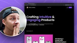
Hey, what's going on? All right, so last week I put out a tweet that said, send me your designs, send me a link to your portfolio, Send me a link to something that you're working on and I will critique your design work. And I guaranteed the first five. And this is the first video of following up on that. So this is the form I'm going to move myself out of the way. So I'm just letting people know I'm going to critique your work. But please know this is going to be videoed and, and I'm gonna use it for content. So it's your email, your name, your Twitter, and your Instagram, so I can tag you later and then your URL or your figma file and then any specific feedback, et cetera. So I've got 23 responses from just last week with one single tweet. So I'm gonna go ahead and I am going to go ahead and click on this link. This person says, tom says, nope, do your words. So I'm gonna open this up in Figma. We couldn't find that one open. Okay, so that's not going to work. Okay. Yannick's design portfolio. So now we are going to review Yannick's design portfolio. All right, so this, I need to move myself over here. Yannick Jimenez, Crafting intuitive and engaging products. Hi, I'm a senior product designer from Canada. I thrive on solving product challenges through great design, prototyping, testing and collaboration. Case studies down below. All right, all right. So first of all, the first thing that I want to critique here, overall I think it's a nice, stark, strong layout. We've got nice left alignment with all this stuff here. We've got some nice top alignment with all of this stuff in here. And anytime you can create those lines of continuation, it's going to create a stronger format. My first critique though would be around this color purple. Now, the color purple for resume is totally fine, but whenever you use the exact same color purple or really the exact same color for both an interactive primary call to action and a non interactive headline or text, then it's going to water down that definition of that color. Also, just in terms from like a user experience perspective or even a call to action, typically your call to action should be an action verb. Take a look or view my resume. If you just say resume, it's gonna be slightly less. You're not really calling someone action, you're just providing a noun. And it's not. It may not seem like that big of a deal. But if it said view my resume, it would probably be a little bit more initiative to click that. So color is definitely the first critique. Not that it looks bad, but it's just when you water down the purple, it waters down that definition and then also around the call to action. Secondly, this right in here, the bold Senior product designer. Great design, prototyping, testing, and then this case studies. Like, all of this feels a little bit jumbled, if that's the right word. It's like too much kind of. If you have like a really long body of text, sometimes these bold and these call outs, this bold text can add a lot. But right here, I feel like it's creating a little bit of visual distraction traction because I'm balancing between crafting intuitive, engaging products. Senior product designer from Canada. Great design prototype. So it just feels like it's jumping in and out and it's not creating this, like, super clean landing page. So I think that you could possibly shorten this paragraph into maybe three or four lines here and make it all the same color possibly, and then take this purple out. I would also look at the font size between Yannick Jimenez work about resume. Let's categorize every single font size. We're probably dealing with 1, 2, 3. And actually, if I wanted to get super technical, I could go and check all of this. So we've got this is 14.8, this is 8.14.6. That's probably using like, rims or, or M's trying to find the font size in here. It's going to be probably not worth it to dig into all this. I'm not going to dig into the code because that will make for a boring video. But anyway, 14.8, 14.6. And then this is just an image. And then we got 66, we got 18, we got 21, we got 32. So there's like font sizes all over the place. I would challenge Yannick and anyone else watching come up with three type sizes for this single page. Let's do one type size for all, everything in the header, and then a second large type size for this and maybe a third type size for this and then we can choose. Okay. Should the case studies be the same type size as stuff in the top like Yannick and case studies is almost the same size, but it's a little bit different. And we want to be very intentional with every single font size that we're choosing. The same way we want to be really intentional with every color that we're choosing. So that is some. Just some initial Critiques out of the gate. I would also consider. I really like the way this pink adds some attention grabbing. It's got some attention grabbing qualities. And this looks pretty good together. So I'm just wondering, what if we took out Case studies right here and took out that entire section? See if I can actually take it out. So, like, what if we had this kind of peeking out of the bottom? So we're teasing out the bottom content of the page instead of saying case studies, I can actually see the case study and it makes me want to scroll down versus saying case studies with an emoji. I feel like that's a little bit of like a slight weak add on. And again, I'm not trying to be like super critical or anything, but I am. But I'm also saying I think there's some good stuff here and it's just a matter of what can we do to continue to elevate the quality of design. I think there's a lot of stuff working really well here. All right, let me just move me again. This is starting to feel really nice. Like this title with this subtext. It has a really nice system of like this size and this size. You can almost see if we just went fully gray here, I feel like it would be a little bit stronger. I know, I understand the desire to say a 35% increase in user engagement, but I don't know if that's really worth sacrificing the quality of this colorful, like this color system with the white and the gray. And then read Case Study. I think that we could probably do without that. And in fact, I also wonder if we could. Let's go to. Where can I do this? I want to move my. Oh, here we go. I want to move that there. Close that. What I really want to show is how this, this might look better if we also focus on the width. See how we have achieving 35% increase in user engagement. We've got this little orphan hanging out on this one line. You can't always try to fix this because sometimes with content and things like that, you can't really. You don't have a lot of control over that. But we're going to just give it a shot. So this is a paragraph. I'm looking for the paragraph tag. All right, let's do max width and see how if we reduce the max width on that right there. And we just put end user engagement down here. And actually, while we're at it, might as well go ahead and change this. So if I. I wonder if I Take the strong tag out. Is it gonna. I'm just trying to remove some. Yeah, that's not gonna work. You tell me in the comments whether or not I should spend the time to try to change this live, or if you'd rather just see. If you'd rather just hear my reaction to it versus me trying to fix it, because sometimes it's not worth it. All right, so I just changed it to gray there. And I'm also trying to. I know that's not the same color gray, but it would actually take too long for me to try to find the exact color gray. So that doesn't necessarily look like way better, but you can see that gets to what I'm talking about. Gamifying loyalty system. And so, like, we can have white call to action text here and white called white headline text here. Because in this context, we are. We're defining the call to action with a border and a button, whereas up here we're defining this color purple. And it's slightly different here, but it's enough to call my eye into different directions. Whereas in this one, I feel like this could totally work. You could even go with a lighter gray around here possibly. But overall, I think that kind of works. And you can see that this probably said, like, 64% boost in risk. I just. I understand the desire to put that in there, but I'm not sure if it's doing enough to warrant keeping that in there. But overall, I do this format and I. I did like the animation in this one, but now that I'm seeing all of the animation, it's feeling like it might be a little bit overwhelming. Like, everything's zooming in and out. It's hard for me to. To rest my eyes. I think that's like, the overall feeling I'm getting from. I'm just going to reload the page so I can get back to the original. There's just. It's like crafting intuitive gauging products. Senior product designer, case studies. And then there's this. This animation, and then there's this animation. So it's almost like if you're listening to a song, if you're listening to, like, a guitar player and they're just like. And just going on, and it's just never any. Like, at first it seems really cool, but then after a few minutes of it, you're like, oh, my gosh. Like, this is getting so old. It's just so much so fast. Versus the melodic sounds of the quiet pause and then the scream. And then. So I Feel like there's a certain amount of not trying to grab attention that sets, like, this quiet, calm stage for when you do really get ready to grab someone's attention. And so I think there's a lot of really interesting things happening here, but possibly could be toned down just a little bit. I really. This call out, I think this looks really good. I'd probably go gray right here, like a lighter gray text, because I feel like that's competing with each other. And you may want to put the name with the photo. Like, the photo could possibly go underneath. Or the name could go up top, and I would grab the name and the photo just to lock them up a little bit better. I also think these arrows feel a little bit out of place because you're not really using that dark gray background anywhere for any of the other stuff. So I would almost just go with a white arrow, possibly in the same style with the same exact white stroke and the same stroke for that arrow. I feel like it would just work because we're constantly defining our interaction. So we're saying, like, white stroke equals action. White stroke equals action. Like, we're saying up here, white stroke equals action. But. But then right here, gray background, black stroke equals action. So we're constantly looking and combing over every little detail that can be used to define those interactions. All right, so let's click into one of these case studies. I'll just go into the first one. Move this down a little bit smaller. I like this logo. And see this is a nice headline, and I think this is a nicer version than what was on the original page. This seems a little bit odd to me. I do this as a little component, but it's just stuck in the middle of this page. And I almost think that you could probably. You could probably come up with a stronger headline and have a. Like, a lockup of all this information. Because I do think I led into InDesign. I work with the product managers, blah, blah, blah. The Deliverables. Like, this is a great list. If I'm looking for to hire someone, I want to know what they worked on. So I would almost be tempted to put this stuff into a bulleted list where it's, here's everything I was responsible for, or here's. That's essentially what Deliverable says. I was. I did the user interviews. I did the competitive analysis. I did the ia that should be ia, not AI. I did the wireframes. I did the mockups. Maybe if. And. And also, like, mockups. Not everyone might not know what that means. So maybe it's like high fidelity interface design. Cause I think that is important on a page like this, especially when you work with a team. People want to know what did you do? Did you just do this animation and everybody else did the design or so I think surfacing the deliverables and what you specifically worked on. I think this is super important right in here. And I would, I probably wouldn't hide that. And I also, again, I think some, some of these animations are nice, but too much of that can, too much of it can be a little overwhelming and sometimes hard to, to, to get all that information. So like this is a good example of. Okay, it's a cool image. There's some pop up stuff like it's taking me, it's giving me a moment to like pause and take it all in. So we're just looking at some of this. What is this NDA there? I'm torn on all of the text here. If I'm just scanning this, a lot of times I'm just scanning the work. Okay, let me see the work. And it's increased the user engagement. Okay, 35%. Great. Complex needed optimize. So what I'm really, what I really want to do is just see a bunch of the design like it is showing me that I can see that you have a good design eye. But a lot of times. And this looks really good, these numbers. In general, I like this. But I think there's a lot of times when I just want to see the work and less words. And I know that there's. People are going to be split on this in terms of how much case study do I put versus how much actual words. But this feels like a lot of reading. And with everything animated as well. Not everything, but with a lot of the stuff animated, it's hard for me to just glance at every single little thing and just soak it up, soak it in. It feels like there's a lot of things calling for my attention. So I'm just kind of, I'm soaking this up. I'm glad to see this one not animated. I do feel like this blurry background, the way that's fading in and out right there, that feels like it's a little bit distracting. Like we could just do without the blur. And it depends on the different browser, but sometimes I can. I find that a little distracting. But this is a long case study and there's like how many headlines do we have here? This looks really good. I would still consider gray. And then locking these up overall, I think this is good. My. My overall recommendation would be, let's see, like a grid of all the stuff you worked on and then maybe three key paragraphs with three key headlines versus increase User engagement. Overview, problem goal, impact, disclaimer, discovery, assessment. 7. Definition is 8. Testing part one, that's 9. Iteration part one, that's 10. Testing part two, that's 11. Design workshops, that is 12. I'm not even counting some of this other stuff. Iteration part two is 13. Testing. I thought we already did testing part one. This is 14th section. This is the 15th section, 16th section. And I'm skipping a lot of this. 17. So there's 20 different blocks of content that all seem a little bit, like, slightly disconnected. I understand the breakdown. There's a lot of stuff to break down. But I just wonder, is there a way that we could simplify this where it's okay, here's all of the initial stuff I did like, here's three different sections and we just simplify it for someone to consume really easily. Assuming that we want a hiring manager or someone to check this out and fully understand. I want to see the work, I want to know what you did, and then maybe read a little tiny bit about it. That's my own personal opinion when I'm looking at some work like this. So I feel like we could definitely simplify this into maybe a grid of things and a title and a small paragraph, and then a grid of things and a title, small paragraph, a grid of things. I would really hesitate to go with more than three or four sections here. So that is my. Just my initial reaction. I think there's some other things we could do with like typography and not having things floating in the middle. Oh, there's one more thing I wanted to say about this. This gray color that you're using here, you're going to want to use HSB with your color picker. And as a matter of fact, let's just do this really quickly in Figma, because this is a good little thing to show. All right, so we're going to go to Figma here and we're going to create a new design file. Going to paste this in. All right, so we're going to pick impact. Just make it roughly the same size. And I'm going to select this gray right out of the. All right, let's go up a little bit more and let's go bold. So it's not exactly the same, but close enough. And then we'll do this one to boost in user activity. Rate. All right, so these two, you can see this is. It's actually in that blue realm, but it's only a 3% saturation of that blue color. So this is how I like to choose my blues or my grays when it comes to merging them with the color. So I'll. I will just leave these here, and I'm going to bring these other ones over here. So what I'm going to do first is just select this actual blue color so you can see, okay, 240. We were already roughly right in there, and now what I'm going to do is maybe put this at 10, and even at 10, it feels like it's a little bit warm, like it's not quite as blue as we need. And this is going to be different for every single color. If you do it for, like, red or yellow or any color on the spectrum here, you're going to need to play with the saturation. So you can see if I fully desaturate it, it's getting, like, a little bit brighter, and it actually doesn't look that bad. But if I add some saturation, I might actually need to add a little bit more and then play around with the lightness here. So you can see, like, if I get up into the 90 range, it has this nice lighter blue and it clashes less. So I can actually start to play around with the saturation and the brightness up in this blue range and pick something out that works a little bit better with that particular color combination. So you can see, like, the difference between these two blues. This one is quite warm, and then this one is feeling a lot cooler, and it goes with that color theme a little bit better. And if we wanted to take this up a notch, we could bust out the Use contrast plugin and. And double check that we're hitting at least 4.5. We could even play around with that. If we put that at 4.5, that still feels a little bit. Oh. Actually, the reason it's doing that is because it's not recognizing this as a color because it's a bitmap image. So if I put this behind that color that you can see, it's 2.8. So it's actually failing. So I need to go up. So let's just leave that selected. I've got this blue color behind it that will help guide that. So a lot of times I'll have this contrast plugin open while I'm working on this color. So let's see if we can desaturate this a bit. And keep it at 4.5. That's going to be the trickier thing to do here. And technically we are 24 pixels bold, so we can actually go with a AA large. So anything 18 pixel bold and larger is going to be fine for AA large. So we could stop it there. We could also try to come and make it 4.5. It's not necessarily going to be a bad thing, but it's just something to be aware of when you're choosing colors. So we could totally go with something like this, which is 3.0, and let's just put this back over here. Or we could go with something a lot brighter. We could go with something brighter in that range and get it to be AA 4.5. But a lot of times if we're going, if we're going brighter and bigger, we might want to go a little bit smaller. And so you can already tell the difference between these gray colors. You can see how, you can see how warm they are and how they clash just a little bit with the blue. So if we can leave a little bit of that actual blue background into the saturation of those colors, it's just going to add a lot more of a richness. And if we're doing that across the entire page, it's just going to have this vibrance, this vibrancy that is hard to detect, but it just has a nice feeling to it. So let's, let's get these side by side and let's look at the difference here. So I'm just going to, I'm going to hold command to get rid of that black bar. And let's, let's do that. And let's do that. Put that in a group, and then I'm going to grab either one of these, send it to the top. This is also a place where you can play around with one, one additional font size. See, there's, this is a slightly larger size than this one. And there are three type sizes here, which is fine. But a lot of times you're going to find that if you use fewer type sizes, it's just going to be easier to design with. And you can play around with case versus size to add some dimension. So we're playing around with title, case, and uppercase, all uppercase here. And we can also play around with weight, in addition to case weight and case in the same font size can actually end up feeling pretty nice. So that is just a super quick little breakdown of the HSB color system. It looks like you were starting to use that HSB system, but it wasn't quite coming through. So I'm just going to double check this again. So that's 20 bold. So we could even go down to. Like I said, we can go down to 3.0 here. That would technically need to be 21 if it's not bold. So if we bump all these up to 21, it's either 18 pixel bold. See how it says valid for 18 pixel bold and 21 pixel regular. That's what we're working on here. This is bold, but we'll go ahead and bump this to 21 as well, just so we have that same font size across the board. But when I go down to 3.5, you can tell that it's like a little. It's like a little bit muddy. So honestly, the white looks. The really bright one looks very good. Pretty good. And I know that I'm splitting hairs here, but ultimately, once you lock these colors in, you spend a lot of time fine tuning and tweaking these colors and trying to lock these in. And then once you've done all of that fine tuning and you're stressing over, like, the individual HSB values, once you've established that, then you could go to town and design everything and you've got these colors locked in. And we could go ahead and save this as a color style and we could say this is the blue, the blue, gray, or whatever we want to call it a aaa. And then we can keep using this throughout our design. Now, there's probably more that I could say about this page overall. In general, I could spend more time going through it. This is actually a pretty cool page. Little bento box action. Yeah, all this stuff looks pretty good. Could possibly get rid of this orphan by shortening the width of this paragraph. But I like this layout a lot. Feels nice and tight and there's only a number. There's only a couple of different sections with a similar vibe. So I would look at. I would look at these case studies and try to give it a similar. It's almost there. I feel like it's almost there. It's just a matter of tweaking this layout and you. You almost want to zoom out to see it all. I want to see it all on a FIGMA board so I can give better feedback. But I think overall, that is. That is my review for Yannick's portfolio page. Let me know down in the comments if you would rather me not spend time in the editor trying to go in and change stuff. And if there's any other thing that you would prefer to see versus what I did, but thank you so much for watching, and I'll see you in the next video.