Transform Your Portfolio: Insight from a PRO Designer
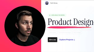
A designer critiques Faith Kinney's portfolio website, pointing out problems with typography, layout, and color. The feedback covers how to improve visual impact and tell a clearer story to attract employers or clients.
Welcome back to another design breakdown. In this video, we're taking a look at Faith Kinney's portfolio. He filled up my design critique form and said, I've been designing my portfolio website since April. What do you think about the explorations page? Alright, so I've been looking around on this page and I actually don't know exactly where the explorations page is. Maybe he's talking about the playground. Possibly. That's what I'm thinking about. I. I will get to that. But first of all, actually let me just move my head out of this frame so I can fully focus on all of this. All right. I like to actually let me bring myself back in here. I like to very, from the very beginning, break everything down into three critical categories. Typography, layout, and then color, in that order. All right, so first of all, we're going to look at typography and layout. So typography wise, the first thing I can see is that these right in here are incredibly tiny and incredibly gray and very light. And you are absolutely going to need to rework these because they are currently, you can see that 1.49 contrast for this size text 12 pixel, that's going to need to be at least 4.5. So if I just get in here and let's just change the color really quickly to £666, that's going to be 5.74. And honestly, that really lightweight font there, let's see, that is. So it's 300 font weight, which is actually pretty small. I typically. Just bring me back over here. I typically want to. I recommend you avoid really light type sizes. Type weight, excuse me, font weight sizes like this. So I would do 400 or 500, especially that smaller size because you're not going to be able to see it. When it gets to be a larger display, you can get away with that light font weight. But when it is so small and so gray and then you have these thin, little tiny strokes on your font weight, you're going to want to avoid the light, lightweight font weights. So I'm just going to update that single font weight right there and color. And you can already see. Okay, interaction design. I can actually see it now. Before we go too much further, I also just want to point out, I don't know that we need these tabs here. So there, there's a lot we could break down, but I'm just trying to critique what I see. But ultimately we want to present our portfolio as an extension of ourselves. Product designer, possibly a good start But I would actually, I would consider getting rid of these. Maybe put these on your about page instead of here. It's just a lot going on and they look like interactive tabs, but they're actually not interactive. So you've got. With a strong focus on the advantage of design systems and UI motion in crafting highly performant and scalable software. I'm pausing here because it is tempting to write something like this. I'm a product designer with a strong focus on the advantage of design systems and UI motion in crafting highly performant and scalable software. To me, that feels like something that you would never say in conversation. And I feel like this probably needs to be reworded. Product designer with a strong focus on design systems, comma, ui. I would say UI animation with a strong focus when that. Where they. You could even say with a strong focus on design, design systems animation. And I don't know, it's hard to copyright on the spot but I. It just feels like a mouthful and I would. You could even throw this in like, you know what, let's just run a little experiment here. We're going to open up our friend Chat GPT and we are going to go. All right, so we're going to open up Chat GTP Chat GPT and we're going to. We are going to say product designer and now we're going to say a streamlined version of my subtext, Product designer specializing in design systems and UI motion for high performance scalable software. That's actually not too bad. All right, let's give me three more options. Make it a fifth grade reading level. These are not. These three are not that good. Making easy to use and fast software cool designs. A smooth move. That's a. A little watered down. Special designs, moving parts. Okay, let's do 10th grade reading level. Specializing in design systems to make software fast and easy to grow using design systems and smooth. All right, this one's not too bad. Using design systems and smooth animations to enhance software performance. Expert in creating organized designs smooth visuals for better scalable software. So this is a little bit of a detour, but I truly believe that the content and the story that you're telling is just as important as the way that it looks. And a lot of times having the correct content and having the correct story that you're trying to tell is going to make your visuals a lot better. And so I can go back here and we can grab. Let's just grab this one or either one of these. It doesn't matter. And I'm going to pop this into this section right. Right here. Actually, I don't know if I'm going to be able to. It's not going to. This is all spanned out, so I'm not going to be able to do it. But. So like, product designer, I would possibly. Gosh, I'm going to change this to. So product designer could be. Could mean anyone. And so I'm thinking, I want to see. Why is it in a. I don't understand why it's in the span wrapper. Can I type in here? No. Oh, because of the animation. Okay. So I would consider putting my name right here for Faith Kenny. Maybe get rid of this on the main section. Or maybe it's just your. I like your avatar up here. Maybe we get rid of the name. And then I would also push that over so this is lined up. But I would be tempted to put Faith Kenny right here. And then I would be tempted to put this stuff in place of all of this. And I would also consider rewriting this to be a little bit less of a mouthful and make it something that you would actually say. You could say Faith Kenny, a product designer using design systems and smooth animations to enhance software performance. Or you could say a product designer who creates organized designs and smooth visuals for better scalable software. Something that rolls off the tongue. Something that you wouldn't feel weird saying out loud to another person. Okay, so with that out of the way, I. I would also. All right, so we're going to possibly get rid of this and put it in your about page over here and possibly rewrite this right here and then move this under here. You may need to add a little more spacing in between here and here. Once you put this text in here, we'll just have to see. And then hire me and explore projects like, I like this lockup. I think that's pretty cool. I would also consider getting rid of these. I just don't know that. Hey. Okay. All righty. All right, bye. So these icons up here also could probably get rid of these because I feel like these are just taking. They're just distracting on this main page here. And LinkedIn, Twitter, I don't think you need this page. And like, you already have work playground about contact. Work playground about contact. And so I would almost just get rid of this. I don't think you necessarily need this. So I could see getting rid of that icon and getting rid of these or just moving them. I don't mind the trusted buy, but there is a part of me that doesn't necessarily love this being center lined when everything else over here is left aligned, but this line right here definitely does help it. So I could either. I could see like popping in maybe another logo over here and maybe another one over there, and then get rid of these and get rid of that and then see where we're at on that one. I would also probably try to get this typeface the same size as this type size right here. Like, these are looking really good. This is feeling a little small and a little thin. So that's why I'm thinking we're going to need to make this space a little larger and then put this stuff down in here, and then these will have to get pushed down a little bit as well. And because we're like going all caps with this right here and this looks like the same, I would just out of curiosity, I don't know if this would actually work or not. See if we can do this. Text. What's it called? Transform. Capitalize. All right, that didn't work. Text, Transform. Capitalize. That didn't work. I don't have it on the correct object. I'm just guessing here. Still not working. I could just retype this, but where even. Okay. Oh, that shouldn't actually capitalize is not the right thing I should do uppercase. That's what I've been looking for so I could copy. Let's see if this works. No, didn't. All right, let's capitalize that. See, I can't get it on the right one. I got to get it on the P tag, but it's varied. All right, I'll do this really quick, a divp and then we'll. Let's go ahead. I'm just going to delete this one off of here and go into this one. And while we're at it, we might as well go ahead and delete these off of here as well. I'm not like, fully anti showing what type of software that you're working with, but I just don't know that on the home page that it's really adding that much value. So I think what we should do, like I said, get rid of this, move this down here, make the font size larger, and then move this stuff down and just see where we're at with that one. We're also going to need to move this over. If we keep it like that. Maybe have our name right here. That just differentiates. You got a really cool name. Faith Kenny. I think that's like a little more powerful and memorable than Product designer. All right. And then down here, I don't know if this is a loading issue, but I'm expecting to see, like, a beautiful image right here, and it feels like it. It didn't load in. I do actually really like this lockup and the Cabinet Grotesque font that you're using right here. I think this is pretty nice, a really nice typeface. And I almost wonder. I don't mind this typeface. I think this is cool, this. But the other one has so much personality with that R and the, like, some of those. The ink traps on the P and the lowercase R. Like, that looks really nice and I really like the way these look. So I wonder if you can take this and use that to guide what you do here in some kind of, like, similar way. All right. I also don't know if we need to show this on the preview panel. Maybe if we click into Transcend, there's a place where we could put that. But see this typeface that you're using? In addition, like right here, you're using it as your main headline, and then you're using it also right here, it starts to get a little bit too small and tiny. So I would actually take a stab at using only this Cabinet Grotesque for everything and just see what that feels like. And then on the case study section, again, like, the overall layout and typography, sizing and spacing feels really nice here. But this is absolutely going to fail. This needs to be at least 4.5. This is going to be like one. Something. Yeah, 1.49. We're really going to need these to be a minimum of 4.5, unless they're 18 pixel bold or 21 pixel regular. And this looks pretty nice right in here. But what would. What we're. Also, what we'd love to do is we'd. We want to get this baseline of this text. The baseline right here. We want to line up the baseline on this one over here and that one over there. It's close right now, but if we can nail it, it's just going to add this line of continuation and I call it like a layout connector. The same way that this left alignment is really nice and strong right here. And actually these are indented a little beyond the F, so I would actually strengthen that left alignment up a bit as well. But these. This feels like a. Ever so slightly, like weak, if that's the right word. I don't know if it's the font weight or if it's the color. Like, if I go up to 500, 400 is not bad, but I'm also just thinking 18, so that color and 18 feels like it's maybe a little bit stronger, maybe a little bit darker as well. I'd probably want to see that at somewhere in the 7 to 12 range with contrast, because for. For. For more of a readable text situation. This would be fully black. So this is going to be like absolute full contrast. 21. Yep. And you can see the difference between this one and this one. And actually if I. Let's see if I can do this where I go and get it like in there. So if I go. This is your original and this one is the one I was adjusting. It's a very subtle change, but I feel like that will help a little bit as well. There's something going on with this, like, crop. Cropping thing as well. I would also make sure. If you're going to put a video right here, make sure that it is amazing because this is like your main showcase. Pick your absolute best work. If this video isn't, like, amazing, then you shouldn't put it here. And right now it feels like more of a process video, which is not necessarily a bad thing. But I want to see, like, the sizzle. Take one of these screens right here, throw it on a purple background or something that, like. Because it looks like there's a decent amount of UI design in here that has, like, a good vibe to it. So I'd almost want to see this page right here. Maybe it's a little narrower and you put a. Like a. What is it called? Like the browser window around it and then put it, like on a background. Some of the stuff that, like, looks really nice and give me like a really nicely presented UI screen. And then maybe put some of this stuff down in the lower areas. So this is actually getting closer. But you're saying animation here, but I actually don't see any and. Okay, there we go. Okay. Oh, okay. So normally when you're doing like a left alignment here, a left nav, it's usually like, just only affecting the content to the right. But what you're doing, it looks like you're. You have this thing changing, like, everything. This is pretty neat, this image right here. This is really cool. I don't know if I need to see a time lapse of you building at all. I want to just see the end product. I think the animation here is cool. If you're like, maybe talking to a technical director about how to use after effects and things like that. And this is pretty cool. Showing how it works in codepen. But what I'm more drawn to is the actual finished product, like a bigger version of just this. Imagine if this right here was really big and it was all right in here and it was just like. And it just sh. And it was like on a slow loop. That would be pretty cool. But if you're going to have these left aligned tabs over here, what you're really going to want to do is have it fixed. You're going to want this to stay fixed. And as you scroll, you're going to want to move all of these titles to the left, left, align it right here. And you're going to want this stuff to like fully fix and stay on that left rail while all of this content changes. Because right now I'm expecting this to just change a little bit, but it's actually changing the entire screen. So anytime we have that there, we're going to want that to stay fixed that way. It's very apparent with what's happening. But yeah, go through all of your colors and make sure that all of this smaller type type stuff is at least 4.5. And. And then that might mean you want to go darker with some of your existing text to keep that contrast scale in play. And then this other one, I think it was blank. I don't know what that down arrow. Maybe this is just incomplete. Could be the playground area though. This, if this is what you're talking about with the exploration page, I absolutely love this. In fact, I wonder if you could incorporate this. To me, this page is the highest impact page you have. So compared to your homepage, this animation is kind of cool and it's okay. It's a start. There's definitely like some things that are distracting or whatnot. But if I'm looking at your page for your work, having this playground stuff and just automatically seeing your work, I could even see it saying faith Kenny, product designer and whatever up here, like this could be your homepage and it could just be. You can just mix your explorations and tutorials and spare time experiments and your work stuff could all be in the same portfolio. Because it truly does not matter to me if this was a client project or if this is just something you were having fun with. I just want to see how good how, what is the quality of work you're producing. And this looks amazing. Like this right here looks really good. Landing page interruption, interaction design concept. I like the fact that you're putting these files in here. You could probably like maybe left align some of this stuff and maybe write a little three to five sentences about this project. But overall, this actual design and this image is looking really good. Looks like you got a Figma file embedded here. I'm not sure if I would do that because then I'm. I'm left just wondering and I might not necessarily want to dig into all that, so I would possibly. So I like what you've done here where you have a little bit more. But I would consider pasting in a non Figma file just so I can see. See it more quickly without having to actually do the work. But overall, like, this stuff, the way that you're putting in these images and these animations, I think this is a lot more powerful. Especially like some of this, the first one we looked at. And this one, like, these are really good. These are really cool. And like I said, it doesn't matter to me if these are just studies or if they were for an actual project, because typically what people are looking at is can they work on what I need them to work on? Because I'm going to be selfishly thinking about my projects, the things I need to hire for my team, for my project, for my thing, and can what Faith is doing apply to what I need? And so I'm trying to make quick decisions about the quality of work and the type of work that you are capable of when I'm thinking about if I want to hire you or not. And ultimately the. The portfolio is gonna show your capabilities and it's ultimately distilled into whoever's viewing it. Can. Can Faith do what I need them to do for my project? Is ultimately the question that you're answering. And so a lot of times I'm just gonna go back to the main page. A lot of times we get caught up in all these little details about. Even when I came to here and I started like working on this. Yes, this is important. This is important that, that it's clear and it communicates. But ultimately you definitely do need to keep in mind if you're trying to get hired, specifically if you're trying to get hired and you're trying to win projects, you need to view your own portfolio through the eyes of someone who is making that decision to hire you. And they're probably not going to care too much about a lot of this stuff. But I would definitely want to give them my name, maybe a quick, strong line, and then put that grid of work. Imagine if you took some of this stuff with the playground and then also grab some of the best stuff out of Here and really curate the best stuff out of your project that's ultimately gonna. Is what's going to make the best portfolio. And some of the best portfolios can just be super, super simple with just a grid of information. And it's really just about trying to present the absolute best work that you can and lifting that those highlights out of your project and putting those best 1, 2, 3 images first that are like highly curated, even if you have to design them a little bit more beyond what they were to make them like stand out and be phenomenal. If you look at any single picture in your case study and you're thinking to yourself, is this a 9 out of a 10 or a 10 out of a 10 in terms of how great this image could be? If it's not a 9 or a 10 on that scale, then I would cut it like these right here. This is cool that you're. That I'm seeing, you're thinking. But I don't think these should be the very first thing that we see. And I don't necessarily think your sketch should be necessarily that big. You're just gonna. You're gonna have to figure out a way to make maybe some of these a lot bigger and have these stand out a little bit more. So I could probably keep going on and on, but I'm gonna stop it there. I do. These are great images. I like what you're doing here. Showing a little bit of yourself backstory. Something's going on with your footer here. You might, you also, you might not need these. I'd probably put my backstory into the full intro without having it in this expand collapse thing. And I'm also wondering, I don't know if, I don't know if I'm not necessarily opposed to the expand collapse, but you might be able to actually put these into maybe four different columns with a little things. I can quickly read them all because I feel like website development and framer, that's pretty straightforward. I don't know if it needs another line of text for product announcement feature guide. So anyway, I think that is probably good for now. Hopefully I helped you out and it wasn't too long and rambly. But anyway, that's going to wrap it up for this one. Thank you for watching. If you have any ideas for future critiques, let me know in the comments below and I'll see you in the next one.










