Watch my live DESIGN PROCESS for a Crayola App
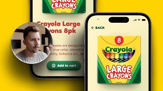
A designer walks through building a Crayola app interface in Figma, covering accessibility, color contrast, typography, shadows, and layout. Real-time decisions on how to make the design work.
Welcome back to another live design. This time we're taking a look at this Crayola page. This is from one of my Shift Nudge students in the style module. First of all, I just want to point out this is a pretty decent design, and overall, it is usable. A couple of things that I would critique right out of the gate, starting at the top. This is a little hard to see, and that is definitely going to be a failing contrast score, and that would not be accessible. People with less than perfect vision may have contrast sensitivity issues. Typically, that's always the first thing that I'm going to notice on designs, whether or not something is going to be accessible or not. And you can see this is. Whoa. This is 1.6. And in order to make this accessible for an icon, it would need to pass double A. So I'm going to choose the background here and go up to double A large. That is what icons are required for an accessibility standpoint. And also just from a good vision standpoint, I've made another video. If you search my channel contrast, you can go to usecontrast.comguide or you can check out my contrast videos I might make more specifically about color contrast. I also cover this extensively in Shift Nudge, but I'm going to just point that out. Have the right feel. So let's just dive into what we can do. I'm going to actually grab one of these old designs since I've been working in the same file, and that way we'll just have the background stuff that we need. We'll get rid of all this just to make our lives a little bit easier. All right, and let's see what else. What else we're gonna do. Let's grab. Let's just do a quick bit of Crayola research. Crayola crayons? Yeah, it looks like they chose the glitter crayons. I'm just gonna look through some images to see if I find anything that strikes my fancy. I kind of like the idea of, like, a 3D box floating on the screen and not cropping the. The box at all. I'm just gonna browse through. That one's pretty cool. I kind of want it to be, like, sitting for whatever reason. I think it could be cool to have a flat background with, like, a protruding 3D box of crayons kind of, like laying out. I mean, I guess it could be standing up, but I kind of like the idea of it laying on a desk and you're looking down at it. We could try to fake it with this one. But it would be nicer to find one that I could just use. Let's. Let's search for Crayola craytons 3D. It's probably not going to turn up anything. Oh, let's go. All right, last. This is taking too long. Let's do where are my tools? Size large. I want to get those nice big images. I'm just going to grab this one because is that one not even. That one's not even nice and large. You can always right click copy image and then paste that right into Figma and let's scale that down a little bit. And I. I mean, I do like the background color that they're using here. Kind of a nice playful pale yellow. Let's see if we can. What I might do is make a copy of this by just option dragging. I'm going to add a black fill to this line. Those back up and with just the back rectangle selected, I am going to add a blur, a layer blur to start to play around with this potential shadow. We'll start with something like that. And now that the blur is there, you can see that this is. The image is actually cropped in a weird way. So I'm going to hold command and get rid of that little white right there. And the other thing I'm going to do, I'm going to put an inner shadow on this and I'm going to make it white. And let's just start off at 100% and let's go 0y. Let's do like 8 blur and let's go 8 spread just to see where that gets us. And we'll play around with maybe four spread, maybe four blur. I'm not exactly sure yet. And then I'm going to knock down. So you can see that 50% on the green is quite intense, but it's a lot more difficult to see on the yellow. And I kind of want the yellow to have it more. So let's do that and then add a little Y. But it's still going to be on the sides. Yeah. So we kind of need to strike a balance in terms of how bright we go. So let's do like a base layer and mostly just look at the green. So like 20%. That's pretty good. I'm going to do another inner shadow on top that's white and we're going to go all the way up to 100. We're going to do like a 4 blur, no spread. Maybe a little. Maybe a little bit more blur. And then we'll start pulling this back. I still have to be careful with the green here. And then I'm going to go back to this one and bring that down. I don't know, I'm going to leave it right in there. And then I'm going to just give this, like, a tiny little rounded edge just to kind of take that sharp point off, like, two pixels. And then let's line these back up. And so basically what I'm doing here is I'm selecting both of them and then I'm holding command and clicking the top one. Oh, sorry. Command Shift will deselect the first box that way. My, my. This one's actually called the shadow, and this one's going to be the box. So now I can play around a little bit more with this blur. You can even get in here and, like, adjust the point so if I hit return, I can, like, pull that. The. The top points in a little bit. That way it doesn't leak out the sides quite as much. Something like that. I might even. I might even get in here and like, make this shadow like a dark, dark green. Because a lot of times it would be, like, reflecting off of the box a little bit. So you wouldn't have, like, a black shadow. It would have a bit of a tint to it because of the box. And if we really wanted to, we could, like, try to get fancy with trying to do some, like, perspective work on this box, something like that. But I don't know if it's really worth doing all of that. For this example, I'll just make it look pretty decent, and then we'll move on to the rest. But I will. I mean, every detail that you design on a screen is a big deal because ultimately your design is a combination of everything on the screen. So it's important, you know. All right, so let's go ahead and just maybe we. Maybe we add a little playful rotation to that, like five degrees, perhaps. And another thing that you could do is, like, layer these shadows. So this is the back shadow. Let's move me down a little bit. And the top shadow, for example, could have less of a blur and could be maybe a little bit more intense of the actual. Whoops. Not that. Oh, wait a second. Okay, so let's. Let's leave that one at 12, and then maybe we. Maybe we crank this one up a little bit more. So I don't want to. I don't want to come up too far out. So. All right, so we're going to. We're going to just, like oh, there we go. There we go. That's money right there. All right, so I'm going to take that one. Going to nudge it over to the right. See how it's, like, creating that little gap there. It's lifting it off the screen. Like, it. That is a shadow. That would happen if that was a taller box. That's kind of what I'm looking at now. I'm going to hold command shift, nudge twice. I went into 10, and I'm going to do shift nudge twice to bring it in the same amount on the other side. So now that one is starting to feel a little bit better. The really, the main thing here is we don't. We can't get too muddy with our shadow. We might even need to go a little bit darker. So we might want to go a little tiny bit darker or maybe reduce this blur a little bit more. Let's just mess with the brightness level here. Something like right in there. And then this is also going to, like, this contrast between the white and glow. And this shadow means, you know, you want that to be a little bit crisp. So another thing, I'm going to add another inner shadow on this box, and this time I'm going to go negative two to blur. And let's crank that up to 100 so we can see what's happening. So we're going to bring this shadow in from the bottom. We used to do stuff like this so often with, like, skew. Skewomorphic design when iOS 6 wasn't out yet. So let's do. Let's do a negative one and then like a two blur. And then we're going to crank this down. Let's see if we do it too much. It makes it look like. So here's turning everything off. Here's turning these three back on. Let me just play around with this for just a tiny bit longer. All right, that's. That's pretty good. Like these three that we just delicately played with. Like, this could still use a little work. Don't get me wrong. Like, I'm not saying that we're done here and this is the best thing in the world that's ever been created, but, I mean, could even bring that bottom part down a little bit. You know, we're just kind of playing with depth here, and I wasn't necessarily thinking, I'm going to spend so much time on this, but, like, that's pretty cool, you know, imagine if we had the same exact design that was not rotated. And you take these three shadow effects off and you look at these side by side. That's a significant difference with no shadows. And we just spent a little bit of time playing with these shadows, kind of working them out. I might even pull this down further and then blur it a little bit more. The only trick is I don't. I don't want it to get too wide outside and I don't want it to peek out of the top any. So we could do this, bring that out a little bit more. So anyway, I just want to point that out like we spent a few minutes. Actually I should have done my timer. I always mean to do the timer, but I always forget. Okay. And we're gonna do timer and we're going to start that timer and I'll try my best to keep that going. But we just spent a little bit of time just really trying to craft these details, these visual details that are really important that can take something ordinary and make it just super cool and super fun. And what if we applied. You can apply all of these same shadows and effects that we're doing in Figma. You can apply all of those with css, with blurs box shadows and inset box shadows and transforms. Like all of the things that we just did is very easily reproducible with css. So if you wanted to put these on the web and all you had were these type of assets, you could creatively rotate and add some shadows and some drop shadows to this. Exactly. And you could have a pretty cool little thing. So let's just call that our crayons and. And then move on. Alright. I don't know what typeface they're using, but it is pretty cute. So I'm gonna try to find. I'm gonna. I'm gonna retype this because that is a little bit different than what we have. And I also, I don't know if that's the proper abbreviation for. For the Crayola thing. And actually I'm not gonna pull up use contrast right now because I'll just use my Mac version really quick because I don't want to mess up the timer. Sometimes this can be slightly inconsistent, but it'll be good enough. So that one's double a 5.58. All right, we're good to go with that. And one thing I want to do is look up Google font that's like kind of fun. And Figma has all of the Google fonts so you can play around with that. Caveat. Indie Flower. Caveat and Indie Flower. That's not gonna work. Indie Flower. That's too. It's too light. We could potentially make those work, but they're a little bit off brand. What's the. I wonder what the Crayola font is. Crayola font Omnis. I wonder. This is a. They have this. I'm going to be surprised. Closest to Crayola font. Anya Elaine. Accent normal. This is risky, but I'm going to do it. Okay. I've installed the font on my other screen and now I'm going to have to close Figma and reboot it to be able to get that to work. So one moment. Let's see if that worked. That. That is called Anya Elaine. I mean, it's not exactly what we need, but it'll work. All right. I usually try for my headlines to have like 100% line height. One way that you can always check this is by, by doing a. A, a letter with a descender like this lowercase Y and then a letter with an ascender like this lowercase B and. And then you can adjust like 110. You wouldn't want to go 100 unless you were going to be all caps for sure. If you were going to be like uppercase Y and uppercase B, you could even bring it tighter than that because these were would always guarantee that you would never have Crayola crayons. It would just always be pretty blocky. But since we're not going to do that, we are going to leave it at like 110 or so Crayola large crayons eight pack. And I might even try to grab this red just to make it match a little bit more. And this is another critique for this particular one. Let's actually, let's put like, let's put 35 minutes. This color being both the title and the call to action is not ideal. It's not that you couldn't ever do this ever, but it diminishes the value, the definition, the definition of your main call to action. Ideally, it's the only color on the screen. The main color. I mean, you could have like a little accent here or there or a checkbox, maybe sometimes a logo. But for the most part it's, it's ideal to have. If everything was black and white and then you had a giant red button and nothing else was the call to action. That would be like, best case scenario. So there they have a nice size for this button. It looks pretty, pretty nice. Let's try like 18 and 36 for two font sizes. I'm going to hit shift A. I am Going to add a fill. Let's. Maybe I'll try. This might not be a good idea, but I'm going to try white and green. Or actually, you know what, let's make. Let's make this text green and let's make this red, because that red is going to. This is going to stand out a lot more than vice versa. For example, if we did this, this could work. And it actually does. It does look good. It might even look better. I was. I actually thought this one was going to look way better. But for whatever reason, maybe because this is lower contrast. This has lower contrast than the green. I thought it was going to be opposite, but this one actually looks better. So a lot of times I like to try to get in the habit of saving artifacts. So let's save that artifact over there. Let's just get it out of the way. And that way, if anybody ever asks us, what did you try green text and red buttons? Because actually, we did try that. Here's what it looks like. And the reason why I decided that the green button was better instead of the red button is because of the contrast. There's a higher contrast on this green. Therefore, my eye is drawn to it more. And anytime you can have a high contrast for your call to action, it's going to be easier for someone to use. So if you can use that logic later when you're presenting your work to a client or a teammate, you will have a much higher chance of getting your designs pushed through versus just saying the green button look cool, which it does. But. But if you can have a little bit more of a reason for. For doing that, then definitely go for that. That's why I like to kind of save artifacts along the way. All right, let's. Let's get some designing going. So I'm just going to stretch that out. I'm going to center that, and let's give ourselves maybe 16. I love this little icon. This is super cute. So I'm going to try to recreate that. All right, so I'm not sure if we'll be able to find that. So let's just recreate it really quickly. I'm going to use the pen tool. Click, click, click, click, click. And then we're going to take a circle, hit the O key. I'm going to make a circle that roughly is that same shape. I'm going to delete that point. I'm going to go into outline mode by hitting command Y. I'm going to bring this. Actually, I'm going to command X that. And then I'm going to return on this path. I'm going to command V onto that path. And now I'm going to draw two more circles for the eyes and one more circle for the mouth. And let's do like 20% opacity so we can see underneath it. And then I'm going to hit P. I'm going to add point there and a point there. I'm going to select this line and delete it. And then I'm going to hold. Select these two, delete them. I'm going to hit command Y. I'm going to command X that. I'm going to paste that back into this thing. And then I'm also. Let's just make these black. And that should be good for now. And then I'll take this little cute little guy over here. Let's put him in a frame, and let's make our frame 24 by 24. And then let's adjust him to fit nicely in this little frame. That's pretty good. And then let's round him up a little bit. Let's give him another stroke. Let's put the rounded, rounded edges on there. That's pretty close. The eyeballs might be a little small, but we'll just leave it like that for now. And then we'll call this icon Smiley Cart. And then I'm going to hit command option K to create a component. And then I'm going to drag an instance of that component out. And then I'm going to make this instant white and I'm going to pop that guy right in there. And what I'm going to do here is create another. I'm going to create a mini auto layout frame inside of our CTA frame. And this is going to be contents. And then actually, I don't know if I needed to do that, but see, I can. I can adjust the line height. I guess I could have done that without doing that too. Yeah, I could do that too. So not. I'm not adjusting the line height. I'm adjusting like the text button. So it's going to adjust everything else, but I definitely want it smaller than. Than the text there. That way it's still nice and even all the way around. And actually let's. Does that need like a little something. Let's actually kind of do that. Yeah, some. Sometimes you have to. Sometimes you have to get creative with like putting stuff around. So if I created just a frame, like an auto layer, not a. Not an auto layout frame, just a frame, then I could just Tap this down a few times just to make it where it's centered. Sometimes things will have a tendency to sit too low or sit too high, depending on if it's got a lot of descenders. So you can also check this by adding a lowercase descender just to make sure that it's going to look. See, I got 20 on top and 18 on the bottom. However, if I draw a little rectangle, you can tell that it's a little bit low. But if I go over here to the. To the D, I'm really. It's really more ideal to test between the top of the D and the bottom of the G. So that tells me I can knock it up one pixel, One pixel. And that's going to give me like a pretty nice and even. So you just need to kind of pay attention to that. I can also tell now that this looks low, but it is. See, it is indeed 16 by 16. But the reason it looks low is because this is not taking up as much room against the bottom. So what I'm going to do is go into this icon frame and while I have all that icon frame stuff selected, I am going to look at this and I'm going to not knock. I'm going to nudge it up. Now. I don't really want to get it outside of the frame, so I think I'll just go right there. The other thing I could do is, like, add a little bit more to the top anyway. This is so granular, but you really want all of this stuff to be spot on. There's not a lot to design here, so you really have to zoom into the details and get all of this stuff looking nice. This font is struggling a little bit at smaller sizes. That's why I want to add a little bit of letter spacing, because it's starting to blob together. And I do really like this muted red a little bit more. So if I. If, for example, if I took this red here and I really liked it, I might look at this HSB value and say, okay, 360, let's round this to 80 and 90. And then let's pull down just the saturation a little bit. Even just like one shift nudge down gives us pretty nice looking contrast. And let's give ourselves like 24 pixels on the left and right. 1298. That dollar sign is horrendous. So we'll probably have to pick another text for, for the body copy. And let's go ahead and give ourselves a circle. Looks like they're using 40 here. That is totally cool. And I mean this isn't. This is a nice looking little arrow, so might as well just draw one. I can't tell you how many arrows I've drawn in my life. It's a lot sometimes just easier to draw stuff instead of finding one and downloading one just because you can get it exactly how you want it and you can adjust it and you don't have to worry about it. And we'll center that. Alright, so here is where we might want to go. This is where we want to, you know, kind of experiment with maybe, maybe that. So this is tricky. Okay. Because red, we've defined it as a title color. Green is our call to action color. Now we could, we could make this green, but then it is now competing visually with our call to action. It might look good, it might match the color scheme and we might even get away with it. However it, it's, it's almost like equally weighted because of the white and the green. So what we might want to do instead is go green and maybe, maybe we start off by doing a black with like 10% or even a white with 10%. That's definitely not showing up. You can tell maybe why they went with yellow because it is kind of a nice color. But maybe, hey, maybe we do yellow and green because that's kind of like what they've got going on. It's. It's very Crayola esque. So let me grab. I would normally just grab my Figma plugin, but I'm gonna grab this. So like that even if these hex codes are a little bit off, that's high enough to where that is super solid for the contrast. And I don't know, like this kind of takes away a little bit to me. We could even just get rid of the. Maybe we have like a blobby crayon marker style arrow instead of. I'm not, I'm just not sure. I'm not sure here. I don't love this one. I mean it's okay, but I don't love it. Sometimes you need to just leave things that you don't love and then go work on the rest of it. And then just know mentally I'm going to come back to this thing and I'm going to tighten it up. I'm going to tighten that one up because I don't love it. Is it too small? Is it too big? I really don't know right now. But I know that something isn't right and therefore I'm going to experiment with it later. All right, so they are using that same font, but we're not going to be able to do that. I'm just going to grab some good old trusty San Francisco Pro and hope for the best. Crayola. Crayola crayons are designed with a focus on true color. Because I'm in America, I'm gonna spell this the American way. Sorry for all of my European watchers. You wouldn't want to do Lorem Ipsen here. That's just not good. We're probably gonna want to go a little bit airier on our body copy. Their body copy, I think is maybe a little bit small. What could be fun, like what if we rotated this cart button a little bit to match the rotation of that? Like what if. What if that was at three rotation and what if this was at three rotation? And then also I got something in my eye. What if we took the same button and turned it into. Well, it can stay. It can stay. I'm just experimenting here because I'm thinking about turning this into a shadow to kind of mimic what's going on with that box. Because I really. Because I really did like that. And it's a simple design so we can kind of flex on these details because we have a little bit more time effects layer. Blur 12, let's just do. I'm gonna do 24, see how this starts shaping up. And one thing I could do here is put an inner shadow on this button. Inner shadow, we're gonna go white. Just gonna go all the way up to 100 so I can see what's happening. And we'll do like negative 2 and 4. That's a good start. Alright, so I'm just playing around with this. We could even like really jack up the Y axis and then put a pretty strong blur on there. And then put this at like 5 or 10%. And that would give it like this like barely perceivable. Like if we. If we really cranked it up, you can tell it's kind of starting to take on like a pill shape. But if we just left it at like 10 or 12, then it might create. See right there. That's too muddy. That's too muddy of a shadow. So you got to bring out a little bit more darkness. If we even do this. I'm not even sure if we do this again. This is where we might say, you know what, that's kind of cool, but I'm going to put it over here as like a maybe that I played around with and Then I'm actually just going to take these off because maybe it's not worth doing all that. Is it even worth rotating the add to cart button? Maybe not. Maybe we could even, like, jiggle this a little bit with code or something. I don't know. I'm just messing around with the spacing just to see if anything feels a little better. The title and the. The price are a little bit more related to one another. So I am going to kind of. You can tell I'm only putting four pixels of spacing there. And then I'm experimenting with 36 or 24 between these two. I feel like this space needs to be a little bit more than this space right in here. And this space could also equal the amount of space that we put right here. Possibly. But you can tell because of these descenders and the way that it measures the box that this space, Even though it's 24 and 24 up here, it's going to look a lot closer on the bottom. So a lot of times your text might need a little bit more space on the bottom because of that, because of the way that they sit. So that's four extra pixels. This is eight extra pixels. And that is starting to look better now. I don't love this button here. It feels out of place. So I might try this red and make this arrow, this background color. And see, that actually kind of looks cool with the. The shadow spilling onto the text a little bit. That's kind of nice. But I might go. I might hit command. I might hit K and scale this down a little bit. And Also, instead of 24 pixel margins, why don't we try 1, 2, 3, 4. Oh, wait, let's frame that up. Call it back. All right, 1, 2, 3, 4. That is going to be 28, 12, 34. That's 32. And then let's do that's 32 there. I don't love how it made that text do that. Maybe I go back down to like 18 on that text. I mean, it's okay. The. Something's still bothering me. Like, it's not. Something is bothering me about all. Well, let me get a different color. The same thing that's bothering me over here. Come on. Where's my. Where's my color? So, whoops, I did the wrong color. So this right here, all of this negative space is kind of happening right here as well. You can't always get away from that, but you can try. So I'm just going to mess around for a minute. See, like, even if we Added like a, a line here, which I don't want to do. You can tell how it, it will start to like anchor the text. So I don't know if that's going to actually work or not. But that is one thing that we could try to like anchor that text right there and then you might want to come across and add this right here. So there. You can't always get away with anchoring that with like a line, but it's worth giving it a shot. Like we could even try to create a maximum width on this title here and then align this price to the baseline and then shift all of that up. That could be a way to do it. But then I'm not sure if that's like the best case scenario either. So just something to think about. I'm not going to spend a ton of time like trying to fix that, but you could consider doing that. Let's try. Let's try a red arrow and like a 10% background. Like that's not too bad. And I should have, I should have kept this one over here just to. It's always good to have some like, memories of what you were trying out. We could honestly, we could try to go even larger with this text. Like maybe we go up to 40 and then maybe these go up to 20 or even 24. Granted, we'd have to keep this in mind for like everything that needs to be on the page, but so that's 24. This would probably need to go up as well. So that's the downside of having this into, into its own frame. I kind of need that to affect that as well. 24 feels a little bit large. Maybe we'll put that at at 20 and then we'll put this one at 20 as well. Now that we're going a little bit bigger with the text, we might need more space. I'm still not sold on that color. We might have to do like a green stroke and then no background at all. Or maybe the background is the green, but 10 or 20%. Really what we're trying to avoid is a big blob of green. A blob of green is going to compete. Like for example, if we had that, all of a sudden we're competing really hard with our add to cart button. You could even try it a completely different way. And maybe we say back instead of having an icon. And maybe that's green text. Or maybe it's green text. If green means interactive, maybe we. Maybe the green text makes a lot of sense right here. Maybe that Goes up to four. That actually is kind of cool. I like that. And we could also. We could play around with darkening this a little bit, potentially. What was that? That was at 90. So we. We brought that down to 80, and I think that might be a little bit better. So we've got 20, 20, 20, 20 and 40. It's a nice double. Double the amount for our font sizes. Could go even bigger with that. Just to get a feel for what that could look like. Let's try to put these back down at 18 and see what's going on. I should have made a copy of some of these before making some big type changes, but sometimes you forget. I mean, that's. That's pretty cool. Something. Maybe. Maybe. Is it the rotation that throw me off? Maybe the rotation isn't. Yeah. So what I would do here is start saving some of these screens. Like, maybe this is the one that had the rotated things just for fun. And then maybe. Okay, now maybe we try to get back into our 32 pixels on each side. So let's see. This width is 329. So let's link that. Let's do 329 and shave off those decimal points. And then let's make sure that that is at 32. And let's make sure this is not on a decimal point either. You can also go to range round to pixel, but I already did that, so. So now we're back into, like, getting this really strict 32 pixels around everything and tightening that up a little bit. Maybe we don't. Maybe we don't need that. Maybe we do. I'm not sure. Maybe it's. Maybe that's red. I don't know. No, that doesn't look good. Yeah, still, there's still something that feels a little bit weird about that. Maybe it's too high. I'm not sure. I can't quite figure out why. I don't like that. Somehow we got two pieces of text there. We could also do something like that. Maybe. I mean, I'm not sure if we would want to do that, but that would give us a little bit more room to give that big image, like, some breathing room. Let's change this to display so it's a little tighter. I might actually go ahead and go with black on that. And then we could just turn this whole thing into, like, tap it. It expands. We could do more or less. I don't know if we need that, but something to think about. And another thing I want to do is just let's scale this Up a little bit, so it's a little bit more in line. So it's. It's getting there. I know we ran out of time, but, I mean, it's definitely getting there. I would probably still, at this point, I'd probably, like, go on to some of the other screens and, and see how some of those. How some of those screens might inform different decisions here. Because we wouldn't always have this giant box on every single screen. Sometimes it might be a little bit smaller here and there. I was just thinking it could also be pretty fun to have a box like that and then have some actual, like, crayons just kind of, like, poking out. I'm not going to spend the time to do that, but you could imagine maybe it was just like some crayon dust on the background. I think that would be pretty cool. Another thing you can do is, like, add a little bit of noise to this image or the shadow, and that would kind of bump up the. The realistic quality of it as well. Just for fun, really quickly, a last little bonus. Let's grab this entire thing and delete everything out of it. And let's do noise and texture plugin by my pal Raji. And I am going to do, like, two pixels and we'll add that to the layer. Let's go look. Maybe a little bit stronger. And let's go screen. This is not exactly working like I thought it would. That's pretty cool. I'm trying to get some, like, multiply stuff going on here. I want it to be, like, darker. What's going on? All right, let's try. Let's just try, like, a random noise generator and then let's set that to multiply. Let's actually. Let's do it here. No, let's do screen. Why is. I could have swore that that would have been a different. Yeah, this is not working out how I thought it would. You can see, like, if you. If you do a little tiny bit, it kind of gives it like a little bit of a texture that it might not have otherwise had. You could even put this inside of your. Of your button just to give it like, a little bit of a little thing, you know? Anyway, I'm going to stop here because this is. But I might end up spending another amount of time, another bit of time trying to figure this out. But actually, now that I'm seeing this smaller, I think we might have had this too big. And so right now I want to probably, like, bring that in. So, like, maybe 64 by 64 would be more ideal. And that would be twice the amount of our margin. Doesn't have to be mathematically accurate, but if it is, sometimes it makes it easier. So let's do that, and then that'll give us a little bit more room to do that. And I might, I might space that out a tiny bit. See, the thing is, the B and the A are too close together, but the C and the K look pretty good. So that's kind of what you would expect with a free typeface downloaded off the Internet. It's just the. The kerning is not going to be the best in the world. All right, I think we're going to leave it there. I think that's not too shabby kind of fun. There's. There's no doubt more we could do, but we are trying to stick with the hour and that is what we are going to do. So notice how we spent so much time on the details of this crayon box because honestly, that's one of the coolest things about this design, is just having this little kind of fun, semi modeled image that is not something that you would always see. And that little detail can turn just a flat graphic into something a lot more fun. So we're gonna cut it there. Thank you so much for watching this video. Let me know if you want me to keep doing these breakdown videos down in the comments. Give it a big thumbs up and subscribe if you want to see more. And thank you so much for watching.










