Why Claude's Icons Feel So Good (Figma Tutorial)
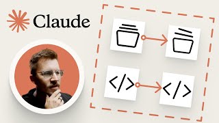
Matt D. Smith builds animated icon components in Figma using 1.5px strokes and Smart Animate. He shows how to set up variants that trigger on hover with 150ms ease-out timing, then explains how developers translate these into CSS transforms.
Questions this video answers
new chat; chats; projects; artifacts; code.
1.5 pixels (center aligned strokes).
About 22 pixels with full corner radius.
Move one bubble 1 pixel left and the other bubble 1 pixel right.
Rotate about 5 degrees and move up 1 pixel; folder scales down by ~0.5 pixels (described as "maybe half a pixel").
Chapters
These micro interactions are so subtle, you might not even notice them consciously, but you feel them. The chat bubbles spread apart, the folder scales down while the papers lift, the brackets push out. I just think it's really cool. It's very fun and it adds so much to the sort of friendly assistant personality that Claude has. In this tutorial, I'm going to show you exactly how to build these animated icon components inside of Figma. We'll cover icon fundamentals, animation values, smart animate setup, and how to structure your component so the animations actually work within your system. Alright, so because this website is in light mode, I like to have my Figma set up in light mode too, just because your eyeballs can do weird things when you're switching between them. And we're going to build five icons, new chat, chats, projects, artifacts and code, and we're going to make them all animate on hover. So let me quickly show you how these icons are constructed. If you know how to design icons, you know to use actual shapes. For example, this chat bubble is just a circle and a rectangle. You bring the rectangle to the midpoint of the circle and union them together. That's roughly it right there. That's the shape. That's how you design an icon. Usually you want to do center alignments on your stroke. A one and a half pixel stroke is a pretty good distance. And we're also going to go to the rounded join corners here. But there's an even faster way to get these particular icons. You can open the inspector inside your web browser, hover the SVG tag, and you'll find all of these icons in a beautiful scalable vector graphic. We can just literally hit Command C and then command V into Figma. And look at that, we have the icon. We're going to do this for every single icon. Find the SVG code, command C, paste into Figma and repeat. Now, the circle button for new chat isn't an SVG usually a rounded object like this. A lot of the times you can just generate that with a div. A div is just a fancy name for something similar to a frame inside of Figma or even a rectangle. It's just something that contains something and you can add things to it, you can adjust the properties. So we're going to recreate that one manually. It's about 22 pixels, full corner radius with the plus sign centered inside. Now, I want to share a couple of shortcuts that will speed this up for you. Shift constrains proportion, option constrains from center and Command keeps content still. I'm going to hold Shift option command and move everything together. I'm going to hit Ctrl C for the eyedropper. This is a little bit faster because you can do it with your left hand. It's kind of like driving a stick. Shift command option K is the same thing as right clicking and choosing Create component. We're going to use this a lot. Now, component naming, the reason I do icon slash chats with a slash is just a cleaner way to name these. If I select them all and hit Command R, I can find and replace to clean up the naming. But the slash naming convention is really just to organize things in your component library. Okay, now we have these static icons as components, but since we're moving around objects on hover, we're going to need variants. I'm going to add a variant to this icon. You can hit plus or Command D, but I'm going to put auto layout on the component set and set it to hug contents. Instead of calling it Property one, we'll call it is hovered and then we'll call this one no and this one yes. Now, when I have this as a component instance, you can see the toggle is hovered, yes or no. Right here. Now let's look at what Claude is actually doing with these animations. They're just spreading apart a little. Pretty simple. For the chat icon, all we're going to do is move one bubble one pixel to the left and the other bubble one pixel to the right. That's probably enough. For the project icon, the folder is scaling down by maybe half a pixel and the papers are rotating up about 5 degrees and moving up a pixel. For the artifacts icon, it's just rotating 180 degrees on these little pieces. So you're not going to see any change in between because it looks basically the same, but. But the animation happens in between those frames. For the code icon, the brackets spread outward, one pixel to the left and one pixel to the right. For the chat icon, the circle is scaling up about a pixel and rotating, let's say, five degrees to the left. Some of you might be thinking, do these details really matter? But if you want fun feeling interfaces, this is how you do it. There's just no ifs, ands or buts about it. This is how it happens. We scaling things down by a pixel or we're rotating things by negative 5 degrees. This is what goes into making really delightful animations and interactions. Now, once we have these icon variants set up, we can add a Prototype connection. Drag a noodle from the default variant to the Hovered variant, and we're going to set the trigger to, while hovering, set the animation to Smart Animate, and we'll just go with like 150 milliseconds and ease out. There's a lot of tweaking you can do to the animation speed. You can even do linear. Like, linear is just kind of robotic. It just happens quickly. I like to give it a little bit of easing. So let's test this. I'm going to click the frame, hit shift space bar to preview, and there it is. And if there's ever an animation that's not working, it's usually a naming issue. If your layer order is the same and the names are the same, the animation will typically work. Otherwise, you've got some cleaning up to do. Now let's build the full navigation item. This is the component that contains the icon and the label with a hover background. I'm going to create a frame with auto layout, put the icon instance inside and add a text label, about 10 pixels of padding and 8 pixel of corner radius. I'm just making educated guesses here based on what the interface looks like. So we can add a property for the text and call it Label. I'm basically attaching the label to that text field so that it comes up in the Properties panel and you can adjust it more easily. Now we create a variant for the hover state. The background goes from 0% opacity to the hover color. And here's the key. In the Hovered variant, we're also going to change the nested icon instance from is hovered. No. To is hovered. Yes. So not only is the nav component changing its own background color, we're also saying one layer deeper. Go ahead and trigger the icon's hover state too. So this works great for one icon. But what if you want to swap which icon is in there? What if you want one nav component that can be any of the five icons? I tried to get this working with Instant Swap, but every time I changed the icon property, it removed the hover toggle. I tried exposing properties from nested instances. I tried assigning the icon property to both variant states, and each one failed a little differently. I was just sitting there trying to think, can I pull this off with a single component? And I really wanted to get this to work with one icon, but I just couldn't see it happening. So my first solution was to create five separate navigation components. One for new chat, one for chats, one for projects, one for artifacts, one for code. And it works. At least I knew that it would work. A developer wouldn't need to do this in actual code. They would just toggle a class name on hover. But for some reason, I was unable to figure this out inside of figma with a single component. But after some deliberation, I thought of another way we could create it with a single component. Instead of five separate icon components, each with their own hover variants, I put all of those icons inside of a single component. One icon component with two properties. Icon name and is hovered, yes or no. So you get this variant matrix. New chat with is hovered, no. New chat with is hovered yes. Chats with hovered no. Chats with hovered, yes, so on and so forth. Ten total variants, five icons with two states for each icon. And because it's the exact same component, Smart Animate sees the state changes within a single component, rather than trying to animate between swapped instances. That's the simple version, and that's what I was missing, putting them all inside the same icon container. So if you have a lot and a lot and a lot of icons, sometimes it's better to keep them separated. But if you're going to animate them, this is definitely a way to have them all working together. So I'm pretty used to having to create a separate prototyping setup, because sometimes prototypes want to be handled differently than the system that is being built. And there's not always enough flexibility to create both with a single component. System components optimize for flexibility and minimal duplication and developer handoff. Prototype components sometimes might even be broken, and they optimize for animation fidelity and smart animation reliability. Sometimes those goals conflict, and that's okay. You just need to know which one you're solving for. If you handed this to a developer, they would know exactly what to build. There's nothing magical about this. You would literally just write CSS that attaches to each hover state. Even these SVG objects can have class names. You could say, move one to the left, move the other to the right. We're just transforming values, whether it's scale or x or y coordinates. It's very easy to do this with css and this is how this stuff is done. Every one of these little details is written down and programmed. And I urge you to learn how to do this so that if you're prompting with AI, and I encourage you to do that as well, you don't expect AI to always get every one of those details right, because it might. But if it doesn't, you need to know how to tell it how to do that. And if it can't do it, you do it. And then you can give it over and say, this is what I'm talking about. And then you can build from there. If everyone using your app feels delighted in a small way when they're using your navigation and you put this much care into every single piece, you're going to have a rich, delightful app that your users simply enjoy using. It's way more fun to hover these because of the animations, period. I don't care who you are, it is more fun. And not only is it more fun, there's a little bit of motion associated with it along with the background color, and it's explicit. I just hovered this. There are visual cues of interaction. It's helpful and it's delightful. Nice job to the team at Anthropic. The brand is awesome. I love the color scheme and the icons are just super fun. So there you have it. Now you know how to build delightful animated icon components in Figma using smart animated. Structure your variants for hover states and set up your components so the animations actually work whether you're prototyping or building a full design system. If you want to see exactly how this is built, you can download the figma file@shiftnudge.com resources see you in the next one.










