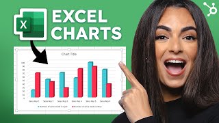
Remi from HubSpot presents a beginner-friendly YouTube tutorial on using Microsoft Excel to build charts and graphs. The video highlights two HubSpot resources: an "Excel Training Crash Course" (a ~1 hour 13 minute course) for learning Excel efficiently, and an "Excel Marketing Templates" bundle (nine templates) that includes a Master Marketing Budget template. Remi demos the Master template: separate tabs for instructions and the prebuilt chart, quarters/months split, "budget" vs "actual" cells, automatic totals and auto-updating graphs; gives a numeric example (PR budget $700 projected, $1050 actual → $350 over). The video closes with links in the description and a call to comment with questions.
Questions this video answers
One hour and 13 minutes.
Nine templates.
$700 (projected).
$1,050 (actual).
$350 over budget.
Chapters
Raise your hand if you like Microsoft Excel. Okay, glad we're all in agreement that not many people enjoy using Excel. To be quite honest, the thought of organizing data into an Excel sheet immediately gives me a migraine. Today I'm going to try my best to change your mind about it, because Excel is actually a very useful tool for organizing data if you know how to use it the right way. Whether you're a business owner, an entrepreneur, a student, or just the type of person that likes to state organized, then this video is for you. And hopefully you'll learn some new tips on how to use Excel to make your workflow easier. Hey everyone, It's Remi from HubSpot. Welcome back to our YouTube channel. So let's talk about how you can easily make charts or graphs in Excel that'll help make it a more enjoyable experience for you. When you can take marketing data and put it into a visual form, it's easier to digest for whoever is reading it. At HubSpot, we have two awesome and free resources that are time savers and super helpful when it comes to using it Excel. The first one is our Excel Training Crash Course. This is a course that you can take in literally one hour and 13 minutes and it'll teach you all that you need to know about how to use Excel more efficiently. If you click the link in the description box below, it'll take you to the course page where you'll find all the information about it and exactly what you'll be learning. We break down who this course is for, what you'll learn, the course details, and the course curriculum. This course is amazing for someone that wants to learn how to use a complicated tool like Excel in a short amount of time. Now let's say you already know how to use Excel, but you don't enjoy the process of building out your own charts or graphs to plug your data into. HubSpot has another great tool that you can use called the Excel Marketing Templates. This gives you nine templates that you can use to quickly plug in your data for things like your marketing budget, your marketing goals, content calendars, and so much more. Let's take a look at how you can use one of these templates. So here I've opened up the Master Marketing Budget template and as you can see, the first tab gives you a little summary on how to to use and understand it. The second tab is the actual chart and it's already made and organized for you. All you have to do is plug in your own numbers. Since this is the master template it includes the product marketing content, paid advertising, pr, branding and creative events, and other sections for you to fill in. It's broken into the four quarters of the year and each month has its own section with your budget versus your actual expenses below it. Under budget you just fill in your projected expenses and then under actual you fill in your actual expenses. Let's say your PR budget for January was $700. This number would go under budget as your projected expenses. Now let's say you spent $1050 for PR in January. This number would go under actual as your actual expenses. As you fill in the chart, you'll see that the totals automatically populate at the bottom in the expense summary chart and you'll see that you spent $350 more than you should have. You'll also see that the line graph to the right automatically adjust as well as you fill in your numbers. By having both the chart and the visual graphs showing you your budget for each month, you'll be able to stay on track with your spending and adjust accordingly where needed in future months. This template takes away the difficulties of having to create your own charts with your own formulas and you can even duplicate it and use it for other focuses within your company. Since this is a master template, it takes a high level view of your marketing budget, but if you want to drill down into specific line items, you can check out the other budget templates that were included under this bundle. Creating charts and organizing graphs can be such a tedious process, so if you're a business owner then this tool will be a huge time saver for you. So there you have it. Two awesome tools that will teach you how to use Excel like a pro. The links to the course and the templates will be in the description box down below, so make sure to check those out. If you guys have any questions, make sure to leave them down below in the comment section. And thank you so much for watching and I'll see you next time. Bye.