Building a Checkout Page on Kajabi from Scratch
James Allen shows how to build a checkout page in Kajabi from start to finish. He covers changing images and copy, setting prices, configuring form fields, and using green buttons for better conversions. He also explains order bumps as a simple upsell and why keeping checkout clean matters.
Chapters
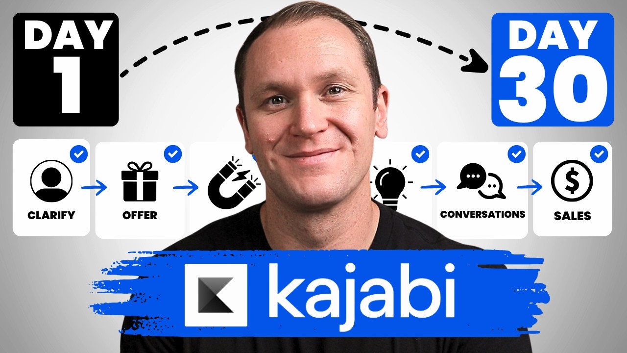
Kajabi is well known for selling online courses and digital products, and a huge part of selling an online course or digital product, or any kind of product for that matter, is your checkout page. So today I'm going to walk you through step by step how to build a checkout page in Kajabi from scratch. If you want to take advantage of a free 30-day trial of Kajabi to play with the platform yourself, you can use my link profityourknowledge.com/kajabi. This is an affiliate link, so I get a small percentage of your investment in Kajabi, but there's no extra cost to you compared to if you went through Kajabi's website yourself. All this does is simply support me and this channel for referring someone to Kajabi. But when you sign up with my link, I'm gonna give you instant access to a course I created called Kajabi Kickstart, which is gonna help you set up and launch your online business with Kajabi in that first 30 days. On top of that, when you're inside of Kajabi Kickstart, you will have access to a free 45-minute coaching session with me where you and I both get to deep dive into your Kajabi account, and I will be there to answer any questions you have about Kajabi, marketing, or even making your first sale with the platform. All this is free, and you can get instant access by going to profityourknowledge.com/kajabi or clicking the link down in the description. Without further ado, let's dive into Kajabi. To get started with customizing your own checkout page inside of Kajabi, we're gonna go over to the sales tab and then go down to offers. This is gonna take us to this page where we have all of our different offers. Offers are separate than products. Products you only get depending on the plan that you have with Kajabi, uh, 3 or 15 or goes up from there. But the basic Kajabi account, you get 3 separate products, but you can build out different offers and have unlimited offers, and you can have many different types of bundles and products to kind of work around that. Topic for a different day. But inside of here, you'll pick whatever offer you want to customize the checkout page. In this example, I'm going to share with you, uh, roughly how I created my checkout page for my course Effortless Income. Walks you through how to start and grow an online business that can run for you. Even when you're not working, okay? Really cool course, really proud of it. People are loving it as well. So I'm gonna show you, 'cause I think this is a perfectly fine checkout page. Some people get, I think, too fancy with their checkout pages. They just, they care too much about it. My philosophy is that if someone, you know, if you set your business up right and do it kind of the way that I've learned and that I teach people, is that by the time they get to your checkout page, they should already know, like, and trust you and be fully clear on what you're offering. So it's really just time to make the decision. But it's good to have a little bit of kind of a recap of what the program delivers on, which is what the text is for here. So we'll click on whatever offer we want to play with. Inside of this one, this example, I'll use my sweet mini course. And you can change the banner image right here by clicking on edit. If you click here, this is where you're going to adjust your actual offer, the name, etc. And you can use this image. So upload new file, select a recent file. You can play with your pricing details, all that kind of stuff. Another way that you can change that banner image up here is if you click edit checkout, you'll see it right there. If you don't have a thumbnail or anything on it, it's not gonna be there, but if you're in the checkout page, you can just click on page content right here, scroll down, and then there's hero image, and that's where you can change up the image however you want it to look for the checkout page. Okay, so I have this set as free. That's a detail that you get when you set up the price details. The reason it's free is because I'm inside of my Kajabi partners account, it's not my actual account. So I wanna show you what this looks like kinda when you're starting from scratch. And yeah, when you change out the pricing, if it's a multi-payment or like this is a one-time payment, you kinda decide that when you set it up, and I'll make another video where I kinda walk through that. And it's gonna showcase that right up here. Typically I just keep this the name of whatever your course is, so in this case, Everless Income Basic. There's also a pro version of the course. So this one's just my sweet mini course, insert a call to action, you click here, again it highlights it all for you. This is a really small box to write things in, but if you click full screen, you'll be able to see this in a lot, a lot nicer view. What's cool about Kajabi and what they do is they say, they kinda give you the prompts to just fill in the blanks. So it's like they give you little templates and stuff to make it really simple for you, and that's basically what I followed in building this out. So what it says is insert a call to action statement that will encourage the customer to purchase. I just wrote join Effortless Income today. Okay, nothing super extreme, nothing crazy, 'cause again, by the time they get to your checkout page, they should be pretty sold on what you have to offer. So we can change that to join my sweet mini course today. Okay, and then there's what you will get. Same thing, you can underline, by the way, if you're seeing like bold, italicize, cross through. This is the difference, I have, like I said, I have two different versions of this course, the basic and the pro. The pro version comes with some extra bonuses, so that is going to be a bigger investment, and then I kind of like to showcase that right here where they can see, oh man, but I'm gonna miss out on those bonuses, okay, and you can do all that stuff inside of this section. So if you want to underline, you can go, um, or I just use, so I, I just kind of use my, um, my keyboard to do like Command+U or Control+U depending on Windows or Mac. And that's kind of how I get the underline, cause I don't really see an option to add an under— or yeah, an underline. You can do bold, italicize, or strikethrough. Okay. And then yeah, you just kind of insert whatever the benefits are. So, you know, you get 5 hours of, I don't know, high quality video. So that's basically what I did here, and if you want to, you can add like the value of whatever it is that they're really getting as well, and you can literally just type it in. That's really all it is. Okay, so you could say like, $200 value. The best thing to do when you're writing value is to actually think about the real value. For example, if your course boils down your one-to-one process that you take people through, then you can price your— you can say that the value of your course is whatever that investment is. So let's say it was $3,000 to work with you longer term. You would say that the value is $3,000 because people have actually paid you $3,000. To invest in the same information, but it's lower price point in an online course because they're going to take that and kind of run with it themselves. They don't really have you holding them as accountable. Okay, but then you can write like bonus this and then bonus here. All right, so what I like to do is make sure those are not bold, and I would say, I don't know, for right now I'll just say Sweet bonus one. So what we'll do is we'll make sure it's not bold. That way it can really separate. And what I like to do is make it more gray. As you can see, it's a bit lighter tone. And then we'll go strikethrough as well. Pretty sure that's all I did. Yeah, if you want to, you could like italicize as well, but I think that a lighter gray and then a strikethrough is fine. And then down here, add any additional disclaimers or details about the purchase. What I did was kind of just, I showcase my guarantee. So if you invest in my course, you get a 60-day money-back guarantee. And this is a great opportunity where I like to say, you know, something with the guarantee. This is a great example. The Effortless Income Program comes with a no-questions-asked, 100%, 60-day money-back guarantee. If it's a mini-course, you could do a 30-day money-back guarantee because it's a shorter course, gives them less time to go through it, 'cause it takes less time to go through it. And I just kinda said something like this, go through the entire course, test it out yourself, even use it and get results, and if you aren't completely satisfied in the first 60 days, send me an email and I'll refund you immediately. Alright, so you can just write something like that right there. We can do 30-day, cool. One other thing is if you like to add these kinda like brackets and kinda separate it like this, the way that you can do that is actually by going back in here, we'll open this up and we'll push this down a little bit. You go right up here to horizontal line and then you can say all caps TOTAL VALUE. We'll just say, I don't know, in this example, $1,000. What did I say? And then yours today for just, we'll say $47. Alright, and then what you can do is hit space, add one more horizontal line, and then have your guarantee underneath that. And what I like to do, what I did here was I made this green and I made sure that my button color was green. I'll show you how to do that here in a sec too. So what you do is just go up to this little spot, text color, and I chose kind of like a money green. I think that was the one that I chose. So go back and you can see this is what it looked like before. Hit save. Already looking way better. Okay, and you can have your money-back guarantee all written out down there. Okay, so we'll go back and then that was the page content. That's this section right here, all the text and whatnot. You can go to the design and that's where we're going to be able to change the color. Again, for a checkout page, I like to use that dark green because it's like green means go. That's kind of the color psychology that I learned and I just like it so I roll with it. My main color is blue, as you can see in the logo right here, and that's where my website buttons are, but when it comes to a checkout page, I just wanted to have it be green. And then right here you can add like your banner image, the logo, et cetera, et cetera. So I don't want the banner image. I don't like the banner image 'cause I feel like the thumbnail does a perfectly fine job of knowing what I'm investing in right there. So I think that this looks good. You can add your logo, banner image. I like to just have the thumbnail. We'll hit save. We'll go back, and then we have form fields. So right now, this is this little section over here. It says email address. If you want to, you can collect a physical address or a phone number. I don't. I just do the name, and then you can add a custom field too if you want as well, which you would have to create new custom fields right there. Okay, so we'll go save, and we can go back. There's additional settings as well. You can do a little bit more advanced settings. You can use the legacy checkout. Anytime you see legacy when you're building out templates or anything like that, like your blog, it's just the old templates that Kajabi used to use, but then they've updated the software and the programs, so they've changed them, but they still give you access to those old templates, which is where you can click this and check out the legacy checkouts. When it comes to checkout pages, like, just keep it simple. I mean, the biggest thing, like I said, is by the time they get to a checkout page, they should already know what they're investing in, primarily. If they watched a workshop, they went to a sales page, they've watched your free content, they have that know, like, and trust factor, et cetera, et cetera. At least if you do business in the way that I teach. I don't want just someone to like randomly land on your checkout page, 'cause you, like, you can add videos, you can do stuff like that, but it's just so unnecessary. Really, 'cause by the time they get there, they should be knowing what they're getting themselves into. So just keep it really simple. Like, you can play with all this stuff, and the bottom line is that the way that Kajabi has it set up is perfectly fine. You can just kinda roll with what they have for you. As long as you have the name of the course, whatever the thumbnail is so they know what they're purchasing, and then you have a way to collect information, their payment information, like over here. In my main account, they can decide if they wanna do card or PayPal. Most people just use their card. The way that you get the card information and PayPal is by going into your payment integrations. In here, I'm in my, uh, Kajabi partners section, so I don't have the payment section set up, so I can't actually show you that. But if you have your payment provider already set up where you have Stripe connected to your Kajabi account and PayPal if you decide to do that, Stripe is gonna allow you to collect card payments like this, and then PayPal is just, you know, it's PayPal. But if you already have that stuff set up inside your Kajabi account, it's automatically gonna get transferred over to every checkout page that you decide to create. Okay, so you don't really have to worry about adding it there. That's the only reason that it's not showing right here. Okay, so you can say subscribe to our email list, that's right there. Service agreement, mobile layout, okay, the footer, all this kind of stuff. And if you want to add an order bump, you can. So you can select a different offer, and then you could write out whatever you want. That's gonna add down in this section an order bump for you. So if you don't know, an order bump is basically like, if they were gonna check this out, it was a $47 course, I could have for $17 or for $19, they could get a free set of trainings, or they could get a free workshop bundle of some kind, like worksheet bundle, like a 90-day game plan or something like that. And you can use that as like a little upsell. And I mean, the best way that I've heard and I think about order bumps is like a, do you want fries with that? So if you go through the drive-through, you get a burger or whatever, they're like, do you want fries with that? It's just very nonchalant, it's a very easy yes or no, and it's a great tool for helping you just increase your revenue inside of your little funnel for your average order value. Okay, so you can do all the order bumps, everything inside of here and add that to your checkout pages. When it comes to checkout page, I mean, yeah, the biggest thing is that you get your payment integration set up in Kajabi. I have a different video on that. And that you just kind of run through and make sure they know everything that they need to know to make this investment. And if you want to learn about cart abandonment emails, for example, if someone lands on your checkout page and then they're like, mm, I don't know, and then they walk away, you can send them an automated email, which is why you should check out this video right over here where I'm gonna show you exactly how to set all that up. I hope this was helpful. If you wanna try out Kajabi yourself, consider checking out my link, profityourknowledge.com/kajabi, and let me know down in the comments if you like Kajabi checkout pages or if you don't like them. I wanna hear your thoughts. Till next time, I'll see you in the next one.