Building a High-Converting Sales Page with Kajabi
James Allen shows how to build a sales page in Kajabi using templates and customization. He breaks down the copy framework as problem, hope, and offer, then walks through pricing options, testimonials, and mobile previews before publishing.
Chapters
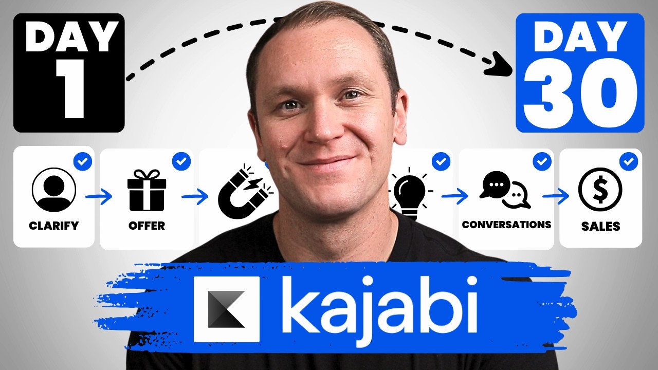
If you're looking to create a compelling sales page to sell an online course, digital product, or a big coaching program, whatever it is, look no further than Kajabi. Today we're going behind the scenes and I'm going to show you just how easy it is to make a beautiful sales page that not only draws people in from its beautiful design, but that also is going to actually result in sales. If you want to take advantage of a free 30-day trial of Kajabi to play with the platform yourself, you can use my link profityourknowledge.com/kajabi. Kajabi. This is an affiliate link, so I get a small percentage of your investment in Kajabi, but there's no extra cost to you compared to if you went through Kajabi's website yourself. All this does is simply support me and this channel for referring someone to Kajabi. But when you sign up with my link, I'm going to give you instant access to a course I created called Kajabi Kickstart, which is going to help you set up and launch your online business with Kajabi in that first 30 days. On top of that, when you're inside of Kajabi Kickstart, you will have access to a free 45-minute coaching session with me where you and I both get to deep dive into your Kajabi account, and I will be there to answer any questions you have about Kajabi marketing or even making your first sale with the platform. All this is free, and you can get instant access by going to profityourknowledge.com/kajabi or clicking the link down in the description. Without further ado, let's dive into Kajabi. To get started building out your sales page, we are gonna wanna go to the website tab and then go down to pages. From here, we can access your website pages, landing pages, or your funnel pages as well. But if we're just making a standalone sales page, we'll click over here to landing page. And then I already have made a few different ones, you know, but I'm not gonna dive into those right now. We're gonna start with a brand new sales page template. So we'll go up here to new landing page. And from here, you can decide if you wanna have a blank page, which if you click it, this is all it is. You can't do anything else. It's just a title and a picture right there. So we'll keep browsing and we'll look at the different options. These are the sales pages. Handful of different pre-made templates that look beautiful and they're fully customizable from the font, from the colors, uh, what the text says, if you want to get rid of a video or add something, all those different things. Okay, so we'll click View All. With each one of these, you can click it and then you can scroll down and preview it before you decide to get started with it. They're already set up with awesome sections, uh, like down here there's a countdown timer, two different payment options, money-back guarantee it says, but also frequently asked questions, okay? So if you like the design of that, you can pick that one. This one's pretty cool, creative. If you like this kind of angled design, really, really cool, really fun. Again, you can change all the colors. If you're like, I like the design, but I don't like all these crazy colors, you can change the color. You can make it black and white if you want, or just, I wouldn't say white, 'cause that wouldn't really make sense, but you could do like white and then whatever your brand color is, whatever you want. Okay, here's another one, we'll kinda scroll through. This one's cool, it's a little offset with the video right there, pretty cool design. See, Kajabi makes it really easy, and it's not just Kajabi, like, just tools nowadays are so simple. You literally just have to change the text. You can obviously get more fancy with it and that kinda stuff and like change more of the design, but you could just roll with this in Kajabi with just a basic template and your sales page is gonna look awesome. Now there is more that goes into a sales page, many, much more than just the design, but the design part is covered for you, which for people can be really stressful. I mean, you do want to have a good design. I like to say that design is what pulls people in, but the copy is what's going to actually make the sale for you, okay? And I'm gonna help you out with that when we get a little bit further into this. But yeah, you can see this sales page Already has multiple different payment options. It looks cool if you like this stacked kind of look where the images are in the background. This would be a great format for you. Tailor is what it calls, it's what it's called. But this one also, it says money-back guarantee and it has the FAQ section already built in. Okay, so we'll scroll down. Streamlined sales, just really simple, really straightforward. Okay, it might be a little too simple for you. It's really up to you. Okay, but as you can see, this one's a lot shorter. Notice how it doesn't have that FAQ page. Alright, but I'm gonna assume, and we can play around with the different ones, I'm gonna assume that you want to create a sales page to sell an online course, we'll say. So we're gonna use Tailor. I'm gonna click Get Started, and we'll just call this sales page, I'm gonna call it 2, 'cause I already had some other ones. But we'll call it Sales Page 2. Call whatever you want. I would just name it whatever the name of your product is, like join name of product today, explanation point. All right, now we're on the sales page, and as you can see, we have the video in the background. If you just click on this background, you can see if you want it to be video or if you want it to just be an image. And that's where you're going to get this one. The video can be a bit distracting. I'd say it'd be better to make this part of video. This is gonna be the thumbnail for your video, and then your video you can add right there, and it will be able to play. You can change the accent color of the player, like the buttons down at the bottom if you wanna pause the video or skip to a different part or change the speed or the resolution or whatever. That's where you have your player settings. So in here you can decide what kind of player settings you wanna have. You can do autoplay, you can loop the video, maybe if it's a short video, a long one, it'll keep looping for you. You can add the play button, and it's just a simple check mark of what you want. Allow full screen, unless you just want to leave it here and it kind of entices them to scroll while they're playing the video in the background. You can show the play bar or adjust video settings as well if they want to change up the resolution or whatever they want to do. Typically on a sales page, it's good just to keep it really simple. Okay, so you can have a play button and then show the play button and that's it. Or if you want to, you can have it be where they can skip through. Typically on sales pages, they don't do that, but it's really cool. Kajabi gives you personal preference. You can do whatever the heck you want. Okay, down here, animations. If you want the video to like pop out, you can. I recommend just keep it very simple. The point of a sales page is to get a sale. You know, that's it. We're not trying to have some crazy fancy website, it already looks great. It already looks great and it's fully customizable from here. So right here at the top, if we're gonna create a high-converting sales page, what I would recommend is first to get rid of this. Okay, can we— yeah, we'll just delete this little block. We don't need it to say Taylor at the top, but right here you can change up the text. So I like to open it up, say something that is Benefit-driven, and that's within reach. So if it's benefit-driven, that's, that's the first thing we want to see, because right when someone lands on this page, the text at the top is the first thing that they're going to see. And at the bottom, where it says is within reach, you can change that to say like, uh, watch this video, dot, dot, dot. Okay. And you can change up the text. Uh, you can change up to where it looks, you know, different formats and things like that. Inside of here, okay? I'm not gonna change it 'cause I actually like the way that it looks right here, but something benefit-driven right in the beginning, that is the first thing that we're going to want to really hook someone in, because if they land on your page and it doesn't hook them in that first sentence, then they're not gonna have a reason to really, they might skim through a little bit, but they're not really gonna care about the page, because whatever you're selling should be solving the person's problem, okay? I'm not gonna dive way too deep into sales copy. I actually do have a, a free guide where I walk you through a 5-step sales copy formula. It's going to help you just have a real good baseline to write out your own sales copy for, you know, if you decide to use Kajabi, um, as well. So you can get that guide by going to profityourknowledge.com/copy, and it's going to walk you through again 5 steps to create compelling sales copy. Just the things I've learned over the years. It's really valuable. And if you do sign up for my link in Kajabi and you get the Kajabi Kickstart course like I mentioned, you get that copy formula inside of there as well. Okay, 'cause I talk about a sales page and that kind of stuff. So you're gonna have that automatically inside of Kajabi Kickstart. But yeah, here, you know, something cool that they show you is right here, problem statement. So these are like the main blocks. If I move that up here, it'll change this. Okay, you can, when you write out sales pages, you can click here and rename this as well. And it's helpful to do that because sales pages can be a little complex. You can have many different moving parts, you know, different sections and whatnot. But just by me creating this, this sales page inside of Kajabi, they know that it's a sales page. And usually the first thing on a sales page is the problem statements, explaining the frustration that your audience has and how you understand that frustration And then there is hope. That's the next piece, is moving into the next section where we show them that we have a solution for them, okay? So the problem statement, they already have labeled this. The hero is the big image at the top. The video is gonna be your actual sales video. Very, very helpful, I would say. Not needed per se, but I would recommend having a video of you on your sales page. And then right here, tired of feeling like you're not enough? And then they already give you a really simple baseline with an image of her being worried. And then right here, it's time to love yourself again, introducing self-love masterclass. With copy, I would recommend to dive deeper into the pain than just this. I would make this, you know, a couple different sections, but what's cool is that this is just a really, really simple overview, but you can click on problem statement on this block and now you can add extra content. So if you're like, well, I wanna add some more text, it's not quite hitting home what I wanna say, then you can go in here and you can change up the size of this. So I think like 9 is usually pretty good. We'll go right here and you can change the format. Change the size of the heading if you want. Um, I think a Heading 3 would be good here just because it's not like the main heading or one of the top headings. And then alignment, we can make that centered. And then, you know, you can move into something, some other, like, a compelling subheadline. It could just be— I'm not, I'm not going to write any because I have no idea what the point of this course that I'm figuratively selling is. Is that what it said earlier? I don't even know. Are you tired of feeling like you're not enough? You know the feeling when. Okay, so if someone's skimming on your page, this would actually work really well. Tired of feeling like you're not enough? People are like, oh yeah, you know, I kinda am. And then they go through and then they see here, you know the feeling when, and then you can dive deeper into that feeling in this text block. Okay, so what's cool that's happening here is that we can continue to add to this block that started out all under the problem statement. So there's like blocks within the block, if that makes sense. But I think it's helpful on this main page to list the different sections that you have. So when you start moving things around, it's much easier to do that. Cool. It's much easier to make sure that you know where everything is. Scroll down and yeah, you can change all this stuff, the different modules that you have, change out all the pictures right here. The image, Module 4, and if you wanted to, you could even have a call to action where if they click on this, it goes to the Buy Now button. You know, you can pick like a, go to a section of this page, for example. And then pricing, cool? So we'll click that. This is Module 4, and then if I open this up, Scroll down and then someone's reading this and they're like, oh yeah, it totally makes sense. They click on it and now it's gonna come down straight to this section. Pretty cool. So as you scroll down, group coaching is kind of explaining more of the offer. Quick tip when it comes to sales copy, your offer should be one of the, it should be more of the short side of your sales page. It should be like the back third of the page. The first two-thirds of the sales page should be about you explaining their situation and their problem and empathizing with them and showing them that you understand what they're struggling with. You can articulate the message and the struggles to them by saying, I can relate, this is what I see when I'm working with people, and you're painting the picture of the feeling, feelings that they're feeling related to whatever your course helps them do. And then you introduce this solution, but spend the first two-thirds of the sales page really diving into not just the pain and the frustration, but also the dream that they have and why your solution is so important. And then you can go into what's actually included in the course. Typically, people spend way little time, not enough time, on just this. They'll leave this, you know, and then they go into this huge section explaining their product. It's like, dude, do you even know my problem fully? Okay, this is down at the end. If you wanted to, you could Scroll down, I don't even know where this is at. Bio image, okay, and then the bio. So what we can do is we can move this up. If you wanted to, you could move it up here. Okay, so now it's just changed the whole look and feel of the sales page. All right, fully customizable. Again, you can change the colors if you click on, uh, this, you can see the background color, and let's say that we wanted it to be, I don't know, more of a gray. Then you can change that, and then you can change all the text, make sure that it's a white, you know, so it looks, it really pops off of that gray. And yeah, we got some testimonials here as well. You can add pictures to that for the different testimonials. Scroll down, and now we have a handful of options. If you're like, it's not $49 a month, maybe it's $100 per month, you could say $97 per month for the payment plan. Paid in full, $499. Let's say that you want to do $997 if they paid in full. Or course and group coaching. Okay, if you have different options, I would recommend to just do a payment plan and then a paid in full. I guess this does make sense where like it's the course and coaching if they want to have some sort of group coaching element to it. But don't go more than 3. Highly recommend keeping it 2 to 3 different options. So payment plan to paid in full, 2 great options. By the time they get here, they're like, hmm, do I want to do a payment plan or paid in full? They get to save some money with the paid in full, obviously. Okay, and then we can scroll down. FAQ is a great section to add on your sales page. If you click on it, it'll have a dropdown. Are my results guaranteed? And again, they already have this copy made out for you, which is pretty awesome. What's cool is you can change up the size. If you wanna have it be longer, I think it was at 7. Change up all the text, the icon even. You can do an arrow or a plus. So right over here, you see the arrow. You can click plus. It's gonna look a bit different. And then the icon color as well. You know, if I wanted to do orange, okay, I can change up that icon color. And then the background as well. The desktop layout, it's just, I don't think you really need to play with this too much. It's if you wanna add some more spacing in the different blocks, but Kajabi already does a great job for it, even like mobile layout too. This is the kind of stuff where you can get way too granular with it. What's nice about Kajabi and their different templates is that they are already suited for mobile, for templates, for desktop, so they're already going to automatically adjust to any one of these different devices that someone could be logged on. For example, when you scroll, when you go down here into the bottom corner, you'll click it and you can decide, right now it's on desktop, but if I want to see what it looks like on a tablet, okay, it looks a bit different, Tablet V, or mobile, and it'll show you what your page is going to look like on mobile. So if you're like, oh, I want to actually have my paid in full at the top, then we can go back, the pricing, and the pricing card, we'll put that to the top. 'Kay, so you wanna have people, ideally we want people to pay in full. So Get Started Today, Paid in Full, and they're like, oh man, I don't know if I can afford that, and then they come down, Payment Plan Option, ooh, that's really cool, okay? So it allows you to really see the real look and feel of what your sales page is gonna be like, and then click Join Now. Go to a URL, this is really important when you build out a sales page in Kajabi. Click here, you can go to a different landing page, ideally we want to go to a checkout page. So you should have a separate checkout page for the paid in full and the payment plan option. And then if you do this course and coaching option too, and you want to make sure that each button is going to be attached to the right checkout page. So join now, okay, this has to be hooked to a checkout page. And then you can decide whatever checkout page you have, like the payment plan right there, click here. Checkout page, this one needs to be paid in full, you know, and then you can save everything. Another cool thing inside of sales pages is when you go down to details, this is kind of important. Oh, I have to save this. Save. Click here, go over to details, and from here, this is what the actual title is gonna look like. So you wouldn't want to call it sales page 2. That's an internal title where only you can see that. You would write like sales page 2 or something. But this is the title everybody's gonna see at the top, like on their tabs on their own computer. So we would say like a great thing is like, yeah, join Effortless Income today. You can do an explanation point. That's what people are going to see when they're on your sales page on the tabs. And then down here you can write some— something short. So if like the course is called Effortless Income, you can go E EI, or you can say Effortless, and it's gonna show your website here, and that's gonna be the link that you can point people to, or when you're building out systems and stuff, like an email sequence, if someone clicks on the link in an email sequence, this is the page that it gets sent to, okay, or if you're gonna share it with people, and then you have to hit Publish if you want your sales page to actually be seen into the world. If you're gonna be working on it, you can hit Draft, you can keep it published too and then still work on it and make adjustments and just hit save and it'll automatically fix it. It kind of depends on the amount of traffic and whatnot that you have out there if you're really ready to publish it. And then if you want to, you can do SEO and social sharing. That's entirely up to you. You can also do show page in search results, or if you don't want it to, it's kind of helpful not to. You can obviously, yeah, leave it open and be able to have it land in search results if people wanted to look it up. But by the time people get to your sales page, you know, they should be, if you have a good system in place, by the time they get to the sales page, they should be like pretty pumped about potentially working with you and actually interested in working with you so they can look through the copy and decide if it really is the right move for them. If you haven't already done it and you're thinking about trying out Kajabi, definitely check out my link, profityourknowledge.com/kajabi. You'll get a 30-day free trial to play with the platform, along with a free course right when you kickstart your 30-day trial to help you set up your business in that 30 days. And you'll also get a one-to-one coaching call with me where I'll answer any and all questions you have about Kajabi, marketing, sales, your business, your goals, whatever it is. I'm here to work with you and make sure that you feel comfortable and confident in using Kajabi, and you can shortcut my whole learning curve when I was trying to figure out how to use it myself. There's a link down in the description. And then on top of that, let me know what your thoughts are on the sales page builder and the and whatnot and the things you saw in this video inside of a comment. I'd love to hear your thoughts, what you like, what maybe you don't like. If you have any questions, let me know down in a comment below. I hope this was helpful and insightful for you in making a decision if Kajabi is right for you. I'll see you in the next one. Mm-hmm.