I tested 7 AI Design tools, the best will surprise you. (Lovable, Replit, V0)
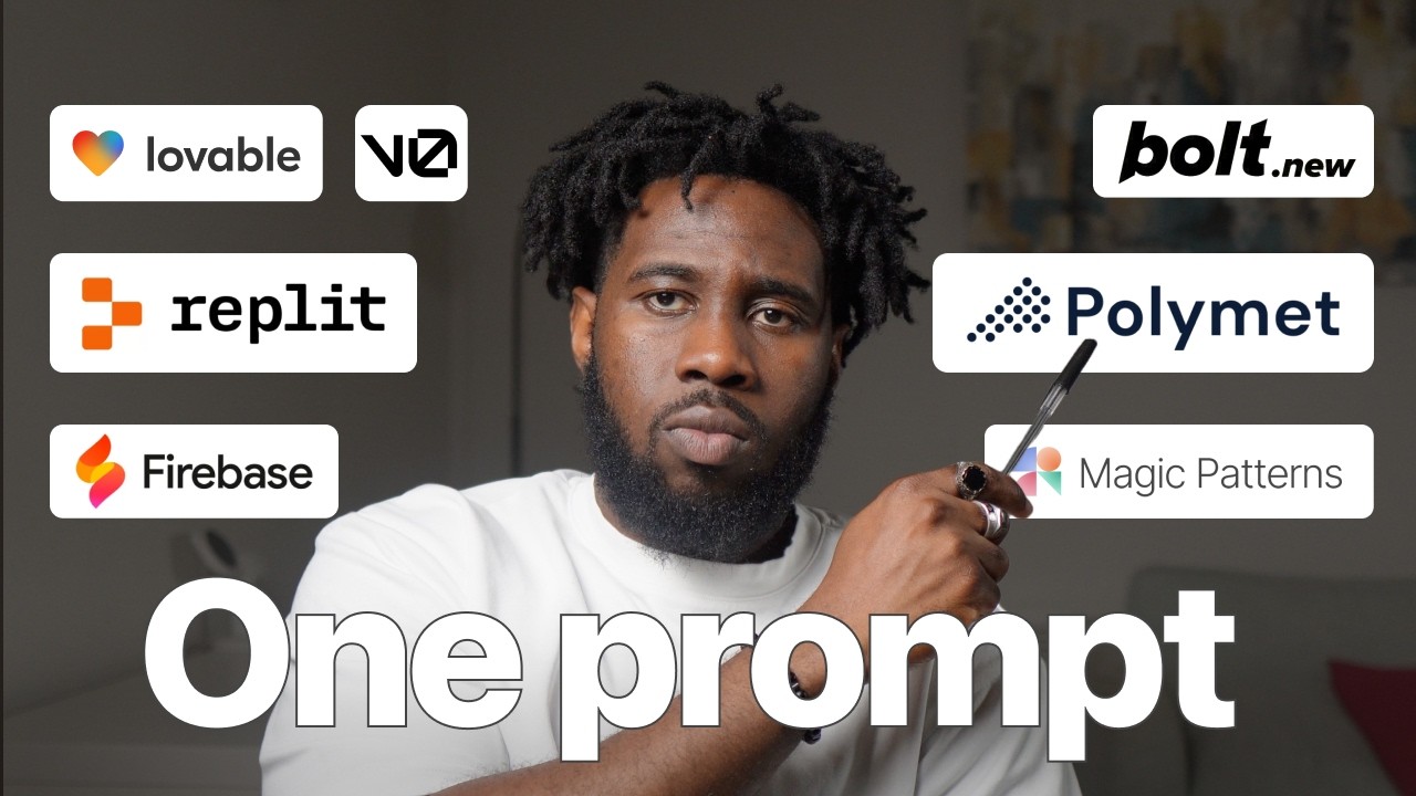
Product designer Samuel Fabayo tested seven AI design tools by asking each to build a gym dashboard. Polymath was the only S-tier tool, while Lovable and V0 also ranked high. He scored each on interactivity, control, and visual design.
Chapters
So in this video, we're going to test 7 AI design tools for UI design and prototyping. I'll use one prompt on all 7 tools, no prompt editing and no refinement, and then I'll rank them based on what they deliver from one prompt. By the end of this video, you'll have a good idea of what the quality of the output for each tool looks like, and that should help you make a decision on which ones to stick to so you don't get overwhelmed like me. If you're new here, my name is Samuel Fabayo. I've been a product designer for 9 years, and in that time, I've worked with startups in Lagos, Nigeria, and a few high-growth companies in the UK, including Deliveroo and Monzo Bank. A portion of this video is sponsored by Mobbin. The 7 AI design tools we'll be exploring are Replit, Lovable, Magic Patterns, bold.new, Polymath, Firebase, and bZero. The goal is to design a simple back office tool for gym owners. The gym owners will be able to use this tool to store the profiles of their members, create new classes, and manage appointments and bookings. We'll score the tools based on 3 criteria. Number 1 is interactivity, which is how well the tool can introduce interactive elements like forms, hover states, and actions just from one prompt. This basically shows how much initiative the tool can take from one prompt. Number 2 is control, which is how easy it is for users to make changes to the design so that it can suit their preferences. Number 3 is visual design, which is how clean and modern the design generated is. To get started, we need 2 things: a prompt to instruct the tool on what to design and a UI design inspiration to guide the tools on what a good design looks like. For our UI inspiration, we're going to head to mobbin.com, the largest library of iOS and web design inspiration in the world. Mobbin literally has any kind of real-world design patterns you're looking for. For example, for our gym back office tool, we can head to the web section of Mobbin and find a good-looking web UI. Since the tooling will most likely look like a dashboard, let's search for dashboards on Mobbin. I really like the UI of this web app, so I'll download one of the dashboard screens. Now we have some design inspiration for our UI which we'll use alongside our prompts. Aside web apps, Mobbin also has a frequently updated iOS app section, so if you've come across a really well-designed app and you've been wondering what the screens look like, then there's a really high chance you'll find that app on Mobbin. Mobbin told me to tell you that if you use my promo code mobbin.com/samuel, you'd get 20% off on their paid plan. I think that's a good deal. I've added a helpful link in the description. To create our prompts, I'll be doing something called meta-prompting, which I've found to be very effective for writing detailed prompts. Meta-prompting is when you describe a goal you want to achieve to a foundational AI model like ChatGPT or Claude, then you ask it to generate the prompt that you can use on another AI tool. It's like asking your friend who already understands you to help you get your thoughts across to their friend because you haven't really met them. And don't understand them yet. I hope that analogy makes sense. So here's my prompt to ChatGPT where I describe the goal I want to achieve, and here's the detailed prompt generated by ChatGPT. You can see how much detail it went into and it even created a project brief. Please, please, please, and please don't just copy and paste the prompt generated by ChatGPT into another tool. Read the prompt and refine it. The point is for ChatGPT or any other foundational model that you use to help you communicate better to another AI tool. Not completely outsource your prompting to AI. Now, I've edited the prompt slightly, I've added the UI design inspiration from Mobbin, and I've prompted all 7 AI design tools to get cooking. While we wait, I just found this shocking stat: 82% of the people that watch this channel regularly haven't subscribed. That's a poor stat. So if you're one of those 82%, what are you waiting for? Hit that subscribe button, and my promise to you is to make sure you never stop learning Do we have a deal? Now our AI design tools are done, it's time to see how well they did. Remember, we are scoring them based on interactivity, control, and visual design. Each criteria will be 5 points, so each tool will have a total attainable score of 15 points. For the ranking, we have the S tier, we have the A tier, we have the B tier, and we have the C tier. Any tool that scores 12+ points falls in the S tier. Any tool that scores 10+ points falls in the A tier. 7.5+ points fall in the B tier. And any tool that scores below 7.5 points falls in the C tier. All right, so we start with Replit here. Here's what Replit has generated for the gym back office tool. It has the dashboard page, the members page, classes, schedule, and then billing, reports, and settings. I would have expected that the navigation icons here is stacked left to right instead of being stacked top and bottom here. I don't know why it did this. There's enough space and it's not like this is adjustable or anything. Also, it looks like the entire page is stuck behind the navigation page. So the navigation bar on the side here, it is above the entire page, which makes me not to be able to see everything on the page. I think that's just like Weird. When I hover on the cards, it has like this nice hover state. It's a nice design touch, but it doesn't exactly tell me anything. It's not useful for anything. There's weird spacing between each of the cards. I think a good designer would really do something about that spacing. It has a line graph here. I don't know what this line graph means. It is not interactive. When I come into the members page, I can add a member. So that's interactive. That's really good. And I can Do that, and it has like a feedback. Although it's an error state, but at least I can get a feedback. Same thing in the classes. I can add classes, and then the schedule page. I like what it has done with the schedule page. The fact that this thing is stuck behind the navbar is really going to make it lose some points. The billing page don't have anything, but I like that it has designed like an empty space for billing, like a coming soon space for billing, and coming soon space for. Reports. And then the settings page has its own page as well. I can edit info for settings and I can save changes and I can get like feedback there for Replit. So on Replit, I'd give for interactivity, I'd give Replit a 2.5 because the interactivity is just basic. On control, I'd give Replit a 2.5 as well for control, mainly because on Replit I can go back to the chat message where I built the tool to be able to roll back in case maybe I've made a mistake or it's built something that I don't like, I can roll back. So I like that level of control that it has provided, but I would have loved it to have more control. And then for visual design, I think visual design is good. It's okay. Um, I would have loved if they didn't have like this weird spacing. So I take that back. I don't think it's good enough. I think it can be way better. So I'm going to give it a 2 for visual design. So that makes Replit have 7 out of 15 points. Now the next one is V0. On V0, we have the same thing, the dashboard, the members page, the classes page, schedule page, billing page, reports, and settings. V0 actually built out all the pages. So that's really good. On the dashboard page, it has like the cards well designed. And then it also has the line graphs. There's no interactivity on the line graphs. I'd have loved if there was some interactivity there. On the members page, I can click add member. That's interactive. I can add members and I can finish that form, select a tier and save changes. And then that adds. I didn't get any kind of feedback to let me know that a member has been added or nothing is added to this table. So that doesn't work, but at least it's interactive. And then on the classes page, I can do the same thing for add classes. That's not interactive. I can go into the search field. I like that it has added like active and status for each of this, but The hover states for each of these pills are not accessible. So I don't know what is there on the hover state. When I come into the schedule page, I kind of like what it's trying to do here, but it could still do a better job at that. When I hover, I can see what this looks like and I can switch between list and calendar view. I would have loved if it pulled in— actually, that's okay. And then yeah, on the members page, I would have loved if you pulled in some avatars or even initials into this profile shapes here. I would have loved if there's some kind of avatar or initials there. I like that you built out the billing page. That's taking initiative. And the reports page is really nice as well. Aside from here, that is like kind of empty. And then we have the settings page as well. So for V0 on interactivity, I'd give it a 3.5. On control for V0, I'd give it a 2.5 because if I want to do any kind of thing here, I have to go back into the charts and then try to prompt my way into making changes. And then on visual design, I think the visual design is okay. It's good. It built out everything. It has like initiatives. The spacing is nice. So on visual design, I'd also give it a 3.5. That would mean that for V0, The score is 10 points out of 15. Next we have Lovable. Lovable, kind of similar to V0, sort of use like, maybe they're even using the same libraries because sort of have like the same similar cards here. Also the line graph is not interactive, but at least I can see like the title of the graph and I can see like, you know, the months and the axis. On the members page, I can add members. And if I try to add members, I can add that and then yeah, it doesn't add anything, but at least again, it's interactive. I like, like this side drawer that he has added here in case I want to do anything there. Then the classes page. I like what he has on the classes page here, where it sort of shows like what the classes are and sort of shows that this one still has a waitlist on. The schedule page as well. I can switch between the class schedule from a list view to a calendar view. I think this is really good because I can actually see what is here. Unlike V0 where I couldn't see which one is the options there, I can see what's here. And this looks really nice. And I like what it has in the calendar view. Feels much more like a calendar view than the other ones that we've been looking at. On billing, I like what they have done for billing as well. Pretty basic reports. V0 reports is a bit more detailed than this, but it looks good as well. And then on the settings page, the settings page looks well designed than the settings page on v0. On Lovable, one thing I like is like this edit with Lovable feature that allows me to be able to make changes and make edits. I think that's the kind of control that I'm talking about, where if I click edit here, I can sort of click something here, or I can click like this entire thing. And it, it sort of allows me to make any kind of changes or any edits that I want to make to it. And I'm trying to see. Yeah. So now it sort of has like where I can change the margin, change the padding, background. Like I said, I'm not going to make, I'm not going to be making any further edits, but at least you can see the level of control that this introduces. So for Lovable on interactivity, I'm going to give it a 3.5 because interaction is similar to V0. On control, I'm going to give it a 4 because I like that I can actually go and make some edits and some changes. I have enough control as a designer to tweak it to what I'd like to actually have. And then for visual design, I'd also give it a 3.5. So that means on Lovable, Lovable has 11 points out of 15. The next one is Polymaths. Polymaths kind of looks interesting. Unfortunately, I can't get like a full view for Polymer. So we're going to have to look at the view from here. But with Polymer, it has 2 states. Um, it has like the focus state and then it has the canvas state, which it, which I think is super interesting. Basically the canvas state breaks down all the page into like different components, which is introducing some control. So if I want to make changes to this particular page, I could make changes to this particular page. So whatever prompt I'm writing is making changes to this particular page. I like that level of control that it brings into things by breaking things down into a canvas and then a focus page for everything. Also, if you look at the graph here, the line graph is interactive. I know what the values on the graph is. You know, I even have like control over the graph. This is so cool. It's actually done so much from just one prompt. You know, and then when I go into the members page, I can add a new member. Unfortunately, that's not interactive, but I like what it has done here with like the members. You know, it pulled in like the profile picture for some of them and it also used initials for some of them, which is what you will find in like a normal tool. Some people will put in their profile pictures, some people won't put in their profile picture. So I like that it has taken initiative to think about that. This is really good. For classes as well, which is like even more interesting. I like what it has done here with the classes. This is really cool because I'm actually using this particular tool for the first time, but see what it has done here with the classes. It rendered the classes, added some pictures to make them look nice. So it's really killing it on visual design. You can add a class that's interactive and again, put a class name and then go through all of that. Even put a picture to the class name. Then the schedule page as well. You know, it has like the shadow page looking really nice just from one prompt, just from one prompt. I think this is really good. The billing reports page were not built. I would have loved if it sort of had some kind of empty state design for the billing reports page and the settings page. It doesn't have that, but I think I'll give it a pass because that's done really well with like the visual design generally. It has done really well with control because I can also come here and then select a particular component and then start making changes to that. Like you saw in Unlovable. I think this is a really cool tool that is already standing out. So for Polymath on interactivity, I'd give it a 3.5 because interactivity is similar to the other tools. On control, I'd give it a 4.5. It has so much control. It has the lovable feature where you can edit and it also breaks down stuff into canvas. Into the canvas where you can pick a particular page and just work on that particular page. And then on visual design, I would also give it a 4 because I think visual design-wise, it's done a way better job than the other tools, taking initiative, using nice design elements with imagery and all of that just from one prompt. So for Polymath, the total points would be 3.5 plus 4, that's 7.5 plus 4.5, so that will be 12 for Polymath. I think that's really good. Now the next one would be Magic Patterns. On Magic Patterns, this looks quite similar to what we've seen on Lovable and v0, except that it doesn't have the chart visualization, which I think would make it lose some points. I like that it has pulled in some kind of colors into like the icons here. The other tools didn't do that. Um, by going to the members page, I can add members. The same feature is coming soon. So that's not interactive as well. It didn't build that. I like that it pulled in avatars to each of the names of the members. And I like this pills that was used here. Also, I could come here and then make edits to this. So interactivity is quite good. Um, and then on classes as well, it has like the classes. I can add the class. That's also not interactive, but again, you know, um, it just gives me some kind of feedback. I like that there's that feedback. It's not just that I'm clicking something and I don't know what's happening. On the schedule page, it tries to do something quite different from the other ones on the schedule page. I'm not sure how scalable this is here because I would think, you know, you know, I'm seeing this Monday, Tuesday, Wednesday, Thursday, Friday, Saturday, Sunday. What does this view look like? Per month, but this is just from one prompt, and I think it's really doing good from one prompt so far. But I also think that this is like we've seen this on Lovable and V0, so nothing special here. So on magic patterns for interactivity, I'd give it a 2.5 because honestly, I couldn't fill any kind of forms here. The forms didn't come out when I click on add member, for example. I couldn't fill the form. But at least it gave me feedback, but I'd love to be able to fill a form. So 2.5 for interactivity. On control, I'd give it a 2.5 as well, because I mean, on control, I think I would even give it a 2 because the only thing that, the only way I can have control here is to still go back into the prompt and start trying to change things in the chat. So I'd give it a 2.5 and then for visual design. I'd give it a 2.5 as well. So that would be 2.5 plus 2 plus 2.5. That would be 7 for Magic Patterns. The next one is Bolt.new. On Bolt.new, similar to Lovable and V0, but honestly feels like a not so final version of Lovable and V0. I don't know what it's doing here with the chat here. The chat feels wrongly placed here. There's no Y-axis for the chart. Only the X-axis is there. The chart is not interactive at all. When I come into the members page, I can add members. So at least there's some kind of interaction going on there. I like that you have like the avatars here. On the classes, I think it did something different here with the classes. So it has like 3 classes currently, and you could create a class that's not interactive as well. Then on the schedule page, it's doing something different on the schedule page here. Also, unlike what we saw on Magic Patterns where you can even check like the schedule by month or by week, you don't have that here. But I like that it has like the list and calendar view. The billing page, I like that it has built out that page. So it's going to get some points for that. I like that it built out the schedule reports page as well. And then the settings page. So all of that is built. So on interactivity for bold.new, I'm going to give it a 3. On control for both new, I'm going to give it a 2 because all I have to do again is to go into the chat and start chatting with it to have any kind of control. And then on visual design, I think the visual design is not so good. Honestly, I think the visual design, it sort of feels like, um, yeah, especially like on this homepage, I would love it to do something better here. So on visual design, it's just basic. So I'll give it a 2.5. So that would be 7.5 for bold.neon. The last one is Firebase Studio by Google. Here we have the dashboard page. Again, I don't know why it has decided to squash the icons on the navbar like this. It has a lot of space, so it's decided to squash it in this manner. And it's going to be losing some points for that. Again, the weird spacing here between the cards here just doesn't feel right. I like that it has like some interactions on the, on the graph here, which is nice, but it looks so bland. The icons are kind of nice. But again, when you look at the entire thing with the design, this actually took me so long to generate. Like at once there were so many errors that was coming up. And remember, we're using one prompt all across. So I think it's fair game. So that would make it lose some points as well. I don't know what it's doing with like the avatars. I think it's just putting like the sizing or like the size for like each of the avatars in the profile there. When I click add member, I can add members. So it's quite interactive. Um, the classes page also come up again, like the weird spacing, similar to what we have on, on Replit as well. The schedule page here is just an accessibility mess. Like I can't see anything on this schedule page. I like that it has like over and between month and week. But then again, it's just an accessibility mess. There's the list version, which is a much better version. I like, you know, that it has like this long list that you could go through for like a new class. The billing and reports page are empty states. So it has like an empty state design there for a coming soon page. And then we have the settings page. Overall, I'm quite Unimpressed by Firebase Studio. On interactivity, I think interactivity is basic. So I'd give it a 2.5 there. On control, I have to go into the chat to enter any kind of prompt that I need to do any kind of control. So similar to the other ones, I'll also give it a 2 on control. On visual design, yeah, it's not really killing it on visual design at all. So I'd give it like a 1.5. Or if I'm being generous, I give it a 2, but honestly, it's a 1.5. So for these, for Firebase, it has like a 2.5 plus a 2, which is 4.5 plus 1.5, which is 6 points out of 15. Based on this point, we have Firebase by Google, Magic Patterns, and Replit in the C tier with 6 points, 7 points, and 7 points out of 15 respectively. Bot.new falls in the B tier tier with 7.5 points. V0 and Lovable are in the A tier with 10 and 11 points respectively, and Polymath, which I literally just knew about at the time of making this video, takes the crown for the only S-tier UI and code generation AI tool. Polymath actually surprised me, and I think more designers should try it out. Now, here's the beautiful thing. You can also be the judge. You saw the output from each tool, so let me know in the comment section if you have a different opinion. Opinion about the ranking. Let's discuss. Something I've noticed with these tools we've explored are that they're not really great with iOS or Android app designs. They are really good at prototyping and they are better suited to web apps. So right here is a video that will be coming up soon on how you can use more powerful AI tools like Cursor to design native iOS apps without writing a single line of code. But while that video is cooking, you can learn how I use AI to generate images here, and I'll see you in that video.