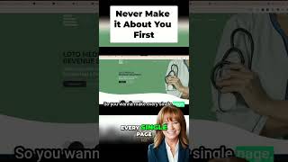
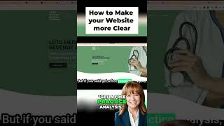
Sandy Wardenburg Waggett reviews the TCS homepage and finds the navigation cluttered and the messaging unclear. She recommends replacing the blog link, adding a clearer headline, and putting a prominent CTA with a lead magnet like a VoIP benefits guide above the fold. The "Find your solution" button should lead to a guided contact flow, not a generic form.
Chapters
Hey, everyone, Sandy Weigt here with MSW Interactive Designs. And today I am here with the marketing tip in the form of just a quick website review. So my good friend Tony Stukin with TCS agreed to let me do a quick review of their website for TCs. And I'm just going to give them some quick tips on on some very simple things that they can do to make their existing website more effective for their business. And if you would like a website review like this for your business, just use the link in this post and you can request a review and I'll make a short video. It'll be under three minutes. And it's not a criticism or critique of the website, it's just a review to give you some suggestions on things that you can do to instantly improve your website. So, and of course, my phone just dinged, so I'm going to turn that off. All right, so let's go. I'm going to share my screen and we are going to look at the TCS website.
Give me one second. And here we go. All right, so TCS up here above the fold is a super important area because the eye goes from left to right. So, so you see TCs, which is their logo. And then our solutions, blog, contact and customer portal. I would probably move the blog down lower on the page. The contact us is something you really want people to do and I'm sure they do want their customer portal to be easily accessible. So it's not in a bad position. But that is the prime position on this page. I would actually change that up and put a call to action here instead. That could be a lead generating mechanism for tcs. And then right here above the fold, of course, I have a big monitor, so this is going to look smaller on most people's screens. This is. We push communication beyond the dial tone. It's a really clever tagline. It's not super clear though, about what exactly they do, so I might save the tagline for a little lower on the page and be a little bit more explicit. One of the things that they say down here is your team and your clients are always on the move. So you might put that up here. Your team and clients are always on the move. And our phone systems help keep you connected with them wherever you are or wherever they are that's a little more clear about exactly what they do. And then this real estate right here below the sentence is prime place for a call to action and maybe even a lead magnet. So in the case of TCs, you know, they don't have a lead magnet on the site. You could do something as simple as like 10 guaranteed ways a VoIP phone system can improve productivity, increase your bottom line. Something tempting that if someone's thinking about changing up their phone system, you can have this lead magnet. They're not taking action here, but you get their email address in exchange for that download where they can learn more about how a VoIP system might save them money and productivity with their team. So I would put that right here and then communication solutions, cloud solutions, brand solutions. These phrases are kind of nebulous or gray to the end user. Not bad to have them here because they are explained. But you might put step one, step two, step three underneath this main area in what exactly you want your prospective customers to do in terms of contacting you. So reach out to us for an analysis of your existing system. Number two, one of our reps will get with you and guide you through the process of what the change looks like and what solutions are going to best fit your needs. And number three is the result. Your team is going to be instantly more productive and your customers are going to be able to reach you no matter where you are, where your team is on the go. So very simple, so clear message up here. Call to action with a lead magnet. And then 1, 2, 3, how to work with you. And then all this here is just fine. You could improve and clarify the language just a little bit. There's a little bit of jargon in here. Most people don't understand the jargon like the people who work at TCS do. So the more you can simplify it, the more effective the sales copy is going to be. Then my biggest tip beyond those is here where it says find your solution. I would actually change this call to action because as TCS is the company you really want to serve as your customer's guide. They don't want to find their own solution. They're actually looking to you for your expertise. But then when you click on this button, it takes you to a very generic contact page. We'll wait while it loads, but once we get there, I'll show you. This page could be so much more effective because it says find your solution. I almost expect to be kind of guided through something on the website when I click on that button, but instead I'm taken to this plain form and it just says contact form and message or promo code. It's so generic and unexpected attached to that button. You know, I think your conversion rate on this is going to be pretty low with that particular call to action just because it's an unexpected result from what that says. Find your solution. So what I would do right away is beef up this page and put some information like what's gonna happen? Contact TCS and one of our expert friendly technicians is gonna contact you. We're gonna look at the solution you currently have right now, find out what challenges you're having with it, and then we're gonna recommend a solution that will instantly money show a return on the bottom line and increase your team's productivity, something like that that really leads them into wanting to fill out the form. So that is my quick assessment of the TCS website. It's a nice looking site. These are just some simple instant improvements that can easily be added to make the site more effective for TCs. So I'm going to stop my screen share and invite you to click on the link in this post. And if you would like a quick assessment of I'm going to at least do one a week. I might do more. I will be happy to do it. We'll post it online and I'll notify you when it's up there and you'll get some free tips from myself and some of my team members might join me on this. Thanks so much and I hope you all have a great day.