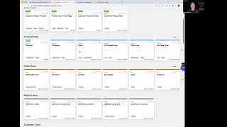
In this 60‑second video, Shagility walks through the design of the Agile Data Catalog page. The catalog displays data assets as a grid of tiles, each representing a table or view. The team originally considered a search‑first interface similar to Google, but abandoned it because building relevance algorithms would require extensive data and would struggle to provide contextual cues. Instead they adopted a browsing‑first approach modeled on Netflix’s catalogue UI: tiles are grouped and tagged by topics, users scroll vertically through topic rows and horizontally within each row when there are more tiles than fit on screen, using arrow navigation. The video explains how this design lets users discover data intuitively, and teases a future episode that will detail the tagging system.
Chapters
Welcome to another Agile Data Gone in 60 Seconds. Today I want to talk about the Agile Data Catalog page and how we came up with the design for that page. So let's have a look, a quick look at the page itself. So in the Agile Data Catalog, you see a bunch of tiles. Each tile is effectively a table of data or a view of data. And as I scroll down, you can see we have lots and lots of tiles because as you would expect in your data platform, you have lots and lots of data. Now, when we looked at how we would design this, originally we thought we would use a search paradigm. So we thought something like Google where we have a bunch of white space. You type in the word you're looking for, for example, customer, hit enter and get back a bunch of links and information about your customers. The challenge we had with that was a couple. First of all, we'd need lots of data to build the algorithms that make sure you got back the tiles of the information that was really relevant. And we know that when we search for customer, there are often multiple customer tables. And multiple columns with the word customer in it. The second thing is actually it's really hard to get context around that. And often people just want to browse for something because they know what they're looking for. So we thought about that concept of browsing and we thought, well, what else actually allows us to use a browsing paradigm? And we came up with the idea of Netflix. So if we think about Netflix, that allows us to have a catalogue of movies. And as we scroll down, we can see that there are lots and lots of movies and they are grouped by topics, so exciting films new releases. And when I see these lots of exciting films, you know, I can scroll right and actually see each of the films until I run out of films for that topic. So that's effectively what we did when we designed the catalogue page within Agile Data. So each tile, as I said, is a table or a view of data. As I scroll down, I can see that these tiles are tagged with a bunch of topics. And in another Gone in 60 Seconds session, I'll talk about how we tag it. But effectively, each tile is coming back based on that that tag. So I can see here that I've got some topics about customer and some topic about Google Analytics. I can also see that when I have more tiles that are on that topic than actually fit the screen, then I get a little arrow that allows me to go right and I can scroll right and see those extra tiles. So effectively allowing us to browse the data in the catalog as easily as we can browse Netflix, which we think is a great thing. So that's another Gone in 60 Seconds. I'll see you all soon.