In this brief walkthrough, Shagility explains the colour‑coding system used throughout the Agile Data application to convey the type and lifecycle stage of data stored in catalogue tiles. Grey tiles represent immutable historical data that serves as a permanent corporate memory. Orange tiles hold detailed attribute data linked to concepts. Blue tiles are concept tables used for counting and managing entities such as customers or products. Green tiles denote events, i.e., core business processes that combine multiple concepts (e.g., a customer ordering a product). Purple tiles indicate consumable data that is ready for downstream use in visualisation tools, dashboards, APIs, or other systems. The video also shows how rules and data maps visualise the flow of data between these colour‑coded tiles, providing a lineage graph that tracks transformations from raw history through concepts, details, events, and finally to consumable outputs.
Chapters
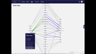
Welcome to another Agile Data Gone in 60 Seconds. Today I want to talk to you a little bit about what we call the colours of agile data. So when we have a look within the Agile Data app, we'll see a bunch of tiles in our catalogue, the tile being a table or a view of data. And as I scroll down, you can see there are a bunch of colours, right? So we've got some greys, some orange, a blue, a green, and some purple. So what do those colours mean? Well, we use them to differentiate the type of data or the way we're storing it within Agile Data. So grey for us is our history area. That's data that's been collected, landed within Agile Data, and it's stored, racked and stacked as an immutable corporate memory of the data from the applications we collected it from. So we store that forever, we never change it, right? That enables us to go back into history and actually see what the data looked like last week, last year, last month. We then take the history data and we, we design it, we lightly model it, and for us we talk about concepts, so things we want to count. So we want a concept of a customer, want to count how many customers we have, we want a concept of a product, how many products do we have. And then against each of those concepts we have a bunch of details. So what's the customer's name, what's the product SKU, what's the order value, order quantity, order date. And we put those together, those concepts together for an event, a core business process. So customer orders product, where we see a customer ordering a product, those three concepts together, that becomes an event. So whenever we see an orange, that means we're storing or playing with some detail about something, about a concept. Where we see a blue, we means it's a concept, something we want to count or manage. And where we see a green, effectively that's a core business process or a relationship between that data. And then the last one is the purple, the consume, and that means that the data has been made available for somebody to use a last mile tool. So a visualisation tool, reporting dashboard, another system to integrate to grab that data, an API, data as a product, all those kind of things. And so that data has been consumed and purple means it's ready for consumption or is being consumed. So all the way through the Agile Data App, we use these colours. So if I go up and I have a look at all the rules, that we use to change data. I can see here that this data is going from a history table, from a grey, and it's populating an orange table detail. I can see this one, history to concept, history to detail. And as I scroll down, you can see the little dots are giving me a visual clue of we're taking data from one tile and moving it to another. So here we go, history to an event. Another way we can look at it is if I go into data map. So data maps showing us all the rules and the flow of the data from our history data that we've collected all the way through to the data that we consumed. And if I click on one of that and say, show me all the rules, I'm getting a map, a lineage graph of where all that data is going, and again, color-coded. So I can see I've got two blues, so two concepts have been populated, two detailed tables, two events, and I'm going out and creating four consumable tables or views that people can use in their reporting. Reports. So colours of agile data. We know that visually being able to see things quickly are important. So when you see grey, orange, blue, green, or purple, you have a very good clue about what that data is holding and what it can be used for. So that was another Agile Data Gone in 60 Seconds. I hope you have a simply magical day.