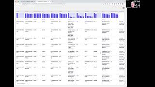
In this 60‑second video, Shagility demonstrates how the AgileData catalog’s data preview and profiling features help users quickly understand a dataset’s shape and quality. Starting from the catalog’s list of tiles (tables or views), she drills into an e‑commerce product‑detail tile, showing the preview pane that reports the number of columns (15) and rows (≈29,000). She then expands the view to run automated profiling statistics, which generate distribution charts for fields such as department, distribution‑center ID, and brand, revealing whether values are evenly spread or heavily skewed. The demo also highlights the null‑value indicators: small icons that turn solid when a column contains nulls, displaying the percentage of missing values. Shagility explains how these visual cues enable rapid data‑quality checks and inform decisions about data usage and design. The video closes with a friendly sign‑off.
Chapters
Welcome to another Agile Data Gone in 60 Seconds. Today I want to have a brief chat about data preview and profiling within it. So if we have a look at the tiles in the catalog, tile being a table or view of data, we can see we've got some tiles here that have been loaded and what I'm interested in, which is my e-commerce product detail. So I'm just going to drill down and have a look at some detail about that. And as you can see, when we go down, we're getting a preview of the data. So this is telling me that if you look down the bottom, there's 15 columns in this tile, 29,000 rows. So I can have a quick browse and, and have a look at that. But sometimes I want to understand the shape of that data. So what I'm able to do is expand that area out. And what it's doing now is it's running some profiling statistics. It's looking for the shape of the data in that tile for me, and it's bringing back a bunch of charts that tell me a story. So I can see here that for department, we've got a bunch of tags for the department of women and a bunch of men, and that more of the products are tagged for women than men. I can look at the distribution center ID and I can see the shape of the data for that. I can go through and look at the names and see a whole lot of information about the shape of the data around brand, all those kind of things. So I can see whether I have something that's fairly evenly distributed or something that's pretty lumpy. Which I can use to make some decisions about how I use this data or how I design it. The other thing I can do is have a look at these little ones here, and that tells me whether there are any nulls in that data. So nulls often are things that we have to deal with from a data quality point of view, or we have to be careful when we're reporting. And so when we see these blank boxes, that means there's no nulls. If we saw something come through with a percentage of nulls, this little line would be filled in to say that 10% of them are nulls or 5%. So again, valuable and easy way to quickly scan dataset or the tile data and have a look and say, no, no nulls, we're all good, it's pretty safe to use. So that is a quick and easy way of getting an understanding of the shape or the profile of the data that's sitting underneath any of those tiles. So that was another Agile Data Gone in 60 Seconds. I hope you have a simply magical day.