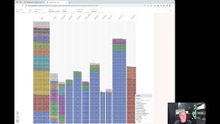
Shagility embedded Google Facets into Agile Data to explore 5 million rows of New Zealand car imports in seconds. The tool visualizes patterns like Japanese dominance and Toyota's prevalence by clicking through dimensions like country, make, and colour. Each dot is a clickable record.
Chapters
Welcome to another Agile Data Gone in 60 Seconds. Today I want to show you a little bit of a demo of a McSpikey we did, a research project around exploring data. So let's have a quick look at the data catalogue here. So we've got a bunch of tiles, tiles being a table or view. And if I go down to the history data and scroll across, I've got a piece of data I brought in which holds all the cars in New Zealand. So dataset of about 5 million rows for every time a car comes into New Zealand. And I can drill down on that tile and go see some information about it. So I can go see a bit of metadata and context, uh, can see a preview of the data and all the columns that came through and rows in that column. But sometimes we want to be able to explore that data, and we've got other videos you can watch where we go out and link out to Google Data Studio and are able to report off there. But we decided that it'd be really useful to be able to profile or explore that data within the application itself, within agile data. So what I'm able to do is go and say explore. And what that's doing is it's kicking off a thing, open source product called Google Facets, which we're embedded into the agile data app. And it's going and grabbing that dataset and bringing it back into my browser. So what I get there is now what I've got is all that data I mean brought back in a way that I can visualize it. And so it's showing me all the cars broken down by the first month of registration, which isn't particularly useful for me. So why don't we go and say, let's go and actually look at where the car came from. So let's go look and say original country. And so we can see there that the blue dots down here are all the cars from Japan. So we can see the majority of the cars that come into New Zealand originally came from Japan. Because we have a large import market here in New Zealand. We don't make our own cars. Um, maybe I want to break that down a little bit differently. Maybe I want to say, okay, we'll break that down and let's break it down by make. So now we can see that actually the majority of the cars coming in are Toyotas, and within the Toyotas there's a large number that come from Japan. But if we look at the Fords, we can see lots of different countries that those cars are coming from. Maybe we want to break it down a bit further, so maybe we want to bin it. So we can go through and say, well, let's look at the color of the cars. So we can see here that black cars are coming in and, you know, a large number of the Mazdas and the Toyotas are coming in are black. But if we look down and scroll down, we can have a look at silver and white, which are the two most popular cars, colours of cars, and you know, most Toyotas are coming in with those colours. If we wanted to, we can say, well, look at these Fords over here, they're coming in in black and blues. And a lot of them have been coming through from places like Australia. And so what I can do is drill in and each one of these dots, if I click on it, is actually a record. So on the right-hand side there you can see the row that we saw coming through. So you can go through and play with the data as much as you want. So I can go through and say, you know, let's take off the make. And now what I can see here is effectively the breakdown of the cars by colour. But not by make or by country. So lots of different ways that you can play and explore that data. So we've found that particularly useful. Like I said, it was a McSpikey, it was an experiment, but we're gonna actually break that, lock that into the app and make that available to all our customers. So we found it really, really useful to initially have a look at the data when it first comes in, understand the shape of that data, explore it, being able to ask questions quickly before we go through and create our rules. So that was another Agile Data Gone in 60 Seconds. I hope you have a simply magical day.