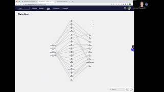
In this 60‑second video, the presenter introduces the Data Map feature of Agile Data, explaining how it visualizes data lineage using a map‑like layout. Data sources appear as history tiles on the left, and rules are shown as colored lines that move data through concept, detail, and consume tiles toward reporting. The map supports scrolling, zooming, and a "run forward" lineage view that highlights the flow of data. Color coding distinguishes concepts (blue), details (orange), and consume tiles (purple). The design draws inspiration from the London Underground map to keep complex data movements clear and space‑efficient. The presenter notes current layout limitations and promises future UI refinements, concluding with an upbeat sign‑off.
Chapters
Welcome to another Agile Data Gone in 60 Seconds. Today I want to have a quick chat about the feature we call data map and why we built it and where we got the inspiration from. So in Agile Data under rules, we have the ability to view a data map, and the way it works is the data on the left-hand side, the stations here, are our history tiles. It's the data that's been collected from our source systems and landed into Agile Data. And then each of the lines is a rule that we use to change the way the data looks, change what it means, change where it's stored, change how we refer to it. So you can see here we can move some data from a history tile across to the order concept tile or the order detail tile, and then we automatically move it from the orders concepts and details out to the consume tiles, which is the ones that you hit when you are reporting or using your visualizations off it. So as I said, each one of these stations is effectively a tile, and the lines are the rules that move the data from left to right until you can use it. As you would expect, as you get more and more data, you get more and more lines and more and more stations. So we can scroll in and scroll out when it starts getting complex to be able to see and find the things that we're after. The other thing we can do is we can actually look at the lineage. We can see where data comes from and where it goes. So for example, if I click on this one and say run forward, You can see here that that history tile has a bunch of rules that are flushing data into two concepts. How do I know that? Well, concepts are blue lines. We're populating two detailed tiles, the orange lines, and also populating two events from this history data. And you can see that each one of those are going through and creating a consume tile, which are the purple lines. So where do we get the inspiration from this data map? Well, you know, it's typical for data platforms. To be able to do this map of data, the lineage as we call it, to see data where it came and where it went to. But one of the things we were really keen on doing was to try and make it as simple as possible, and the design that we're really after is the one that was from the London Underground. We're a great fan of this map. It's a way of taking complex movement of trains and stations and lines and seeing it visually on one screen. As you can see, one of the beautiful things about the London Underground map though is the way it optimizes the white space, the way it blaze it out so that although lines are overlapping, they're still fairly easy to see. We've got a little bit more work to do on data map at the moment. We haven't optimized the layout for the screen, but we'll do that in a future, in the future, feature in the future. But for now we can see the data going from the left all the way from the right. We can see what objects we're creating or what tiles we're creating from that data, and it gives us a perfect map of our data. So on that, that's another Golden 60 Seconds. I hope you have a simply magical day.