In this 10‑minute YouTube walkthrough, developer Tod Maffin explores the iOS 7 beta on an iPhone 4S, highlighting the new flat UI, Helvetica Neue typeface, and fresh features such as Control Center, revamped Notification Center, multi‑page folders, and an updated Siri voice. He demonstrates design touches like the chalk‑board‑style background, Add‑to‑Contacts shortcut, and the weather app’s graphics, while also pointing out a range of usability glitches and performance problems – notably a roughly 25 % slowdown, sluggish app launches, hard‑to‑press backspace, cramped button spacing, and limited home‑screen real‑estate. Maffin notes that the beta is only available to registered Apple developers and speculates that some issues may persist into the final release. The video blends casual commentary with concrete observations, offering a balanced view of iOS 7’s visual overhaul and its early‑stage rough edges.
Chapters
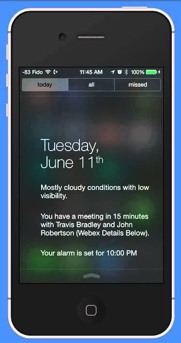
Well, I've had the iOS 7 beta for a number of hours now, been playing around with it, and I thought I'd give you a bit of a tour. Some things that are really cool, some things that are still yet to be worked out in the design phase, obviously, but a couple of really nice touches. Let me just start it going here, and you can see this is my fat cat Tycho. And as I scroll to the right, the photo kind of fades out, which is a nice touch. I have noticed the phone feels about 25% slower. So if you're going to install this, or at least the beta, which you have to do via the developer site— you have to be a developer of Apple to download it, at least to download it legally like I did— you'll see a few glitches in it, and it feels about 25% slower, like I say. So even though this is an iPhone 4S that I'm using, gosh, it feels like I'm using an iPhone 2 or 3. It's a little slow, and I expect it'll probably be that way for the real version once it comes out as well. Let me show you a couple of the weird design things so far that are peculiar. You can notice it's nice and flat across the tops, a lot simpler, especially that battery meter is going to be easier to read. But let me show you some really sort of strange things. All of these apps, by the way, are almost identical to the way they used to be. If you look across the bottom, that gray bar, you'll see the gray bar is all in the same place, all the buttons are in the same place. You'll find this with most of the Apple apps that are on board this, is that they will now it's flashing at me or something, that's strange, um, is that it's just sort of been redesigned. I don't mind the flat look, I'm not a big fan of these big circles. One thing that is kind of interesting though, if you take a look at the background on this desktop, you'll see it's kind of a, a, um, what would you call it, like a chalkboard-y kind of look essentially. So watch what happens now when I dial the phone, is as I hold down these keys, that chalkboard kind of bleeds through. This is what they're talking about, about the design being layered. It's kind of a nice touch. But one of the things that I did notice— this is also very nice, a little Add to Contacts link right there. Oops, I held it down instead of clicking it. There we are. So it's nice to have it right there. But I did notice that it's a little tough to click because that Add to Contacts is jammed between the numbers and the, and the number that is is currently in the queue there. And also, it took me a second to figure out how to backspace. It turns out backspace is that tiny blue X in the upper left, which in itself is sort of difficult to touch. So this is just one example of the design glitches that I think hopefully will be worked out. Even the space in the call between the bottom row of buttons and call is just kind of a little tight there. But the rest of it operates sort of the same way that you would expect it would. OK, so let us pile through the settings first of all. Again, all of the— with the exception of a couple of new things like Control Center, these are pretty much exactly the same as they used to be. The notifications is still irritatingly— although I hope that they'll fix this— if you go to Notification Center, there still is no way to sort alphabetically, you have to sort, which is really bizarre that they've done that. But anyway, whatever. There are a couple of new things. Obviously, the Control Center is new. We'll get to that in a second. You can, if you find the text to be too big, you can change the size of it, but it really only, as you can see, only changes the help text. It doesn't change the kind of the big look. The typeface they've used in this case for the whole UI is called Helvetica Neue. It's an updated version of Helvetica. Trust me, Helvetica Neue will become the Comic Sans of our generation. Everyone is using it and I'm not a big fan. Anyway, across the top, when you pull down, you get a really nice— take a look at this— you get a really nice sort of thing. It tells you when I've got a meeting with those two people. It's in 15 minutes. I've got an alarm set. It tells me what the weather is. It'd be nice to have that in graphics, but that's okay. You get a look at your calendar. The stocks— you can turn these on or off as well in the settings. I'll just swipe up again. Now if you swipe up from the bottom, you get this whole new area, and this is really nice. This is what takes all of the stuff— this should have been in the very first version of iPhone, frankly. But you can change the brightness really easily, the volume. You click this button down here and it'll turn the light on, so a really easy flashlight. You've got other accesses to things, turning on the camera. This will— what does this do? That goes to your clocks, essentially. There's what a notification looks like, by the way, across the top. For some reason, it's coming twice. I guess that's just another glitch. That's sort of a nice look. It seems to be a little longer than the other ones. You may have noticed also that as you click these, it kind of zooms. Whoop. Some things are very irritating though. Um, even though it is nice that the new folders can contain multiple pages, as it turns out these screens now contain less than before. So I used to have all of my reading apps fit on one screen. Uh, now I couldn't expand that screen. I got 12, uh, but I was happy with 12. Uh, now you only get 9 and then you have to swipe. That's quite irritating. You'll see the design choices toward bigger, more white space, and what that means is less space space for other things. Siri has a new voice, also a little bit sluggish as well, but a little bit more clear. Say something nice to me. Now you'll notice it hasn't— there, it's just starting to get to the— that should have come up right away. Let's see what it does. It's probably going to send me a message that says nice to me. But notice how slow it is. Yeah. Yes. I don't know if it will actually send a message to me on my own phone. See how long it's taking for it to process? Okay, I'll send it. And then nothing happens. Did I get it? I don't think I even got it. Anyway, I wouldn't expect her to send it to myself. Safari also sluggish. All the apps are a little slow. Take a look at this. 2, 3, 4, 5. This is an iPhone 4S, remember. They're not the slowest phones in the world. It's not that old of a phone. Ugh. Now, some of this might be the speed of my internet connection, but my internet connection is pretty good. So really quite slow. Kind of disappointed by that. Some of the Apple apps themselves are sort of really nice. Obviously the weather app was the one that got the most eye candy. It's quite nice. It's going to take a second now for those graphics to kick in. Oh, there. I just got— it does send a message to myself. Isn't that interesting? One other nice thing is that now you can get rid of notifications by swiping up on them. Before, you just had to kind of have them sit there on your screen. So if you're looking at something at the top of your screen that's being covered by notification, especially now that notification is taking a bit longer— or excuse me, a bit more space— you can get rid of it. There, the graphics for Cabos, for the partly cloudy, have kicked in. You can swipe to get a little bit more. So that is all I've really been able to play with so far, and I hope you enjoyed the tour.