Ep. 41: Is Your Book Cover Making the Cut?
17 Feb 2023 · 31 min
Vanessa Campos, Jen Dorsey, and Paul Roberts break down why book covers matter in physical stores and online. A cover needs to work at thumbnail size on Amazon and spine-out on shelves. They use comp titles to research what's selling in your category, and stress that bold, simple design beats complexity every time.
Chapters
Welcome to the Pub Date Podcast, the show where two book broads discuss what should happen before, during, and after your book publication date. Brought to you by Broad Book Group with your host Vanessa Campos and Jen Dorsey. Hello, welcome to the show. Happy Friday, Vanessa Campos. Got some technical difficulties here.
That's me. I have the mute button on. I'm looking at Paul and he's like, go. And I'm like, everyone's mouthing things and I'm just like, wait, it's me. I'm like pushing all the buttons. I had you guys on mute.
It's me. I'm the problem. It's me.
It's me. Yes, that is my Taylor Swift moment.
What does that say about your show host? And when she starts the show by putting you on mute. How much of a conversation does she really want to have here?
I am feeling under the weather, but that's just, again, that's just me. Oh my Lord, it's the beauty of live, of live podcasting.
You never know what's gonna happen.
Live radio, live podcasting. Well, I think I'm only hanging on live for a moment because I want to congratulate the two of you. This, today's a kind of a mailbag show where people get to ask you anything. And I have a couple of questions I want to throw in. I know you have others that people send in email over time, or questions you get asked a lot, but I want to ask you about winning an award for one of your book covers.
What? We did?
No, I didn't even hear about it. Somebody else had to tell me about it. You were like, oh please, you know, don't, we're too modest. We don't want to talk about this here. Yeah.
Likewise. We didn't know about it until we looked on LinkedIn yesterday and we're like, oh. We won something.
Yeah.
What did you win and for what?
So we entered— we're part of, uh, PubWest, which is a really great organization for indie publishers and authors, and they have an annual conference. And in that conference, they do a, um, design and literary award competition. So we looked at one of the books that we did last year. I mean, they were all really great, but one really stood out for us, and it was Marcos Rivera's Street Pricing, because it talks about pricing strategies in B2B SaaS. Sounds like a snoozer, but his story is really, you know, it really interweaves a lot of hip-hop music. So our designer Andrew Waliczko, he came up with this, and like, he took what he had, what the author had originally, um, concepted and created this beautiful thing that it's just stunning. So we submitted it and we won.
Gorgeous.
And I know about it because I helped you put— we're still putting the finishing touches on the audiobook version of that, which should come out shortly. And I was amazed too. I thought as he read this story and told his tale of a kid growing up in kind of the projects in the Bronx and his love of hip-hop, and because he's of that era and of that, that community and that culture, how he has continued to use that metaphor to explain this very sophisticated SaaS pricing. If you're Netflix and you're trying to figure out the different levels of pricing for your software as a service, what's the entry-level point? What's the upgrade? How much do you give? How do you do it? And most people, as he admits, just kind of stick their finger in the air and say, how does that feel? Which way is the wind blowing? And then, oh, that's not working. Disney's going through that right now. They just raised the prices and a bunch of people dropped out. But not as many people as they feared. So, okay, I guess we guessed right. He's saying, don't guess. There's some real theories behind how you price these things and set them up. And he relates them to hip-hop, which I didn't think had much value other than kill the cops kind of metaphors or, you know, yo, I won't use the slang terms, but yo girl, you know, that kind of stuff. Real hard edge imagery. He really sees it as poetry. And he sees it as explaining a lot of, uh, he sees it as a very lofty artistic form. And so he somehow weaves that love of hip-hop into his explanation of pricing strategies. If for no other reason than that, you gotta get this book and check it out. It's just, I mean, it's a very valuable, and a lot of it gets really technical and I get it. It's not for everybody, but just his stories and how he it takes them to describe a pricing strategy is mind-blowing.
It's wild. And I think that's one of the things that appealed to us about the book so much. It's, it's so different. You would never in a million years put those two things together. I mean, you just wouldn't. And I remember when Vanessa Campos Campos Campos was like, do you want to do this book? Read it and let me know what you think. And I, I said, this is just crazy enough to really work and really be a fascinating read for, like you said, for anybody, even, you know, even if you're in that software as a service world. You could even just apply the pricing structure concepts to whatever it is you are selling.
And how do I price these podcasts? How do you price your books? How do you price all these kinds of things? Most of us don't have a strategy. We just kind of look around and say, well, that's what they're doing. Can I try that?
Maybe that's exactly—
that'll work.
And Marcos's story just brings it home. And it's the right book at the right time. It's the 50th anniversary of hip-hop this year. They just did a huge thing at the Grammys, you know, this huge extended jam session with, you know, tons of different people. And so it's, it's back on everybody's radar in a really big way. So some of those, you know, earlier, earlier tracks. So it's cool. And the book is beautiful.
And I'll give you one more thing, takeaway that I got listening to him tell this story, helping record and produce this audio version of the book, because when he tells it, he brings it alive too. You get who he is and where he came and the amazing journey of, you know, impoverished kid from, was it the Bronx or someplace like that in New York, to rising to a pretty upper echelon of sophisticated people who work with big sophisticated brands. He could rattle them all off, but many of which I'd heard of because everybody's trying to sell stuff as a service. You don't go buy Microsoft Office anymore. You subscribe to it and they give you the new version. You don't just go physically buy it and stick it to your computer. You don't buy movies. On a DVD and take it home and just play it. You subscribe to a service that gives you access to it. More and more everything is software, everything is a subscription online. And in that world, I forgot how he got there, but he talks through how he went through college and got into some startups and strategizing stuff. He developed this expertise how to do it. But my point is this. He makes me interested in hip-hop, which at my age, I'm an old white guy, I have no interest in hip-hop. I see no value in hip-hop whatsoever. It's just this endless beat and these bad to me rhymes that I can't understand half of what they're saying. And most of it seemed violent and just kind of, you know, showy and blingy and yo, in your face and all this stuff here. And he describes Alvin's stuff and I thought, you're really making this sound beautiful to me. Something— you're helping me see a beauty in it that I couldn't see, and a meaning that's awesome that missed me. So that alone, as an ambassador for hip-hop, is, is worth reading the book here.
Oh, it's fantastic. And, and I think, you know, kudos to, um, as Vanessa Campos mentioned, Andrew Campos, our designer, who just absolutely got it and took it and ran with it. And the COVID is just— it's a work of art. I would hang it up. I would hang up the COVID That's how much I like it.
So have you got one? You don't even have one to show right now. Have you got one?
Do you have one, Vanessa Campos Campos Campos? She keeps all the books. There it is.
Yeah.
These gorgeous headphones, like the dripping and the— I just love it.
So talk to me, hold that up for a second, cuz that's my first question is this. I really wonder if book covers matter in a world of online sales in a, in a store. I get it. Like the grocery store, the package has got to pop. If I'm walking down the streets of an— of a traditional Barnes Noble, if there's still any of those around, and there's just acres and acres, shelves and shelves full of books, something's got to make me stop and reach out for it. Even if I'm in the section of books I'm looking for— mystery, business, politics, something, something— there's a million of them up there and something's got to make me reach out and open that book, but in online, I'm not looking at millions of times, not just endlessly scrolling through books. Oh, stop. That one looks interesting.
I'm probably— I think that's what most people are doing.
Do you? Okay. Well then that, that counteracts my argument. My theory is I'm going to look for a business book on pricing strategy and this one pops up and maybe there's no other book that pops up. So therefore, right. It's not important.
So this is, this is the way that, again, and I think that Marcos has a really good, uh, good handle on consumer behavior and all of this because there's a little bit of psychology in this book. And we're just gushing over this book right now. But if you think about it, bookstores have limited amounts of space, so the majority of the time you're only going to see the spine. So on the spine, on a bookshelf, all you're seeing is a name, a title, and a logo, and, and a color, maybe the color, color. So we're shifting it to like, okay, your book might not be forward-facing if it's in a bookstore, in a Barnes Noble, or your local bookstore, but it will always be forward-facing meaning the front cover is showing online regardless, right?
So that's, that's true. You don't, you don't see the spine online.
You don't see the spine online, right? You see the COVID It's kind of a rhyme in there in itself.
I don't see the spine online. We could make a hip-hop about that.
Look at you being a hip-hop convert now. I love it. I love it, Paul. But Vanessa's right, everything is face out when it's online. You know, you're not fighting for that space. You are with like the algorithm and the SEO and what populates what books you see first. You're fighting on that front, but not on the COVID front because everybody's face out. So the competition is even tougher, I think, online because not only is everybody getting that face-out opportunity, but you also have to look at it tiny, right? Because you're not looking at it full size like you would when you pick it up physically in a store. So you're looking at this little 25-30% size of a book cover. So that it's even more important for the book cover to have some of those elements of pop to really stand out, like Street Pricing does. You know, I'm looking that book versus maybe a standard textbook design on Street Pricing, you know, yes, the textbook looks super important and highbrow. But if I look at Street Pricing, I'm going to be like, hmm, well, now that's interesting. What's that? Because of that pop and that color and that just diverse, different look to it. So I think that, yeah, it matters a lot online.
So you make an interesting point. They're all facing forward. And even when I find— I'm going to Google, I'm going to search on Amazon books for something about pricing models. That's what I'm interested in. I'm starting a business. I want to know about pricing models for whatever. And I don't know that there's a lot of books on that subject. I suspect they're not. That's probably what helps too. If there are millions of them, but even if there are 2 or 4 or 104, I've got to scroll through those then and decide which one to click on and open and explore. And I guess I hadn't thought about it. I was going to start with the title and the picture of the book. Talk about the title too. Is the title key? Can, can I just say The Fundamentals of Street Pricing and get the same reaction as, uh, I don't know, Street Pricing and a Hip-Hop Vibe to it or something? Does that make more people go, ooh, that's— I gotta open this one.
Wow, that's a good question. I think, I think the title has to be the hook. The title has to be the thing that draws you in, and then the subtitle has to provide the hard information. A lot of the time, at least in our world, like in the non-fiction book world, or especially in like business and, you know, self-help and personal growth, I want to be pulled in by something like Street Pricing. Okay, different. And then I want that subtitle to say, and here's what it is about.
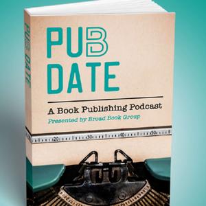
So I guess I don't know why I'm fighting this because I live in a world of podcasts and podcasts all have the same challenge, like a book, because they, in a weird way, I say podcasts and audiobooks are the same. They're a long story broken out over multiple episodes or chapters. You don't just digest the whole thing. Like a typical media interview for a million years was just a soundbite. You went on some show, you got a couple of minutes. It was over. And you tried to jam as much as you could in there as a tease to call me, to read more, to buy more, learn more or something. But by definition, an audiobook, like a podcast, have followed the same kind of trajectory of acceptance and interest because there are places and spaces where I got time to kill. I can't watch, I can't read, I'm driving, I'm walking, I'm doing something. And I'll give you more time to tell your story. It's a— so it unfolds. And if it's done right, like a Netflix series, when the first episode's over, you immediately want to go to the next one. You want to, you want to go to the third one, you want to go to the fourth one. And so in that world, if you were to go on and look at any of the podcast sites from iTunes to iHeart, you get a forward-facing title, a page cover for your show, and then some little text sample of, of something to try it and open it. And listen to it. And in that world, I would suspect as I'm scrolling through lots of potential podcasts to listen about book publishing, that when you see something like this, I'll put yours back up here. That's got to be more eye-grabbing and attention. Pub Date, a book publishing podcast. Okay. And it's done in a kind of movie poster style that I don't see a lot of podcasts do. I don't know why I'm always pushing for that. But it looks— a movie poster, the same thing. It makes you, when you're walking through the theater, I want to come and see that one when that comes out.
Well, I think that, you know, you bring up a really good point in terms of like, we're swimming against a lot of other podcasts that might do something very similar. And this is where we get a lot of questions regarding, okay, what is a comp title? Who is the competition? And why should we care what other people are doing? And, you know, a lot of the times as a traditional publisher, we will ask You know, when you submit a book proposal, we'll ask who are— what are the other books in your genre or your niche that are similar to your book? And then if you get a response as a publisher that says there is no other book like this, well, we can't necessarily put, you know, hedge our bets against that because we don't know how it's going to sell. And you tell us, well, this book is for everyone, but the reality is that it's not. You don't want to talk to everyone, you want to talk to your niche. So I think I think that's actually, um, a really good, uh, movement into this question is like, what is a comp title and why should I care?
Right, exactly. I think, you know, authors— yeah, I— when, whenever authors are writing book proposals or trying to pitch their book and they want to show how they are different to a potential publisher, that's a term that gets thrown around a lot, comp title, because we, we pull them and we use them. And but I think it's really hard sometimes for authors who are not really in the weeds of publishing to, to know what exactly to pull for a comp title. In other words, to show, okay, these are the books in my content landscape, but how am I different? How am I— not that I'm better, like a better person— but how's my book better, right? And so to me, authors really need to become a student of their content area and of their competition and of their colleagues. So the 3 C's: content, competition, colleagues. You need to know those. You need to, you know, get on Amazon, go to your bookstore, see who else is out there speaking on your topic, figure out who else is playing in the same sandbox as you so that you can then say, okay, here's what's good about their book, here's what their book is lacking, here's how mine is different. If you have, uh, I'll step— I'll put up my academic hat for a second here. In college, if you ever had to write an annotated bibliography, that's really similar to how you need to talk about comp titles as an author when you're writing that book proposal. Those 3 things that you used to include in those old annotated bib you did when you were looking up articles. What's good about it? What it lacks? And how is mine better? So I think if, if authors go into their research phase when they're writing a proposal or getting ready to pitch a title, thinking about those things when they're thinking about comp titles will help them make it the best case for their book.
So you just made the light bulb go on in my head. I produce podcasts for a living, which I've started by comparing to a book because it's an unfolding narrative over time. We have episodes instead of chapters, but if you do it right, it could just be like old, um, uh, sitcom TV where they can go in any order. They're just complete little packages, every episode unto itself, and it doesn't matter what sequence. But more and more, I try and see people try and have some sort of arc, some sort of discussion, or maybe they do string 2 or 3 podcasts together. As kind of chapter 1, chapter 2, chapter 3 of a story. That being said, you're gonna make me think about this better. If somebody's creating a podcast, go look at the comp titles. What else is out there in that space? What's good about it? What's bad about it? What's missing? And what can you do better? Because too often we just like writing a book. I'm just gonna launch and tell my story and be damned if there's anything like it, or if there's even an audience for it. I gotta tell my story here. And then we're trying to figure out how to find an audience for that and market that and package that and get people to touch it and open it and listen to it and like it and all that stuff here. And I've always said for a long time, I put a great deal of importance on podcast titles and podcast covers. And most publishers I know put very little thought into that. It's that doesn't matter. Just put something up. It's all about the content and it's all about the recording and it's all about the promotion, like a listicle. It doesn't matter what you say, it's just how you promote it. It's what you do with it afterwards. Like any content will do and any cover will do. It doesn't really matter what you do. That's fine. But I think people write books the same way. It doesn't matter what the COVID is. Doesn't matter. That's fine. But this book has really got some really juicy content in it, but nobody's gonna ever click on it. Nobody's ever gonna pick it up in the bookstore. It doesn't have a catchy title and grab you on the COVID Right.
And I think that authors also on that same front need to overcome the myth of what I like personally is what everyone else is going to like personally. Right. I don't know how many times Vanessa Campos and I have had to go to the mattresses on that conversation with authors. And I get it. It's their book. They have a vision in their head, but that's not always the same vision that's gonna sell the book. So, you know, if you hate the color purple and you say, well, I don't want purple on the COVID ever. Well, maybe purple's the right color to sell your topic, right? And I've literally, I've had that conversation with an author before.
Do you ever go deep into the meaning of colors? For example, years ago.
Oh, we do. You know, we actually do.
Pantone, the large color matching system. Publishes every year. I don't think people even know this, the colors that they pick for that year. And it's, they're kind of a trendsetter. So people tend to follow it, but they do it because everybody has to decide what color refrigerator, what color cars, what color clothes are we going to make this year? And there tend to be some themes and somebody has to sort of set that stage and say, we think this is it. And then people react against it or for it, but colors They actually set the colors because the color designers have to look ahead 3, 4, 5 years. They're not just producing a toaster for this year or a car for this year. I got to produce something. I got to guess what the colors are. And rather than everybody picking a different color, they try and look at some trends and they think about the psychology of colors, hot color, you know, like they used to do with miniskirts. The length of the miniskirt has something to do about this, supposedly the times we live in. And, you know, long skirts mean one thing, short skirts mean another thing. And so they kind of think about the psychology and then a group of them go out on a limb and say, here are the color pan— go look that up sometime. Pantone colors.
Oh yeah, the Pantone color of the year. I actually don't know what it is this year. So if you know that, let us know. But that is one of the really wonderful things that you get when working with us on either your hybrid or your self-published book or a book that, you know, we're putting out through our imprint is that Every book that we do comes with COVID concepts because obviously, you know, there's iterations of a cover until we get to that right cover that's perfect for not just your audience but the audience at large on distribution channels. Um, when I say that, I mean Amazon, Barnes Noble, etc. But the great thing about it is, is that our designer Andrew, um, is really thoughtful when he puts these things together, and he basically gives us like Here's a masterclass as to why these colors are chosen based on what's been used in the market for this type of author and this type of topic and this— it's— and the fonts and the iconography that we use. It's really wonderful, and we love working with him because of those reasons. But those are very much factors that we think about, the psychology of color.
So, for example, in the internet, font— I'm pointing the wrong way here— the font above me, our OC Talk Radio font, is a sans-serif without those little twirls, those little serif things. For a million years, all newspapers like the LA Times and the New York Times put those very calligraphy kind of, you know, with a serif font. You know, it immediately has a flair to it. It has—
so yeah, like the Old English, like the Old English.
Exactly. That was considered learned and knowledgeable and catchy and and all that stuff. When the internet came along, that doesn't— what I— little research I read, that doesn't play well or show well in little tiny print and font, so they went to Arial font, this generic, you know, just circles and there's no extra little pieces to the font. And so they went to very simple kind of fonts. You look at the whole internet is populated with sans-serif kind of fonts, and yet books may or may not still follow that. They may have a much more— looks more like iconographic, uh, something that looks more like an image and less just like a font. So lots of millions of choices, millions of fonts out there, but most of us are just familiar with this one that's kind of up here. So what font you choose, what color— orange is supposed to be an everyman color. Home Depot, Harley-Davidson, OC Talk Radio, and street pricing. I'm not shocked. It's kind of an everyman approach to a complicated subject. I'm not surprised that your designer would use orange, and orange is a real hot color for some reason, and how it appeals, it pops or something here. So all of those kinds of things go into designing. What the heck does that have to do with writing a book?
I think a lot.
But I mean, so when the guy writes the book, did— I dare say, I don't know, but did Did Marcos, in this case, envision all of this there? He was just trying to tell a story initially, and then he somehow, he came up with on his own this idea of integrating this hip-hop theme to it, which was unique. But it, at its core, is a business book to explain and lay out a formula for creating your pricing strategies. And you guys brought that to life, I think.
Well, he did come to the table, you know, with the concept, um, his original book cover, which was designed by, you know, someone that he works with on, um, not book covers. So there's also that you need to fully understand, like, what we need on a book cover. So a book designer— always work with a book designer, don't work with your, um, online designer, graphic designer, etc.
Your cousin's too different.
Your cousin, yeah, it needs it. There is a way of doing it, and there's a science to it. So he had come up to us, you know, he had concepts. He had like the old cassette tape. Um, I don't know that very many people listening to us right now know what a cassette player is or looks like anymore.
Yeah, or, or would gravitate to that. I want to see that because, oh, that's a fond memory for me, right?
I think vinyl's coming back, but I mean, I'm old enough to know what an 8-track looks like. I don't know that I would put that on there just because it reflects a mention of, you know, the topic. But Andrew took that idea, that little nugget, and ran with it with something that is, you know, we're still using them. I mean, we've got these over-the-ear headphones that came out like when the vinyl came out, when the 8-track came out, like we're using for a podcast here, podcasting. So it's, it's that one thing. And it also reflects, I think, the fact that he's telling you something you're going to want to listen Oh, I like that.
Hold up the book cover for one more thing. I know you got other things to talk about other than book covers, but I think the other thing about it is it's bold and simple at the same time. Too many covers, like podcast covers, way too much stuff. It looks good in one size, but when you shrink it down, all that information gets lost. All that detail gets lost and it's a, it's a mess. And I think that survives my test. The Mickey Mouse test. Mickey Mouse looks good, right? Little or big. It's a very iconic looking thing here. It doesn't have to be one size.
I do love this book.
There's clarity. There's a clarity to it that works, right?
So it pops, it's bold, it's color, it jumps at you, but it also, it's very simple. It doesn't— not a lot of clutter, not a lot of detail, not a lot of other confusing things in the background here that might look good on a big poster. But the more you shrink it down, what is all that little squiggles and swirls and things in the back there? You can lose all that detail as you shrink it down.
So the lesson of the day is trust your good book designer, trust your publisher, trust your publisher to lead you, to lead you down a path that, you know, you're going to put the things on it that will help sell the book, that will help it look good, not only in person but also online.
I think the real lesson of the day is you got to have— you got to trust that you need a publisher. You need a coach. You need somebody outside of you to give you a perspective and to take what you've done and say, well, if that's what you're doing, how about this? And to take it to another level, which most of us don't think we need. I can accessorize this. I can design my own house. I can design my own book. I can design my own podcast. Yeah, exactly. We live in a world like this. Home designing. Do I need an interior designer? No, I'll just go to Home Depot. I'll go to, I don't know, someplace fancier, Renovation Hardware or something or whatever, you know, and I'll just go pick out their stuff. They've got these little collections. I'll just drop it into my house and that's it. Maybe, but not if you want to really pop, not if you really want to—
not if you want to win an award.
There you go. Well, I didn't mean to take over this whole show, but you opened up a question. I think that's a fascinating one. Book covers. Designs, all that stuff. Is it necessary in a digital age? You're saying yes, more, maybe more than ever. And the color, by the way, of the year is magenta. Oh, well then, that's sort of— what is magenta? It's sort of a pinkish red, or that's the color, purplish. Yeah, magenta.
I wonder if— and I don't know, I mean, we had started talking about the Grammys, but I, I also noticed that at the— as, uh, The color of the year tends to come out in fashion. So did you— did we see a lot of magentas in the dresses and the outfits for the—
it's a good point. I wasn't paying attention.
I wasn't paying attention to that.
I wasn't—
is the color of the year, and it, it tends to be— you start seeing it in cars, you start seeing it in clothes, you start seeing it in appliances. They, they try and come up with an agreed-upon, all right, if that's it, then let's all get behind it and support is blue, pink, red, brown, black, whatever it is. And then that becomes— there's a whole bunch of that stuff they push on us here, just like fashion. You know, they don't— there is sort of a— they may all have different ideas, but they sort of get together and say, we're going to focus on this, I think, for, for this reason. And whether or not it flies, the public may not buy that or accept that, but that's their push, and that's what they create. I'm old enough to remember— you guys aren't old enough to I don't remember the '70s, but there was a lot of bizarre colors that put— my parents had a turquoise kitchen. All the appliances were turquoise blue, sort of like that in my logo there. And everything, our whole house kitchen had this shocking electric blue.
The jewel tones.
Yeah. And, and later that looks so ugly and so awful, or brown. Uh, but they had to strip all that stuff away when they sold the house. But for a few years they were cool. And they were in the color of the year and everybody had those kinds of things. Now, like for example, white kitchens are back. I don't know when white kitchen, you know, for you.
Gray. Everything's gray.
Gray. Yeah. Every gray and stuff here.
I have a lot of grays and, and very neutrals because I just don't know. So I'm like, just make it neutral.
Um, anything I can put anything on there.
If I need to decorate, I just have books.
Books. Exactly.
That are beautiful. That stand out.
That win in a way.
That's right.
All right. Well, I'm gonna shut up. Take us out. Fascinating discussion here today.
All right. Well, thanks for joining us. We've got so many great things to talk about. We'll have Andrew back on sometime to talk more about covers and color theory and, and give him kudos in person on his award-winning cover from us. So until next time, we will see you. Thank you so much to our producer and hip-hop convert, Paul Roberts, and our executive producer, Emily Carpenter-Polskamp of Little Red Communications. We'll see you next time. We hope that you gained some valuable insights into the world of book publishing. Head over to broadbookgroup.com to learn more about us and all our services, and be sure to check out all our social media @BroadBookGroup. Until then, keep publishing!
More from Vanessa

Ep. 47: Spin-Offs and Sequels: Building a Content Ecosystem for Non-Fiction Authors
Ep. 47: Spin-Offs and Sequels: Building a Content Ecosystem for Non-Fiction Authors
Ep. 46: Don’t Get Caught Out! An Author’s Guide to Protecting Themselves in Publisher Shutdowns
Ep. 46: Don’t Get Caught Out! An Author’s Guide to Protecting Themselves in Publisher Shutdowns