Akansha Yadav shows how to pull TCS stock data with Python's yfinance library and build seven different chart types: candlestick, volume bars, area, line, scatter, step, and mountain graphs. She covers fetching metrics like market cap and PE ratio, then combines all charts into one multi-panel view using matplotlib subplots.
Chapters
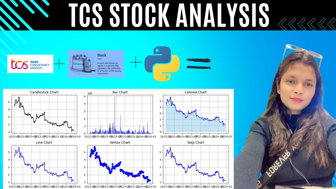
Ladies and gentlemen, hello everyone, welcome back to my YouTube channel. And in today's video, we are going to see how we can plot different stock market stock graphs using Python. So for this, we are going to use the library called yfinance. I'm using the yfinance. I'm going to evaluate the company TCS on the basis of the multiple parameters of the company, and also we will see how we can plot the graphs through which we can predict the value of closing price, opening price, or the volume of the trade. So first, what I have done is I have imported library Yfinance. After that, I have tried to retrieve the information about the company TCS. To get the info, I have multiple parameters so that I can see the key statistics of the company. So for that, I am printing the market capital, enterprise value, trailing PE, forward PE, PEG ratio, price, sale price, earning per share, what is the earning per share forward 12 months and trailing 12 months, dividend yield, payout ratio, beta, and then 52 weeks high, 52 2-week low, and also the forward annual dividend rate and forward annual dividend yield. These are few parameters that I have considered to know about the company. So these statistics I am printing out using the for loop over here. So I got to know that these are the parameters about the TCS, that the market capital is 66063104, and so on. So now we will see how we can plot the graphs on the basis of the TCS, like about the company TCS. So we are going to plot candlestick chart, bar chart, color chart, line chart, vertex, step, and mountain. So first see all these basic graphs. To plot this graph, what I need is I need a matplotlib library. So what you can do is you can install this library. You can directly say pip install, and this will install the libraries. If you have not installed any of these libraries, you can use this command to install it. Okay, so let's continue with the graph. So in this plotting, what I am doing is I am selecting the figure. I am considering the size over like 30, 8, which is height and width. Then I am trying to print the candlestick chart, which I am going to consider as in subplot because I don't want my plot to take the entire width of my laptop screen. So I'm just considering a subplot and I'm mentioning the values. And what I have done is I have written the title, I am giving it a plot that I have to plot the stock_data.index, which is the stock data closing price I want, and our color is black. Then I am trying to add two more values, which is the fillbetween. In the fillbetween, I am using two values. One is in the green color, another one is in the red color, for which I have set the alpha to 0.4 and 0.4. In both the cases, I am trying to compare open and close, open choose. And this is how it comes out. I am considering the grid also so that I can easily evaluate it to get the overview of it. What I can do is I can copy it as well and I can save it as well. Same way, this is the first chart in the candlestick chart, and in stock market we use the candlestick chart as a lot to predict the prices. Another chart that we use is the bar chart. Bar chart— for this I am trying writing the title as bar chart and then plot.bar, which will take the index and the I wanted to print the volume of the trade which should be in the color blue, and I am considering grid over here, which I— for which I have made the grid value to true. Over here you can see I have the grids, and the title of this chart is bar chart. And apart from this, I have the bar chart which represents the volume of the trade, that on this particular date this was the volume of the trade. Now I am trying to predict the color chart, which is— I am going to use another, which is index, and then the close. And in this, I am going to color it with the sky blue color where I have alpha value is 0.5. And main data, which is the closing price, I want it to be in the dark blue color. So here you can see, this is our closing price and this is the area which shows the, uh, closing price with the index, which is filled with this— this area is filled with the sky blue color. Another type of a chart that we use in stock market is the line chart. So to plot the line chart, the method is very simple. We know that the plt.plot will always take a default method to plot the line chart. But if you wanted to define it, you can still define it. But without defining it, if you want, you can write down the title of that particular chart. Like in this case, I am plotting the line chart, so I've kept the title as line chart, then providing it the data that I wanted to print the close price in the chart. And I want the grids also to be there, so I have made the grids to be true, which is the vertical lines and the horizontal line plotted inside the graph. Earlier we were getting the colored area, but in this line chart, it is normal line chart, so we are not getting any colored area. Another type of a graph that we have in the market list is the vertex chart. Vertex chart is also similar to the scatter plot, but this is something where the points are plotted into the vertex, uh, line, vertical line basically. So we have to provide the x-axis and the y-axis and it will be printed. Another is the step chart, which is also the major part in the stock market. It's just similar to the, uh, this chart, line chart we have plotted above. Another is the mountain chart, which we do not use in the machine learning, but this is important in the stock market analysis. So For this, what you have to do is you have to define the title, you have to provide the plot, uh, the x-axis and the y-axis. Along with this, I want grid, so I have made it true. So after this, what we have to do is we have to combine all these graphs which we have plotted from starting to till now, and we will be creating a subplot. It means in the particular area, we will be adding all those graphs. So to do that, what we are doing is we are using the subplot function, and I have taken all the codes from above for vertex chart, line chart, step chart, mountain chart, and all the charts I have taken. And then I have used the function called tight layout, and then I am printing it. So all these graphs are printed onto the screen on— in the particular area, the size of the area which we have defined above. So everything is printed in this particular region. This is a subplot. We are using the subplot function for making it happen. So if you like this video, don't forget to hit the like