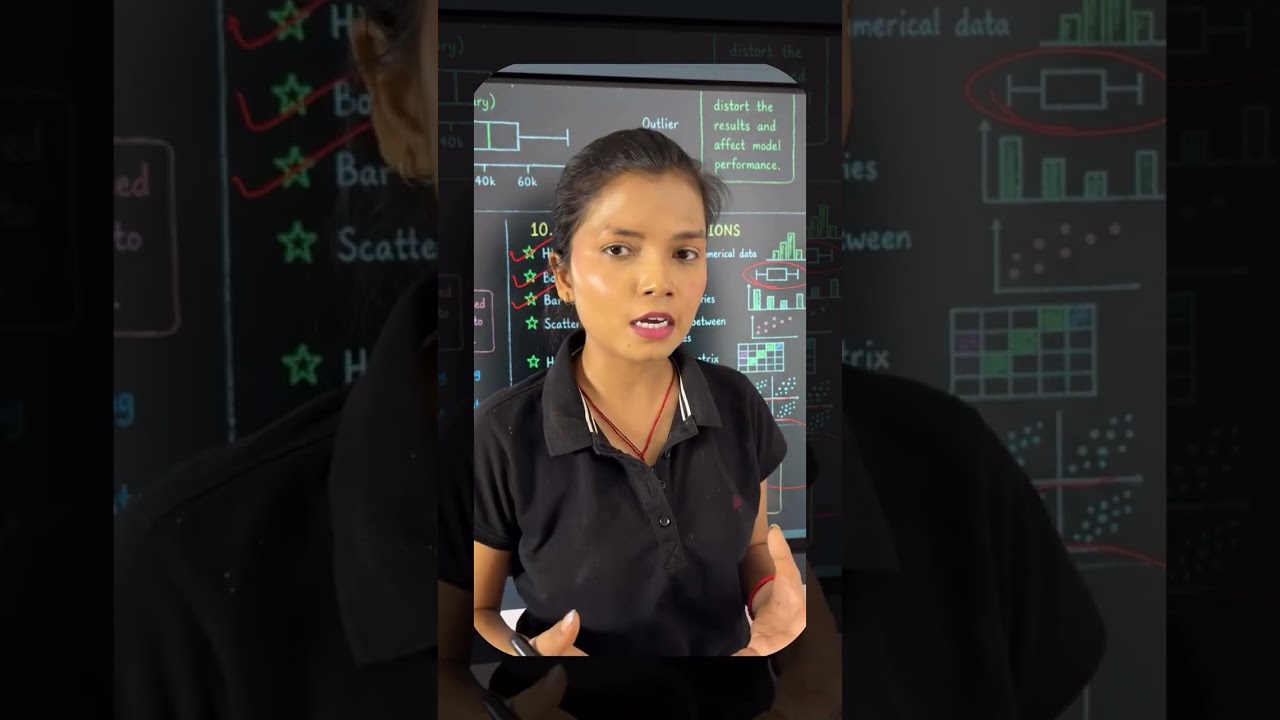
Akansha Yadav explains why visualization matters in data science: histograms show distributions and outliers, box plots pinpoint anomalies, bar charts compare groups, heatmaps reveal feature relationships, and pair plots explore multiple columns at once. These tools help you understand your data before building models.
Chapters
देखो जब भी हमें डेटा मिलता है हमें डायरेक्टली जंपी करना है मशीन लर्निंग, मॉडल बिल्ड करने में या फिर एनालिसिस करने में तो हमें करना क्या चाहिए हमें एक्सप्लोरेटरी डेटा अनालिसिस अप्लाई करना चाहिए जब हम एक्सप्लोरेटरी डेटा अनालिसिस करते हैं वहीं पर हमें लगता है डेटा, विज्वलाइजेशन सबको ऐसा लगता है डार्सबोड्स क्रिएट करने के लिए ही विज्वलाइजेशन सीखना चाहिए ऐसा नहीं है विज्वलाइजेशन हमें मदद करता है डेटा को अंडरस्टैंड करने में रिलेशनशिप जानने में कि कॉलम ए कॉलम बी से कितना रिलेटेबल है क्या इन दोनों का आपस में कोई इम्पैक्ट है भी या नहीं अगर ए बी से नहीं है तो क्या ए डी से है तो बेसिकली हम कॉलम के बीच की रिलेशनशिप को जानने के लि भी विज्वलाइजेशन क्रिएट करते हैं अंडरस्टैंड करने के लिए अपने डेटा को भी हम विज्वलाइजेशन क्रिएट करते हैं आज हम यही समझेंगे कि कौन कौन सी विज्वलाइजेशन हमारी मदद करती है देखो विज्वलाइजेशन की बात करें तो सबसे पहले हिस्टोग्राम हिस्टोग्राम क्या बताता है हिस्टोग्राम हमें यह बताता है कि नुमेरिकल कॉलम की जो डिस्ट्रीब्यूशन है वो किस तरीके से है क्या वो बहुत ज्यादा फायदा हुआ है क्या उसमें आउटलायर्स है या नहीं है तो में ली तो हम हिस्टोग्राम का यूज करते हैं डिस्ट्रीब्यूशन जानने के लिए जब बात आती है आउटलायर्स के आउटलायर्स मतलब वो वैल्यू जो 1 रेंज से बाहर है जो 1 रेंज से बाहर है वहीं आउटलाइन होती है उसी को बॉक् की मदद से हम क्रिएट कर सकते है बॉक्स प्लॉट क्रिएट कर सकते है और पा डिटेक्ट करने के उसके बाद बार चार्ट जब हमें कम्पेयर करना हो कैटेगरी की मान लो मेल फीमेल की कैटेगरी अलग अलग कंपेयर करनी है सैलरी की ज्यादा हम बार चार्ट क्रिएट कर सकते है उस केस में और हम उन कैटेगरीज को कंपेयर कर सकते है जो मदद करता है हमारे 2 वैल्यू के बीच वैरिएबल के बीच में रिलेशनशिप निकालने के लिए हीट मैप क्रिएट करना मतलब को रिलेशन मेट्रिक्स मतलब की 1 कॉलम का दूसरे कॉलम से क्या रिलेशन है पॉजिटिव है, नेगेटिव है पॉजिटिव को रिलेशन है या फिर वो दोनों इंटरडिपेंडेंट है तो वो चीजें हमें बीटमैपसेपतलसलते है जो पूरा टेबल क्रिएट करके देते है अगर आपके पास 50 कॉलम है तो 50 वर्सेज 50 करके 1 टेबल क्रिएट होगी आपके लिए टेयरप्लॉडमतलबकि मल्टीपल फीचर्स के बीच अगर आपको जानना है तो आप पेयरप्लॉट डायरेक्ट ली क्रिएट कर लो और ये सारी ही सारी विजुवलाइजेशन ही है जो मदद करेंगे आपकी उसको सीखने के लिए जिनको आप इम्प्लीमेंट कर सकते हो माटपलॉटलीपसीवान प्लॉटर जैसी लाइब्रेरीज से और पांडा और नंबर आपके डेटा हार्डिंग और न्यूमेरिकल ऑपरेशन में हेल्प करते हैं तो कुछ ऐसी लाइब्रेरीज भी सीखो जो जरूरी नहीं है की डालजवुटस क्रिएट करने में हेल्प करेंगे वो आपको डेटा अंडरस्टैंड करने में मॉडल को कौन सा किस तरीके का डेटा देना है कौन सा फीचर हमारे भी इम्पोर्टेंट है यह जानने के लिए भी विज्वलाइजेशन जरूरी होती है।