In this video, the creator, a designer who built his own portfolio on Webflow, vents his frustration with the endless cycle of obsessively crafting a portfolio, hating it after a few days, and then starting over. He explores Framer, a newer no‑code website builder, by reviewing several portfolio templates from Framer’s marketplace. For each template he highlights specific UI details—animated headlines, scroll‑overlap interactions, subtle loading transitions, sticky scroll progress bars, fixed bottom navbars, hidden menus, light/dark mode adaptation, and high‑quality typography—while comparing them to his Webflow experience. He notes how micro‑interactions and scroll‑based animations elevate the experience, praises responsive design choices, and critiques aspects like oversized desktop images. Throughout, his tone swings between exasperated, impressed, and enthusiastic. He ends with a call‑to‑action: a link to a free Framer portfolio template and an invitation for viewers to comment on their favorite template or request a tutorial, promising to create one if the comment gains enough likes.
Chapters
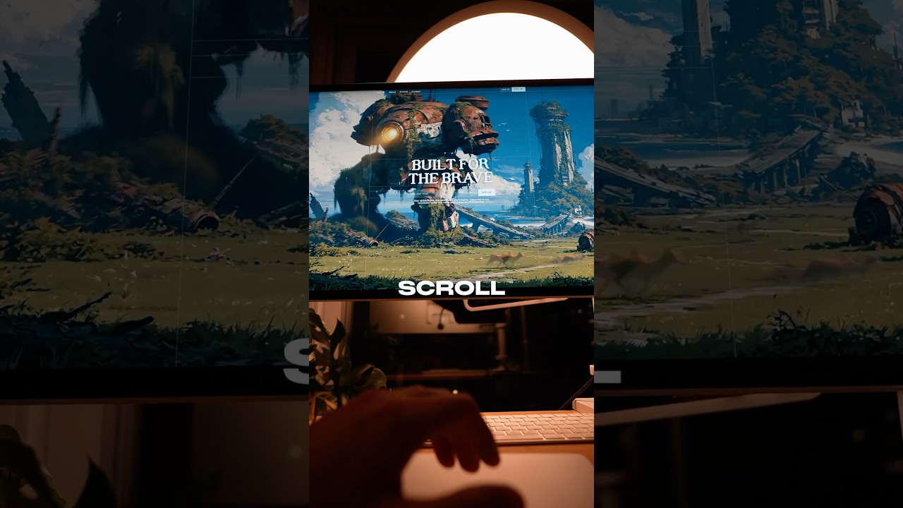
The design portfolio. The thing designers use to flex on each other and determine their place in the designer hierarchy. When I first created my design portfolio, I loved it. It took me about 284 hours to create, and after I finished, it only took me 3 days to absolutely hate it. And now my portfolio is slowly collecting dust and dying from old age. So that got me thinking, it's time to spend another 284 hours to create a new portfolio so I can cry myself to sleep after 3 days because designers like me are never satisfied. My portfolio is currently built on Webflow, a no-code website builder, but Framer, a no-code website builder, has been the new hot girl on the block. But before I make any rash decisions to break up with Webflow, I have to see just what sort of portfolio websites I can build with Framer. So I started on Framer's template marketplace and found this portfolio that just pissed me off. That animated headline, the scroll overlap interaction, the subtle loading transition in their case study page. The layout was perfect. They even had that sticky scroll, the goal of this template. And check out that subtle progress bar at the top. It was good. It was really good. And near the very end of the page, a warm invitation to see more case studies or contact for client projects. And I can't tolerate this disrespect. Anyways, let's see what else I can create on Framer. Hmm, This one looks interesting. Wow, I just got flexed on. Did you guys see that? Let's check out that initial loading animation again. Sick! Check out those little micro interactions. Oh, that's so sexy. All right, what else we got here? Mmm, love it. So simple. Brilliant. Compared to Elvis Costello, but I think Huey has a far more bitter, cynical sense of humor. That navigation on the left is just a piece of work, isn't it? Look at those subtle loading transitions as I go to each menu item. He really outdid himself, didn't he? Oh, beautiful. Let's check out what this looks like on mobile. Wow. That fixed navbar at the bottom is so clean. Wow. I love how he kept the same loading transitions. And look at that. He hid a menu within the menu. Beautiful. And let's see what happens if we change our settings to light mode. It actually changes the entire site to light mode to follow what the user has set on their device. Hey, Paul! Ahh! Let's check out another template. Wait, what is this? Impossible. This can't be. It's as if Apple themselves created this template. The typography. The visual hierarchy. Wait, wait. How does it look like on mobile? So if you want to check out these templates and get a bonus free template that you can use on Framer for your own portfolio, then check out the link below and I'll send it your way. Oh my God, this site is so clean. Ah, I'm actually just use this template. Yep. Look at that loading transition. Damn. Typography is perfect. Images are a little bit too large for my taste, but let's look like on mobile. See how mobile images are not that big? It's just on desktop they're really big. Okay, man. Yeah, Framer has a lot of great templates. Oh man, this is sexy. All right, let's see another template. Damn. So as I'm scrolling, this animates. Scroll-based interactions are king. Wow. Yeah, I'm a big fan for all this little attention to detail. All these micro interactions are amazing. Yeah, this template is primarily catered to architects, but I imagine that you can probably swap out those images for anything else like UX design, web design. All right, let's see how this bad boy looks like on mobile. Mm. Okay. It's kept those scroll-based interactions. Let's see that homepage. Yep, that's hot. That's hot. So let me know what portfolio template was your favorite in the comments down below. And if you want a free portfolio template, then go ahead and check out the link in the description. And also, If you're looking for a tutorial for how to build your portfolio, comment that down below too, because if that comment gets enough likes, then I'll start creating that next tutorial.