Designer Andres Gonzalez breaks down five AI startup websites built on Framer, showing how scroll animations, typography, spacing, and dark mode build trust. He argues polished design separates quality products from the noise in AI.
Chapters
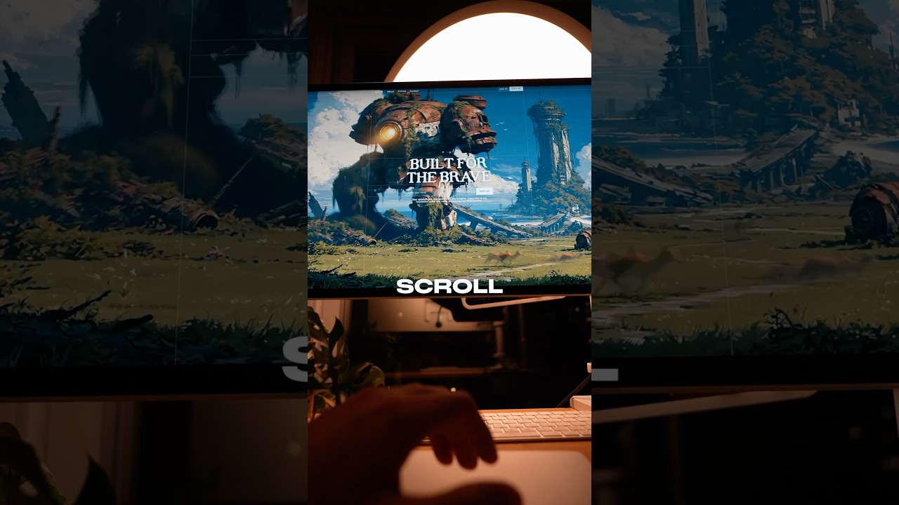
So one of my favorite things to do as a designer is spend hours looking at inspiration to refine my taste, to appreciate strong typography, generous spacing, and artistic visuals. And as someone who works at a startup, I was curious to study the best AI startup websites and identify some common patterns. I'm not just going to share some of the best websites that I found, but I'll be explaining from a designer's perspective why they stand out. And shout out to Framer for sponsoring this video, but more on them later. This is Visual Electric, an AI-powered image and video generator designed specifically for creatives. The homepage animates its UI elements on every scroll, which actually makes me want to scroll more. And this isn't just a cool effect. It's a way to show their creativity to the people who care— creatives, designers, art directors, and more. It's a way to say, I understand you. And in a sea of AI tools that want to replace creativity, it's refreshing to see someone who wants to enhance it. And that's what all these interactive animations communicate to me. This is taste. You're welcome. This is Flora, another AI-powered image and video generator. But don't worry, we have some other categories too. But as you can see here from the homepage, visuals thoughtfully connected through iteration. I can even click and drag images around, and as I hover, the dots in the background respond to my cursor's position. Now, these effects are cool, but they actually serve an important purpose. At a glance, they demonstrate their product's core offering: a visually connected creative tool for generating images and videos. And notice their choice in typography. This detail I want you to pay attention to: a handcrafted serif paired with a pixelated font, maybe representing the joining of human craft and AI technology. This is Cartesia, a voice AI platform where I could literally test it out for myself right on the homepage. So let's go ahead and put, you're literally Batman, don't worry, I'll keep your secret. You're literally Batman. Don't worry, I'll keep your secret. That's pretty cool. That's pretty good. See, I love their scroll-based animations and use of texture that make for a beautiful background. And the way they incorporate these textures to visuals like this is really impressive. But most importantly, the reason this website stood out to me the most was because most why websites and brands are bland and minimalistic, and this brand seems to have some personality and intentionality. It stays in dark mode, which isn't even a common pattern among its peers. Either way, I'm adding this to my bookmarks. So every website that I mentioned in this video was built on Framer, a no-code website builder designed for creatives but powerful enough AI startups, as you can see. If you're curious what you can build with Framer, check out their gallery page where you can see all the cool shit people are building. I've personally used Framer for my own portfolio and I haven't looked back, and I've used a lot of website builders in my day. It's free to get started, so check it out for yourself. Link is down below. This is Unagi Games, an AI crypto startup reinventing entertainment. They're creating an interactive story platform called Persona, and I'm in love with their art direction. Yes, I'm biased because I'm an anime fan, but I think there's something special here and I can't really put as much words to this one because it just looks really cool and I don't know how else to describe this website. It has like this vintage anime sort of feel. And as I scroll through everything, it's neatly placed within a bento box style, but like grid with generous spacing for each element, giving it enough room to breathe and there's always a hint of animation in every section, but never too much. And I just really appreciate what they're doing. This is V7 Labs. It's an AI agent platform that I think has some of the cleanest designs I've seen, almost as if Apple themselves helped design this website. Their duotone typography is tasteful, their colors are mature, and they've managed to animate subtle UI elements that give them a degree of polish. And I don't know about you, but when I see a website or product that is poorly designed, kind, I don't trust that it's even worth using or trying out. Yes, for tools, I do judge a book by its cover. You can actually learn a lot about a tool based on how well the design is. And V7Labs is a sort of AI tool that I think would be worth testing and tinkering with just because of how well designed it is. So if you take away anything from this video, I want you to remember one thing, that big bets on good design are more important than ever. There's tons of AI slop, uninspired junk out there because everyone can create a startup or vibe code a tool and simply spending the time to invest in subtle details that might actually go unnoticed by some is a differentiator. So let me know what your favorite AI tools and their websites are down below. Curious to check them out. Until next time, Batman out.