Andres Gonzalez breaks down seven designer portfolio websites with standout interaction design: retro 90s aesthetics, 3D planes, parallax effects, and sophisticated animations. He highlights how Framer's canvas-based workflow powers one site and explains what makes these interactions feel intuitive rather than gimmicky.
Chapters
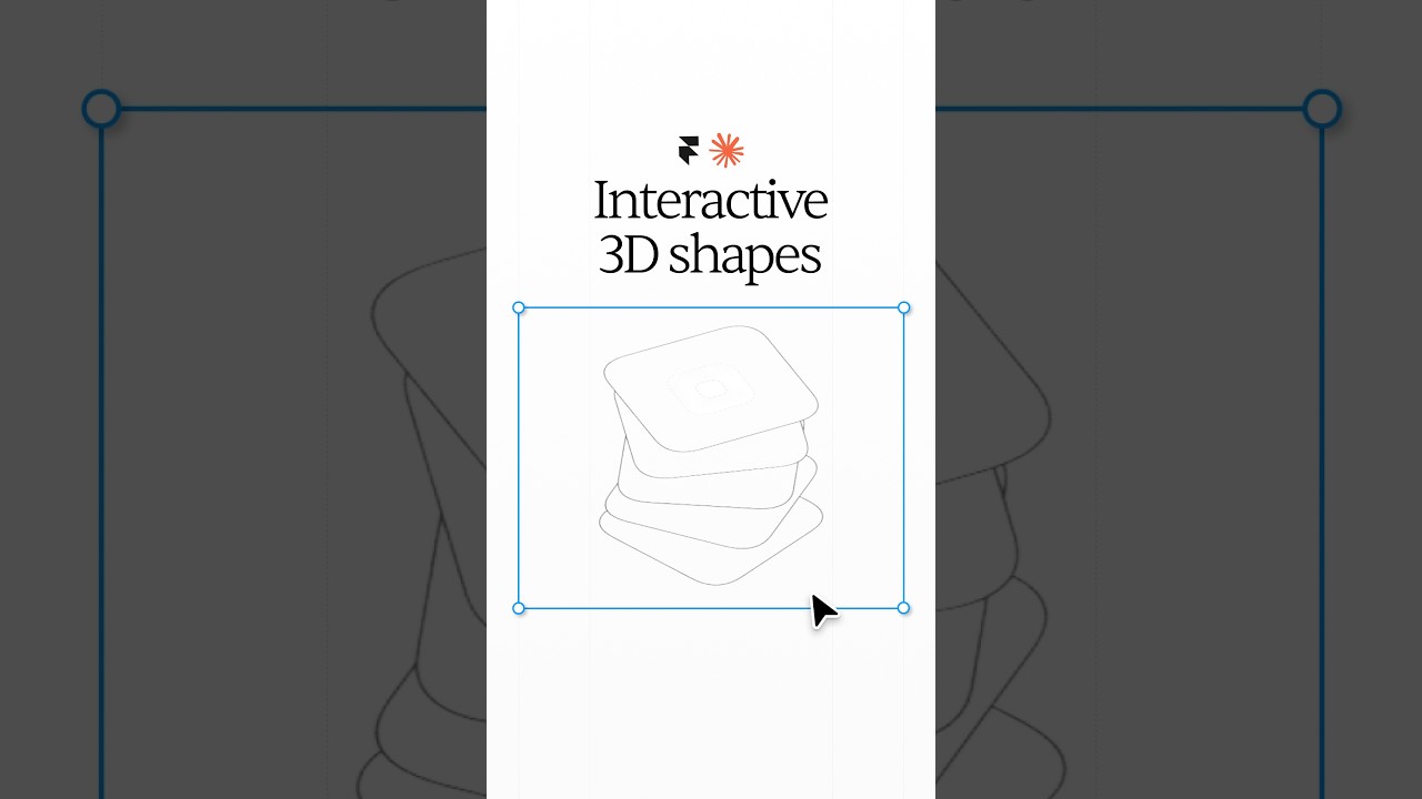
Dear residents of Gotham, today we're going to be going through some of the most insane portfolio websites I've ever seen. Portfolio websites that have genuinely brought me joy, made me blush, and even gave me butterflies. Am I attracted to portfolios? And the only thing that you have to do is like this video and comment "You're literally Batman" to feed my delusions. And if this video gets 15,000 likes, I will dress up as Batman in my Batman Mask and cape on the next video. Feel it. Yo, so this guy's website is absolutely incredible. This retro style design of his homepage makes me feel like I'm back in the '90s when I used to play games like Mega Man, Tony Hawk on my Game Boy SP. Let me know if you ever had a Game Boy SP or if you know what that is. This portfolio is like screaming with personality. He's a designer, director, and a geek. And check out how his cursor changes when I hover over geek. And did you guys— did you guys hear that? Let's play that again. Really cool hover interactions. Like, my dopamine levels are going absolutely insane right now. Dude, this guy is in a category of his own. Yes, when I said that these are the most insane portfolios I've ever come across, I meant it. Check this out. When I click, there's a piano sound that plays. I click and drag and it becomes an interactive 3D plane. I resize my window and this pixel counter thingy dynamically changes. I hover over these items and its description follows my cursor and plays a video. I checked out his work and I genuinely fell in love with this guy's portfolio. If you've watched some of my portfolio videos in the past, you'll know that I have a soft spot for interaction design, and this guy's work is absolutely amazing on that front. I'm honestly so inspired by it. I mean, this, this is insane. Like, wow. These are like really tasteful interactions. When most people think about animations, most people think like something that's distracting, something that's very animated. But I think the best interaction design is actually interaction design that feels intuitive. Anyway, I do a terrible job of explaining what I mean. He actually has an essay describing what makes a good interaction design. And I don't like reading very much, but I loved reading this essay. It's really solid. Nice. We've got a clean bento style grid portfolio website here with tasteful hover interactions. And the dog, my favorite bento grid. Let's see some of his work. Okay. Sierra for Samsung. Let's check out the Samsung one. Classic password protected. Let's check out some of his other work. Oh, super nice. Okay. Like his layout. Oh, I love this sort of table of contents thing here on the left-hand side. It looks like it's a lot of— it's a bit— it's a pretty big case study, actually. Nice. Phenomenal job. Let's learn more about him. Loving his about page. Oh, and you guys, you guys have to check this out. His portfolio is actually built on Framer. With Framer, you can create websites just like this. And the best part is it's not even that complicated to use. If you're familiar with Figma like me, you'll recognize its canvas-based approach super easily. And one of my favorite features is Framer's ability to create really cool animations and interactions. And they also got an extensive library of templates for you to start with. So if you want to support me, support the sponsor of today's video, Framer, by signing up to the free account and just trying it out for yourself. Wow, that was like really clean. Damn. So as I'm scrolling, I'm literally getting a spinning carousel of projects. I've literally never seen anyone do this before in their portfolio. We got— we got to check this out. We got to check out some of his work. Jeez, we're getting flexed on right now. Better buckle in. Wow. That's— that's really nice. That is really, really nice. Yeah, I would definitely hire this guy for some work. Look at that. I mean, that's just— oh, I think the feeling that I'm getting from this portfolio is elegance, beauty, you know, premium. Yeah, this is incredible. Great job. Oh my, yo. That's crazy. That is absolutely insane. This is an insane portfolio. Interactive artist. Yeah, I could tell. The paper. Oh, so it's like a, it's like a newspaper style portfolio. Oh, it's like beautiful to look at. Again, I think this is such a unique take on what a portfolio could be, and I just really deeply respect this guy's ability to think of this. Beautiful typography. The Perfect Artisan. And then check this out, as like I hover over these cards, it's like it feels 3D. It feels like it has texture, you know, but it's tasteful. It's not like in your face. Wow. Yo, like even his menu transitions are incredible. Like it's like a paper being— oh, so good. Am I crying? I'm not crying. Dude, oh my God, I'm kind of speechless. I don't even know what to say at this point. I should just shut up and just absorb, absorb this incredible beauty. Wow, that's— Jesus. Now, warranted, it is a little laggy cuz I haven't upgraded my laptop yet, but phenomenal job. Wow, look at this guy flexing on us with his text animations. I'm loving that sidebar menu. Let's see some of his work. Okay. Okay. I love those. Like, those tasteful little transitions are so nice. I love— I love it. This. Yes. More, more of this. So cool. Interesting. Let's learn more about him. Again, the text animations, they're just clean, they're creative. Looks like he was an industrial designer, which is interesting. Awesome brands that have worked with. Got some testimonials. Oh, nice. Look at that. He actually went to San Jose State. I went to San Jose State too. Spartan gang, what's up? Oh, very clean. Wow. Beautifully spaced. And his cursor hacking is pretty tasteful too. I'm typically not a fan, but I think he did a good job. Nice little parallax movement right here. His work also feels like premium in like a high-tech Google type of way. Very cool. That's Oh, he has a little light mode and dark mode switch. Not bad. All right. I respect that. It's a lot of work to do that. You know, let's see his about page. Little menu transition there. Okay. It looks like we're directed back to his home page. Interesting. Oh, look at that smile. Oh, that's good. That's good. All right. If you want to book a coaching call, there you go. Let me know in the comments down below what portfolio was your favorite and what video you would like Batman to do next. If you love this series, there's actually another video loaded up right in front of my face somewhere. So yeah, I know the video's— you don't have to look at me now, but you can, you can watch the video next though. There you go. Yep, right there. Yep.