7 Portfolio Websites That Will Make You Jealous

Seven designer portfolios show what works: smooth animations, clear problem statements, user research, and measurable results. Dennis, Oliver, Kaysen, and others nail interaction design and storytelling in their case studies. See what to steal for your own site.
Chapters
Portfolio websites. Ladies and gentlemen, today we're going to be going through some amazing portfolio websites that will get you fired up. They're going to be filled with carefully crafted interactions, eye-popping animations, and beautiful typography. The goal of this video is simply to show you what is possible. If you're looking to get noticed as a designer, these websites will serve you with just inspiration you need to revamp that portfolio website. Site and stand out from the crowd. And all you have to do is like this video. Seriously, that's it. That's all you got to do. Question is, why are you not doing it? You gotta do it right there. Yep, click. We're starting off this video hot. We got one of my favorite portfolio websites. We got Dennis's portfolio. This portfolio is for you web designers and developers out there. See, the interactions and the animations on this website are super smooth. And front and center, we got a great photo of Dennis. But notice how his portrait matches the colors and the minimalistic design of his website. Everything is put together pretty nicely. Yeah. And check out this little detail. His name automatically moves horizontally, but if you scroll, it actually changes directions. As I hover my mouse, we see this kind of magnetic pull, then bounce as I hover away. Same type of interaction with the menu. It pulls from the left and goes from curved to straight. But let's actually check out some of his work. Super dope transition. Very nice presentation of his visual design and awesome mockups. I don't even know how he got most updated MacBook Pros. However, I kind of wish he added a bit more context on the problem that he was solving for the client. I'd love to know why he made certain design decisions and interactions. Wow. Beautiful. Honestly, this is amazing. I just love how interactive all of his work is. If you take one takeaway from this portfolio website is interaction. Very well done, Dennis. Bravo. Next up, we got Oliver's portfolio. This is for all your UX and product product designers out there, you guys are in for a treat. See, Oliver is currently a product designer at Snapchat and previously ZipRecruiter, so his portfolio is actually going to be focused on user research, problem solving, and strategy. Wait, you didn't think I'd only show you great visual design and typography, did you? Come on now. In front and center, we've got his work. He's not playing around. First, we get the context we need to understand what this project is about, his roles and responsibilities, his team, and the background of the project. Most importantly, we get a clear problem statement. An aspiring nurse looked at a nurse nursing jobs in New York, but she also helped her husband look for marketing jobs. So now she's getting marketing job roles, which doesn't really apply to her. See how fast I was able to understand the problem? This is an example of a well-crafted case study because immediately I know what the problem was. Now look at this. We also see how research was involved in determining how users felt about their suggested job results within user surveys. This is an example of what you can do in the user research step of your product design case studies. And this is also how one would validate that the actual problem exists. Interesting. So Oliver's design just wanted to show transparency of where these suggested jobs were actually even coming from. So users are informed and are able to then give feedback on whether they want to see these suggested job results. Now, this is how you end a well-crafted case study. You talk about the results. So this redesign increased clicks on suggested jobs by 22%. Applications went up by 8% and unique users who engage with suggested jobs by 10%. And they also lifted satisfaction by 8%. Now, results are key to a well-crafted case study. All I have to say is bravo, 10 out of 10. So if you want to build your own portfolio website, I recommend using Hostinger. Hostinger is a web hosting platform that is perfect for your portfolio website. I've used Hostinger in the past with some of my client projects, and as a designer, I love how simple and easy it is to use. They have super fast servers, they're optimized for WordPress, you get a free domain, and there's a 30-day money-back guarantee. I actually have a coupon code, AndresTheDesigner, which will give you 91% off all the yearly plans. So after you use my coupon code and create your account, you'll want to click on Premium Shared Hosting, then choose I'm creating a website for myself, then select it'll be a portfolio website. Choose your level of experience. Then you can directly connect to your WordPress account and just remember that email and password. And don't worry if you haven't created your WordPress account quite yet, you can set this up later, but you do want to get that free domain. I recommend choosing something with your first name in it. And after you go through that super simple process, you're introduced to the HPanel where you'll be able to manage the backend of your website. And here's where you can connect that WordPress account if you haven't already. And WordPress has a huge library of templates online that you can use for your portfolio website. I'll put some links down in the description for you to check out, but just remember to use Andres Gonzalez designer when signing up for Hostinger. We got another one for you UX and product designers. We got one by Kaysen. He's a senior lead product designer at Rivian, and he's also worked with brands like Tesla, Moment, Boosted, and more. Let's see what kind of inspiration we can get from his portfolio. Really simple and clean way to present his work. Love it. Case studies. Let's do it. Let's check out this Core case study. Nice. We get the background of the project, the challenge, a.k.a. problem statement. Oh, and we get a visual visual look of the prior designs as well. It's almost like Kyson is telling a story here with his case studies, and I love it. It's great. And for you aspiring UX or product designers out there, notice the pattern in these case studies. Notice how they're crafted. Reverse engineer them. Take notes. I really love the simplicity and clean design of this portfolio. Well done. Well done. You feel alive, let's hit the dance floor. Don't worry, Jantana Henard. Sorry if I'm mispronouncing the name. So right from the beginning, we're introduced with Moving gradients. Oh, look at that. It's interactive. As I move my mouse around, it creates a sort of splash. Mm. Check this out. And she has a dark mode and light mode switch. That's pretty cool. Oh, and this is really cool. Jelly rolling effect. I wonder how she actually developed this effect. There's also this, like, interesting bending effect that happens as I scroll over certain objects like these photos. Interesting. See what happens when we click through some of her case studies. Very nice transition as I click through her work and that bending effect continues on to other web pages as well. Yeah, and the art direction to these case studies, pretty awesome. You know, if you take any one of these small details on their own, they wouldn't be super impressive by themselves. However, these details in combination with the entire user experience is very impressive. So this just goes to show that these little little touches that you do to your website. On their own, they don't matter, but in combination can make your portfolio stand out. So this next portfolio is from Paulo, and it's a perfect inspiration for those of you that want to start your own UX design consultancy. This is a unique style portfolio that breaks the norms of what you typically see. It's an interactive grid. It also seems to be built on Webflow, which I'm a huge fan of as well. Oh, and it looks like he's done some work for Pandora. Very nice. It also seems like you can toggle through and see multiple images within the grid. It would be nice to see some case studies on the portfolio, but overall it's nicely done, well-designed. I haven't seen this type of format before. So again, if you want to stand out, this might be an inspiration for your next portfolio. Next up, we've got Francisca. She is a graphic and interactive designer and her website is very interesting. We got this infinite photographic scroll going on and on. These photographs actually represent some of her work. And when we click through some of these photographs, you get a beautifully presented transition and animation. And as we scroll, we got some interaction as well, which makes her website look quite polished. We can see that she gives context in a brief on her case study, which is much appreciated. And this is also super helpful when someone is trying to hire you. They They want to understand why you've made certain design decisions, not just that you can make good visual design work. Really nicely done there. Overall, her work just looks really nice. It's great use of spacing and typography and movement as you scroll. And as we finish reading this case study, we're prompted to see the next project. Keeps people engaged, keeps people wanting to see more and more. Then we got William's portfolio. Andreas Gonzalez. He's a good friend of mine, so I'm probably going to be biased, but it's still worth checking out because honestly, I think he probably has one of the best, most well-crafted case studies I've seen. So let's start with his homepage. I love the fact that he has a video trailer that introduces himself. You get a good idea of what he sounds like, what he looks like, what he's about, some of the philosophies that he believes in. Watch the video. It's good. And it's also a sign that he goes above and beyond. And as we scroll to see his case studies, we see this cool color background change. And check this out, guys. When we click through his case study, we see the most detailed, comprehensive breakdown of his work. Damn, it's just filled with user research, personas, competitive analysis, interaction design, and downloadable PDF of the design spec. His actual design work, screenshots of his process, him reflecting on the successes, results, and lessons of the project. Man, if you're building out your portfolio, need some ideas of what to include in your case studies, William's website might be just right for you. Now, if you thought this video was any good, you should see my other videos, especially if you're trying to teach yourself UX design and have actually made a self self-taught UX design guide right here. Go ahead, give it a watch. There's no courses, there's no boot camps. It's how I personally learned how to teach myself UX design. Do it. Click on the video. It's, it's really good. Adios.
More from Andres


Claude Design, meet Aqua Chat (anyone else obsessed with Aqua UI 👀) #claude #design @claude #ad
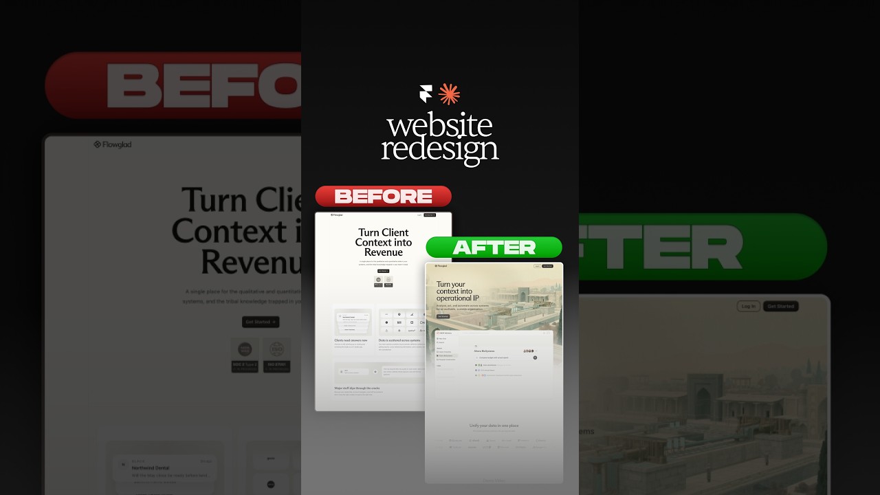
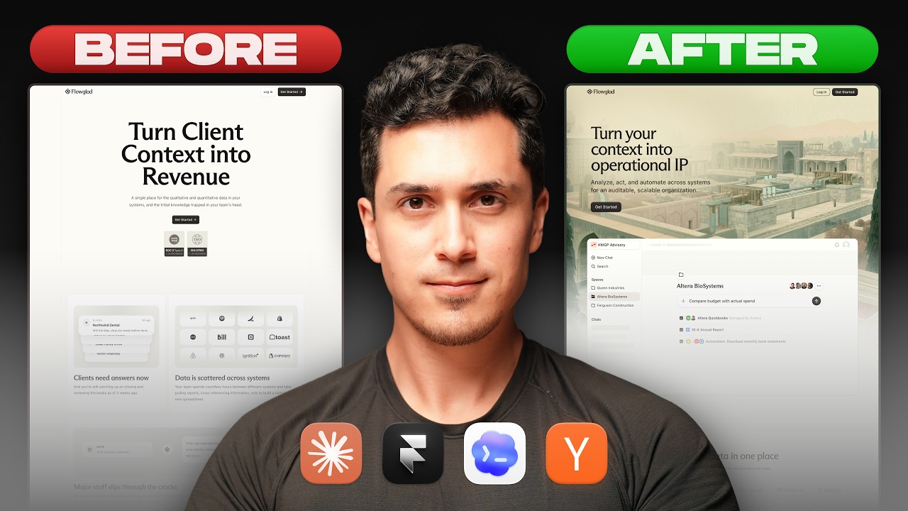
Website redesign for the coolest Y-Combinator startup everrrrr 😏#framer #webdesign #ad


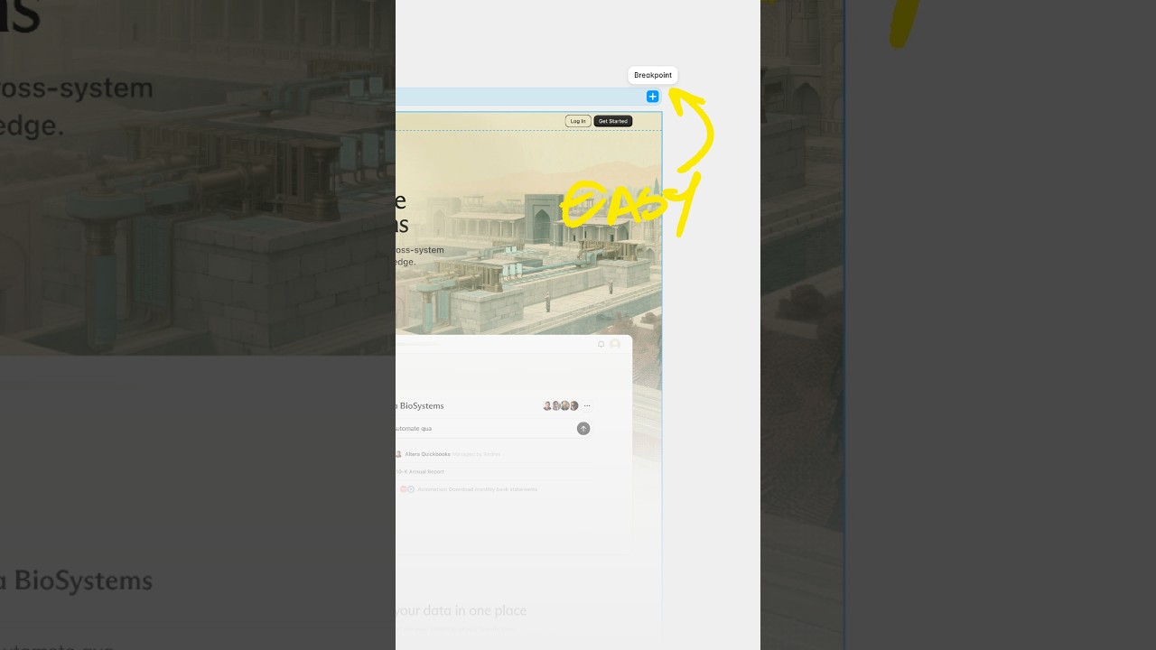
Break barriers by letting Framer agents' break points 😏 #webdesign #framer #framerpartner