Andres Gonzalez shows seven website templates built with dark mode, grids, and Batman vibes. He walks through his own portfolio template with smooth transitions, a free waitlist template with yellow accents and Geist fonts, and explains his design choices like bottom navbars for mobile and consistent hover states.
Chapters
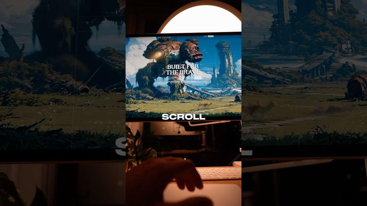
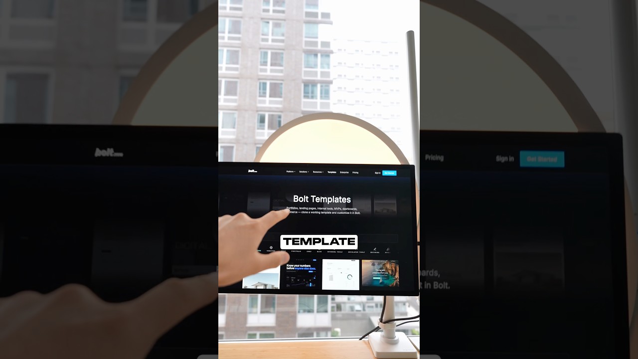
¡Hola! Residents of Gotham, I'm glad you're here because I'm going to be sharing 7 website templates that just might turn you into Batman. I don't make the rules. 2 templates I've created myself and one template is 100% for free. All you got to do is comment which one is your favorite down below. That's it. Let's get into it. Yo, we're starting off with a banger. Check out this portfolio website. It is absolutely stunning. Every single interaction feels super polished. I mean, just check out that page transition. Wow, that is super smooth. Whatever sort of animation curve that they're using is hot. And what I also love about it, its composition is really good. Its layout, it's really, really nice. It feels like everything that I look at is intentionally placed. And oh, those text effects, it's incredible. Every single item gets blurred in individually after the other. That is, that is amazing. And I think most details like this really make these sort of templates stand out. And sure, it's a little bit fancy in its hero section, but everything else is more mature. It's more dialed back. It's, it's animated but not too much, you know. This template is Amazing. All right, so I'm going to be sharing one of the free templates that I've actually created myself. So this is a waitlist template specifically for anyone who's live coding any sort of product, any sort of software, but want to be able to like showcase their software and potentially grow their waitlist of users, potential users. And what I love about this is its subtle input field. That little shine of yellow is something that I thought was a really nice touch and it's typography. I'm using Geist and, uh, Geist Mono. It's very— Vercel does a really good job with their typography. So yeah, if you want to use this, it's 100% free. It's kind of cute. I don't know, it has like a cute sort of like vibe to it. I love my grids. If you see my work, you'll see, you'll see that I love my grids. Okay, ladies and gentlemen, I gotta show you some of my My proudest work actually was this portfolio template that I was actually using for a long time. And this is what I mean by taking something that you love— in my case, I love Batman— and really trying to design something that is deeply inspired by it. The yellow, the grids, because I use all these sort of design tools. So what you'll notice is a lot of these interactions are not just very Batman-like, but they're also kind of design-like as well. So I wanted to combine my love for design and design tools, and also my love for Batman. And so that's kind of what this portfolio really is, is a culmination of those two worlds put together. I put together this portfolio for anyone who really loves Batman like me and wants to be able to showcase their work in a way that shows off that sort of personality. I also try to pay attention to making this mobile friendly. And if you notice, look at that navbar, look look how it shifts from the top to the bottom. And I don't know why more websites don't do this because your thumb is closer to the bottom of the screen. The tab bar at the bottom, it's very nice. I don't know, I personally think this is a superior design component. I also just love the way that it looks as well. It feels like this website is actually a piece of software and not just some nav, you know, not just an informational website, which it is an informational net website. But also the fact that I was able to get this right on mobile, that little like intro interaction Very difficult. Anyway, hope you liked it. Oh, so one of the things I love about this website is how responsive it feels. And similar to the first template that I showed, page transitions, it is very, very nice. Um, also the mono font, it is— I usually don't like mono font on websites, but they've done it really, really well. It just feels super responsive. And very fast, very quick, you know. This is like a very young Batman sort of feel, if that makes any sort of sense. And I also love how responsive it is. It like is obviously very intentional with how the images respond to different sort of breakpoints. Um, and those page transitions again translate really well on mobile, and this hover interaction feels very like back computer-like. This feels like something that I would see on the back computer itself. Um, obviously light mode, we don't talk about that. We want dark mode, but you have that option there. Um, beautiful work by Maya. Very, very, very nice and well put together. Um, yeah, this is super sick. I also just love the little see more hover interaction that happens as you hover over product cards or template cards. Yeah, this is, this is nice. All right, ladies and gentlemen, I'm super excited to show you this template. I've showed this template before and I'm showing it again because I love it. It's one of those like templates that kind of last over time, and as I've gone through many sort of iterations of my own template, I've learned that I kind of hate it after, after a while. But the true test of good design is when you look at a template or you look at a piece of, a piece of work really, and you don't hate it after a while. That's really where the bar is. And if you're a designer, you probably know exactly what I mean. And this template is one of those that I've kind of come back to and I've realized, wow, this still is holding up after almost a year of me continuing my design work, and there's something timeless about it. And so that's one of the reasons that I wanted to showcase this template on, on here. It's great. All right, we're gonna go through this very terminal-like, Matrix-like portfolio. This is a sort of website that I imagine maybe Batman Beyond, you know, uh, really liking. And some people might call it cheesy, you know, the little terminal-like feel. I don't think it's cheesy at all. I think that it is nice. It is like— I, I appreciate— I, I, I think that this could be customized in a way to make it even more tasteful. But yeah, I really like this template. I like the direction of this template as well. It makes me feel like I'm in the future, you know, and maybe it's just the music that's going on right now that's kind of making me feel that way. But I love this, and I'm spending more time in the terminal these days with Claude Code. And so having something like this kind of feels, kind of feels nice. It feels right, you know? It feels like I'm doing something for the future. I'm building for the future. And yeah, also it's mobile responsive, but like not just a half-baked mobile responsive. It's actually really nice. All right, ladies and gentlemen, there you have it. Those were some templates that turn you into Batman. Let me know in the comments down below which one was your favorite. I'd love to know. And as always, God bless you in everything that you do, and more videos coming soon. Peace.