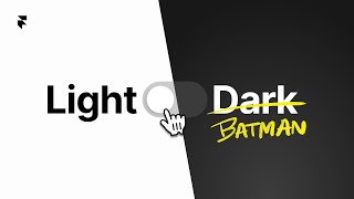
Build a custom light/dark mode toggle in Framer using color styles and a code component. The toggle saves user preference to localStorage, detects system theme automatically, and uses CSS animations to scale the inner circle based on overall size.
Chapters
As the official Dark Knight, it is my sole responsibility to teach you how to create this custom toggle that switches your site from light mode to Batman mode. My weapon of choice is Framer, one of my favorite ways to build websites. By default, Framer follows the system's light and dark mode settings on a user's device, but in this video, I'll show you how to let users manually override that with some custom code magic. And all you have to do is comment "You're literally Batman." Yeah, you gotta do it. Like, I can't, I can't proceed unless. Let's talk about how to create color styles the right way. The first thing that you wanna do is ensure that your website has color styles created and applied across your site. By default, when you create a color style, that color will apply to both light and dark mode unless you specifically click on this dark mode toggle and set a different color. All right, so you can think of light mode as the base for both modes unless you set the dark mode toggle. All right, it makes sense once you do it. Once you do that, you'll have two distinct colors for this specific color style, and all we have to do next is apply that color style to a specific element on our website, like this text for example, and this background. Now to see how this looks like in dark mode, we can actually just click on this moon icon here. There you go. Next, we're diving into the fun part— this custom code component, aka the Batman Mode toggle. Now, this element works a little bit different than other usual Framer elements on your site, but don't worry, most of you won't have to learn any code to use this toggle on your website. Framer actually makes it super easy to customize this toggle without needing to read or update any code. Because our code includes this addPropertyControls function, we can simply move this slider to change its size and change its color like any other element on our website. Once you've created color styles, you've set dark mode values and applied it to specific elements on your website, this component should just work straight out of the box. Yeah, I know, I'm awesome. I've linked this file for free so you can copy this component onto your own website, and the only thing I ask is that you follow me on X and you call me Batman. I'm a simple man. But what if you want to customize this toggle further, like change its width or its shape or the size of its inner circle? In that case, you're one of the few brave souls that will need to dive into this code of this component to customize it further. So let's take a look on how this code component actually works. This getStoredTheme function stores the user's theme in local storage. This function here detects the system's theme automatically, and this themeSwitch function contains the actual component. Logic. But as I scroll down further, it's this formula that's responsible for dynamically scaling the circle size based on the overall size of the toggle to maintain a balanced look. You can change these fixed values manually here, then press Command+S to save and update the component. We can see how it looks here on the preview panel. This is how you will change the aspect ratio of the toggle. But as we scroll further, we get more visual customizations. And remember, Its size is managed through this switchSize variable, which serves as a property control we can change on our property panel. If we delete it and simply replace it with a numerical value, then you'll lose the ability to update that toggle size. Instead, you want to tweak the hardcoded values to get the toggle to be wider or shorter. And that's a theme I'd like to recommend when customizing this toggle. Tweak the fixed numerical values, not the variables or functions. But what about the animation? Well, this code is responsible for that, the inner circle that moves from left to right. If you want to change the timing of the animation, edit this CSS property. But what about all the other parts of the code? In my template linked below, you'll find more explanations like this to help you understand how each section of this code component works. You can also just use ChatGPT to help update or explain parts of the code for yourself. If you want to see some sick dark mode portfolio websites that will make you feel like a Dark Knight, you'll want to watch this video next. And God bless you, and Batman out.